


这几天在做GeoDa实践作业,进行主成分分析时发现GeoDa自带的主成分分析虽然能够快捷输出如特征值、主成分载荷等数据结果,不过均是以数据报表形式,而非直观的主成分载荷图。为了便于将结果进行可视化,从而更直观地将数据关系理清,我编写了一个利用GeoDa主成分分析结果绘制主成分载荷图的matlab脚本。
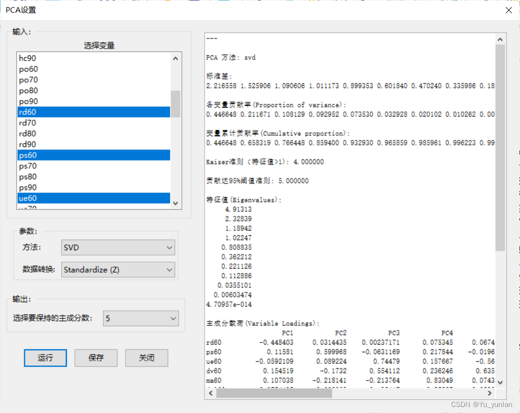
可以看到GeoDa里的主成分载荷数据已经归一化到(-1,1),如果是自己处理的数据在后续进行数据源替换即可。
核心代码
% Loadings为变量在各主成分上的载荷
pc1 = 1; % 第1个主成分上载荷,对应图像横轴
pc2 = 2; % 第2个主成分上载荷,对应图像纵轴

figure()
axis([-1,1,-1,1]) % 坐标轴范围视具体
ax = gca;
ax.XAxisLocation = 'origin';
ax.YAxisLocation = 'origin';
set (ax,'ticklength',[0 0])
drawLoadings(Loadings,pc1,pc2)

function drawLoadings(Loadings,pc1,pc2)
% 由于我是用Struct结构存储主成分分析结果,因此在读取载荷数据时为了方便就用结构体的读取方式
% 如果使用的数据存储方式不一样,需要自行调整一下
fields = fieldnames(Loadings);
for i = 1:numel(fields)
    FileName = fields{i};
    x = Loadings.(FileName)(pc1);y = Loadings.(FileName)(pc2);
    PlotLineArrow(gca,[0,x],[0,y],'b',FileName)
end
    % 来自CoderMan_1012大佬的代码,因为原点位于图像中心,
    % 以此利用annotation函数时需要进行一定变化将箭头起点移植画面中心
    function PlotLineArrow(obj, x, y, lineColor,str)
    posAxes = get(obj, 'Position');
    posX = posAxes(1);
    posY = posAxes(2);
    width = posAxes(3);
    height = posAxes(4);
    limX = get(obj, 'Xlim');
    limY = get(obj, 'Ylim');
    minX = limX(1);
    maxX = limX(2);
    minY = limY(1);
    maxY = limY(2);
    xNew = posX + (x - minX) / (maxX - minX) * width;
    yNew = posY + (y - minY) / (maxY - minY) * height;
    annotation('arrow', xNew, yNew, 'color', lineColor)
    text(x,y,str)
    end
end
完整示例
由于我是利用GeoDa分析结果进行图标绘制,因此这里附上从数据读取再到图标绘制的完整代码。
% GeoDa PCA结果读取与载荷图绘制
[txtName,txtFile] = uigetfile({'*.txt';'*.*'});
txtid = fopen([txtFile,txtName]);
dataType = 0;
PCA.Eigenvalues = []; % 特征值
%Loadings = []; % 主成分载荷
while 1
    if dataType == 1
        while 1
            e_str = fgetl(txtid);
            if strcmp(e_str,'')
                dataType = 0;
                break
            end
            PCA.Eigenvalues = [PCA.Eigenvalues;str2double(e_str)];
        end
    elseif dataType == 2
        while 1
            l_str = fgetl(txtid);
            if strcmp(l_str,'')
                dataType = 0;
                break
            end
            l_cell = strsplit(l_str,' ');
            FileName = cell2mat(l_cell(1));
            for i = 2:length(l_cell)
                PCA.Loadings.(FileName)(i-1) = str2double(cell2mat(l_cell(i)));
            end
        end
    end

    str = fgetl(txtid);
    if str == -1
        break
    end

    if strcmp(str,'特征值(Eigenvalues):')
        dataType = 1;
    elseif strcmp(str,'主成分载荷(Variable Loadings):')
        dataType = 2;
        str = fgetl(txtid);
    end
end
figure()
bar(PCA.Eigenvalues)
hold on
title = "特征值柱状图";
hold off

figure()
axis([-1,1,-1,1])
ax = gca;
ax.XAxisLocation = 'origin';
ax.YAxisLocation = 'origin';
set (ax,'ticklength',[0 0])
drawLoadings(PCA.Loadings,1,2)
hold on
title = "主成分载荷图";
hold off


function drawLoadings(Loadings,pc1,pc2)
fields = fieldnames(Loadings);
for i = 1:numel(fields)
    FileName = fields{i};
    x = Loadings.(FileName)(pc1);y = Loadings.(FileName)(pc2);
    PlotLineArrow(gca,[0,x],[0,y],'b',FileName)
end
    function PlotLineArrow(obj, x, y, lineColor,str)
    posAxes = get(obj, 'Position');
    posX = posAxes(1);
    posY = posAxes(2);
    width = posAxes(3);
    height = posAxes(4);
    % 获取 Axes 范围
    limX = get(obj, 'Xlim');
    limY = get(obj, 'Ylim');
    minX = limX(1);
    maxX = limX(2);
    minY = limY(1);
    maxY = limY(2);
    % 转换坐标
    xNew = posX + (x - minX) / (maxX - minX) * width;
    yNew = posY + (y - minY) / (maxY - minY) * height;
    % 画箭头
    annotation('arrow', xNew, yNew, 'color', lineColor)
    text(x,y,str)
    end
end
成图效果如下
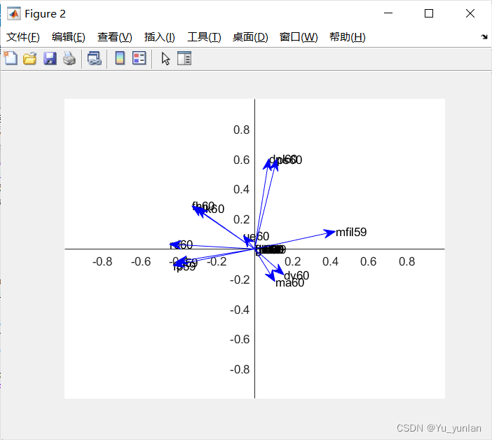
由于annotation函数绘制的箭头并不会随着图表缩放而移动,因此缩放后会出现图像错乱情况。实际使用还需根据个人情况调整。


 被折叠的 条评论
为什么被折叠?
被折叠的 条评论
为什么被折叠?
 到【灌水乐园】发言


