


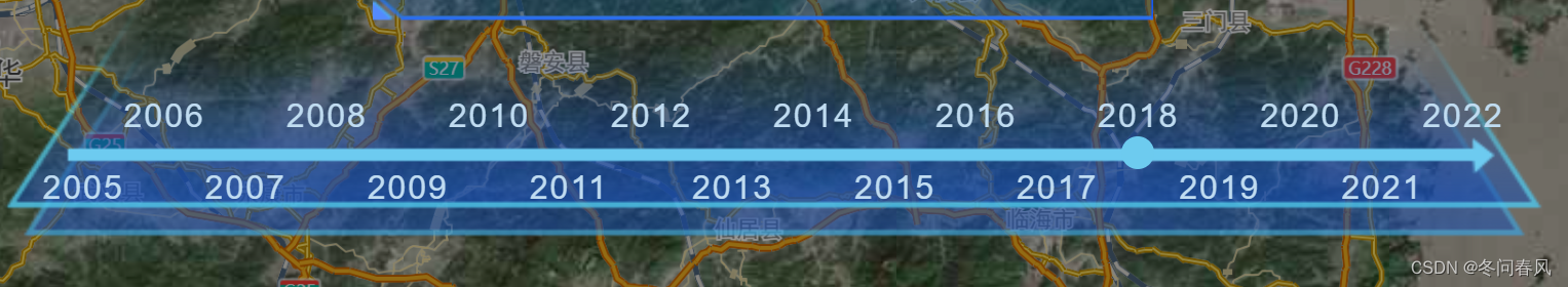
一、先上一波效果图
二、实现思路
- 调整好布局:主要是X轴,以及时间圆点。
- 时间数据: 使用div标签,使其浮动,给奇或偶数添加 margin-top,上下分开。
<div class="year"> <div @click="onChange(index)" v-for="(item, index) in list" :key="index" :class="{ ever: index % 2 === 0 }" :style="`width: ${width}%;`" > {{ item[0].year }} </div> </div> .year { display: flex; justify-content: space-around; div { color: #c0dcf1; position: relative; margin-top: 10px; cursor: pointer; } .ever { top: 35px; } } -
圆点随时间跳动:给其设置一个动态的左间距
 <div class="circle" :style="`left: calc(${(widthLeft / list.length) * 95 + 4}%)`">
    </div>
三、代码实现
<template>
  <div class="center" @mouseenter="handleMouseEnter" @mouseleave="handleMouseLeave">
    <div class="LTimeLine">
      <div class="yearRange">
        <div class="year">
          <div @click="onChange(index)" v-for="(item, index) in list" :key="index"
            :class="{ ever: index % 2 === 0 }" :style="`width: ${width}%;`">
            {{ item[0].year }}
          </div>
        </div>
      </div>
      <div class="lineImg"></div>
    </div>
    <div class="axios"></div>
    <div class="circle" :style="`left: calc(${(widthLeft / list.length) * 95 + 4}%)`">
    </div>
    <div class="popoverSelf">
      <div class="PTitle">{{ year }}年生态文明创建大事记</div>
      <div class="PContent">
        获得荣誉:<span>{{ count }}项</span>
      </div>
    </div>
  </div>
</template>

<script>
import request from "@/utils/request";
export default {
  name: "center",
  components: {},
  data() {
    return {
      width: 0,
      widthLeft: 0,
      time: 0,
      itemData: [],
      list: [],
    };
  },

  computed: {
    year() {
      return this.list[this.widthLeft][0].year;
    },
    count() {
      return this.list[this.widthLeft][0].count;
    },
  },
  created() {
    this.getYearList();
  },
  methods: {
    initData() {
      this.widthLeft++;
      if (this.widthLeft === this.list.length) {
        this.widthLeft = 0;
      }
      this.$emit("getYear", this.year);
    },

    getYearList() {
      request({
        url: "xxxxxxxxxxxxxxxxxxxxxxxxxx",
        method: "get",
      }).then((res) => {
        if (res.code === 200 && res.data) {
          this.list = Object.values(res.data);
          this.width = 100 / this.list.length;
          this.$emit("getYear", this.year);
        }
      });
    },

    //切换年份
    onChange(val) {
      this.widthLeft = val;
      this.$emit("onChangeYear", this.year);
    },

    handleMouseEnter() {
      this.$emit("mouseLeave");
    },
    handleMouseLeave() {
      this.$emit("mouseOut");
    },
  },
};
</script>

<style lang="scss" scoped>
.center {
  height: auto;
  width: 750px;
  .LTimeLine {
    align-self: center;
    width: 100%;
    height: 100px;
    display: flex;
    align-items: center;
    position: relative;
    justify-content: center;
    .yearRange {
      width: 100%;
      height: 10px;
      position: absolute;
      display: flex;
      justify-content: space-around;
      letter-spacing: 1px;
      .year {
        display: flex;
        justify-content: space-around;
        div {
          color: #c0dcf1;
          position: relative;
          margin-top: 10px;
          cursor: pointer;
        }
        .ever {
          top: 35px;
        }
      }
    }
    .lineImg {
      width: 100%;
      height: 150px;
      background: url('../assets/center/bottom.png') no-repeat;
      background-size: 100% 100%;
    }
  }
}
.axios {
  width: 800px;
  height: 250px;
  position: absolute;
  top: -42px;
  background: url('../assets/center/axis2.png') no-repeat;
  background-size: 95% 100%;
  pointer-events: none;
}
.circle {
  position: absolute;
  top: 74px;
  left: 10%;
  width: 16px;
  height: 16px;
  border-radius: 50%;
  background-color: #6dcbef;
}
.popoverSelf {
  position: absolute;
  bottom: 80px;
  left: 180px;
  // top: 0;
  // transform: translateY(-120%);
  width: 380px;
  height: 147px;
  background: url('../assets/center/infoBlock.png') no-repeat;
  background-size: 100% 100%;
  display: flex;
  flex-direction: column;
  padding: 4px 10px;
  align-items: center;
  padding-top: 20px;

  .PTitle {
    align-items: start;
    font-size: 18px;
    font-family: Source Han Sans CN;
    font-weight: 400;
    color: #d5f0ff !important;
    width: 100%;
    text-align: center;
  }
  .PContent {
    margin: auto;
    font-size: 14px;
    font-family: Source Han Sans CN;
    font-weight: 400;
    color: #d5f0ff !important;
    line-height: 24px;
    span {
      font-size: 20px;
    }
  }
  .typeItem {
    cursor: pointer;
  }
}
</style>
四、配合父组件实现轮播
  // 字组件 鼠标进入 关闭定时器
    handleMouseEnter() {
      clearInterval(this.time);
    },

    //  字组件 鼠标离开 开启定时器
    handleMouseLeave() {
      this.time = setInterval(() => {
        this.$refs.centerCom.initData();
        this.$refs.leftThree.initData(this.year);
      }, 5000);
    },


 929
929


 被折叠的 条评论
为什么被折叠?
被折叠的 条评论
为什么被折叠?
 到【灌水乐园】发言


