


打字机效果展示
原理步骤
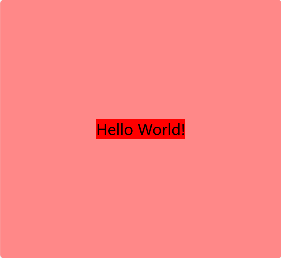
初步框架
<!DOCTYPE html>
<html lang="en">

<head>
  <meta charset="UTF-8">
  <meta name="viewport" content="width=device-width, initial-scale=1.0">
  <title>Document</title>

  <style>
    body {
      margin: 0;
      background: #ff8888;
      height: 100vh;
      display: flex;
      justify-content: center;
      align-items: center;
    }

    .text {
      font-size: 40px;
      position: relative;
      background: red;
    }

  </style>
</head>

<body>
  <div class="text-box">
    <span class="text">Hello World!</span>
  </div>
</body>

</html>
1形态
增加伪元素,遮挡住文字,根据keyframe动画就行慢慢"亮相"
<!DOCTYPE html>
<html lang="en">

<head>
  <meta charset="UTF-8">
  <meta name="viewport" content="width=device-width, initial-scale=1.0">
  <title>Document</title>

  <style>
    body {
      margin: 0;
      background: #ff8888;
      height: 100vh;
      display: flex;
      justify-content: center;
      align-items: center;
    }

    .text {
      font-size: 40px;
      position: relative;
      background: red;
    }

    .text::before {
      content: "";
      position: absolute;
      width: 100%;
      height: 100%;
      background: orange;
    }
  </style>
</head>

<body>
  <div class="text-box">
    <span class="text">Hello World!</span>
  </div>
</body>

</html>

这里的伪元素设置content=“” 和绝对定位 ,父盒子相对定位原因如下
伪元素是给DOM增加新的内容,但是不会出现在源代码里,只会在CSS里
伪元素默认插入内联元素a span…
特点如下
没有宽高,宽高由其包含的文本宽度决定——无宽高
只有水平的内外边距和border——无垂直内外距,边框
横向排列,宽度超出父盒子则换行——不和div一样换行
因此,当我们想给内联元素设置宽高时就必须定义为块级元素
绝对定位和固定定位都可以使行内元素也就是内联元素变成块级元素
子绝父相, 绝对定位的初始位置x,y是以父盒子的左顶点x,y开始的
因此需要给外面的盒子加相对定位,否则就会以body的左顶点作为初始点,就会跑到左上角去了,且该元素的width 100%将会是整个body的100%
用绝对定位就能将其锁死在该span范围内进行"亮相操作"
2形态
设置初始值left为0,一开始在左边
设置出场关键帧,
0-40% left增加到100% 完全亮相
40%-60% 静止不动 100% 相当于delay延时
60%-100时 删除效果 0%
当然你也可以简写成
40%-60% 静止不动 100%
60%-100时 完全亮相 100%
**设置输入内容时的光标闪烁动画关键帧
增加左边框, from #eee有颜色 到 to transparent 透明
应用关键帧
animation: 关键帧名 总耗时 帧数 循环次数
关键帧名字 总耗时(文字数量/2) steps(一共做了多少步也就是总帧数,帧数就是一秒几张图片,越大越丝滑,越小越卡,由于这里的光标闪烁属于那种卡卡的闪的很慢的我们给小一点,文字的总帧数尽量和文字数量一致,例如5个字,steps就为5也就是一帧一个字的变化)
当然还有播放delay 播放方向direction 动画结束后的状态fill-mode 时间曲线time function 有点类似于Pr Ae剪辑里的拉速度曲线缓入缓出等 可自行探索
<!DOCTYPE html>
<html lang="en">

<head>
  <meta charset="UTF-8">
  <meta name="viewport" content="width=device-width, initial-scale=1.0">
  <title>Document</title>

  <style>
    body {
      margin: 0;
      background: #ff8888;
      height: 100vh;
      display: flex;
      justify-content: center;
      align-items: center;
    }


    .text {
      font-size: 20px;
      position: relative;
    }


    .text::before {
      left: 0;
      content: "";
      position: absolute;
      width: 100%;
      height: 100%;
      background: #ff8888;
      border-left: 2px solid #ffffff;
      animation:
        grow 2.8s infinite steps(10),
        cursor 400ms steps(44) infinite normal;

    }

    @keyframes grow {

      40%,
      60% {
        left: 100%;
      }

      100% {
        left: 0%;
      }
    }

    @keyframes cursor {
      0% {
        border-left-color: #eee;
      }

      100% {
        border-left-color: transparent;
      }
    }
  </style>
</head>

<body>
  <div class="text-box">
    <span class="text">Hello World!</span>
  </div>
</body>

</html>
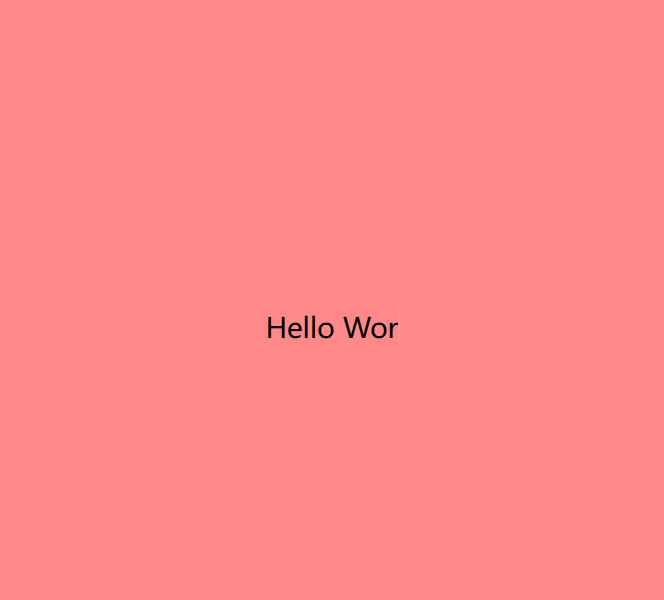
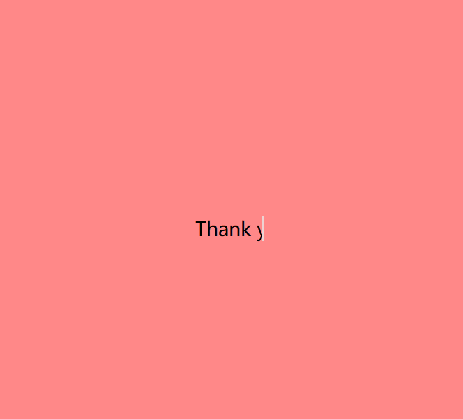
3形态
使用选择器加定时器 替换文本内容
<!DOCTYPE html>
<html lang="en">

<head>
  <meta charset="UTF-8">
  <meta name="viewport" content="width=device-width, initial-scale=1.0">
  <title>Document</title>

  <style>
    body {
      margin: 0;
      background: #ff8888;
      height: 100vh;
      display: flex;
      justify-content: center;
      align-items: center;
    }


    .text {
      font-size: 20px;
      position: relative;
    }


    .text::before {
      left: 0;
      content: "";
      position: absolute;
      width: 100%;
      height: 100%;
      background: #ff8888;
      border-left: 2px solid #ffffff;
      animation:
        grow 4s infinite steps(10),
        cursor 400ms steps(44) infinite normal;

    }

    @keyframes grow {

      40%,
      60% {
        left: 100%;
      }

      100% {
        left: 0%;
      }
    }

    @keyframes cursor {
      0% {
        border-left-color: #eee;
      }

      100% {
        border-left-color: transparent;
      }
    }
  </style>
</head>

<body>
  <div class="text-box">
    <span class="text">Hello World!</span>
  </div>


  <script>
    const text = document.querySelector('.text')
    const textLoad = () => {
      setTimeout(() => {
        text.textContent = "How are you?";
      }, 0);
      setTimeout(() => {
        text.textContent = "I am fine";
      }, 4000);
      setTimeout(() => {
        text.textContent = "Thank you";
      }, 8000);
    }
    textLoad();
    setInterval(textLoad, 12000)
  </script>
</body>

</html>


 82
82

 被折叠的 条评论
为什么被折叠?
被折叠的 条评论
为什么被折叠?
 到【灌水乐园】发言


