


bootstrap在android上的风格还是挺不错的。
下面直接演示各种空间的用法和属性:
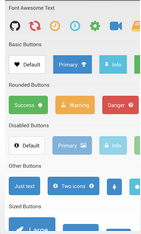
FontAwesomeText: (字体icon)
 <com.beardedhen.androidbootstrap.FontAwesomeText
                    android:id="@+id/lblOne"
                    android:layout_width="wrap_content"
                    android:layout_height="wrap_content"
                    android:layout_margin="10dp"
                    android:textSize="32sp"       /* 字体大小 */
                    fontawesometext:fa_icon="fa-github" /* 都是单个图片做背景 */  />
button:(下面的button都是来自BootstrapButton)
  <com.beardedhen.androidbootstrap.BootstrapButton
                android:id="@+id/btnOne"
                android:layout_width="wrap_content"
                android:layout_height="wrap_content"
                android:layout_margin="10dp"
                android:text="Default"
                bootstrapbutton:bb_icon_left="fa-heart"
                bootstrapbutton:bb_type="default" />
base-button的属性:
 bootstrapbutton:bb_icon_left="fa-heart" /* 设置icon位于左边位置 */
 bootstrapbutton:bb_type="default"       /* 默认背景为白色,字体和icon为黑色 */
rounded-button的属性:
bootstrapbutton:bb_roundedCorners="true" /* true包含圆角 */
bootstrapbutton:bb_type="success"       /* 类型 */
android:enabled="false"  /*  设置触碰无效 */
android:text="Default"
bootstrapbutton:bb_icon_left="fa-info-circle"
bootstrapbutton:bb_roundedCorners="true"
bootstrapbutton:bb_type="default"
sized-button的属性:
bootstrapbutton:bb_size="xsmall" /* 设置大小 */
  <com.beardedhen.androidbootstrap.BootstrapEditText
            android:id="@+id/txtOne"
            android:layout_width="150dp"
            android:layout_height="wrap_content"
            android:layout_margin="10dp"
            android:hint="rounded"
            bootstrapbutton:be_roundedCorners="true"
            android:gravity="center"/>
edit-text的属性:
android:hint="rounded"  /* 框内的灰色提示文字*/
bootstrapbutton:be_roundedCorners="true" /*  设置圆角  */
bootstrapbutton:be_state="success"  /* 类型颜色 */
thumbnail(拇指甲!哈哈!)一种含内框的框行控件,内框可以设置背景或者文字
 <com.beardedhen.androidbootstrap.BootstrapThumbnail
                android:id="@+id/thumbnailTwo"
                android:layout_width="wrap_content"
                android:layout_height="wrap_content"
                bootstrapthumbnail:bt_width="150dp"   /*设置内框的宽度*/
                bootstrapthumbnail:bt_height="110dp"  /*设置内框的高度*/
                android:layout_margin="10dp"          /*设置内框距外框的距离*/
                bootstrapthumbnail:bt_image="@drawable/bbuton_danger" /*设置内框的背景*/ />
含内框的圆形(可以做成头像的)circleThumbail
            <com.beardedhen.androidbootstrap.BootstrapCircleThumbnail
                android:id="@+id/thumbnailTwo"
                android:layout_width="wrap_content"
                android:layout_height="wrap_content"
                bootstrap:bct_image="@drawable/headshot"
                bootstrap:bct_size="large"
                android:layout_margin="10dp"/>:bct_size="large"
                android:layout_margin="10dp"/>
不含内框的圆形circleThumbail
<com.beardedhen.androidbootstrap.BootstrapCircleThumbnail
                android:id="@+id/minimalOne"
                android:layout_width="wrap_content"
                android:layout_height="wrap_content"
                bootstrap:bct_image="@drawable/headshot"
                bootstrap:bct_size="xlarge"
                bootstrap:bct_minimal="true"    /* 设置不含内框 */
                android:layout_margin="10dp"/>
皮肤主题汇总:
//set up the bootstrap types
	private enum BootstrapTypes
	{
		DEFAULT(R.drawable.bbuton_default, R.color.black),
		PRIMARY(R.drawable.bbuton_primary, R.color.white),
		SUCCESS(R.drawable.bbuton_success, R.color.white),
		INFO(R.drawable.bbuton_info, R.color.white),
		WARNING(R.drawable.bbuton_warning, R.color.white),
		DANGER(R.drawable.bbuton_danger, R.color.white),
		INVERSE(R.drawable.bbuton_inverse, R.color.white),

		DEFAULT_ROUNDED(R.drawable.bbuton_default_rounded, R.color.black),
		PRIMARY_ROUNDED(R.drawable.bbuton_primary_rounded, R.color.white),
		SUCCESS_ROUNDED(R.drawable.bbuton_success_rounded, R.color.white),
		INFO_ROUNDED(R.drawable.bbuton_info_rounded, R.color.white),
		WARNING_ROUNDED(R.drawable.bbuton_warning_rounded, R.color.white),
		DANGER_ROUNDED(R.drawable.bbuton_danger_rounded, R.color.white),
		INVERSE_ROUNDED(R.drawable.bbuton_inverse_rounded, R.color.white);

		private int backgroundDrawable;
		private int textColour;

		BootstrapTypes(int backgroundDrawable, int textColour)
		{
			this.backgroundDrawable = backgroundDrawable;
			this.textColour = textColour;
		}
	}
这是BootstrapButton类,原来是继承一个FrameLayout,,然后里边有3个TextView,哈哈,3个正好。即可放icon也可放文字。
public class BootstrapButton extends FrameLayout {

	private static Map<String, BootstrapTypes> bbuttonTypeMap;
	private static Map<String, BootstrapTypes> bbuttonTypeMapRounded;
	private static Typeface font;

	private static Map<String, String> faMap;

	private TextView lblMiddle;
	private TextView lblRight;
	private TextView lblLeft;
	private ViewGroup layout;
	private boolean roundedCorners = false;
	private boolean fillparent = false;

	private static final String FA_ICON_QUESTION = "fa-question";

	static{

		bbuttonTypeMap = new HashMap<String, BootstrapTypes>();

		bbuttonTypeMap.put("default", BootstrapTypes.DEFAULT);
		bbuttonTypeMap.put("primary", BootstrapTypes.PRIMARY);
		bbuttonTypeMap.put("success", BootstrapTypes.SUCCESS);
		bbuttonTypeMap.put("info", BootstrapTypes.INFO);
		bbuttonTypeMap.put("warning", BootstrapTypes.WARNING);
		bbuttonTypeMap.put("danger", BootstrapTypes.DANGER);
		bbuttonTypeMap.put("inverse", BootstrapTypes.INVERSE);

		bbuttonTypeMapRounded = new HashMap<String, BootstrapTypes>();

		bbuttonTypeMapRounded.put("default", BootstrapTypes.DEFAULT_ROUNDED);
		bbuttonTypeMapRounded.put("primary", BootstrapTypes.PRIMARY_ROUNDED);
		bbuttonTypeMapRounded.put("success", BootstrapTypes.SUCCESS_ROUNDED);
		bbuttonTypeMapRounded.put("info", BootstrapTypes.INFO_ROUNDED);
		bbuttonTypeMapRounded.put("warning", BootstrapTypes.WARNING_ROUNDED);
		bbuttonTypeMapRounded.put("danger", BootstrapTypes.DANGER_ROUNDED);
		bbuttonTypeMapRounded.put("inverse", BootstrapTypes.INVERSE_ROUNDED);


		faMap = FontAwesome.getFaMap();

	}

	public BootstrapButton(Context context, AttributeSet attrs, int defStyle) {
		super(context, attrs, defStyle);
		initialise(attrs);
	}

	public BootstrapButton(Context context, AttributeSet attrs) {
		super(context, attrs);
		initialise(attrs);
	}

	public BootstrapButton(Context context) {
		super(context);
		initialise(null);
	}

	//set up the bootstrap types
	private enum BootstrapTypes
	{
		DEFAULT(R.drawable.bbuton_default, R.color.black),
		PRIMARY(R.drawable.bbuton_primary, R.color.white),
		SUCCESS(R.drawable.bbuton_success, R.color.white),
		INFO(R.drawable.bbuton_info, R.color.white),
		WARNING(R.drawable.bbuton_warning, R.color.white),
		DANGER(R.drawable.bbuton_danger, R.color.white),
		INVERSE(R.drawable.bbuton_inverse, R.color.white),

		DEFAULT_ROUNDED(R.drawable.bbuton_default_rounded, R.color.black),
		PRIMARY_ROUNDED(R.drawable.bbuton_primary_rounded, R.color.white),
		SUCCESS_ROUNDED(R.drawable.bbuton_success_rounded, R.color.white),
		INFO_ROUNDED(R.drawable.bbuton_info_rounded, R.color.white),
		WARNING_ROUNDED(R.drawable.bbuton_warning_rounded, R.color.white),
		DANGER_ROUNDED(R.drawable.bbuton_danger_rounded, R.color.white),
		INVERSE_ROUNDED(R.drawable.bbuton_inverse_rounded, R.color.white);

		private int backgroundDrawable;
		private int textColour;

		BootstrapTypes(int backgroundDrawable, int textColour)
		{
			this.backgroundDrawable = backgroundDrawable;
			this.textColour = textColour;
		}
	}


	private void initialise( AttributeSet attrs )
	{
		LayoutInflater inflator = (LayoutInflater)getContext().getSystemService(
			    Context.LAYOUT_INFLATER_SERVICE);

		//get font
		readFont(getContext());

		TypedArray a = getContext().obtainStyledAttributes(attrs,
			    R.styleable.BootstrapButton);

		//defaults
		BootstrapTypes type = null;
		String bootstrapType = "default";
		String iconLeft = "";
		String iconRight = "";
		String text = "";
		//boolean roundedCorners = false;
		float fontSize = 14.0f;
		float scale = getResources().getDisplayMetrics().density; //for padding
		String size = "default";
		int paddingA = (int) (10 *scale + 0.5f);
		int paddingB = (int) (15 *scale + 0.5f);


		//attribute values

		if (a.getString(R.styleable.BootstrapButton_bb_type) != null) {
			bootstrapType = a.getString(R.styleable.BootstrapButton_bb_type);
		}

		if (a.getString(R.styleable.BootstrapButton_bb_roundedCorners) != null) {
			roundedCorners = a.getBoolean(R.styleable.BootstrapButton_bb_roundedCorners, false) ;
		}

		if(a.getString(R.styleable.BootstrapButton_bb_size) != null) {
			size = a.getString(R.styleable.BootstrapButton_bb_size);
		}

		if ( a.getString(R.styleable.BootstrapButton_bb_icon_left) != null) {
			iconLeft =  a.getString(R.styleable.BootstrapButton_bb_icon_left );
		}

		if(a.getString(R.styleable.BootstrapButton_bb_icon_right) != null) {
			iconRight = a.getString(R.styleable.BootstrapButton_bb_icon_right );
		}

		if(a.getString(R.styleable.BootstrapButton_android_text) != null) {
			text = a.getString(R.styleable.BootstrapButton_android_text);
		}
		String gravity = "";
		if(a.getString(R.styleable.BootstrapButton_bb_text_gravity) != null) {
			gravity = a.getString(R.styleable.BootstrapButton_bb_text_gravity);
		}

		boolean enabled = true;
		if(a.getString(R.styleable.BootstrapButton_android_enabled) != null) {
			enabled = a.getBoolean(R.styleable.BootstrapButton_android_enabled, true);
		}

		int layoutWidth = 0;
		if(a.getString(R.styleable.BootstrapButton_android_layout_width) != null) {
			layoutWidth = a.getInt(R.styleable.BootstrapButton_android_layout_width, 0);
		}

		//works even if it's fill_parent or match_parent
		if( (layoutWidth == LayoutParams.MATCH_PARENT)) {
			fillparent = true;
		}

		if(a.getString(R.styleable.BootstrapButton_android_textSize) != null) {

			//font sizes
			String xmlProvidedSize = attrs.getAttributeValue(
					"http://schemas.android.com/apk/res/android", "textSize");
			final Pattern PATTERN_FONT_SIZE = Pattern
					.compile("([0-9]+[.]?[0-9]*)sp");
			Matcher m = PATTERN_FONT_SIZE.matcher(xmlProvidedSize);

			if (m.find()) {

				if (m.groupCount() == 1) {

					fontSize = Float.valueOf(m.group(1));
				}

			}

		}

		a.recycle();
		View v = null;
		if(fillparent){
			v = inflator.inflate(R.layout.bootstrap_button_fill, null, false);
		} else {
			 v = inflator.inflate(R.layout.bootstrap_button, null, false);
		}


		//set up font sizes and padding for different button sizes
		if(size.equals("large")){
			fontSize = 20.0f;
			paddingA = (int) (15 *scale + 0.5f);;
			paddingB = (int) (20 *scale + 0.5f);;
		}

		if(size.equals("small")){
			fontSize = 12.0f;
			paddingA = (int) (5 *scale + 0.5f);;
			paddingB = (int) (10 *scale + 0.5f);;
		}

		if(size.equals("xsmall")){
			fontSize = 10.0f;
			paddingA = (int) (2 *scale + 0.5f);;
			paddingB = (int) (5 *scale + 0.5f);;
		}

		//get layout items
		layout = (ViewGroup) v.findViewById(R.id.layout);
		lblLeft = (TextView) v.findViewById(R.id.lblLeft);
		lblMiddle = (TextView) v.findViewById(R.id.lblMiddle);
		lblRight = (TextView) v.findViewById(R.id.lblRight);

		//set the background
		//setBootstrapType(bootstrapType);

		//get the correct background type
		if(roundedCorners == true)
		{
			type = bbuttonTypeMapRounded.get(bootstrapType);
		} else {
			type = bbuttonTypeMap.get(bootstrapType);
		}

		//set up as default
		if (type == null)
		{
			type = BootstrapTypes.DEFAULT;
		}

		//apply the background type
		layout.setBackgroundResource(type.backgroundDrawable);
		lblLeft.setTextColor(getResources().getColor(type.textColour));
		lblMiddle.setTextColor(getResources().getColor(type.textColour));
		lblRight.setTextColor(getResources().getColor(type.textColour));

		//set the font awesome icon typeface
		lblLeft.setTypeface(font);
		lblRight.setTypeface(font);

		//set up the font size
		lblLeft.setTextSize(TypedValue.COMPLEX_UNIT_SP, fontSize);
        lblMiddle.setTextSize(TypedValue.COMPLEX_UNIT_SP, fontSize);
        lblRight.setTextSize(TypedValue.COMPLEX_UNIT_SP, fontSize);

        //deal with gravity

        if(gravity.length() > 0) {
        	setTextGravity(gravity);
        }


        boolean onlyIcon = true;

        //set the text
        if(text.length() > 0){
        	lblMiddle.setText(text );
        	lblMiddle.setVisibility(View.VISIBLE);
        	onlyIcon = false;
        }

        //set up the padding

        if (iconLeft.length() > 0) {
        	//lblLeft.setText(iconLeft);
        	setLeftIcon(iconLeft);
        	lblLeft.setVisibility(View.VISIBLE);

        	if (onlyIcon == false){
        		lblLeft.setPadding(paddingB, 0, 0, 0);
        	} else {
        		lblLeft.setPadding(paddingB, 0, paddingB, 0);
        	}

        	//padding for symmetry
        	if ( ( iconRight.length() == 0) && onlyIcon == false ) {
        		lblMiddle.setPadding(paddingA, 0, (int) paddingB, 0);
        	}

        }

        if (iconRight.length() > 0) {
        	//lblRight.setText(iconRight);
        	setRightIcon(iconRight);
        	lblRight.setVisibility(View.VISIBLE);

        	if (onlyIcon == false){
        		lblRight.setPadding(0, 0, paddingB, 0);
        	}else {
        		lblRight.setPadding(paddingB, 0, paddingB, 0);
        	}

        	//padding for symmetry
        	if ( (iconLeft.length() == 0) && onlyIcon == false ) {
        		lblMiddle.setPadding(paddingB, 0, (int) paddingA, 0);
        	}
        }

        if(iconLeft.length() > 0 && iconRight.length() > 0 )
        {
        	lblMiddle.setPadding(paddingA, 0, paddingA, 0);
        }
        this.setClickable(true);

        this.setEnabled(enabled);

        layout.setPadding(0, paddingB, 0, paddingB);

		addView(v);
	}

	//static class to read in font
	private static void readFont(Context context)
	{

		if(font == null){
			try {
			font = Typeface.createFromAsset(context.getAssets(), "fontawesome-webfont.ttf");
			} catch (Exception e) {
                Log.e("BootstrapButton", "Could not get typeface because " + e.getMessage());
                font = Typeface.DEFAULT;
            }
		}

	}


	/**
	 * Changes the button text
	 * @param text - String value for what is displayed on the button
	 */
	public void setText(String text) {
		lblMiddle.setText(text);
	}


	/**
	 * Changes the left icon on a BootstrapButton
	 * @param leftIcon- String value for the icon as per http://fortawesome.github.io/Font-Awesome/cheatsheet/
	 */
	public void setLeftIcon(String leftIcon) {

		String icon = faMap.get(leftIcon);

		if (icon == null)
		{
			icon = faMap.get(FA_ICON_QUESTION);
		}

		lblLeft.setText(icon);
	}

	/**
	 * Changes the right icon on a BootstrapButton
	 * @param rightIcon - String value for the icon as per http://fortawesome.github.io/Font-Awesome/cheatsheet/
	 */
	public void setRightIcon(String rightIcon) {

		String icon = faMap.get(rightIcon);

		if (icon == null)
		{
			icon = faMap.get(FA_ICON_QUESTION);
		}

		lblRight.setText(icon);

	}

	/**
	 * Changes the type of BootstrapButton
	 * @param bootstrapType - String value for the type of button e.g. "primary"
	 */
	public void setBootstrapType(String bootstrapType) {

		BootstrapTypes type = null;

		//get the correct background type
		if (roundedCorners == true) {
			type = bbuttonTypeMapRounded.get(bootstrapType);
		} else {
			type = bbuttonTypeMap.get(bootstrapType);
		}

		//set up as default
		if (type == null) {
			type = BootstrapTypes.DEFAULT;
		}


		layout.setBackgroundResource(type.backgroundDrawable);
		lblLeft.setTextColor(getResources().getColor(type.textColour));
		lblMiddle.setTextColor(getResources().getColor(type.textColour));
		lblRight.setTextColor(getResources().getColor(type.textColour));

	}

	/**
	 * Specifies whether the BootstrapButton is enabled or disabled
	 * @param enabled - boolean state for either enabled or disabled
	 */
	public void setBootstrapButtonEnabled(boolean enabled)
	{
		this.setEnabled(enabled);
	}


	/**
	 * Changes the gravity for the text on a bootstrap button that is not wrap_content
	 * @param gravity - string for either center, right, or left.
	 */
	public void setTextGravity(String gravity) {
		if(gravity.equals("left")) {
			lblMiddle.setGravity(Gravity.LEFT | Gravity.CENTER_VERTICAL);
		} else if (gravity.equals("center")) {
			lblMiddle.setGravity(Gravity.CENTER_HORIZONTAL | Gravity.CENTER_VERTICAL);
		} else if (gravity.equals("right")) {
			lblMiddle.setGravity(Gravity.RIGHT | Gravity.CENTER_VERTICAL);
		}

	}
} <declare-styleable name="BootstrapButton">
<attr name="bb_type" format="string"/>
<attr name="bb_icon_left" format="string"/>
<attr name="bb_icon_right" format="string"/>
<attr name="bb_roundedCorners" format="boolean"/>
<attr name="bb_text_alignment" format="string"/>
<attr name="bb_size" format="string"/>
<attr name="bb_text_gravity" format="string"/>
<attr name="android:textSize"/>
<attr name="android:text"/>
<attr name="android:enabled"/>
<attr name="android:layout_width"/>
</declare-styleable>


 扫一扫
扫一扫
 503
503

 被折叠的 条评论
为什么被折叠?
被折叠的 条评论
为什么被折叠?
 到【灌水乐园】发言


