


ConstraintLayout 约束布局使用
ConstraintLayout 现已做为布局的默认父布局,优点在于可以减少布局嵌套,大多数情况只要一个ConstraintLayout即可完成整个页面的布局,推荐用法是使用控件拖动的方式添加,连接约束线自动生成布局代码,但不习惯的小伙伴就要对布局的属性设置了如指掌
引入控件
implementation 'androidx.constraintlayout:constraintlayout:2.0.1'
边界约束
app:layout_constraintXXX_toXXXOf(XXX代表Bottom、Left、Right、Top、Start、End)
第一个XXX代表本控件的四边,第二个XXX代表要对其的目标的边

例如:app:layout_constraintBottom_toTopOf="@id/tv_name"代表当前控件的底部对其ID为tv_name``控件的顶部,控件在水平方向和竖直方向至少要有一个约束属性,否则控件位置可能与预览的不一样
如果左右两边都有锚点,则控件在这两个锚点的中间,实现居中效果
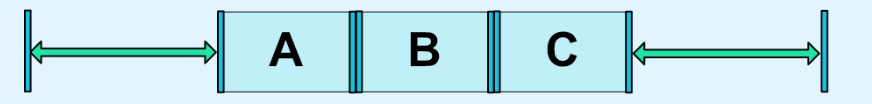
chain链
一个方向上两两约束,形成链,类似LinearLayout的权重属性,不过功能更全面
链上的首个布局可设置chainStyle 有三种:packed、spread、spread_inside
-
spread 默认模式 空闲空间平均分配

-
spread_inside 两端贴边 中间平分

-
packed 中间贴紧,两边平分
同时可配合layout_constraintHorizontal_weight设置权重来分配剩余空间,但必须width=“0dp”,如果是竖直方向则height=“0dp”
goneMargin
layout_goneMarginXXX 代表该方向的锚点视图隐藏时该margin生效
偏移量bias
当前控件左右两边都有锚点时,控件居中,相当于 app:layout_constraintHorizontal_bias="0.5",修改该值则左右两边的间隔比例改变
View 尺寸
constraintWidth 控制
配合android:layout_width="0dp"使用,layout_constraintWidth_default值有三种
- spread 默认值,填充所有能占有的空间,相当于match_parent
- percent 百分比模式,通过
layout_constraintWidth_percent设置占父布局的百分之多少 - wrap 自适应长,类似
wrap_content但不会超出约束限制 - 两个控件横向排列表,其中一个控件宽高变化,为了不挤压其他控件的位置,同时又能够保证两控件紧密连接在一起,可配合
chainStyle和constraintWidth的wrap_content_constrained达成这一效果,wrap_content_constrained在保留wrap特性的同时又遵循约束的控制,保证控件在约束的范围内
ratio 控制
app:layout_constraintDimensionRatio="2:1"
宽高至少有一项为0dp才生效,其值是“width:height”的形式
- 只有一项0dp,则按设置比例计算最终宽高
- 两项都为0dp,则会按约束的最大值计算宽高,也可以指定H、W 如:“H,2:1”则按宽匹配,高是宽的1/2
max min
app:layout_constraintWidth_max="100dp" 即设定宽最大100dp
圆形布局
- layout_constraintCircle 指定圆心
-layout_constraintCircleRadius指定半径
layout_constraintCircleAngle指定角度 0度在正上方
辅助控件
GuideLine 参考线
可设置一条水平或竖直的线,其他控件可将锚点设置在这条线之上
<androidx.constraintlayout.widget.Guideline
        android:id="@+id/guide_line"
        android:layout_width="match_parent"
        android:layout_height="wrap_content"
        android:orientation="horizontal"
        app:layout_constraintTop_toTopOf="parent"
        app:layout_constraintGuide_percent="0.5"/>
orientation 设置方向 layout_constraintGuide_percent设置在该方向的比例,也可通过layout_constraintGuide_begin设置距离边界的具体值
Group 组
通过constraint_referenced_ids指定这些控件为一个组,一般用于设置组的可见性来集体控制组内成员的可见性
    <androidx.constraintlayout.widget.Group
        android:layout_width="wrap_content"
        android:layout_height="wrap_content"
        android:visibility="invisible"
        app:constraint_referenced_ids="tv_1,tv_7"/>
Placeholder 占位控件
该布局占据一个位置,显示的内容通过
app:content指定,而对于ID位置上的布局相当于gone,关键点在于可动态设置content的值,可用性一下子就上来了
 <androidx.constraintlayout.widget.Placeholder
        android:layout_width="200dp"
        android:layout_height="200dp"
        app:content="@id/tv_7"
        app:layout_constraintBottom_toBottomOf="parent"
        app:layout_constraintLeft_toLeftOf="parent"
        app:layout_constraintRight_toRightOf="parent"/>
Barrier 屏障
Barrier主要解决多个布局带来的边界问题,比如左边两控件AB一上一下摆放,右边一个控件C需要在AB的右边,但不能相互遮挡,如果C的左边锚点连A就连不了C,用参考线分割又过于死板,所以可以设置AB的右侧为一个屏障,C设定在屏障的右边即可
<android.support.constraint.Barrier
	android:id="@+id/barrier"
	android:layout_width="wrap_content"
	android:layout_height="wrap_content"
	app:barrierDirection="end"
	app:constraint_referenced_ids="tv_1,tv_2" />
进阶版MotionLayout
MotionLayout 是ConstraintLayout的子类,除了拥有上述功能外,还具有动画处理能力,它通过Transition的动画文件设置开始状态和结束状态,


 915
915


 被折叠的 条评论
为什么被折叠?
被折叠的 条评论
为什么被折叠?
 到【灌水乐园】发言


