


关于css3中flex布局(弹性布局/弹性盒子)
开启flex布局
开启flex只需要在父标签中使用display:flex即可让整个父标签变成flex布局
flex容器属性
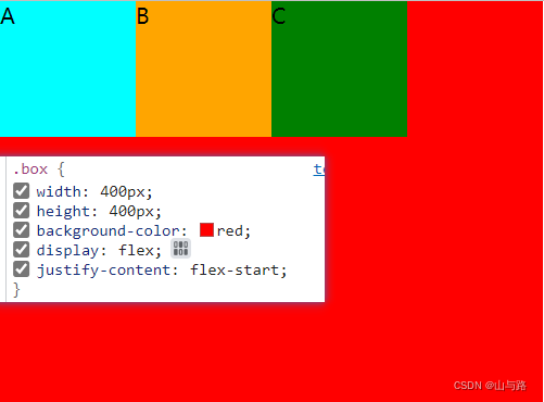
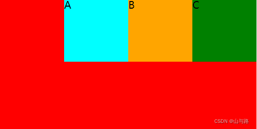
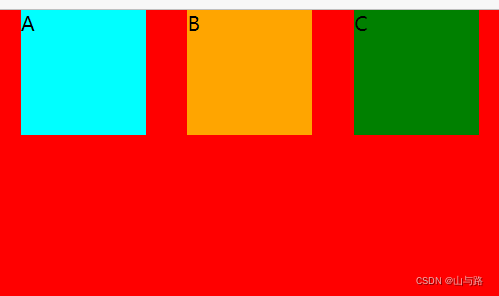
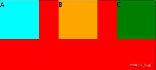
justify-content
水平上子组件分布情况
-
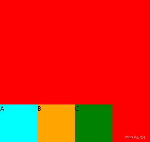
flex-start(向左对齐)
-
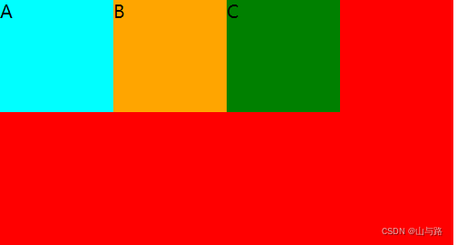
center(居中对齐)

-
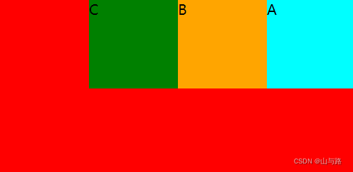
flex-end(向右对齐)
-
space-around(左右二边存在相同间距)
-
space-between(左右二端对齐,间距相等)
-
space-evenly

align-items
垂直上子组件分布情况
-
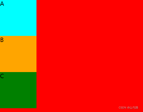
flex-start(靠上对齐)

-
center(靠中对齐)

-
flex-end(靠下对齐)
flex-direction
子组件方向分布
-
row(同一行)
-
column(同一列)
-
row-reverse(同一行并反转)
-
column-reverse(同一列并反转)

flex-wrap
-
nowrap(当宽度大于父类宽度强行不换行)
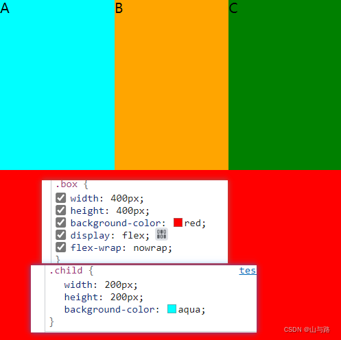
-
wrap(当宽度大于父类宽度自行换行)

项目属性
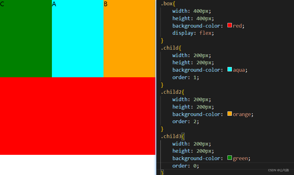
order
子组件分布优先级(越小越前)
align-self
不继承父类的 垂直分布

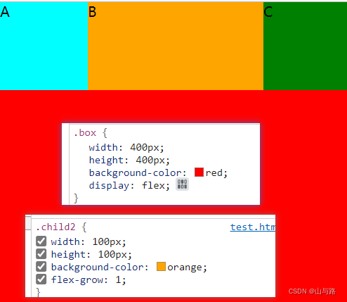
flex-grow
确定元素是否自动填满剩余空间
flex-shrink
与上着相反,是否进行缩小

实战
实现div置于中央
<!DOCTYPE html>
<html lang="en">
<head>
    <meta charset="UTF-8">
    <meta http-equiv="X-UA-Compatible" content="IE=edge">
    <meta name="viewport" content="width=device-width, initial-scale=1.0">
    <title>Document</title>
</head>
<body>
    <div class="box">
        <div class="child"></div>
    </div>
<style>
    *{
        margin: 0;
        padding: 0;
        width: 100%;
        height: 100%;

    }
    .box{
        width: 100%;
        height: 100%;
        display: flex;
        justify-content: center;
        align-items: center;
    }
    .child{
        width: 200px;
        height:200px;
        background-color: aqua;
    }
</style>
</body>

</html>


 870
870


 被折叠的 条评论
为什么被折叠?
被折叠的 条评论
为什么被折叠?
 到【灌水乐园】发言


