


博客核心内容:
1、vertical-align(如何将文字和图片进行水平对齐)
2、如何将文字和图片设置为居中
3、我是如何在图片上插入文字的.
4、标签盒子属性—–border
5、列表的相关属性操作
6、display重要特性(可以和float比肩的重要性能)
7、padding(通过padding也可以达到居中的效果)
8、float漂浮的作用(不仅仅是对块级标签有作用)
9、clear(清楚浮动,但是最终决定的不是自己,而是加载顺序)==>通过clear标签可以将漂浮层和非漂浮层关联起来。
10、我们是如何将父标签给撑起来的(2种方式、很重要)
11、positive(各种定位方式===>父亲的定位+儿子定位的完美组合)
12、图片调细节(技巧)
13:
http://transcoder.baiducontent.com/from=1000953c/bd_page_type=1/ssid=0/uid=0/pu=usm%401%2Csz%40320_1002%2Cta%40iphone_2_5.1_2_5.3/baiduid=CD72017954442886DAC3A7D05D4EDC92/w=0_10_/t=iphone/l=3/tc?ref=www_iphone&lid=11147844604296618165&order=1&fm=alop&h5ad=1&srd=1&dict=32&tj=www_normal_1_0_10_title&url_mf_score=4&vit=osres&m=8&cltj=cloud_title&asres=1&nt=wnor&title=%E5%85%B3%E4%BA%8EHTML%E4%B8%AD%2C%E7%BB%9D%E5%AF%B9%E5%AE%9A%E4%BD%8D%2C%E7%9B%B8%E5%AF%B9%E5%AE%9A%E4%BD%8D%E7%9A%84%E7%90%86%E8%A7%A3...%28%E5%AD%A6%E4%B9%A0HTML%E8%BF%87%E7%A8%8B...&w_qd=IlPT2AEptyoA_yixCEqlnf80O6sKtZhGoU-gs3_BdvVIGRFK4k1Dp7qy-v5mtLZgpxkY&sec=24097&di=69605d4a52321128&bdenc=1&tch=124.21.249.166.0.0&nsrc=IlPT2AEptyoA_yixCFOxXnANedT62v3IEQGG_ytK1DK6mlrte4viZQRAMSPuQpCqZpPPtCPQpxcFxnGb2m1skNYWgK&eqid=9ab5199a925ae0001000000359c1c071&wd=&clk_info=%7B%22srcid%22%3A%221599%22%2C%22tplname%22%3A%22www_normal%22%2C%22t%22%3A1505869945345%2C%22sig%22%3A%227383%22%2C%22xpath%22%3A%22div-a-h3-em3%22%7D&guid=9d0988c2493c460e| ①vertical-align |
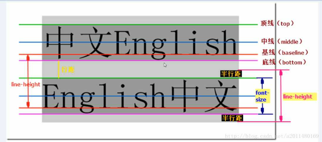
vertical-align:-4px 设置元素内容的垂直对齐方式 ,只对行内元素有效,对块级元素无效。
文本有顶线、中线、基线和底线,图片和文本的线对应。
基线的相关概念:
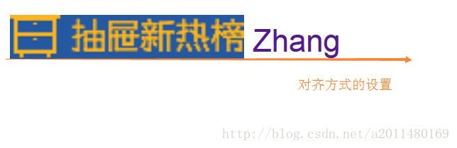
代码:如何将图片与文本进行对齐
<!DOCTYPE html>
<html lang="en">
<!--测试vertical aline的使用-->
<head>
    <meta charset="UTF-8">
    <title>Title</title>
    <style>
        /*<!--如何将a标签带的下划线给去掉-->*/
        a{
            text-decoration: none;

        }
         a > img{
            vertical-align:bottom;
        }
    </style>
</head>
<body>
    <a href="http://www.baidu.com" target="_blank">
        <img src="http://dig.chouti.com/images/logo.png" alt="图片">
        <span>Zhang</span>
    </a>
</body>
</html>
运行效果:
| ②如何将文字和图片设置为居中 |
知识:
如何以背景作为标签....

background-color:背景颜色,背景上面还可以有别的东西,但是图片不行,因为图片本身就是一个标签。

background-image:以图片作为背景.
     background-image: url("daima.png");

background-repeat:(默认是以x轴和y轴进行平铺)
     background-repeat:no-repeat:既不是x,也不是y.就以一张图片进行平铺。

background-position:设置图片的相对位置.
   background-position:100px 200px:距离left100像素,距离top200像素.
   background-position:center center:上下居中,左右居中。
示例:
<!DOCTYPE html>
<html lang="en">
<head>
    <meta charset="UTF-8">
    <title>Title</title>
    <style>
        .item1{
            height: 500px;
            width: 100%;
            border: solid 1px red;
            /*background-image: url("daima.png");*/
            /*background-repeat:no-repeat;*/
            /*!*如何将图片调到正中心呢*!*/
            /*background-position:center center;*/
            /*通过一个background将上面的三行都包括*/
            background: url("daima.png") no-repeat center center;
        }
        .item2{
            height: 100px;
            width: 100%;
            border: solid 1px red;
            /*文字水平居中*/
            text-align: center;
            /*文字数值居中*/
            line-height: 100px;
        }
    </style>
</head>
<body>
    <!--我们如何为将一个图片作为背景:???-->
     <div class="item1"></div>
     <div class="item2">文字居中</div>
</body>
</html>
效果展示:
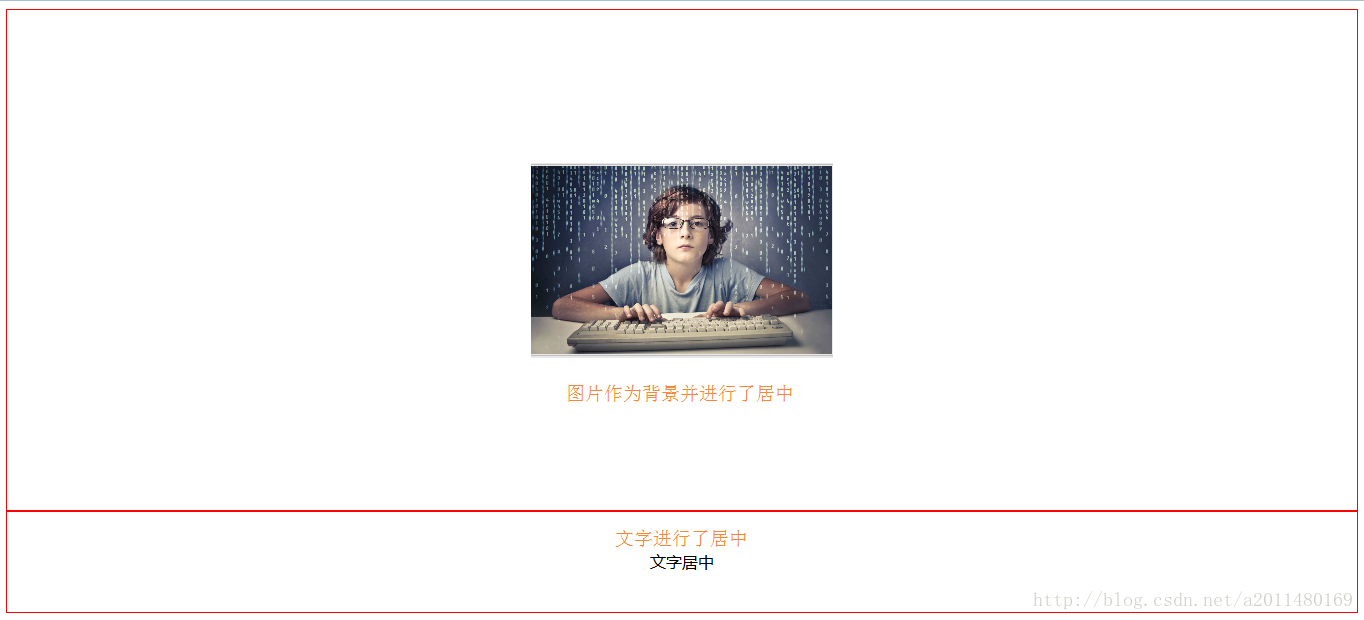
将一个标签里插入图片 或者 将图片作为标签的背景有的时候分的并没有那么的细,两者是可以想通的。
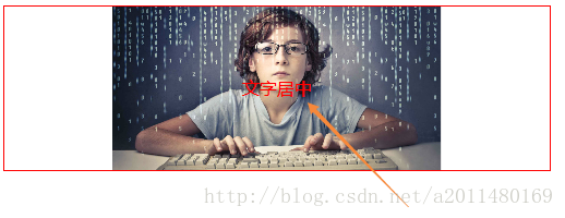
| 3 我是如何在图片上面插入文字的 |
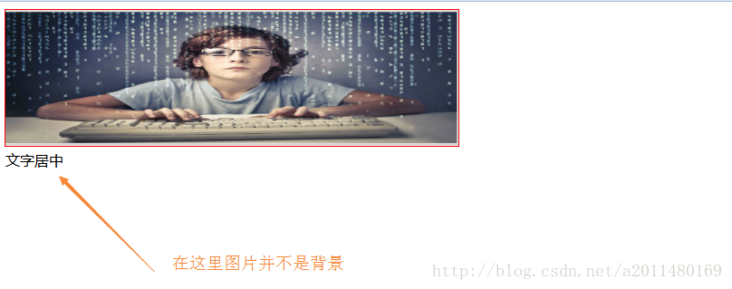
将一个标签里插入图片 或者 将图片作为标签的背景有的时候分的并没有那么的细,两者是可以想通的。
方法1:这种方式是在标签里面插入一张img标签,但是由于图片不是背景,所以图片上面并不能够添加文字。
<!DOCTYPE html>
<html lang="en">
    <head>
        <meta charset="UTF-8">
        <title>Title</title>
        <style>
            .item1{
                border: solid 1px red;
                width: 500px;
                height: 150px;
            }
            /*这种方式我是在标签里面插入一张图片,并通过宽高进行设置*/
            .item1 > img{
                width: 500px;
                height: 150px;
            }
        </style>
    </head>

    <body>
       <div class="item1">
           <img src="daima.png" alt="猿人">
           文字居中
       </div>
    </body>

</html>
效果展示:
方法2:将一个图片作为背景,文字可以在上面随意填充。
<!DOCTYPE html>
<html lang="en">

    <head>
        <meta charset="UTF-8">
        <title>Title</title>
        <style>

            .item1{
                border: solid 1px red;
                width: 500px;
                height: 150px;
                background: url("daima.png") no-repeat center ;
                text-align: center;
                line-height: 150px;
                color: red ;
            }
        </style>
    </head>

    <body>
        <div class="item1">文字居中</div>
    </body>

</html>
效果展示:
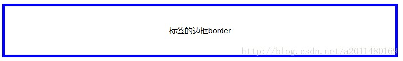
| 4、标签盒子属性–border |
盒子模型:在网页中,一个元素占有空间的大小由几个部分构成,其中包括元素的内容(content),元素的内边距(padding),元素的边框(border),元素的外边距(margin)四个部分。这四个部分占有的空间中,有的部分可以显示相应的内容,而有的部分只用来分隔相邻的区域或区域。4个部分一起构成了css中元素的盒模型。
<!DOCTYPE html>
<html lang="en">

    <head>
        <meta charset="UTF-8">
        <title>Title</title>
        <style>
            .item{
                height: 100px;
                width: 800px;
                /*border-color: blue;*/
                /*border-style: double;*/
                /*border-width: 5px;*/
                border:solid 5px blue;
                text-align: center;
                line-height: 100px;
            }
        </style>
    </head>

    <body>
        <div class="item">标签的边框border</div>
    </body>

</html>
效果展示:
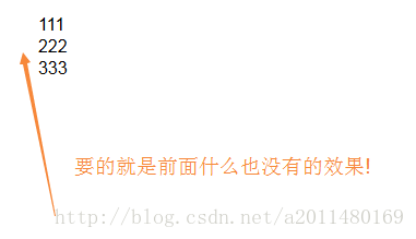
| 5、列表的相关属性操作 |
列表属性:
disc:默认是实心圆
circle:是空心圆
square:是正方体
none:列表前面什么也没有,这是我们经常使用的
代码:
<!DOCTYPE html>
<html lang="en">
    <head>
        <meta charset="UTF-8">
        <title>Title</title>
    </head>
        <style>

            /*在列表当中,我们常常前面的什么也不显示*/
            ul{
                list-style:none;
            }
        </style>
    <body>
        <ul>
            <li classs="item">111</li>
            <li classs="item">222</li>
            <li classs="item">333</li>
        </ul>

    </body>

</html>
效果展示:
| 6、display重要特性 |
display相关属性:
display: none ===>当display隐藏之后,位置是不在的;
我的理解是将标签进行隐藏,同时位置也消失了。
display: inline ===>通过inline可以将块级标签转化为内联标签;
我的理解是无论一个标签是块级标签还是内联标签,最终都是内联标签。
display: block ===>通过block可以将内联转化为块级标签;
我的理解是无论一个标签是块级标签还是内联标签,最终都是块级标签。
display: inline-block ===>通过inline-block既可以设置大小,也可以在同一行显示。
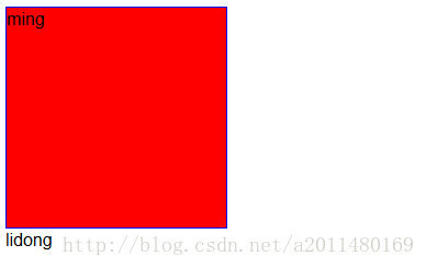
我的理解是无论一个标签是块级标签还是内联标签,既可以在一行显示,也可以设置大小。需求1:将item1标签进行隐藏
<!DOCTYPE html>
<html lang="en">

    <head>
        <meta charset="UTF-8">
        <title>Title</title>
        <style>
          .item1{
              border: solid 1px red;
              width: 200px;
              height: 200px;
              background-color: wheat;
              /*当display隐藏之后,位置是不在的*/
               display: none;
          }
          .item2{
              border: solid 1px blue;
              width: 200px;
              height: 200px;
              background-color: red;
              /*我们将标签藏起来的目的是为了让其更好的去显示*/
              /*display: none;*/
          }
        </style>
    </head>

    <body>
        <div class="item1">zhang</div>
        <div class="item2">ming</div>
        <div>lidong</div>
    </body>

</html>
效果图:
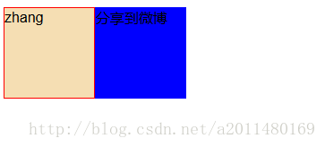
需求2:当我们将鼠标放在悬浮区域的时候,会显示出隐藏的标签。
<!DOCTYPE html>
<html lang="en">
    <head>
        <meta charset="UTF-8">
        <title>Title</title>
        <style>

            /*父类标签将会容纳子类标签*/
            /*我们的display可以将内联标签设置为块级标签,将块级标签设置为内联标签*/
            /*内联标签不可以设置为长和宽*/

            .item{
                height: 100px;
            }


            .item1{
                width: 100px;
                height: 100px;
                border: solid 1px red;
                background-color: wheat;
                float: left;
            }

            .item2{
                width: 100px;
                height: 100px;
                border: solid 1px blue;
                background-color: blue;
                float: left;
                display: none;
            }

            .item:hover .item2 {
                display: block;
            }

        </style>
    </head>

    <body>
       <div class="item">
           <div class="item1">zhang</div>
           <div class="item2">分享到微博</div>
       </div>
    </body>

</html>
效果图:
需求3:通过display属性将内联标签和快级标签进行切换(我的理解是通过display可以强制指定标签到底是什么类型的标签)
<!DOCTYPE html>
    <html lang="en">

    <head>
        <meta charset="UTF-8">
        <title>Title</title>
        <style>
            /*<!--通过inline可以将块级标签转化为内联标签-->*/
            div{
                display: inline;
                background:red;
            }
            /*<!--通过block可以将内联转化为块级标签-->*/
            span{
                display: block;
                background: black;
            }
            /*在此引发我们的一个问题:float可以将两个块级标签置为一行,是否还有用?*/
        </style>
    </head>

    <body>
        <div class="block">BLOCK</div>
        <span class="inline">INLINE</span>
    </body>
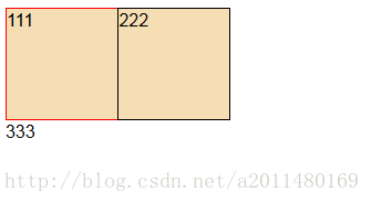
</html>需求4:inline-block和float属性的比较
<!DOCTYPE html>
<html lang="en">

    <head>
        <meta charset="UTF-8">
        <title>Title</title>
        <style>
            .item1{
                height: 100px;
                width: 100px;
                border: solid 1px red;
                background: wheat;
                /*通过inline-block既可以设置大小,也可以在同一行显示*/
                display: inline-block;
            }
            /*我感觉以后还是用这种方法比较好*/
            .item2{
                height: 100px;
                width: 100px;
                border: solid 1px black;
                background: wheat;
                /*通过display这种方式:默认会有一个间隙,通过margin-left可以进行左移动*/
                display: inline-block;
                margin-left: -5px;
            }
        </style>
    </head>

    <body>
        <div>
            <div class="item1">111</div>
            <div class="item2">222</div>
        </div>
        <div>333</div>
    </body>

</html>
效果图:
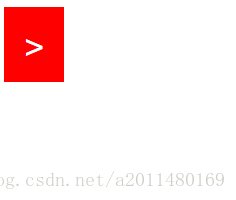
| 7、padding(通过padding也可以达到居中的效果) |
padding:20px 代表上下左右的20个像素.
padding:20px 15px 代表上下20;左右15.
padding:10px 20px 30px 40px 代表上、右、下、左的顺时针方向.
在设置的时候我们先调节长和宽仅仅适用于文字的,然后在通过padding进行调节。

padding相比于:
                /*text-align: center;*/
                /*line-height: 100px;*/
在居中的时候更加灵活.


通常情况下我们会再开始指定:
            *{
                margin: 0px;
                padding: 0px;
            }
需求:通过padding设置居中的效果
<!DOCTYPE html>
<html lang="en">
    <head>
        <meta charset="UTF-8">
        <title>Title</title>
        <style>
            *{
                margin: 0px;
                padding: 0px;
            }
            /*.item{*/
                /*width: 60px;*/
                /*height: 100px;*/
                /*background: blue;*/
                /*text-align: center;*/
                /*line-height: 100px;*/
                /*font-size: 35px;*/
                /*font-family: inherit;*/
                /*color: white;*/
            /*}*/
            /*我们通过padding达到同样的效果:*/
            .item{
                background: wheat;
                /*在设置的时候我们先调节长和宽仅仅适用于文字的,然后在通过padding进行调节。*/
                width: 20px;
                height: 35px;
                font-size: 35px;
                font-family: inherit;
                color: white;
                /*这种方式值得我们思考和学习*/
                padding:20px
            }
        </style>
    </head>

    <body>
        <div class="item"> > </div>
    </body>

</html>
效果展示:
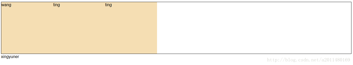
| 8、float漂浮的作用(对内联标签也会产生影响) |
float漂浮的作用:

对于块级标签:可以让块级标签在一行显示.
对于内联标签:可以让内联标签设置长和宽.

相同点:都是漂浮状态,可以并排显示。
示例:
<!DOCTYPE html>
<html lang="en">

    <head>
        <meta charset="UTF-8">
        <title>Title</title>
        <style>
            .item11{
                height: 200px;
                border: solid 1px;
            }
            span{
                float: left;
                width: 200px;
                height: 200px;
                background: 1px wheat;
            }
        </style>
    </head>

    <body>
        <div class="item11">
            <span class="item1">wang</span>
            <span class="item2">ting</span>
            <span class="item3">ting</span>
        </div>
        <div>xingyuner</div>
    </body>

</html>
效果展示:
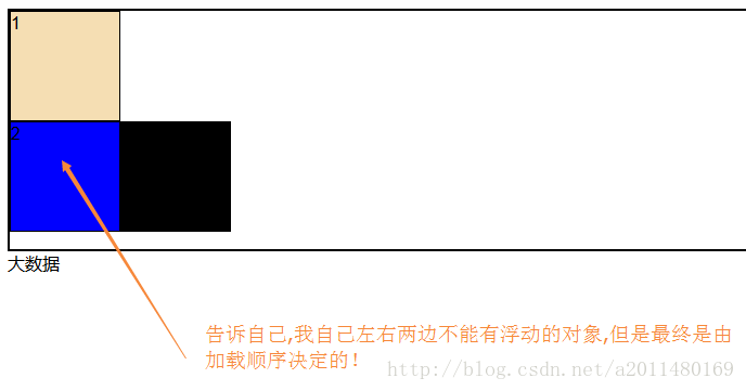
| 9、清除浮动,但是最终决定的却是加载顺序 |
clear:清除浮动!(针对漂浮和非漂浮对象)

作用:加载的元素左边或者右边不能有浮动的元素。
==>clear标签是告诉自己,左边或者右边不能有浮动的元素。
加载顺序决定最终的效果!
注意:父标签飘则子标签一定飘,但是子标签飘父标签不一定飘。
通常情况下,父标签是不飘的,而是里面的子标签都飘起来,最终通过某种方式将父标签给撑起来。(父不飘,通过clear撑起来)clear语法:
clear : none | left | right | both
取值:
none : 默认值。允许两边都可以有浮动对象
left : 不允许左边有浮动对象
right : 不允许右边有浮动对象
both : 不允许有浮动对象
但是需要注意的是:clear属性只会对自身起作用,而不会影响其他元素。
把握住两点:
1、元素是从上到下、从左到右依次加载的。
2、clear: left;对自身起作用,一旦左边有浮动元素,即切换到下一行来保证左边元素不是浮动的,依据这一点解决父级塌陷问题。<!DOCTYPE html>
<html lang="en">
<head>
<meta charset="UTF-8">
<title>Title</title>
<style>
.item{
border: solid 2px;
height: 220px;
}
.item1{
width: 100px;
height: 100px;
border: solid 1px;
background-color: wheat;
float: left;
}
.item2{
width: 100px;
height: 100px;
border: solid 1px;
background-color: blue;
float: left;
/*告诉自己,我的左边或者右边不能有浮动的元素!*/
clear: both;
}
.item3{
width: 100px;
height: 100px;
border: solid 1px;
background-color: black;
float: left;
}
</style>
</head>
<body>
<div class="item">
<div class="item1">1</div>
<div class="item2">2</div>
<div class="item3">3</div>
</div>
<div>大数据</div>
</body>
</html>效果展示:
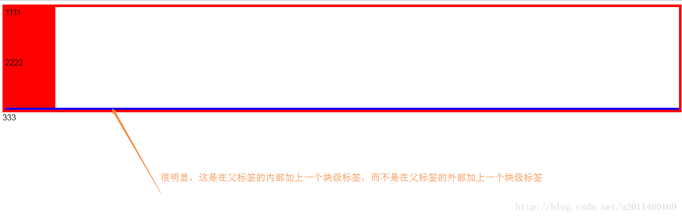
| 10、我们是如何将父标签给撑起来的(2种方式,很重要) |
1:伪类选择器的使用
介绍:
 :before    p:before       在每个<p>元素之前插入内容
 :after     p:after        在每个<p>元素之后插入内容

例:p:before{content:"hello";color:red;display: block;}
<!DOCTYPE html>
<html lang="en">
<head>
<meta charset="UTF-8">
<title>Title</title>
<style>
.item{
border: solid 5px red;
}
.item1,.item2{
width: 100px;
height: 100px;
background-color: red;
}
/*很明显:这是在每一个父标签范围的最后加上一个块级标签*/
.item:after{
content: "";
display: block;
clear: both;
border: solid 2px blue;
}
</style>
</head>
<body>
<div class="item">
<div class="item1">1111</div>
<div class="item2">2222</div>
</div>
<div class="wai">333</div>
</body>
</html>效果展示:
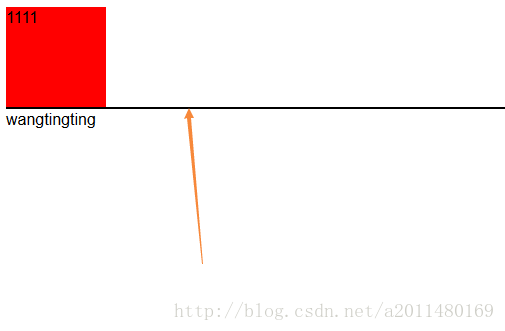
2:我们是如何防止父类标签塌陷的(方式1:很重要)
<!DOCTYPE html>
<html lang="en">
<head>
    <meta charset="UTF-8">
    <title>Title</title>
    <style>
        .item{
            width: 100px;
            height: 100px;
            background-color: red;
            float: left;
        }
        /*下面这行代码太牛逼了!!!告诉自己左边不能有浮动的元素*/
        /*item2的标签左边不能有浮动的标签*/
        .item2{
            clear: left;
            border:solid 1px;
        }
    </style>
</head>
<body>
    <div class="item">1111</div>
    <div class="item2"></div>
    <div>wangtingting</div>
</body>
</html>
效果展示:
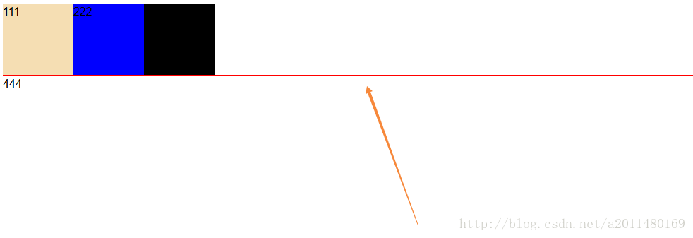
3:我们是如何防止父类标签塌陷的(方式2:很重要)
<!DOCTYPE html>
<html lang="en">

    <head>
        <meta charset="UTF-8">
        <title>Title</title>
        <style>
            .item1{
                width: 100px;
                height:100px;
                background-color: wheat;
                float: left;
            }
            .item2{
                width: 100px;
                height:100px;
                background-color: blue;
                float: left;
            }
            .item3{
                width: 100px;
                height:100px;
                background-color: black;
                float: left;
            }
            /*给父类标签的后面加一个这种block标签*/
            .clearfix:after{
                content: "";
                display: block;
                clear: both;
                border: solid 1px red;
            }
        </style>
    </head>

    <body>
        <div class="item clearfix">
            <div class="item1">111</div>
            <div class="item2">222</div>
            <div class="item3">333</div>
        </div>

        <div name="box">444</div>
    </body>

</html>
效果展示:
| 11、各种定位方式 |
在此处推荐一篇博客:http://blog.csdn.net/cyyax/article/details/50607066
1、static,无特殊定位,该定位方式下,top、right、bottom、left、z-index等属性是无效的。
2、相对定位相对的是它原本在文档流中的位置而进行的偏移,而我们也知道relative定位也是遵循正常的文档流,它没有脱离文档流,但是它的top/left/right/bottom属性是生效的,可以说它是static到absoult的一个中间过渡属性,最重要的是它还占有文档空间,而且占据的文档空间不会随 top / right / left / bottom 等属性的偏移而发生变动,也就是说它后面的元素是依据虚线位置( top / left / right / bottom 等属性生效之前)进行的定位。
3、top / right / left / bottom 属性是不会对relative定位的元素所占据的文档空间产生偏移,但是margin / padding会让该文档空间产生偏移。
4、relative和static方式在最外层时是以标签为定位原点的,而absoulte方式在无父级是position非static定位时是以作为原点定位。和元素相差9px左右。
简单来说:absolute相对html定位,relative相对于body进行定位。
5、我们如果使用absoulte或fixed定位的话,必须指定 left、right、 top、 bottom 属性中的至少一个,否则left/right/top/bottom属性会使用它们的默认值 auto ,这将导致对象遵从正常的HTML布局规则,在前一个对象之后立即被呈递,简单讲就是都变成relative,会占用文档空间,这点非常重要,很多人使用absolute定位后发现没有脱离文档流就是这个原因,这里要特别注意~~~
6、祖先类的margin会让子类的absoulte跟着偏移,而padding却不会让子类的absoulte发生偏移。总结一下,就是absoulte是根据祖先类的border进行的定位。
脱离文档流的几种方式:

1、正常文档流
2、绝对脱离文档流(完全脱离了)==> 这种东西很有用(相对于我们的窗口,屏幕定位的)
3、半脱离文档流(下面的文字被挤出来了,这种现象理解就好,不用研究)

绝对定位需要记住的口诀是:(最后看body,**绝对定位之后还是在父亲的范围之内**)

     1.绝对定位会找到与自己最近的父类来定位,不是自己的父类与自己无关。

     2.绝对定位找到了自己的父类之后,要看这个父类是否进行了相对定位,没有相对定位的话就不会找这个父类来定位。

     总结:绝对定位会寻找一个 距离自己最近的 父类 ,并且这个父类进行了 相对定位,那么这个盒子就会找这个已经有了相对定位的父类来定位。

position:fixed 的使用.
参数的相关设置:
                position: fixed(是不在我们的页面上的);
                left: 1200px;
                top:500px;

position:relative(实际上也是我们正常文档流里面的设置,参考的使我们自己)
标签元素并没有脱离我们正常的文档流.

总结:脱离文档流只有下面几种可能.

position  :(定位的5个参数)
static    默认值,无定位  ===> 注意:这是没有定位
relative  :(没有脱离文档流,不影响其它的布局)===>给父亲定位一下,操作方便!
float     :半脱离  ==> 下面的文字会被挤压出来
fixed     :绝对脱离文档流 (参照物是当前屏幕)
absolute  :绝对脱离文档流(参照物是它  已经定位了  的父亲)==> 很重要
如果往上层一直找,最后将以body为定位标准。 ===> 参照物不一样,表现的就不一样.

以后的用法:父亲设置为relative进行相对定位(给儿子做参照);儿子标签设置为absolute绝对
定位(京东8个图片).

简单来说:
相对定位:相对的是自己,并且自己以前的位置不会被冲掉,不会脱离正常的文档流,但是top等起作用,如果仅仅写了一个position:relative,和不写是没有什么区别的。
绝对定位:绝对定位会寻找一个 距离自己最近的 父类 ,并且这个父类进行了 相对定位,绝对定位的时候必须要指定top等其中的一个(fixed也是一样,也要指定至少一个)。
**在写绝对定位的时候,推荐父亲写的是relative,因为absolute会影响正常文档流的布局。**
绝对定位的示例:
<!DOCTYPE html>
<html lang="en">

    <head>
        <meta charset="UTF-8">
        <title>Title</title>
        <style>
            body{
                margin-top: 50px;
                border: solid 3px;
            }
            .div1{
                height: 200px;
                width: 200px;
                border: solid 1px;
                background-color: red;
            }
            .div2{
                height: 100px;
                width: 100px;
                background-color: blue;
                position: relative;
            }
            .div3{
                height: 50px;
                width: 50px;
                background-color: wheat;
                position: absolute;
                top:50px;
                left: 50px;
            }
        </style>
    </head>

    <body>
        <div class="div1">
            <div class="div2">
                <div class="div3">你好</div>
            </div>
        </div>
    </body>

</html>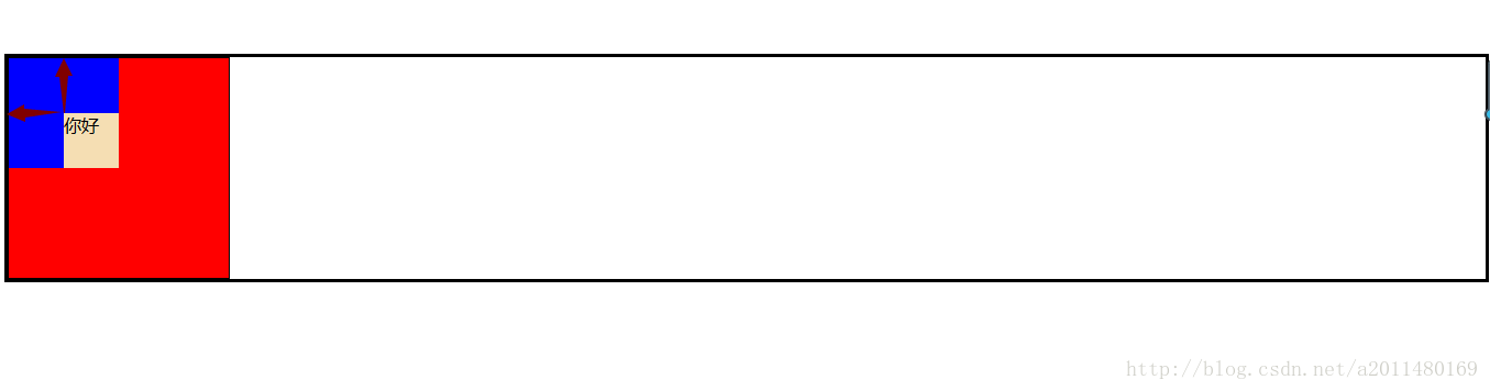
后续上面我这个例子是这么写的:
<!DOCTYPE html>
<html lang="en">
<head>
<meta charset="UTF-8">
<title>Title</title>
<style>
html {
border: 1px dashed green;
}
body {
border: 1px dashed blue;
}
.item1{
height: 200px;
width: 200px;
border: solid red 1px;
}
.item2{
height: 100px;
width: 100px;
border: dashed red 2px;
position: relative;
}
.item3{
height: 50px;
width: 50px;
border: solid red 1px;
position: absolute;
top:50px;
left: 50px;
}
</style>
</head>
<body>
<div class="item1">
<div class="item2">
<div class="item3">你好</div>
</div>
</div>
</body>
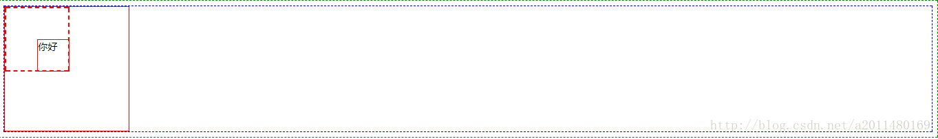
</html>效果图:
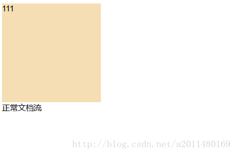
需求1:float :半脱离 ==> 下面的文字会被挤压出来
<!DOCTYPE html>
<html lang="en">
    <head>
        <meta charset="UTF-8">
        <title>Title</title>
        <style>
            .item1{
                width: 200px;
                height: 200px;
                background-color: wheat;
                float: left;
            }
            /*效果当中文字为什么被挤出来了呢!=> item1是半脱离文档流的状态*/
            .item2{
                width: 200px;
                height: 200px;
                background-color: blue;
            }
        </style>
    </head>

    <body>
        <div class="item1">111</div>
        <div class="item2">正常文档流</div>
    </body>

</html>
效果展示:
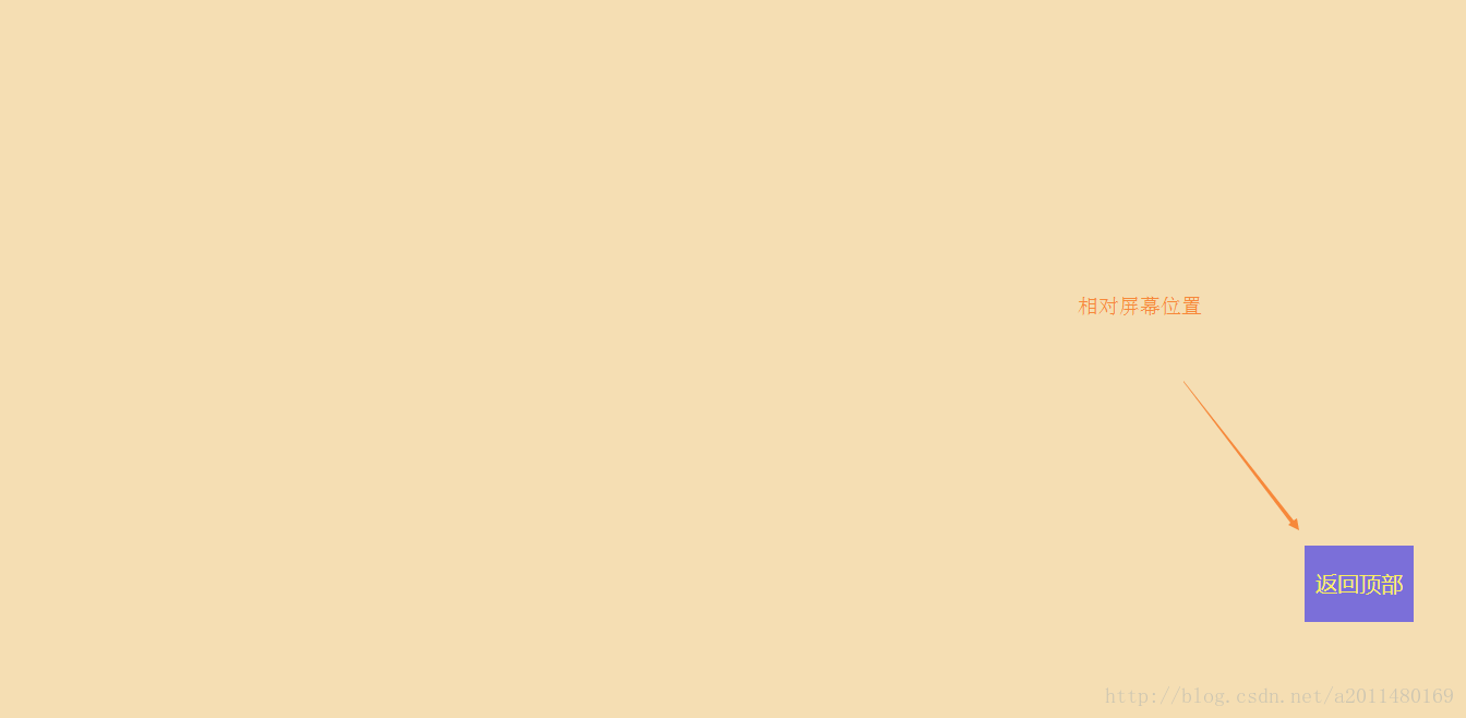
需求2:fixed :绝对脱离文档流 (参照物是当前屏幕)
<!DOCTYPE html>
<html lang="en">

    <head>
        <meta charset="UTF-8">
        <title>Title</title>
        <style>
            body{
                margin: 0px;
            }
            .con{
                width: 100%;
                height: 2000px;
                background-color: wheat;
            }
            .return_top{
                width: 100px;
                height: 70px;
                background-color: blue;
                /*透明度的设置*/
                opacity: 0.5;
                text-align: center;
                line-height: 70px;
                font-size: 20px;
                color: yellow;
                /*定位*/
                position: fixed;
                left: 1200px;
                top:500px;
            }
        </style>
    </head>

    <body>
        <div class="con"></div>
        <div class="return_top">返回顶部</div>
    </body>

</html>
效果展示:
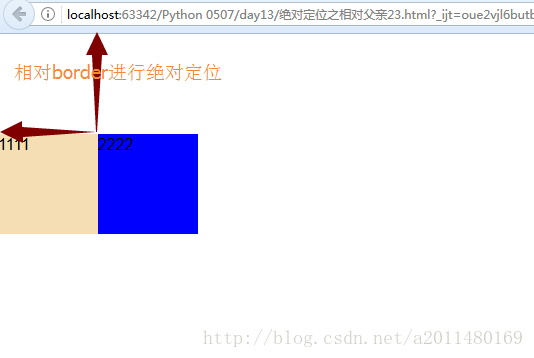
需求3:绝对定位(参照物是border)
<!DOCTYPE html>
<html lang="en">

    <head>
        <meta charset="UTF-8">
        <title>Title</title>
        <style>
            body{
                margin: 0px;
            }
            .item{
                margin-top: 100px;
                /*position: relative;*/
            }
            .item1{
                width: 100px;
                height:100px;
                background-color: wheat;
            }
            .item2{
                width: 100px;
                height:100px;
                background-color: blue;
                position: absolute;
                top:100px;
                left: 100px;
                /*position: absolute;*/
                /*top:100px;*/
                /*left: 100px;*/
            }
        </style>
    </head>

    <body>
        <div class="item">
            <div class="item1">1111</div>
            <div class="item2">2222</div>
        </div>
    </body>

</html>
效果展示:
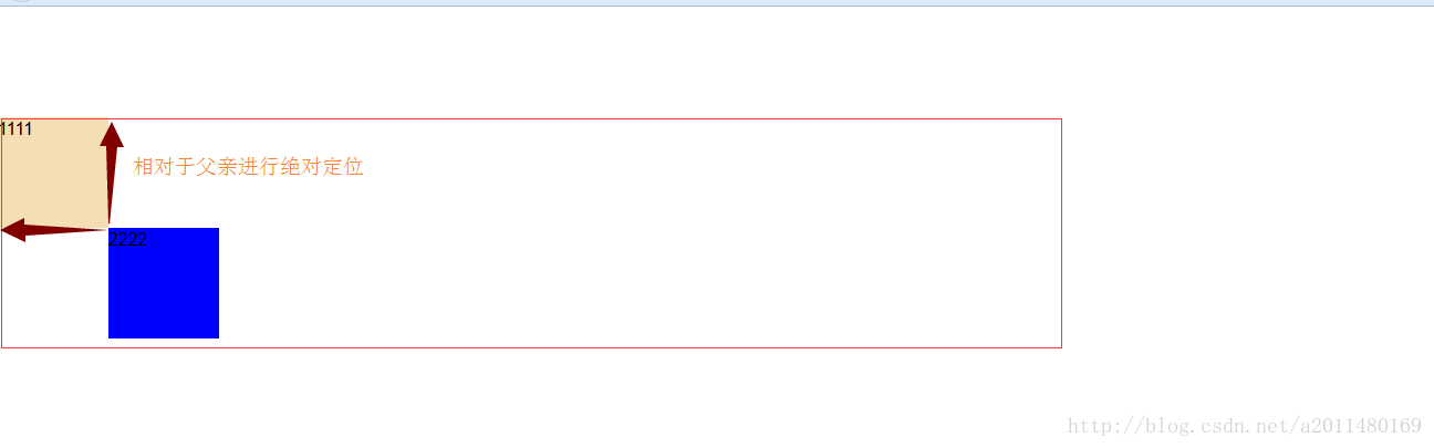
需求4:参照物是父亲进行绝对定位
<!DOCTYPE html>
<html lang="en">

    <head>
        <meta charset="UTF-8">
        <title>Title</title>
        <style>
            body{
                margin: 0px;
            }
            .item{
                margin-top: 100px;
                position: relative;
            }
            .item1{
                width: 100px;
                height:100px;
                background-color: wheat;
            }
            .item2{
                width: 100px;
                height:100px;
                background-color: blue;
                position: absolute;
                top:100px;
                left: 100px;
                /*position: absolute;*/
                /*top:100px;*/
                /*left: 100px;*/
            }
        </style>
    </head>

    <body>
        <div class="item">
            <div class="item1">1111</div>
            <div class="item2">2222</div>
        </div>
    </body>

</html>
效果展示:
| 12、图片调细节 |
<!DOCTYPE html>
<html lang="en">
    <head>
        <meta charset="UTF-8">
        <title>Title</title>
        <style>
            a{
                float: left;
                width: 50px;
                height: 50px;
                background-color: gray;
            }
            span{
                float: left;
                width: 16px;
                height: 16px;
                background: url("http://dig.chouti.com/images/icon.png") no-repeat 0px -180px;

            }
        </style>
    </head>

    <body>
        <a href="">
            <span></span>
        </a>
    </body>

</html>
效果:


 5998
5998

 被折叠的 条评论
为什么被折叠?
被折叠的 条评论
为什么被折叠?
 到【灌水乐园】发言


