使用requests获取天气API数据并用matplotlib绘制折线图

需要用到的模块

1.requests
2.matplotlib

API来源

阿里云API市场–>墨迹天气API

  • 0元试用20次,8.9元可以用1W次
    在这里插入图片描述

获取天气数据

墨迹天气这个API还是挺好用的,大部分天气数据在API可以获取到,由于是渣新刚学,所以就只用了未来15天的气温数据。
获取未来15天的天气数据,返回JSON数据。

def get_data():
    url = "http://aliv18.data.moji.com/whapi/json/alicityweather/condition"
    appcode = "你自己的CODE"  # 阿里云appcode

    post_data = {
        'cityId': "650",  # 城市ID,长沙市:650,广州:886,上海:39,北京:2
        'token': 'API的token',  # 每个API的token都不一样,具体看自己阿里云上的
    }

    headers = {
        'Authorization': "APPCODE " + appcode,  # APPCODE后面要留一个空格,否则会401
        'Content-Type': 'application/x-www-form-urlencoded; charset=UTF-8',  # Content-Type格式是固定的
    }
    res = requests.post(url, data=post_data, headers=headers)  # 发送请求并爬取数据
    str_json = res.content.decode("utf8")  # 解析数据
    json_data = json.loads(str_json)  # API返回的json数据需要转换为dict数据,否则会认为是个str
    return json_data
  • 这里有个坑,请求头的“Authorization”:“APPCODE”后面要留一个空格,即“APPCODE ”,不然的话会报401。
    返回数据:
    在这里插入图片描述
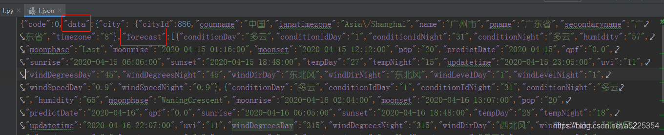
    从返回的数据可以看出,“data”是城市的信息,“forecast”是15天的天气信息。
    从forecast得出“predictDate=日期”,“tempDay=日间温度”,“tempNight=夜间温度”,我要以“predictDate”作为图表的X轴,“tempDay”以及"tempNight"作为Y轴,因此需要将他们的数据都遍历出来。
class Graphing:
    def __init__(self, data):
        """初始化并生成X、Y轴数据"""
        self.json_data = data  # # 获取数据
        self.city_data = self.json_data['data']['city']  # 获取城市信息
        self.temp_data = self.json_data['data']['forecast']  # 获取15天的天气信息
        self.predictDateList = [date["predictDate"] for date in self.temp_data]  # 以日期生成X轴数据
        self.tempDayList = [temp["tempDay"] for temp in self.temp_data]  # 日间温度
        self.tempNightList = [temp["tempNight"] for temp in self.temp_data]  # 晚间温度
        self.tempDayList = list(map(int, self.tempDayList))  # 列表中的数据都是STR类型,因此都要转为int类型
        self.tempNightList = list(map(int, self.tempNightList))

if __name__ == "__main__":
    json_data = get_data()  # 获取未来15天的气温数据
    img = Graphing(json_data)  # 实例化类,并将气温数据传入

这样我就得到了X轴和Y轴的数据,然后就可以绘制图形。

class Graphing:
    def __init__(self, data):
        """初始化并生成X、Y轴数据"""
        self.json_data = data  # # 获取数据
        self.city_data = self.json_data['data']['city']  # 获取城市信息
        self.temp_data = self.json_data['data']['forecast']  # 获取15天的天气信息
        self.predictDateList = [date["predictDate"] for date in self.temp_data]  # 以日期生成X轴数据
        self.tempDayList = [temp["tempDay"] for temp in self.temp_data]  # 日间温度
        self.tempNightList = [temp["tempNight"] for temp in self.temp_data]  # 晚间温度
        self.tempDayList = list(map(int, self.tempDayList))  # 列表中的数据都是STR类型,因此都要转为int类型
        self.tempNightList = list(map(int, self.tempNightList))
    
	def draw_lines(self):
		"""绘制图形"""
		pyplot.figure(figsize=(15, 10))  # 设置图纸大小
		pyplot.plot(self.predictDateList, self.tempDayList, marker="o", label="日间温度")  # 生成线条,日间温度的线条
		pyplot.plot(self.predictDateList, self.tempNightList, marker="o", label="晚间温度")  # 生成线条,晚间温度的线条

    def show_img(self):
         pyplot.show()


if __name__ == "__main__":
    json_data = get_data()  # 获取未来15天的气温数据
    img = Graphing(json_data)  # 实例化类,并将气温数据传入
    img.draw_lines()  # 绘制图形
    img.show_img()  # show

运行结果:
在这里插入图片描述
以上的代码就成功的将图形绘制出来了,接下来就是对图形做些美化,例如加个标题,X、Y轴的描述,还有线条的描述等等。

class Graphing:
    def __init__(self, data):
        """初始化并生成X、Y轴数据"""
        self.json_data = data  # # 获取数据
        self.city_data = self.json_data['data']['city']  # 获取城市信息
        self.temp_data = self.json_data['data']['forecast']  # 获取15天的天气信息
        self.predictDateList = [date["predictDate"] for date in self.temp_data]  # 以日期生成X轴数据
        self.tempDayList = [temp["tempDay"] for temp in self.temp_data]  # 日间温度
        self.tempNightList = [temp["tempNight"] for temp in self.temp_data]  # 晚间温度
        self.tempDayList = list(map(int, self.tempDayList))  # 列表中的数据都是STR类型,因此都要转为int类型
        self.tempNightList = list(map(int, self.tempNightList))
    
	def draw_lines(self):
		"""绘制图形"""
		pyplot.figure(figsize=(15, 10))  # 设置图纸大小
		pyplot.plot(self.predictDateList, self.tempDayList, marker="o", label="日间温度")  # 生成线条,日间温度的线条
		pyplot.plot(self.predictDateList, self.tempNightList, marker="o", label="晚间温度")  # 生成线条,晚间温度的线条

    def beautify_graphics(self):
        """美化图形"""
        pyplot.xticks(rotation=45)  # X轴倾斜45°
        pyplot.xlabel("日期")  # X轴描述
        pyplot.ylabel("温度(℃)")  # Y轴描述
        pyplot.title("{}{}未来15天的气温".format(self.city_data["secondaryname"], self.city_data["name"]))# 标题
        pyplot.legend()  # 添加线条描述
        pyplot.grid()  # 添加网格

    def show_img(self):
         pyplot.show()


if __name__ == "__main__":
    json_data = get_data()  # 获取未来15天的气温数据
    img = Graphing(json_data)  # 实例化类,并将气温数据传入
    img.draw_lines()  # 绘制图形
    img.beautify_graphics()  # 美化图形
    img.show_img()  # show

运行结果:
在这里插入图片描述
图形变好看了,但是中文没显示出来,因此还需要对字体做些处理。
在__init__()方法中加上

self.font = FontProperties(fname=r"c:\windows\fonts\simsun.ttc", size=15)  # 设置字体

然后在每个需要显示中文的地方加上一个参数 fontproperties=self.font,不过要注意,legend是用prop=self.font。
完整的绘图代码:

from matplotlib import pyplot
from matplotlib.font_manager import FontProperties


class Graphing:
    def __init__(self, data):
        """初始化并生成X、Y轴数据"""
        self.json_data = data  # 获取数据
        self.font = FontProperties(fname=r"c:\windows\fonts\simsun.ttc", size=15)  # 设置字体
        self.city_data = self.json_data['data']['city']  # 获取城市信息
        self.temp_data = self.json_data['data']['forecast']  # 获取15天的天气信息
        self.predictDateList = [date["predictDate"] for date in self.temp_data]  # 以日期生成X轴数据
        self.tempDayList = [temp["tempDay"] for temp in self.temp_data]  # 日间温度
        self.tempNightList = [temp["tempNight"] for temp in self.temp_data]  # 晚间温度
        self.tempDayList = list(map(int, self.tempDayList))  # 列表中的数据都是STR类型,因此都要转为int类型
        self.tempNightList = list(map(int, self.tempNightList))

    def draw_lines(self):
        """绘制图形"""
        pyplot.figure(figsize=(15, 10))  # 设置图纸大小
        pyplot.plot(self.predictDateList, self.tempDayList, marker="o", label="日间温度")  # 生成线条,日间温度的线条
        pyplot.plot(self.predictDateList, self.tempNightList, marker="o", label="晚间温度")  # 生成线条,晚间温度的线条

        # pyplot.show()

    def beautify_graphics(self):
        """美化图形"""
        pyplot.xticks(rotation=45)  # X轴倾斜45°
        pyplot.xlabel("日期", fontproperties=self.font)  # X轴描述
        pyplot.ylabel("温度(℃)", fontproperties=self.font)  # Y轴描述
        pyplot.title("{}{}未来15天的气温".format(self.city_data["secondaryname"], self.city_data["name"]),
                     fontproperties=self.font)  # 标题
        pyplot.legend(prop=self.font)  # 添加线条描述
        pyplot.grid()  # 添加网格

    def save_img(self):
        pyplot.savefig("{}{}未来15天的气温".format(self.city_data["secondaryname"], self.city_data["name"]))

    def show_img(self):
         pyplot.show()


if __name__ == "__main__":
    json_data = get_data()  # 获取未来15天的气温数据
    img = Graphing(json_data)  # 实例化类,并将气温数据传入
    img.draw_lines()  # 绘制图形
    img.beautify_graphics()  # 美化图形
    img.save_img()  # 保存图片
    img.show_img()  # show

最后就完成了一个简单的图形:
在这里插入图片描述

  • 1
    点赞
  • 8
    收藏
    觉得还不错? 一键收藏
  • 0
    评论

“相关推荐”对你有帮助么?

  • 非常没帮助
  • 没帮助
  • 一般
  • 有帮助
  • 非常有帮助
提交
评论
添加红包

请填写红包祝福语或标题

红包个数最小为10个

红包金额最低5元

当前余额3.43前往充值 >
需支付:10.00
成就一亿技术人!
领取后你会自动成为博主和红包主的粉丝 规则
hope_wisdom
发出的红包
实付
使用余额支付
点击重新获取
扫码支付
钱包余额 0

抵扣说明:

1.余额是钱包充值的虚拟货币,按照1:1的比例进行支付金额的抵扣。
2.余额无法直接购买下载,可以购买VIP、付费专栏及课程。

余额充值