


首页功能
前面,我们已经完成了影视信息组件的开发,接下来,我们要用该组件来完成首页界面功能的开发,如下图

可以看到,首页顶部一个标题栏,下面是‘最新’、‘最热’两个选项卡。我们要完成的有标题栏、选项卡、以及选项卡切换的内容。
标题栏
这里的标题栏,我们使用的是ToolbarAndroid,看名称我们就知道这个是android下特有的组件view,所以就立马想到,这个组件是ios、android不能通用的。因此,我们定义一个TitleBarComponent,方便以后重复使用和ios适配。这里,先提一下关于组件适配的一些问题。
组件平台适配
不同平台使用不同的组件,React Native 提供了以下四种解决方案
- 最直接的方案就是把组件放置到不同的文件夹下:
/common/components/
/android/components/
/ios/components/- 根据平台不同在组件的文件命名上加以区分,如下:
BigButtonIOS.js
BigButtonAndroid.js- 使用扩展名
BigButton.ios.js
BigButton.android.js
以上三种方案,再引用的时候去掉平台标识,如下
import BigButton from './components/BigButton';- Platform.select()
import React, {Component,Platform} from 'react';

var Component = Platform.select({
  ios: () => require('ComponentIOS'),
  android: () => require('ComponentAndroid'),
});
Platform.OS在iOS上会返回ios,而在Android设备或模拟器上则会返回android。
创建标题栏
根据上面的方案,我们这里使用的是使用扩展名的方案来适配平台的。在js/component下创建TitleBarComponent.android.js文件。
标题栏总共有标题、副标题和左边的返回按钮icon,返回按钮只有在子页面(二级页面)才有,因此我们定义如下属性
//初始化props
static defaultProps = {
    title:'',//标题
    subtitle:'',//副标题
    subScene:true,//是否是子页面
};
然后,在render返回一个ToolbarAndroid
render() {
    return(
        <ToolbarAndroid
            title={this.props.title}
            navIcon={this.props.subScene?require('../../img/ic_actionbar_back.png'):null}
            titleColor='white'
            subtitle={this.props.subtitle}
            subtitleColor='#ebf0f6'
            actions={actions}
            onActionSelected={this._onActionClick.bind(this)}
            onIconClicked={this._onIconClick.bind(this)}
            style={styles.toolbar}
        />
        );
    }

    //返回按钮事件
    _onIconClick(){

    }
这里几个属性说明下
- title 就是标题
- titleColor 设置标题颜色
- subtitle 就是副标题
- subtitleColor 设置副标题颜色
- actions 了解android的都知道Toolbar右边还可以设置一些动作按钮(我们这里没有就不设置该属性)
它的格式如下,可以设置多个
const actions = [
    {title:'全部',show:'always',icon:require('../../img/icon_all.png'),showWithText:true},
]- onActionSelected 动作按钮被触发时的回调(我们这里没有就不设置该属性)
- onIconClicked 标题栏左边的图标被点击后的回调(我们这里是返回按钮,返回图标可以到github上得到)
- style 设置整个标题栏的样式,高度、背景等。
TitleBarComponent的完整代码如下
import React,{Component} from 'react';
import {
    ToolbarAndroid,
    DeviceEventEmitter,
    StyleSheet,
    Text,
    TouchableOpacity,
}from 'react-native';

export default class TitleBarComponent extends Component {
    constructor(props) {
        super(props);
    }

    //初始化props
    static defaultProps = {
        title:'',//标题
        subtitle:'',//副标题
        subScene:true,//是否是子页面
    };

    render() {
        return(
            <ToolbarAndroid
                title={this.props.title}
                navIcon={this.props.subScene?require('../../img/ic_actionbar_back.png'):null}
                titleColor='white'
                subtitle={this.props.subtitle}
                subtitleColor='#ebf0f6'
                onIconClicked={this._onIconClick.bind(this)}
                style={styles.toolbar}
            />
        );
    }

    //返回按钮事件
    _onIconClick(){

    }
}

const styles = StyleSheet.create({
    toolbar:{
        height:56,
        backgroundColor:'#ff5722',
    },
});
这样我们就完成了标题栏的设计。
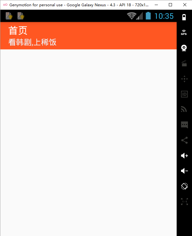
创建首页Scene
添加标题
接下来我们需要创建一个首页Scene,来展示首页功能。在js文件夹新建HomeScene.js文件,并为首页添加一个标题栏。
import React,{Component} from 'react';
import {
    View,
    Text,
    StyleSheet,
    TouchableOpacity
} from 'react-native';

import TitleBar from './component/TitleBarComponent'

export default class HomeScene extends Component{
    constructor(props){
        super(props);
    }

    render(){
        return(
            <View style={{flex:1}}>
                <TitleBar title="首页" subtitle="看韩剧,上稀饭" subScene={false}/>
            </View>
        );
    };
}
然后将index.android.js使用HomeScene
import HomeScene from './js/HomeScene';

class XiFan extends Component {

  render(){
    return(
        <HomeScene/>
    );
  }
}

AppRegistry.registerComponent('XiFan', () => XiFan);
执行代码,就可以看到如下效果
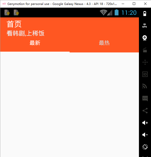
添加选项卡
这样首页的标题有了,我们接下来要添加‘最新’、‘最热’两个选项卡
在HomeScene内添加如下代码
state增加一个tabIndex属性,标识当前选中的tab项
constructor(props){
    super(props);
    this.state = {
        tabIndex:0,
    };
}
接着就是绘制Tab了
//tab切换
_onTabPress(index){
    this.setState({
        tabIndex:index,
    });
}

render(){
    return(
        <View style={{flex:1}}>
            <TitleBar title="首页" subtitle="看韩剧,上稀饭" subScene={false}/>
            <View style={{height:35,flexDirection:'row',justifyContent:'center',alignItems:'center',backgroundColor:'#ff5722'}}>
                <View style={{flex:1}}>
                    <TouchableOpacity style={{flex:1,justifyContent:'center'}} activeOpacity={0.6} onPress={this._onTabPress.bind(this,0)}>
                        <Text style={this.state.tabIndex===0?styles.TabSelect:styles.TabUnSelect}>最新</Text>
                    </TouchableOpacity>
                    <View style={this.state.tabIndex===0?styles.TabUnderlineSelect:styles.TabUnderlineUnSelect}/>
                </View>
                <View style={{flex:1}}>
                    <TouchableOpacity style={{flex:1,justifyContent:'center'}} activeOpacity={0.6} onPress={this._onTabPress.bind(this,1)}>
                        <Text style={this.state.tabIndex===0?styles.TabUnSelect:styles.TabSelect}>最热</Text>
                    </TouchableOpacity>
                    <View style={this.state.tabIndex===0?styles.TabUnderlineUnSelect:styles.TabUnderlineSelect}/>
                </View>
            </View>
        </View>
    );
};
该段代码的核心主要是根据tabIndex是否被选中项,动态修改View的样式
var styles = StyleSheet.create({
    TabSelect:{
        flex:1,
        textAlign:'center',
        color:'white',
    },
    TabUnderlineSelect:{
        backgroundColor:'white',
        height:2,
    },
    TabUnSelect:{
        flex:1,
        textAlign:'center',
        color:'#d5d5d5',
    },
    TabUnderlineUnSelect:{
        height:0,
    },
});
现在的效果是这样的
添加选项卡内容
应用的功能就是像在堆积木一样,一点一点叠起来。现在给选项卡下方添加对应的内容。选项卡切换时,底下切换到对应的内容,我们这里使用的是ViewPagerAndroid。
//ViewPager 页面发生切换时调用,修改tabIndex
_onPageSelected(event){
    const position = event.nativeEvent.position;
    this.setState({
        tabIndex:position,
    });
}
_onPageScrollStateChanged(status){
    //idle 空闲,意味着当前没有交互。

    //dragging 拖动中,意味着当前页面正在被拖动。

    //settling 处理中,意味着当前页面发生过交互,且正在结束开头或收尾的动画。
}

render(){
    return(
        <View style={{flex:1}}>
            ...//省略其它代码

            <ViewPagerAndroid
                style={{flex:1}}
                initialPage={0}
                onPageSelected={this._onPageSelected.bind(this)}
                scrollEnabled={true}
                pageMargin={0}
                onPageScrollStateChanged={this._onPageScrollStateChanged}
                keyboardDismissMode='on-drag'
                ref={(viewPager)=>{this.viewPager = viewPager}}
            >
                <View style={{flex:1}}>
                    <DramaComponent url='/hanju/new/'/>
                </View>
                <View style={{flex:1}}>
                    <DramaComponent url='/hanju/renqi/'/>
                </View>
            </ViewPagerAndroid>
        </View>
    );
};
主要说几个属性
- initialPage 初始显示哪个页面
- onPageSelected页面选中时的回调函数
- onPageScrollStateChanged 滚动状态发生变化时调用(目前没用到)
- ref 定义该组件的实例对象,这里我们将ViewPagerAndroid实例对象声明为viewPager,然后我们就可以在这个页面内使用该对象,比如,前面的_onTabPress方法,在tab切换时需要下面的内容也切换到对应的内容,所以我们对_onTabPress方法添加如下代码:
//tab切换
_onTabPress(index){
    this.viewPager.setPage(index);
    this.setState({
        tabIndex:index,
    });
}
调用了viewPager对象setPage方法,进行页面切换。
还有另一种定义ref方式,如下:
<ViewPagerAndroid
    ...//省略其它代码
    ref="viewPage">
    ...//省略其它代码
</ViewPagerAndroid>
然后使用对象时
//tab切换
_onTabPress(index){
    this.refs.viewPage.setPage(index);
    this.setState({
        tabIndex:index,
    });
}
再看下上面的代码,我们在ViewPagerAndroid内部塞了两个View,这两个View实际上就是要显示的内容了,它们就是我们之前自定义的DramaComponent,传入了不同的url,一个是最新的地址,一个是最热的人气,这样解析显示出来就是对应的数据了。
关于ViewPagerAndroid更多信息,可以查看ViewPagerAndroid
最后上一下本节的完成的成果效果图:

HomeScene.js的所有代码
import React,{Component} from 'react';
import {
    View,
    Text,
    StyleSheet,
    TouchableOpacity,
    ViewPagerAndroid
} from 'react-native';

import TitleBar from './component/TitleBarComponent'
import DramaComponent from './component/DramaComponent';

export default class HomeScene extends Component{
    constructor(props){
        super(props);
        this.state = {
            tabIndex:0,
        };
    }

    //tab切换
    _onTabPress(index){
        this.viewPager.setPage(index);
        this.setState({
            tabIndex:index,
        });
    }
    //ViewPager 页面发生切换时调用
    _onPageSelected(event){
        const position = event.nativeEvent.position;
        this.setState({
            tabIndex:position,
        });
    }

    _onPageScrollStateChanged(status){
        //idle 空闲,意味着当前没有交互。

        //dragging 拖动中,意味着当前页面正在被拖动。

        //settling 处理中,意味着当前页面发生过交互,且正在结束开头或收尾的动画。
    }

    render(){
        return(
            <View style={{flex:1}}>
                <TitleBar title="首页" subtitle="看韩剧,上稀饭" subScene={false}/>
                <View style={{height:35,flexDirection:'row',justifyContent:'center',alignItems:'center',backgroundColor:'#ff5722'}}>
                    <View style={{flex:1}}>
                        <TouchableOpacity style={{flex:1,justifyContent:'center'}} activeOpacity={0.6} onPress={this._onTabPress.bind(this,0)}>
                            <Text style={this.state.tabIndex===0?styles.TabSelect:styles.TabUnSelect}>最新</Text>
                        </TouchableOpacity>
                        <View style={this.state.tabIndex===0?styles.TabUnderlineSelect:styles.TabUnderlineUnSelect}/>
                    </View>
                    <View style={{flex:1}}>
                        <TouchableOpacity style={{flex:1,justifyContent:'center'}} activeOpacity={0.6} onPress={this._onTabPress.bind(this,1)}>
                            <Text style={this.state.tabIndex===0?styles.TabUnSelect:styles.TabSelect}>最热</Text>
                        </TouchableOpacity>
                        <View style={this.state.tabIndex===0?styles.TabUnderlineUnSelect:styles.TabUnderlineSelect}/>
                    </View>
                </View>

                <ViewPagerAndroid
                    style={{flex:1}}
                    initialPage={0}
                    onPageSelected={this._onPageSelected.bind(this)}
                    scrollEnabled={true}
                    pageMargin={0}
                    onPageScrollStateChanged={this._onPageScrollStateChanged}
                    keyboardDismissMode='on-drag'
                    ref={(viewPager)=>{this.viewPager = viewPager}}
                >
                    <View style={{flex:1}}>
                        <DramaComponent url='/hanju/new/'/>
                    </View>
                    <View style={{flex:1}}>
                        <DramaComponent url='/hanju/renqi/'/>
                    </View>
                </ViewPagerAndroid>
            </View>
        );
    };
}
var styles = StyleSheet.create({
    TabSelect:{
        flex:1,
        textAlign:'center',
        color:'white',
    },
    TabUnderlineSelect:{
        backgroundColor:'white',
        height:2,
    },
    TabUnSelect:{
        flex:1,
        textAlign:'center',
        color:'#d5d5d5',
    },
    TabUnderlineUnSelect:{
        height:0,
    },
});
总结
这节,我们完成了首页功能的开发,主要涉及到了标题栏、选项卡切换的功能,细节上提到了组件的平台适配、ViewPager的使用等。下一节,我们将开发主界面的功能,包括底部TabBar的开发以及Navigator实现页面的跳转,而页面的跳转将是最主要的一个功能,下一节我们再详细来述说。


 1614
1614

 被折叠的 条评论
为什么被折叠?
被折叠的 条评论
为什么被折叠?
 到【灌水乐园】发言


