


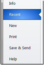
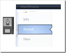
这是Office2010中的文件菜单点开后的效果。本文我将以强大的WPF(www.itstrike.cn)来实现类似的效果。希望你能有所收获。而不是只拷贝/粘贴代码而已。
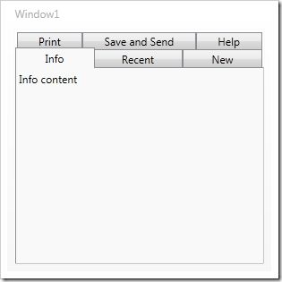
开始之前。先把TabControl找个地方放着。
<Window x:Class="TestClient.MainWindow"
xmlns="http://schemas.microsoft.com/winfx/2006/xaml/presentation"
xmlns:x="http://schemas.microsoft.com/winfx/2006/xaml"
Title="MainWindow" Height="350" Width="525">
<TabControl Name="tabSteps">
<TabItem Header="Info" IsSelected="True">
<TextBlock>Info content</TextBlock>
</TabItem>
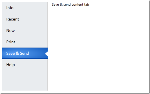
<TabItem Header="Recent">
<TextBlock>Recent content tab</TextBlock>
</TabItem>
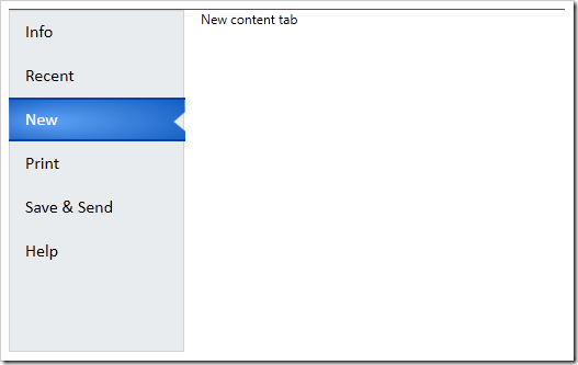
<TabItem Header="New">
<TextBlock>New content tab</TextBlock>
</TabItem>
<TabItem Header="Print">
<TextBlock>Print content tab</TextBlock>
</TabItem>
<TabItem Header="Save & Send">
<TextBlock>Save & send content tab</TextBlock>
</TabItem>
<TabItem Header="Help">
<TextBlock>Help tab</TextBlock>
</TabItem>
</TabControl>
</Window>
然后会大概是这个效果
为了改变TabControl的显示效果。我们使用模板机制,我们把模板写进一个资源字典里。这样就可以重用了。添加一个资源字典的步骤如下
右键点击工程-添加-资源字典
然后在资源字典里添加一些代码。
<Grid>
<Grid.ColumnDefinitions>
<ColumnDefinition Width="160" />
<ColumnDefinition/>
</Grid.ColumnDefinitions>
<Border Background="#FFE9ECEF"
Grid.Column="0"
BorderBrush="LightGray"
BorderThickness="1"
SnapsToDevicePixels="True" />
<StackPanel IsItemsHost="True"
Grid.Column="0"
Margin="0,0,-1,0"
SnapsToDevicePixels="True" />
<ContentPresenter
Content="{TemplateBinding SelectedContent}"
Grid.Column="1"
Margin="15,0,0,0" />
</Grid>
</ControlTemplate>
这样就添加了一个有一个grid元素的名为OfficeTabControl的控件模板 . Grid 被分成两列,一列是标签页,一列是页内容。左边的列包含一个灰色背景和亮灰色的边缘线,然后一个StackPanel,IsItemsHost属性被设置为true,
这样标签项被会放在这个栈面板里。第二列是ContentPresenter 这会放置标签页内容。然后让我们前面的TabControl使用新模板。设置Template 属性。
<Window.Resources>
<ResourceDictionary>
<ResourceDictionary.MergedDictionaries>
<ResourceDictionary Source="OfficeTab.xaml" />
</ResourceDictionary.MergedDictionaries>
</ResourceDictionary>
</Window.Resources>
<TabControl Name="tabSteps" Template="{StaticResource OfficeTabControl}">
在这之前,先把资源字典加到窗体的Reesouce里。然后再设置。然后运行软件。效果会有一些不一样。
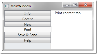
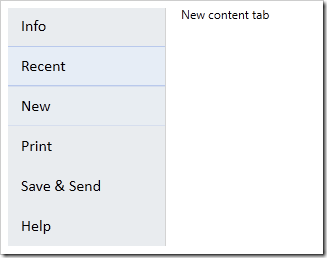
然后要修改左侧单个标签的显示效果。通过改变模板来实现。给模板添加如下的代码
<ControlTemplate x:Key="OfficeTabControl" TargetType="{x:Type TabControl}">
<ControlTemplate.Resources>
<Style TargetType="{x:Type TabItem}">
<Setter Property="Template">
<Setter.Value>
<ControlTemplate TargetType="{x:Type TabItem}">
<Grid SnapsToDevicePixels="True">
<ContentPresenter
Name="buttonText"
Margin="15,0,5,0"
TextBlock.FontFamily="Calibri"
TextBlock.FontSize="12pt"
TextBlock.Foreground="Black"
Content="{TemplateBinding Header}"
VerticalAlignment="Center"/>
</Grid>
</ControlTemplate>
</Setter.Value>
</Setter>
</Style>
</ControlTemplate.Resources>
然后再运行

VisualState很有意思。我们可以放在Grid里。然后设置正常状态和鼠标悬停的状态。
为了添加鼠标悬停效果,我们添加两个Borders元素。一个右边缘是灰线,另一个用在背景上。亮蓝色放在上下边缘
<Border Name="hoverShape"
Height="40"
Margin="0,0,1,0"
SnapsToDevicePixels="True"
BorderThickness="0,0,1,0"
BorderBrush="LightGray">
<Border BorderBrush="#FFA1B7EA"
BorderThickness="0,1"
Background="#FFE5EEF9"
Height="40"
SnapsToDevicePixels="True" />
</Border>
之后,我们为VisualState创建故事板,一个是正常状态。会使得hoverShape的透明度为0.另一个是鼠标悬停的状态。透明度会变成1
<Grid SnapsToDevicePixels="True">
<VisualStateManager.VisualStateGroups>
<VisualStateGroup Name="CommonStates">
<VisualState Name="MouseOver">
<Storyboard>
<DoubleAnimation
Storyboard.TargetName="hoverShape"
Storyboard.TargetProperty="Opacity"
To="1"
Duration="0:0:.1"/>
</Storyboard>
</VisualState>
<VisualState Name="Normal">
<Storyboard>
<DoubleAnimation
Storyboard.TargetName="hoverShape"
Storyboard.TargetProperty="Opacity"
To="0"
Duration="0:0:.1"/>
</Storyboard>
</VisualState>
</VisualStateGroup>
之后效果如下
然后添加选中项的样式,在hoverShape 下面再添加一个Border,名字是buttonShape。通过这个我们给被选中项的上下边缘添加2个像素的黑蓝色边缘,
在 Expression Blend中打开, 使用钢笔工具绘制个你想要的路径形状即可。然后把生成的xaml代码拷些过来。
也可以直接用我的代码。。不顾我说过要怎么做了。
最终看起来应该是这样的。
<Border
Name="buttonShape"
Opacity="0"
BorderBrush="#FF0343A6"
BorderThickness="0,2"
Height="40"
SnapsToDevicePixels="True">
<Path
Data="M214,108 L346,108 346.125,118.125 337.75,126.125
346.375,134 346.375,143.875 214.25,144.25 z"
SnapsToDevicePixels="True"
Stretch="Fill"
Height="40">
<Path.Fill>
<RadialGradientBrush GradientOrigin="0.2,0.5" RadiusX="0.8" RadiusY="0.8">
<GradientStop Color="#FF5FA3F6" Offset="0" />
<GradientStop Color="#FF0C55B9" Offset="1" />
</RadialGradientBrush>
</Path.Fill>
</Path>
</Border>
当你运行的时候你会发现没什么变化。我们还要定义被选中标签的VisualState
当添加如下代码的时候 添加一个VisualState组。也就是 SelectionStates ,然后给选中/为选中的状态添加行为/故事板。.这里通过修改透明度来实现一些效果
<VisualStateGroup Name="SelectionStates">
<VisualState Name="Selected">
<Storyboard>
<DoubleAnimation
Storyboard.TargetName="buttonShape" Storyboard.TargetProperty="Opacity"
To="1" Duration="0:0:.3"/>
<DoubleAnimation
Storyboard.TargetName="hoverShape" Storyboard.TargetProperty="Opacity"
To="0" Duration="0:0:.1"/>
<ColorAnimation
Storyboard.TargetName="buttonText"
Storyboard.TargetProperty=
"(TextBlock.Foreground).(SolidColorBrush.Color)"
To="White" Duration="0:0:.1" />
</Storyboard>
</VisualState>
<VisualState Name="Unselected">
<Storyboard>
<DoubleAnimation
Storyboard.TargetName="buttonShape"
Storyboard.TargetProperty="Opacity" To="0" Duration="0:0:.1"/>
<DoubleAnimation
Storyboard.TargetName="hoverShape"
Storyboard.TargetProperty="Opacity" To="0" Duration="0:0:.1"/>
</Storyboard>
</VisualState>
</VisualStateGroup>
现在再运行会发现效果更好了
还有个小问题,就是那个陷进入的小三角形的背景颜色依然还在。通过在下面添加一个白色的形状。,并且对故事板的选中和为选中状态改变一下透明度就可以了。
<VisualStateGroup Name="SelectionStates">
<VisualState Name="Selected">
<Storyboard>
<DoubleAnimation
Storyboard.TargetName="buttonBackgroundShape"
Storyboard.TargetProperty="Opacity" To="1" Duration="0"/>
</Storyboard>
</VisualState>
<VisualState Name="Unselected">
<Storyboard>
<DoubleAnimation
Storyboard.TargetName="buttonBackgroundShape"
Storyboard.TargetProperty="Opacity" To="0" Duration="0"/>
</Storyboard>
</VisualState>
</VisualStateGroup>
最终效果如下:


 扫一扫
扫一扫
 128
128

 被折叠的 条评论
为什么被折叠?
被折叠的 条评论
为什么被折叠?
 到【灌水乐园】发言


