


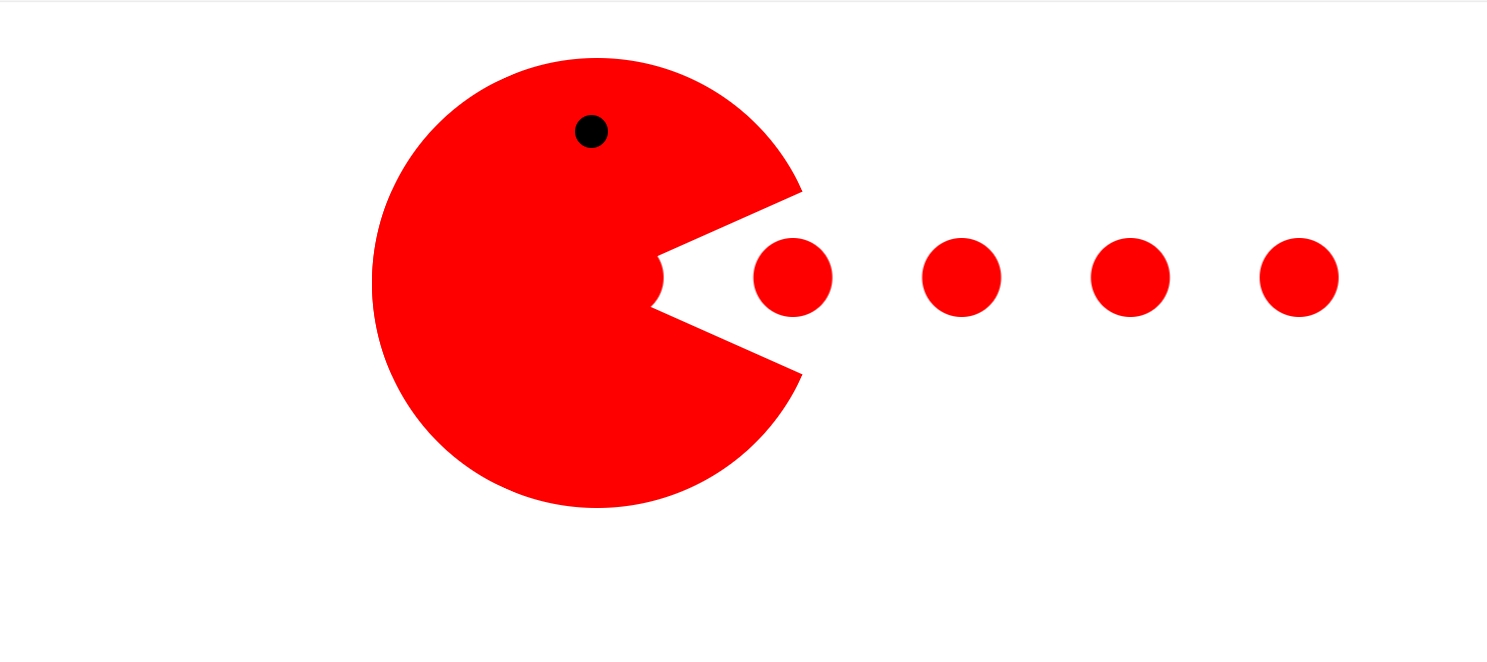
这个代码实现了一个有趣的动画效果,主要是一个红色圆形(嘴巴)开合动画和几个小红豆移动的动画。
代码部分:
<!DOCTYPE html>
<!--
To change this license header, choose License Headers in Project Properties.
To change this template file, choose Tools | Templates
and open the template in the editor.
-->
<html>
    <head>
        <title>TODO supply a title</title>
        <meta charset="UTF-8">
        <meta name="viewport" content="width=device-width, initial-scale=1.0">
         <!--<title>TODO supply a title</title>-->
        <meta charset="UTF-8">
        <meta name="viewport" content="width=device-width, initial-scale=1.0">
   <style>
body{
margin:0px;
}
.pea{
width:800px;
height:400px;
/*background-color:#FF6633;*/
margin:auto;
margin-top:50px;
position: relative;
}
.pea .eat{
width:400px;
height:400px;
/*border:1px solid black;*/
border-radius:50%;
overflow:hidden;
/*background-color:#00FF33;*/
position: relative;
}
.pea .eat::before{
    content: "";
    display: block;
    width: 400px;
    height: 200px;
    background-color: red;
    transform: rotate(0deg);
    transform-origin: bottom center;
    /*transform: rotate(-30deg);*非常重要/
    /*transform-origin: bottom center;*/
    /*animation: alm .5s ease infinite alternate;非常重要*/
    animation: alm .5s ease infinite alternate;
}
@Keyframes alm{
    0% {
     transform: rotate(0deg);
    }
    100% {
        transform: rotate(-30deg);
    }
}
.pea .eat::after{
    content: "";
    display: block;
    width: 400px;
    height: 200px;
    background-color:red;
    transform: rotate(0deg);
    transform-origin: top center;
    animation: alm1 .5s ease infinite alternate;
    /*transform-origin: top center;非常重要*/
}
@Keyframes alm1{
    0% {
     transform: rotate(0deg);
    }
    100% {
        transform: rotate(30deg);
    }
}
.pea .eat .eye{
    width: 30px;
    height:30px;
    background-color: black;
   left:180px;
   top:50px;
   position: absolute;
   border-radius: 50%;
}
.pea .peas{
    width: 70px;
    height: 70px;
    background-color:red;
    position:absolute;
    left: 250px;
    top: 160px;
    border-radius: 50%;
    /*box-shadow:非常重要*/
    box-shadow:150px 0px 0px red,300px 0px 0px red,450px 0px 0px red,600px 0px 0px red;
    animation: move 1s ease infinite;

}
.eat:hover{
    cursor: pointer;
}
.peas:hover{
    cursor: pointer;
}
@Keyframes move{
    0% {
        transform:translateX(0px);
    }
    100%{
        transform:translateX(-150px);
    }
}
img{
    top: 0px;
    left: 0px;
    position: absolute;
    cursor: pointer;
}

</style>
<body>
<div class="pea">

<div class="eat">
    <div class="eye"></div>
</div>
    <div class="peas">

    </div>
</div>
</body>
</html>
关键CSS属性和动画
1. 嘴巴开合动画
.eat::before, .eat::after {
  content: "";
  display: block;
  width: 400px;
  height: 200px;
  background-color: red;
  /* 关键属性 */
  transform-origin: bottom/top center;
  animation: alm/alm1 .5s ease infinite alternate;
}关键点:
-
使用伪元素
::before和::after创建嘴巴的上下两部分 -
transform-origin: 设置旋转中心点-
before部分旋转中心在底部(bottom center) -
after部分旋转中心在顶部(top center)
-
-
animation: 定义动画-
alm和alm1是动画名称 -
.5s持续时间 -
ease缓动函数 -
infinite无限循环 -
alternate来回交替播放
-
动画定义:
@Keyframes alm {
  0% { transform: rotate(0deg); }
  100% { transform: rotate(-30deg); }
}

@Keyframes alm1 {
  0% { transform: rotate(0deg); }
  100% { transform: rotate(30deg); }
}-
上嘴唇(
before)从0度旋转到-30度 -
下嘴唇(
after)从0度旋转到30度 -
形成嘴巴张合的效果
2. 小红豆动画
.peas {
  width: 70px;
  height: 70px;
  background-color: red;
  border-radius: 50%;
  /* 关键属性 */
  box-shadow: 150px 0px 0px red, 300px 0px 0px red,
              450px 0px 0px red, 600px 0px 0px red;
  animation: move 1s ease infinite;
}关键点:
-
box-shadow: 创建多个小红豆的副本-
每个
150px 0px 0px red表示一个向右偏移150px的红色阴影 -
共创建了4个副本
-
-
animation: 定义移动动画-
move动画名称 -
1s持续时间 -
ease缓动函数 -
infinite无限循环
-
动画定义:
@Keyframes move {
  0% { transform: translateX(0px); }
  100% { transform: translateX(-150px); }
}
交互效果
-
小红豆向左移动150px
-
由于有多个阴影副本,形成连续的移动效果
.eat:hover, .peas:hover {
  cursor: pointer;
}-
鼠标悬停在嘴巴或小红豆上时,光标变为手型
总结
这个动画效果主要依靠:
-
CSS伪元素创建嘴巴的上下部分
-
transform-origin设置正确的旋转中心点 -
box-shadow复制多个小红豆 -
CSS动画(
@keyframes)实现运动和旋转效果 -
animation属性控制动画的播放方式。


 扫一扫
扫一扫


 被折叠的 条评论
为什么被折叠?
被折叠的 条评论
为什么被折叠?
 到【灌水乐园】发言


