


用d3绘制区间图
js、微信小程序创建区间图请看http://t.csdn.cn/Ddenp
前言
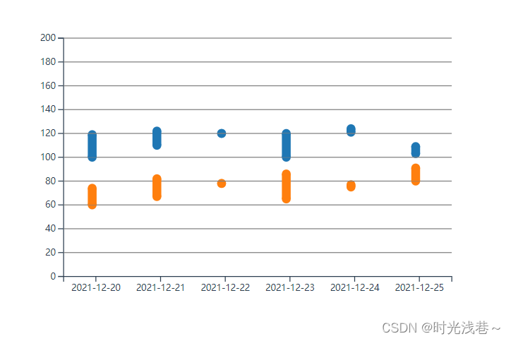
需求要求绘制血压区间图,在网上找了一圈,没有找到适合的,d3灵活性比较高,就用d3绘制了,用散点图和柱状图组合就是区间图了
一、安装d3
npm install d3 --save-dev
二、使用步骤
1.引入库
代码如下(示例):
import * as d3 from 'd3'
2.代码示例
<template>
  <div class="svg">

  </div>
</template>
基础配置
var w = 600;
var h = 400;
const _colors = d3.scaleOrdinal(d3.schemeCategory10)
const config = {
    pointColor: _colors(0),
		  barColor: _colors(1),
    margins: {top: 80, left: 80, bottom: 50, right: 80},
    textColor: 'black',
    gridColor: 'gray',
    ShowGridX: [1, 2, 3, 4, 5, 6, 7 ,8, 9, 10],
    ShowGridY: [20, 40, 60, 80, 100, 120, 140 ,160, 180, 200],
    title: '散点图',
    pointSize: 5,
    hoverColor: 'white',
    animateDuration: 1000
}
尺度转换
// 点数据(这是一列四个点,两条数据)
const data = [{"x":"2021-12-20","y":119,"t":1},{"x":"2021-12-20","y":100,"t":1},{"x":"2021-12-20","y":74,"t":2},{"x":"2021-12-20","y":60,"t":2},{"x":"2021-12-21","y":122,"t":1},{"x":"2021-12-21","y":110,"t":1},{"x":"2021-12-21","y":82,"t":2},{"x":"2021-12-21","y":67,"t":2},{"x":"2021-12-22","y":120,"t":1},{"x":"2021-12-22","y":120,"t":1},{"x":"2021-12-22","y":78,"t":2},{"x":"2021-12-22","y":78,"t":2},{"x":"2021-12-23","y":120,"t":1},{"x":"2021-12-23","y":100,"t":1},{"x":"2021-12-23","y":86,"t":2},{"x":"2021-12-23","y":65,"t":2},{"x":"2021-12-24","y":124,"t":1},{"x":"2021-12-24","y":121,"t":1},{"x":"2021-12-24","y":77,"t":2},{"x":"2021-12-24","y":75,"t":2},{"x":"2021-12-25","y":109,"t":1},{"x":"2021-12-25","y":103,"t":1},{"x":"2021-12-25","y":91,"t":2},{"x":"2021-12-25","y":80,"t":2}]
const g_width= w - config.margins.left - config.margins.right //g元素(图表的宽度)
const g_height= h - config.margins.top - config.margins.bottom //g 元素的高

const left = g_height/(data.length/4)
var scaleY = d3.scaleLinear()
                .domain([0, Math.ceil(d3.max(config.ShowGridY, (d) => d)/10)*10])
                .range([g_height, 0])
/* ----------------------------尺度转换------------------------  */
const scaleX = d3.scaleBand()
         .domain(data.map((d) => d.x))
         .range([0, g_width])

const Y = d3.scaleLinear()
         .domain([0, d3.max(data, (d) => d.y)])
         .range([g_height, 0])

console.log(scaleX,scaleY)
var svg = d3.select(".svg")
			.append("svg")
			.attr("width", w)
			.attr("height", h);
坐标轴
svg.append("g")
        .attr('transform', 'translate('+ config.margins.left +',' + (parseFloat(config.margins.top) + parseFloat(g_height)) + ')')
        .attr('class', 'xAxis')
        .call(d3.axisBottom(scaleX));
svg.append("g")
		.attr('transform', 'translate('+ config.margins.left +',' + config.margins.top + ')')
		.attr('class', 'yAxis')
		.call(d3.axisLeft(scaleY));
//画线
d3.selectAll('.yAxis .tick')
    .each(function(d, i){
        if (config.ShowGridY.indexOf(d) > -1){
            d3.select(this).append('line')
              .attr('class','grid')
              .attr('stroke', config.gridColor)
              .attr('x1', 0)
              .attr('y1', 0)
              .attr('x2', g_width)
              .attr('y2', 0);
        }
    });
点坐标
let points = svg.selectAll('.point')
	            .data(data);

    points.enter()
        .append('circle')
        .classed('point', true)
        .merge(points)
        .attr('transform', 'translate('+ (config.margins.left+left-12.5) +',' + config.margins.top + ')')
        .attr('cx', (d) => scaleX(d.x))
        .attr('cy', (d) => scaleY(d.y))
        .attr('r', 0)
        .attr('fill', (d) => {
          if(d.t==1){
            return _colors(0)
          } else {
            return _colors(1)
          }
				})
        .transition().duration(config.animateDuration)
        .attr('r', config.pointSize)
柱状图
let bars = svg.selectAll('.bar')
				.data(data1);

bars.enter()
		.append('rect')
		.attr('class','bar')
		.merge(bars)
		.attr('transform', 'translate('+ (config.margins.left+left-12.5) +','+ config.margins.top +')')
		.attr('x', (d) => {
			return scaleX(d.x) - 5
		})
		.attr('y', (d) => scaleY(d.y))
		.attr('width', 10)
		.attr('height', (d) => scaleY(d.h))
		.attr('fill', (d) => {
			if(d.t==1){
				return _colors(0)
			} else {
				return _colors(1)
			}
		})
		.transition().duration(config.animateDuration)
		.attr('height', (d) => g_height - scaleY(d.h))
		.attr('y', (d) => scaleY(d.y));
完整代码
<template>
  <div class="svg">

  </div>
</template>

<script>
import * as d3 from 'd3'
// import {chart} from "@/assets/js/chart.js"
export default {
  name: 'HelloWorld',
  data () {
    return {
      // arr: [1,2,3,4,5]
    }
  },
  mounted() {
	  var w = 600;
	  var h = 400;
	  const _colors = d3.scaleOrdinal(d3.schemeCategory10)
	  const config = {
      pointColor: _colors(0),
      barColor: _colors(1),
      margins: {top: 80, left: 80, bottom: 50, right: 80},
      textColor: 'black',
      gridColor: 'gray',
      ShowGridX: [1, 2, 3, 4, 5, 6, 7 ,8, 9, 10],
      ShowGridY: [20, 40, 60, 80, 100, 120, 140 ,160, 180, 200],
      title: '散点图',
      pointSize: 5,
      hoverColor: 'white',
      animateDuration: 1000
	  }
    // 点数据
	  const data = [{"x":"2021-12-20","y":119,"t":1},{"x":"2021-12-20","y":100,"t":1},{"x":"2021-12-20","y":74,"t":2},{"x":"2021-12-20","y":60,"t":2},{"x":"2021-12-21","y":122,"t":1},{"x":"2021-12-21","y":110,"t":1},{"x":"2021-12-21","y":82,"t":2},{"x":"2021-12-21","y":67,"t":2},{"x":"2021-12-22","y":120,"t":1},{"x":"2021-12-22","y":120,"t":1},{"x":"2021-12-22","y":78,"t":2},{"x":"2021-12-22","y":78,"t":2},{"x":"2021-12-23","y":120,"t":1},{"x":"2021-12-23","y":100,"t":1},{"x":"2021-12-23","y":86,"t":2},{"x":"2021-12-23","y":65,"t":2},{"x":"2021-12-24","y":124,"t":1},{"x":"2021-12-24","y":121,"t":1},{"x":"2021-12-24","y":77,"t":2},{"x":"2021-12-24","y":75,"t":2},{"x":"2021-12-25","y":109,"t":1},{"x":"2021-12-25","y":103,"t":1},{"x":"2021-12-25","y":91,"t":2},{"x":"2021-12-25","y":80,"t":2}]
    // 柱状图数据
    const data1 = [{"x":"2021-12-20","y":119,"h":19,"t":1},{"x":"2021-12-20","y":74,"h":14,"t":2},{"x":"2021-12-21","y":122,"h":12,"t":1},{"x":"2021-12-21","y":82,"h":15,"t":2},{"x":"2021-12-22","y":120,"h":0,"t":1},{"x":"2021-12-22","y":78,"h":0,"t":2},{"x":"2021-12-23","y":120,"h":20,"t":1},{"x":"2021-12-23","y":86,"h":21,"t":2},{"x":"2021-12-24","y":124,"h":3,"t":1},{"x":"2021-12-24","y":77,"h":2,"t":2},{"x":"2021-12-25","y":109,"h":6,"t":1},{"x":"2021-12-25","y":91,"h":11,"t":2}]

	  const g_width= w - config.margins.left - config.margins.right //g元素(图表的宽度)
	  const g_height= h - config.margins.top - config.margins.bottom //g 元素的高

	  const left = g_height/(data.length/4)
	  var scaleY = d3.scaleLinear()
	                  .domain([0, Math.ceil(d3.max(config.ShowGridY, (d) => d)/10)*10])
	                  .range([g_height, 0])
    /* ----------------------------尺度转换------------------------  */
    const scaleX = d3.scaleBand()
            .domain(data.map((d) => d.x))
            .range([0, g_width])

	  const Y = d3.scaleLinear()
            .domain([0, d3.max(data, (d) => d.y)])
            .range([g_height, 0])

    console.log(scaleX,scaleY)
    var svg = d3.select(".svg")
			.append("svg")
			.attr("width", w)
			.attr("height", h);
    //画点
    let points = svg.selectAll('.point')
	            .data(data);

    points.enter()
        .append('circle')
        .classed('point', true)
        .merge(points)
        .attr('transform', 'translate('+ (config.margins.left+left-12.5) +',' + config.margins.top + ')')
        .attr('cx', (d) => scaleX(d.x))
        .attr('cy', (d) => scaleY(d.y))
        .attr('r', 0)
        .attr('fill', (d) => {
          if(d.t==1){
            return _colors(0)
          } else {
            return _colors(1)
          }
				})
        .transition().duration(config.animateDuration)
        .attr('r', config.pointSize)
				//画坐标轴
    svg.append("g")
        .attr('transform', 'translate('+ config.margins.left +',' + (parseFloat(config.margins.top) + parseFloat(g_height)) + ')')
        .attr('class', 'xAxis')
        .call(d3.axisBottom(scaleX));
		svg.append("g")
				.attr('transform', 'translate('+ config.margins.left +',' + config.margins.top + ')')
				.attr('class', 'yAxis')
				.call(d3.axisLeft(scaleY));
		//画线
		d3.selectAll('.yAxis .tick')
		    .each(function(d, i){
		        if (config.ShowGridY.indexOf(d) > -1){
              d3.select(this).append('line')
                .attr('class','grid')
                .attr('stroke', config.gridColor)
                .attr('x1', 0)
                .attr('y1', 0)
                .attr('x2', g_width)
                .attr('y2', 0);
		        }
		    });

		// d3.selectAll('.xAxis .tick')
		//     .each(function(d, i){
		//         if (config.ShowGridX.indexOf(d) > -1){
		//             d3.select(this).append('line')
		//                 .attr('class','grid')
		//                 .attr('stroke', config.gridColor)
		//                 .attr('x1', 0)
		//                 .attr('y1', 0)
		//                 .attr('x2', 0)
		//                 .attr('y2', -g_height);
		//         }
		//     });

		//画柱状图


		/* ----------------------------渲染柱形------------------------  */
		let bars = svg.selectAll('.bar')
				.data(data1);

		bars.enter()
				.append('rect')
				.attr('class','bar')
				.merge(bars)
				.attr('transform', 'translate('+ (config.margins.left+left-12.5) +','+ config.margins.top +')')
				.attr('x', (d) => {
					return scaleX(d.x) - 5
				})
				.attr('y', (d) => scaleY(d.y))
				.attr('width', 10)
				.attr('height', (d) => scaleY(d.h))
				.attr('fill', (d) => {
					if(d.t==1){
						return _colors(0)
					} else {
						return _colors(1)
					}
				})
				.transition().duration(config.animateDuration)
				.attr('height', (d) => g_height - scaleY(d.h))
				.attr('y', (d) => scaleY(d.y));


  },
  methods: {
     }
}
</script>

<style>
.box{
    margin: 10% auto;
    width: 600px;
    height: 400px;
    background-color: #ddd;
}

.axisText{
    font-size: 15px;
}

.title{
    font-size: 20px;
}
</style>
总结
以上是组合图,也可以单独用柱状图显示区间,看需求和ui设计


 7466
7466


 被折叠的 条评论
为什么被折叠?
被折叠的 条评论
为什么被折叠?
 到【灌水乐园】发言


