


Taro中使用Input组件
背景
在Taro&React环境中实现验证码弹窗,弹出时输入框自动聚焦,拉起键盘,输入的字符展示到6个小格子中,60s后可重新发送验证码。本文主要介绍Input的使用以及踩坑解决方案

Input技术方案
全程只使用一个输入框,悬浮在6个小格之上,输入后依次渲染到小格之上
遇到的问题
1、Input样式问题
Input组件用户全程无感,边框、value、光标等都需要隐藏掉,因此css写了下方代码
// 移除边框
 outline: 0;
 // 移除光标
 caret-color: transparent !important;
 // 字体设置成透明
 color: transparent;
 background-color: transparent;
按照上方代码设置caret-color后,光标还是无法隐藏,因此走了野路子,从元素的维度隐藏掉,输入框宽度150% ,左移50%,光标即可隐藏
  // 隐藏光标
  left: -50%;
  width: 150%;
2、自动聚焦后Input被键盘遮挡
问题描述:
打开弹窗后,立即执行了聚焦的代码先拉起了键盘,后渲染的弹窗,导致弹窗被键盘完全遮挡
解决方案:
    useEffect(() => {
      if (count === 1) {
        setTimeout(() => inputRef.current.focus(), 500);
      }
    }, [count]);
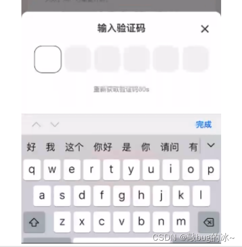
3、键盘没有遮住输入框,但是遮住了“重新发送”按钮
原图:
实际效果:

解决方案:
设置光标距离键盘的垂直距离 cursorSpacing
 <Input
 	...
 	 cursorSpacing={75}
   />
代码
jsx
import { useRef, useState, useEffect, forwardRef, useImperativeHandle, useMemo, useCallback  } from 'react';
import { View, Image, Input } from '@tarojs/components';
import Taro from '@tarojs/taro';

import styles from './index.module.less';

 const inputRef = useRef();
 const [focusIndex, setFocusIndex] = useState();
 const [boxInfos, setBoxInfos] = useState();
 const [inputValue, setInputValue] = useState();

<View className={styles.inputVerifyBox}>
  <Input
    cursorSpacing={75}
    holdKeyboard={true}
    ref={inputRef}
    value={inputValue}
    type="text"
    focus={false}
    className={styles.input}
    onFocus={e => {
      console.log('聚焦');
    }}
    onBlur={() => {
      console.log('失去焦点');
    }}
    onInput={onChangeInput}
    maxlength={ 6}
  />
  <View className={styles.boxList}>
    {boxInfos?.map((v, vIndex) => {
      return (
        <View class={`${styles.boxItem} ${focusIndex === vIndex ? styles.boxActive : ''}`}>
          {v.value || ''}
        </View>
      );
    })}
  </View>
</View>
index.module.less
  .inputVerifyBox {
    position: relative;
    margin-top: 52px;
    .input {
      position: absolute;
      top: 0;
      left: 0;

      // 隐藏光标
      left: -50%;
      width: 150%;
      height: 99px;
      margin-right: 12px;
      background: transparent;
      outline: 0;
      // 移除光标
      caret-color: transparent !important;
      color: transparent;
      background-color: transparent;
    }

    .boxList {
      display: flex;
      justify-content: space-around;
      width: 100%;
      .boxItem {
        width: 99px;
        height: 99px;
        background: #f1f1f1;
        border-radius: 30px;
        text-align: center;
        line-height: 99px;
        margin-right: 12px;

        font-size: 36px;
        font-family: PingFang SC;
        font-weight: bold;
        &:last-child {
          margin-right: 0;
        }
      }
      .boxActive {
        background: #ffffff;
        border: 2px solid #333333;
      }
    }
  }


 312
312


 被折叠的 条评论
为什么被折叠?
被折叠的 条评论
为什么被折叠?
 到【灌水乐园】发言


