


 超级会员免费看
创建组件
由于第二,三篇已经讲过模块创建与在模块中如何创建组件我们直接跳过
不懂的返回去看看。
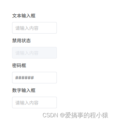
文本输入框
我的文本输入框继承T.TextField, 有部分属性我不想暴露,所以在外层在加上Item
// 需要暴露哪些属性通过alias映射出去既可
import QtQuick 2.12
import QtQuick.Controls 2.12
import QtQuick.Controls.impl 2.12
import QtQuick.Templates 2.12 as T
import "../common"

Item{

    id: control
    implicitWidth: edit.implicitWidth
    implicitHeight: edit.implicitHeight

    property alias text: edit.text
    property alias placeholderText: edit.placeholderText


    // 三种状态的不同颜色
    property color bgColor: BinColors.input_BgColor
    property color borderColor: BinColors.input_BorderColor
    property color foreColor: BinColors.input_ForeColor
    property color bgColor_Active: BinColors.input_BgColor_Active
    property color borderColor_Active: BinColors.input_BorderColor_Active
    property color foreColor_Active: BinColors.input_ForeColor_Active
    property color bgColor_Disabled: BinColors.input_BgColor_Disabled
    property color borderColor_Disabled: BinColors.input_BorderColor_Disabled
    property color foreColor_Disabled: BinColors.input_ForeColor_Disabled

    // 圆角,边框大小,
    property int radius: 4
    property int borderWidth: 1


    T.TextField {
        id: edit

        implicitWidth: implicitBackgroundWidth + leftInset + rightInset
                       || Math.max(contentWidth, placeholder.implicitWidth) + leftPadding + rightPadding
        implicitHeight: Math.max(implicitBackgroundHeight + topInset + bottomInset,
                                 contentHeight + topPadding + bottomPadding,
                                 placeholder.implicitHeight + topPadding + bottomPadding)

        padding: 6
        leftPadding: padding + 4
        antialiasing: true
        smooth: true


        state: {
            // 聚焦样式先不用|| activeFocus || visualFocus || highlighted
            if(activeFocus){
                return "active"
            }else if(!enabled){
                return "disabled"
            }else{
                return "normal"
            }
        }

        states: [
            State {
                name: "normal"
                PropertyChanges {
                    target: back
                    color: control.bgColor
                    border.color: control.borderColor
                }
                PropertyChanges {
                    target: edit
                    color: control.foreColor
                }
            },
            State {
                name: "active"
                PropertyChanges {
                    target: back
                    color: control.bgColor_Active
                    border.color: control.borderColor_Active
                }
                PropertyChanges {
                    target: edit
                    color: control.foreColor_Active
                }
            },
            State {
                name: "disabled"
                PropertyChanges {
                    target: back
                    color: control.bgColor_Disabled
                    border.color: control.borderColor_Disabled
                }
                PropertyChanges {
                    target: edit
                    color: control.foreColor_Disabled
                }
            }
        ]


        selectionColor: edit.palette.highlight
        selectedTextColor: edit.palette.highlightedText
        placeholderTextColor: Color.transparent(edit.color, 0.5)
        verticalAlignment: TextInput.AlignVCenter

        PlaceholderText {
            id: placeholder
            x: edit.leftPadding
            y: edit.topPadding
            width: edit.width - (edit.leftPadding + edit.rightPadding)
            height: edit.height - (edit.topPadding + edit.bottomPadding)

            text: edit.placeholderText
            font: edit.font
            color: edit.placeholderTextColor
            verticalAlignment: edit.verticalAlignment
            visible: !edit.length && !edit.preeditText && (!edit.activeFocus || edit.horizontalAlignment !== Qt.AlignHCenter)
            elide: Text.ElideRight
            renderType: edit.renderType
        }

        background: Rectangle {
            id: back
            implicitWidth: 144
            implicitHeight: 37
            border.width: control.borderWidth
            radius: control.radius
        }
    }

}
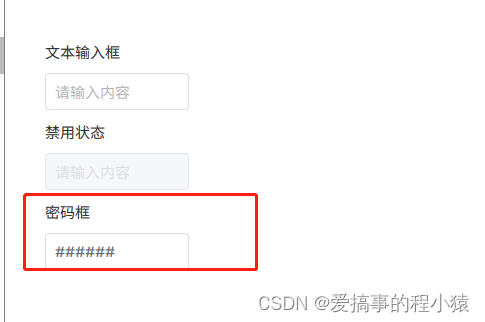
密码框
实际是与TextInput中echoMode设置有关
Label{
            text: qsTr("密码框")
        }

        Row{
            spacing: 10
            BinTextInput{
                placeholderText: qsTr("请输入内容")
                text: "123456"
                isPassword: true
                passwordCharacter: "#" //显示的密码掩码
            }
        }
数字输入框
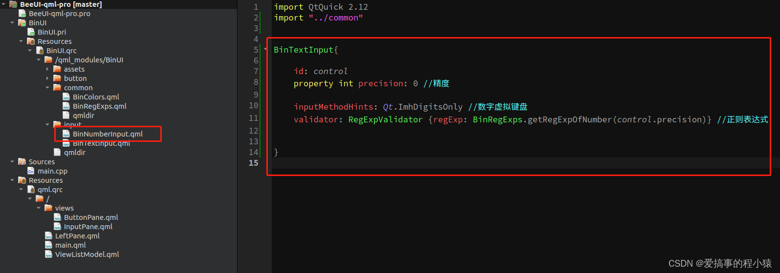
继承我们的文本输入框,使用正则表达式进行规范约束
源码
源码
索引InputPane.qml


 5062
5062

 被折叠的 条评论
为什么被折叠?
被折叠的 条评论
为什么被折叠?
 到【灌水乐园】发言


