


在这之前,我们先回顾一下上一期的知识点,之前我们讲了帧动画,就是利用动画里面一个均分动画时长的属性: animation-timing-function: steps(N);我们可以根据精灵图的人物的个数来分N;
然后了解了一下什么是弹性布局,这是浏览器推荐用的一种布局方式,有四个部分,水平方向的主轴,垂直方向的侧轴,父级叫弹性容器,子级叫弹性盒子;还有几种布局方式,均分、靠边、居中等,那么这一期接着讲;
我们可以发现就只可以按照水平方向排列太单一了,如果我们想要垂直方向排列怎么办,这里还有几个属性:
1、转换主轴:
主轴方向变为侧轴方向
flex-direction: column;相应的我们的侧轴变为主轴方向,那么我们控制主轴的对齐方式就可以在垂直方向显示,也就是这几个属性;
justify-content: center;
justify-content: space-around;
justify-content: space-evenly;
justify-content: space-between;
2、换行显示
flex-wrap: wrap;默认的弹性盒子是不会换行的,我们加上这一个就会换行,按照我们设置的宽高换行,默认的是nowrap,毕竟是弹性盒子,我们加的元素再多也会在一行改变宽度来将排列,这样的话就不能换行了,如果我们加了这个属性并且带有宽度的话,如果一行满了就会换行
3、侧轴排列方式
align-content: space-around;这个属性的作用和justify-content基本差不多,只不过是在侧轴方向进行排列,一般我们不会用到,如果感兴趣的可以去试一试;
<!DOCTYPE html>
<html lang="en">
<head>
<meta charset="UTF-8">
<meta http-equiv="X-UA-Compatible" content="IE=edge">
<meta name="viewport" content="width=device-width, initial-scale=1.0">
<title>index</title>
<link rel="stylesheet" href="../iconfont/iconfont.css">
<link rel="stylesheet" href="./css/base.css">
<link rel="stylesheet" href="./css/index.css">
</head>
<body>
<!-- 登录盒子 -->
<div class="login">
<div>
<!-- 标题和输入框 -->
<h5>login</h5>
<div class="tex">
<input type="text" placeholder="username">
<input type="text" placeholder="password">
</div>
</div>
<div>
<!-- 按钮 -->
<a href="#">登录</a>
</div>
</div>
</body>
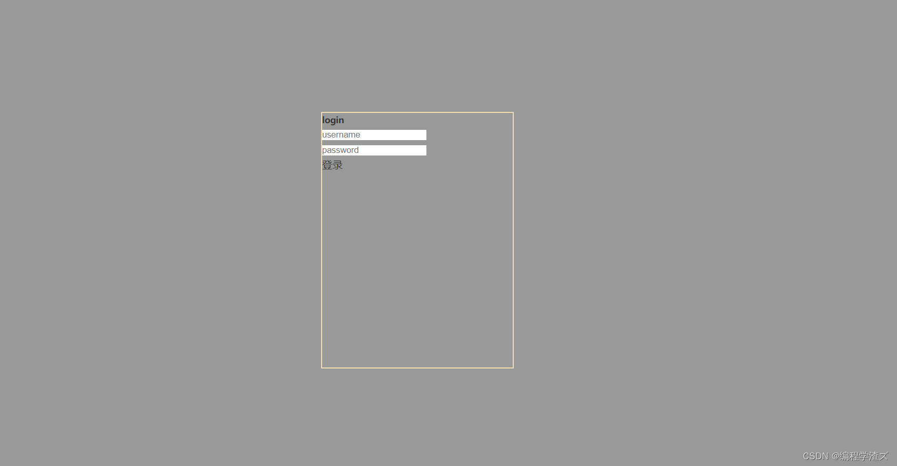
</html>盒子的结构就是这样的,css样式为index.css,base.css是用来清除默认样式的,另外我们还需要引入字体图标,相信大家都会用,我们就不过多赘述;
4、使用弹性布局来做一个登录页面
首先,我们在body上将登录页面的盒子居中:
body{
    display:flex;
    height: 100vh;
    flex-direction: column;
    justify-content: center;
    align-items: center;
    background-color: rgba(0,0,0,.4);
}
.login{
    width: 300px;
    height: 400px;
    border: 2px solid wheat;
}
这里使用了一个height:100vh,这个在将移动端适应的时候会讲到,作用就是适应屏幕,这里就先这样写,然后我们干了一件事,就是使用弹性布局并且转换了主轴,所以我们可以拿到这个效果:
那么接下来我们就对子元素进行美化一下,这里有两个输入框,我们可以使用公共样式来写比较简单;
既然弹性布局那么好用,我们也就干脆写成一个公共样式:
/* 公共样式 */
.common{
    width: 250px;
    height: 40px;
    border: 2px solid wheat;
    font-size: 20px;
    color: black;
    font-weight: bolder;
    border-radius: 15px;
}
.middle{
    display:flex;
    flex-direction: column;
    justify-content: space-evenly;
    align-items: center;
}
那么我们的盒子内容居中显示就只需要加上这个类就可以了,于是代码就变成了:
<body class="middle">
<!-- 登录盒子 -->
<div class="login middle">
<div class="content middle">
<!-- 标题和输入框 -->
<h1>login</h1>
<div class="txt middle">
<input class="common" type="text " placeholder="username">
<input class="common" type="password" placeholder="password">
</div>
</div>
<div>
<!-- 按钮 -->
<a href="#">登录</a>
</div>
</div>
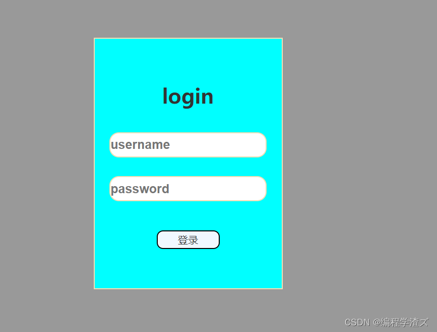
</body>但是对于已经居中了的input我们想要好看一点就需要加一个间距,另外给我们的第一部分加一个宽高分配一下盒子的空间;
/* 输入框和标题部分 */
.content{
    width: 300px;
    height: 200px;

}
.txt input{
    margin-top: 30px;
}
于是就变成了: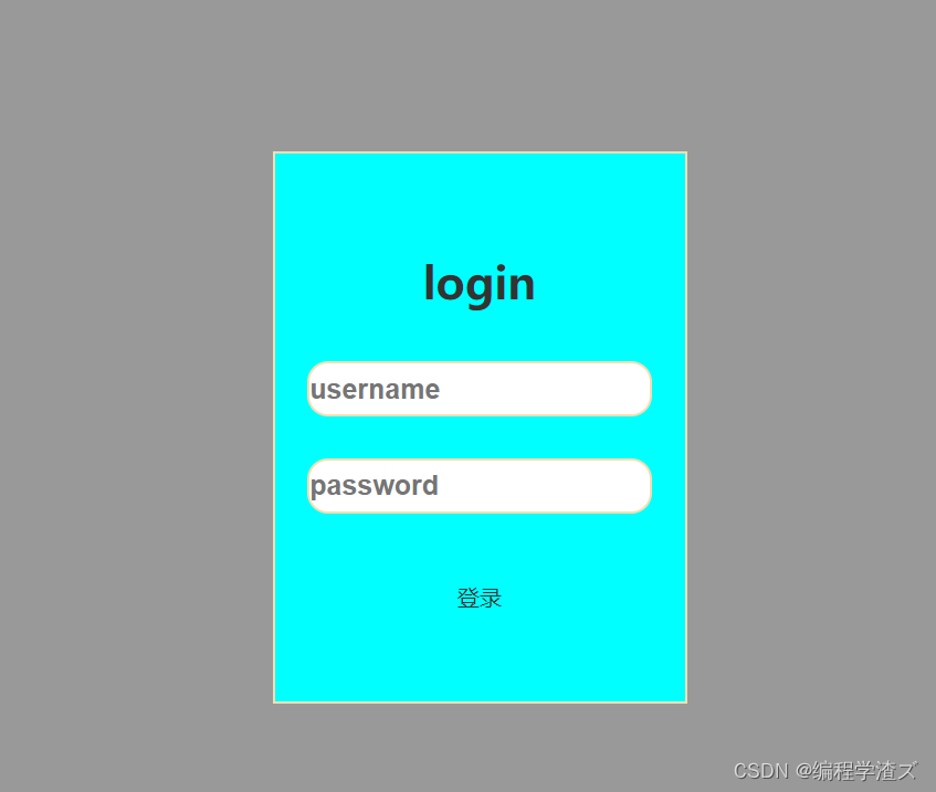
这样就好看多了,然后再美化一下最后的按钮,注意,如果行内标签出现在弹性盒子里面,那么它的宽高是可以变化的,一般我们的行内元素是无法直接改变宽高的;
        <div class="btn middle">
             <!-- 按钮 -->
            <a href="#">登录</a>
        </div>
我们同样给后面一部分也添加弹性布局,然后可以看到我们直接改变了宽高:
.btn{
    width: 100px;
    height: 30px;
    background-color: aliceblue;
    border-radius: 10px;
    border: 2px solid black;
}
于是样式变成了:
是不是特别方便;
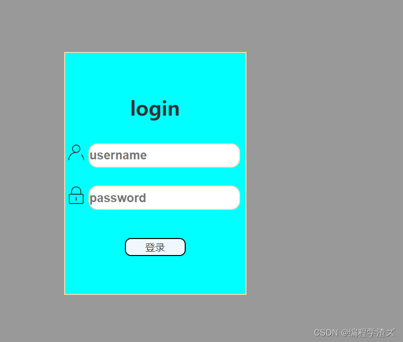
在txt部分加上弹性布局主要是为了讲解,其实不需要用的这么频繁,所以我们加下来去掉,然后加上图标来美化一下:
加上两个i标签作为图标的盒子
 <!-- 登录盒子 -->
    <div class="login middle">
        <div class="content middle">
            <!-- 标题和输入框 -->
            <h1>login</h1>
            <div class="txt">
                <i class="iconfont icon-login_zhanghu"></i><input class="common" type="text " placeholder="username">
                <i class="iconfont icon-login_mima"></i><input class="common" type="password" placeholder="password">
            </div>
        </div>
        <div class="btn middle">
             <!-- 按钮 -->
            <a href="#">登录</a>
        </div>
    </div>
编写样式在分配一下空间:
.txt i{
    font-size: 30px;
    margin: 0px 5px ;
}
最后变成了:
好了,那么这一期主要就是讲解一下弹性布局的用法,比较重要,所以大家一定要多加练习,我就不多逼逼了,还不会写登录页面的快去试试,这里推荐大家可以改进一下,比如我们将鼠标一上去的时候盒子翻转,然后显示一个注册页面,用到的内容也就是我们之前讲过的变换的内容,那这一期就到这了,熟能生巧;


 901
901


 被折叠的 条评论
为什么被折叠?
被折叠的 条评论
为什么被折叠?
 到【灌水乐园】发言


