


IE浏览不支持IE9及以下浏览器。使用纯CSS3制作的动感垂直手风琴列表ui界面设计效果。该手风琴特效设计时尚,颜色搭配非常好,每次点击手风琴项时都带有很酷的动画效果。HTML结构该手风琴特效的每一个手风琴项使用的是元素和元素的组合。在元素中放置的是每一个手风琴项的具体内容。
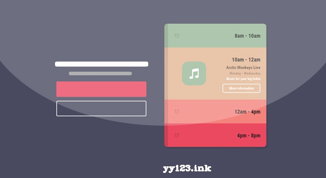
8am - 10am
Jamie talks design
Monday - Thursday
I talk a bunch of rubbish
More informationCSS样式手风琴的包裹元素div.app使用绝对定位,设置为固定的宽度和高度,以及一些阴影效果。同时使用帧动画来在页面加载时为手风琴添加一些放大和旋转的效果。.app { border-radius: 10px; width: 340px; margin: 0 auto; height: 414px; position: absolute; left: 0; top: 35%; box-shadow: 4px 5px 0px rgba(0, 0, 0, 0.11); -webkit-animation: intro 0.34s 0.4s cubic-bezier(1, 1.4, 0.41, 1.01) forwards; animation: intro 0.34s 0.4s cubic-bezier(1, 1.4, 0.41, 1.01) forwards; -webkit-transform: translateY(-50%) scale(0) rotateX(10deg) rotateY(10deg) rotateZ(10deg); transform: translateY(-50%) scale(0) rotateX(10deg) rotateY(10deg) rotateZ(10deg); margin: auto; overflow: hidden; font-family: "Roboto Condensed", sans-serif;} 接着在每一个手风琴项中,使用checkBox hack技术来设置手风琴项选中和未选中时,手风琴项中的左右侧内容的动画效果。.app_inner { position: relative;}.app_inner input[type="radio"] { display: none;}.app_inner input[type="radio"]:checked + label .app_inner__tab { height: 175px;}.app_inner input[type="radio"]:checked + label .app_inner__tab .tab_right { top: 39px; -webkit-transition: all 0.3s 0.2s cubic-bezier(0.455, 0.03, 0.515, 0.955); transition: all 0.3s 0.2s cubic-bezier(0.455, 0.03, 0.515, 0.955);}.app_inner input[type="radio"]:not(checked) + label .app_inner__tab { height: 80px; border-left: 12px solid rgba(0, 0, 0, 0.12);}.app_inner input[type="radio"]:not(checked) + label .app_inner__tab .tab_right { top: 200px; -webkit-transition: all 0.3s 0.3s cubic-bezier(0.455, 0.03, 0.515, 0.955); transition: all 0.3s 0.3s cubic-bezier(0.455, 0.03, 0.515, 0.955);}.app_inner input[type="radio"]:checked + label .app_inner__tab .tab_left .tab_left__image { -webkit-animation: move_in 0.55s 0.05s cubic-bezier(0.455, 0.03, 0.515, 0.955) forwards; animation: move_in 0.55s 0.05s cubic-bezier(0.455, 0.03, 0.515, 0.955) forwards; -webkit-transition: all 0.3s 0.36s cubic-bezier(0.455, 0.03, 0.515, 0.955); transition: all 0.3s 0.36s cubic-bezier(0.455, 0.03, 0.515, 0.955);}.app_inner input[type="radio"]:not(checked) + label .app_inner__tab .tab_left .tab_left__image { -webkit-animation: move_out 0.75s 0s cubic-bezier(0.455, 0.03, 0.515, 0.955) forwards; animation: move_out 0.75s 0s cubic-bezier(0.455, 0.03, 0.515, 0.955) forwards; -webkit-transition: all 0.3s 0.3s cubic-bezier(0.455, 0.03, 0.515, 0.955); transition: all 0.3s 0.3s cubic-bezier(0.455, 0.03, 0.515, 0.955);}.app_inner input[type="radio"]:checked + label .app_inner__tab .tab_left .big { left: 260px;}.app_inner input[type="radio"]:not(checked) + label .app_inner__tab .tab_left .big { left: 400px;}.app_inner input[type="radio"]:checked + label .app_inner__tab h2 i { opacity: 0;}.app_inner input[type="radio"]:not(checked) + label .app_inner__tab h2 i { opacity: .3;}
dd:


 1486
1486


 被折叠的 条评论
为什么被折叠?
被折叠的 条评论
为什么被折叠?
 到【灌水乐园】发言


