


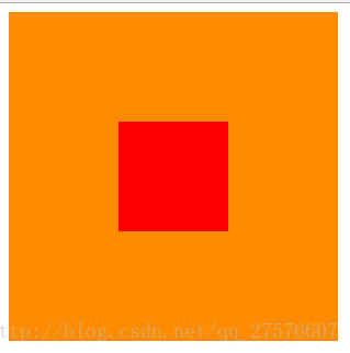
方案1:position 元素已知宽度
父元素设置为:position: relative;
子元素设置为:position: absolute;
距上50%,据左50%,然后减去元素自身宽度的距离就可以实现
效果图:
代码:
div class="box">
    <div class="content">
    </div>
</div>

.box {
    background-color: #FF8C00;
    width: 300px;
    height: 300px;
    position: relative;
}
.content {
    background-color: #F00;
    width: 100px;
    height: 100px;
    position: absolute;
    left: 50%;
    top: 50%;
    margin: -50px 0 0 -50px;
}
方案2:position transform 元素未知宽度
如果元素未知宽度,只需将上面例子中的margin: -50px 0 0 -50px;替换为:transform: translate(-50%,-50%);
代码:
<div class="box">
    <div class="content">
    </div>
</div>

.box {
    background-color: #FF8C00;
    width: 300px;
    height: 300px;
    position: relative;
}
.content {
    background-color: #F00;
    width: 100px;
    height: 100px;
    position: absolute;
    left: 50%;
    top: 50%;
    transform: translate(-50%,-50%);
}
方案3:flex布局
代码:
<div class="box">
    <div class="content">
    </div>
</div>

.box {
    background-color: #FF8C00;
    width: 300px;
    height: 300px;
    display: flex;//flex布局
    justify-content: center;//使子项目水平居中
    align-items: center;//使子项目垂直居中
}
.content {
    background-color: #F00;
    width: 100px;
    height: 100px;
}
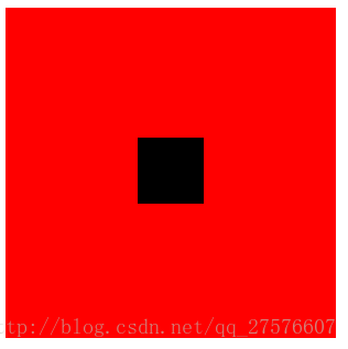
方案4:table-cell布局
因为table-cell相当与表格的td,td为行内元素,无法设置宽和高,所以嵌套一层,嵌套一层必须设置display: inline-block;td的背景覆盖了橘黄色,不推荐使用
效果图:
<div class="box">
    <div class="content">
        <div class="inner">
        </div>
    </div>
</div>

.box {
    background-color: #FF8C00;//橘黄色
    width: 300px;
    height: 300px;
    display: table;
}
.content {
    background-color: #F00;//红色
    display: table-cell;
    vertical-align: middle;//使子元素垂直居中
    text-align: center;//使子元素水平居中
}
.inner {
    background-color: #000;//黑色
    display: inline-block;
    width: 20%;
    height: 20%;
}


 1万+
1万+


 被折叠的 条评论
为什么被折叠?
被折叠的 条评论
为什么被折叠?
 到【灌水乐园】发言


