


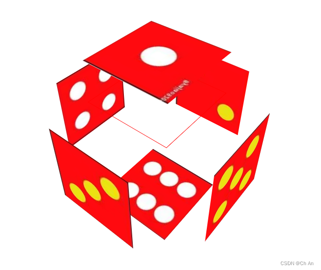
作业:做一个动画
<!DOCTYPE html>
<html>
	<head>
		<meta charset="utf-8">
		<title>图片魔方</title>
	</head>
	<style>
		body {
			perspective: 800px;
		}

		@keyframes myAnimation {
			from {
				transform: rotateX(0deg) rotateZ(0);
			}

			to {
				transform: rotateX(360deg) rotateZ(360deg);
			}
		}

		.con {
			width: 200px;
			height: 200px;
			margin: 300px auto;
			position: relative;
			border: 1px solid red;
			transform-style: preserve-3d;
			transform: rotateX(30deg) rotateY(60deg);
			animation: myAnimation 10s infinite linear;
		}

		.con>img {
			width: 200px;
			height: 200px;
			position: absolute;
		}

		.con:hover>img:first-child {
			transform: translateZ(-100px);
		}

		.con>img:nth-child(2) {
			left: -200px;
			transform: rotateY(90deg);
			transform-origin: right;
		}

		.con:hover>img:nth-child(2) {
			left: -300px;
			transform-origin: right;
		}

		.con>img:nth-child(3) {
			right: -200px;
			transform-origin: left;
			transform: rotateY(-90deg);
		}

		.con:hover>img:nth-child(3) {
			right: -300px;
			transform-origin: left;
		}

		.con>img:nth-child(4) {
			top: -200px;
			transform-origin: bottom;
			transform: rotateX(-90deg);
		}

		.con:hover>img:nth-child(4) {
			top: -300px;
			transform-origin: bottom;
		}

		.con>img:nth-child(5) {
			bottom: -200px;
			transform-origin: top;
			transform: rotateX(90deg);
		}

		.con:hover>img:nth-child(5) {
			bottom: -300px;
			transform-origin: top;
		}

		.con>img:last-child {
			transform: translateZ(200px);
		}

		.con:hover>img:last-child {
			transform: translateZ(300px);
		}
	</style>
	<body>
		<div class="con">
			<img src="./s1.png">
			<img src="./s2.png">
			<img src="./s3.png">
			<img src="./s4.png">
			<img src="./s5.png">
			<img src="./s6.png">
		</div>
	</body>
</html>


 812
812


 被折叠的 条评论
为什么被折叠?
被折叠的 条评论
为什么被折叠?
 到【灌水乐园】发言


