


简介
DSlate 是一个基于Slate 构建的React富文本编辑器。你可以通过插件的方式轻松自定义节点、工具等元素。
如果能帮到你,希望能给我一个Star。感谢!
文档
https://rojer95.github.io/dslate
功能
- 插件化:内置了基础编辑器常用插件,亦可自行定制插件扩展编辑器
- 国际化:支持国际化,可以与Antd、Semi的国际化联合使用
- 预设风格:预设了已经封装好Antd与Semi风格的开箱即用组件,亦可自行扩展风格
- 自定义上传:支持自定义上传,方便接入自有系统
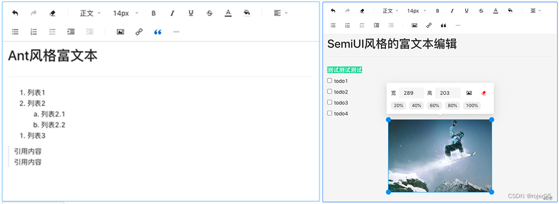
预览
使用方法
安装
# 根据自己想要的风格,以下任选其一
yarn install @dslate/antd # Ant 风格
yarn install @dslate/semi # Semi 风格
在代码中使用
import React, { useState } from 'react';
import type { Descendant } from 'slate';
// 二选一,或者自己封装
import DSlateAnt from '@dslate/dslate';
import DSlateSemi from '@dslate/semi';

export default () => {
  const [value, setValue] = useState<Descendant[]>([
    {
      type: 'paragraph',
      children: [{ text: '' }],
    },
  ]);


  return (
    <div>
      <DSlateAnt value={value} onChange={setValue} placeholder="Ant 风格编辑器" />
      <DSlateSemi value={value} onChange={setValue} placeholder="Semi 风格编辑器" />
    </div>
  );
};
插件开发
开发插件,只需要构建一个类型为DSlatePlugin的对象并导出到 DSlate 的ConfigProvider ,然后再 DSlate 组件的 在 toolbar 参数中配置插件的type值即可。详见下方代码
DSlatePlugin定义
type DSlatePlugin = {
  uuid?: React.Key; // 插件唯一标识 `不填会自动生成,一般情况下不需要填写`
  type: string; // 插件类型,作为插件渲染组件与样式等功能的识别的依据
  nodeType: 'element' | 'text' | 'tool'; // 节点类型
  isVoid?: ((element: DSlateCustomElement) => boolean) | boolean; // 是否为空元素
  isInline?: ((element: DSlateCustomElement) => boolean) | boolean; // 是否为行内元素
  toolbar?: React.ReactNode; // 在工具栏展示的组件,一般为一个ICON按钮
  renderElement?: (props: RenderElementPropsWithStyle, editor: Editor) => JSX.Element; // 作为 Element 容器节点渲染方法
  renderLeaf?: (props: RenderLeafPropsWithStyle, editor: Editor) => JSX.Element; // 作为 Text 叶子节点渲染方法
  renderStyle?:
    | ((node: Descendant, editor: Editor, props?: Record<string, any>) => CSSProperties)
    | CSSProperties; // 样式
  normalizeNode?: (entry: NodeEntry, editor: Editor, next: NormalizeNode) => void; // 规范化
  withPlugin?: (editor: Editor) => Editor; // 重写插件行为/添加辅助函数,同 Slate 用法
  onKeyDown?: (e: React.KeyboardEvent<HTMLDivElement>, editor: Editor) => void; // 键盘事件响应,同 Slate 用法
  isDefaultElement?: boolean; // 是否为默认渲染组件,一般情况下为false,只有段落为true
  locale?: Locale[]; // 插件内部 国际化语言包
  props?: Record<string, any>;  // 插件参数默认值
  serialize?: (element: any, pluginProps: any, children: any[]) => string; // 转 HTML 调用
  serializeWeapp?: (element: any, pluginProps: any, children: any[]) => any; // 转 小程序 调用
};
nodeType
- element:在自定义域中拥有语义的 Element 容器节点。(与 Slate 的 Element 容器节点 概念相同)
- text: 包含文档文本的 Text 叶子节点。(与 Slate 的 Text 叶子节点 概念相同)
- tool: 工具类型,不参与编辑器元素渲染,仅作为 Toolbar 的工具(比如:重做/撤销、清除样式等插件)
normalizeNode 规范化
规范化 是确保你的编辑器的内容总是正确形式的办法。它与 验证 相似,只是它的任务是修复内容,使它重新有效,而不仅仅是判断内容是否有效。
DSlate 的 规范化用法与 同Slate的规范化 基本相同,区别在于多了一个next参数,你需要在没有规范化的时候显示的调用next函数,以保证接下来的规范化能够顺利执行。
如下为link插件的规范化,他将空内容的 link 直接解除包裹以达到移除 link 的效果:
const normalizeNode = (entry: NodeEntry, editor: Editor, next: NormalizeNode) => {
  const [node, path] = entry;
  if (node.type === 'link') {
    const isEmpty = Node.string(node).length === 0;
    if (isEmpty) {
      // 如果内容为空 且 类型为 link
      Transforms.unwrapNodes(editor, {
        at: path,
        match: (n) => !Editor.isEditor(n) && n.type === TYPE,
        split: true,
      });
      return;
    }
  }

  next(entry);
};
插件 props
在插件中可以预设一些自定义参数。在插件中通过 usePlugin hook 可以取出预设的 props。
内置插件的预设 props 见: 插件/内置插件
const { props } = usePlugin();
除此之外,插件预设参数可以被 ConfigProvider 的 pluginProps 覆盖,因此我们能够自定义插件的预设参数。
例如文本颜色插件预设了 colors 参数(颜色列表)。你可以通过上述方法,来覆盖预设的颜色。
type PluginProps = Record<string, any>;

const pluginProps: PluginProps = {
  // ↱ 文本颜色插件的type值
  color: {
    // ↱ 文本颜色插件的预设颜色,是一个string[]
    colors: ['#000000', '#0969da', '#da3109'],
  },
};
Demo
- 通过设置插件参数
- 修改预设字体/背景颜色
- 设置默认上传图片 100%宽度铺满
- 自定义一个插入文本的插件
import React, { useState } from 'react';
import type { Descendant } from 'slate';
import { Range, Transforms } from 'slate';

import DSlate, { DefaultToolbar, DefaultPlugin } from '@dslate/dslate';
import type { DSlatePlugin } from '@dslate/core';
import { usePlugin } from '@dslate/core';
import { ConfigProvider, defaultConfig } from '@dslate/core';
import { Toolbar } from '@dslate/component';
import { useSlate } from 'slate-react';

/**
 * 自定义一个插入文本的插件
 */

const CustomPluginToolbar = () => {
  const editor = useSlate();
  const { props } = usePlugin();

  const toggleText = () => {
    if (!editor.selection) return;
    if (Range.isExpanded(editor.selection)) {
      Transforms.delete(editor);
      Transforms.insertText(editor, props?.changeText);
    } else {
      Transforms.insertText(editor, props?.insertText);
    }
  };

  return <Toolbar.Button onClick={toggleText}>一段文本</Toolbar.Button>;
};

const CustomPlugin: DSlatePlugin = {
  type: 'custom',
  nodeType: 'tool',
  toolbar: <CustomPluginToolbar />,
  props: {
    insertText: '插入文本文案',
    changeText: '转为特定文本文案',
  },
};

export default () => {
  const [value, setValue] = useState<Descendant[]>([
    {
      type: 'paragraph',
      children: [{ text: '' }],
    },
  ]);

  return (
    <ConfigProvider
      value={{
        ...defaultConfig,
        plugins: [...Object.values(DefaultPlugin), CustomPlugin],
        pluginProps: {
          color: { colors: ['#000000', '#0969da', '#da3109'] },
          'background-color': { colors: ['#000000', '#0969da', '#da3109'] },
          img: {
            defaultWidth: '100%',
          },
        },
      }}
    >
      <DSlate value={value} onChange={setValue} toolbar={[...DefaultToolbar, 'custom']} />
    </ConfigProvider>
  );
};
国际化
DSlate 提供了插件国际化功能,目前插件内仅内置了中文与英文,如需要可自行扩展。
其他具体使用方法见文档,这里只展示了与Ant组件一起使用的中英文切换
import React, { useState } from 'react';

import DSlate, { ConfigProvider, defaultConfig, Locales } from '@dslate/antd';
import {
  ConfigProvider as AntdConfigProvider,
  DatePicker,
  Radio,
  Space,
} from 'antd';
import enUS from 'antd/lib/locale/en_US';
import zhCN from 'antd/lib/locale/zh_CN';

import type { Descendant } from 'slate';

// 将DSlate的语言定义与Ant的语言包关联起来
const locales = {
  [Locales.enUS]: enUS,
  [Locales.zhCN]: zhCN,
};

export default () => {
  const [localeCode, setLocaleCode] = useState<string>(Locales.zhCN);
  const [value, setValue] = useState<Descendant[]>([
    {
      type: 'paragraph',
      children: [{ text: '' }],
    },
  ]);

  return (
    <div>
      <div style={{ marginBottom: 16 }}>
        <Space>
          <span style={{ marginRight: 16 }}>Change locale of components: </span>
          <Radio.Group
            value={localeCode}
            onChange={(e) => {
              const localeValue = e.target.value;
              setLocaleCode(localeValue);
            }}
          >
            <Radio.Button key={Locales.zhCN} value={Locales.zhCN}>
              中文
            </Radio.Button>
            <Radio.Button key={Locales.enUS} value={Locales.enUS}>
              English
            </Radio.Button>
          </Radio.Group>
        </Space>
      </div>
      {/* Antd的国际化配置 */}
      <AntdConfigProvider locale={locales[localeCode]}>
        <div style={{ marginBottom: 16 }}>
          {/* DSlate的国际化配置 */}
          <ConfigProvider
            value={{
              ...defaultConfig,
              // 通过DSlate提供的 ConfigProvider 定义编辑器语言包。目前只有 placeholder 有用到,其余的语言包均定义在插件内部
              locales: [
                { locale: zhCN.locale, placeholder: '请在这里输入呦 (#^.^#)' },
                {
                  locale: enUS.locale,
                  placeholder: 'please enter here (#^.^#)',
                },
              ],
              // 当前选择的语言
              locale: localeCode,
            }}
          >
            <DSlate value={value} onChange={setValue} />
          </ConfigProvider>
        </div>
        <div style={{ marginBottom: 16 }}>Antd组件:</div>
        <div style={{ marginBottom: 16 }}>
          <DatePicker />
        </div>
      </AntdConfigProvider>
    </div>
  );
};
自定义上传文件
在编辑器使用过程中,会遇到需要上传文件的过程,而由于上传方法方式存在普遍的差异性,所以需要自定义文件上传的功能。
使用方法
对于自定义上传,DSlate 提供了一个 React 组件 ConfigProvider 用于全局配置上传回调函数。
回调函数
在全局配置了上传回调函数 customUploadRequest 后,在用户选择文件后 DSlate 会调用此函数。 如果没有配置上传回调函数,DSlate 则会按照默认方式,将文件转为 base64 文本串传递给渲染组件。
customUploadRequest: ({ onSuccess, onProgress, onError, file }) => {
  // 用户选择要上传的文件
  console.log(file);

  // 反馈上传进度到进度条
  onProgress?.({ percent: 10 });

  // 上传成功,返回一个包含url的object
  onSuccess?.({
    url: `...`,
  });

  // 上传失败
  onError?.(error);
};
回调参数说明
| 参数 | 说明 | 类型 |
|---|---|---|
| onProgress | 上传进度反馈回调 | (event: { percent: number }): void |
| onError | 失败回调 | (e: Error): void |
| onSuccess | 成功回调,body中需要含有url作为上传结果 | (body: Object): void |
| file | 需要上传的文件 | File |
示例代码
import React, { useState } from 'react';
import type { Descendant } from 'slate';

import DSlate from '@dslate/dslate';
import { ConfigProvider, defaultConfig } from '@dslate/core';

export default () => {
  const [value, setValue] = useState<Descendant[]>([
    {
      type: 'paragraph',
      children: [{ text: '' }],
    },
  ]);

  return (
    <div>
      <ConfigProvider
        value={{
          ...defaultConfig,
          customUploadRequest: ({ onSuccess, onProgress }) => {
            onProgress?.({ percent: 10 });
            setTimeout(() => {
              onProgress?.({ percent: 50 });
            }, 500);
            setTimeout(() => {
              // 这里模拟上传成功,传回一个URL
              onSuccess?.({
                url: `https://source.unsplash.com/300x200/?t=${new Date().valueOf()}`,
              });
            }, 1000);
          },
        }}
      >
        <DSlate value={value} onChange={setValue} />
      </ConfigProvider>
    </div>
  );
};


 832
832


 被折叠的 条评论
为什么被折叠?
被折叠的 条评论
为什么被折叠?
 到【灌水乐园】发言


