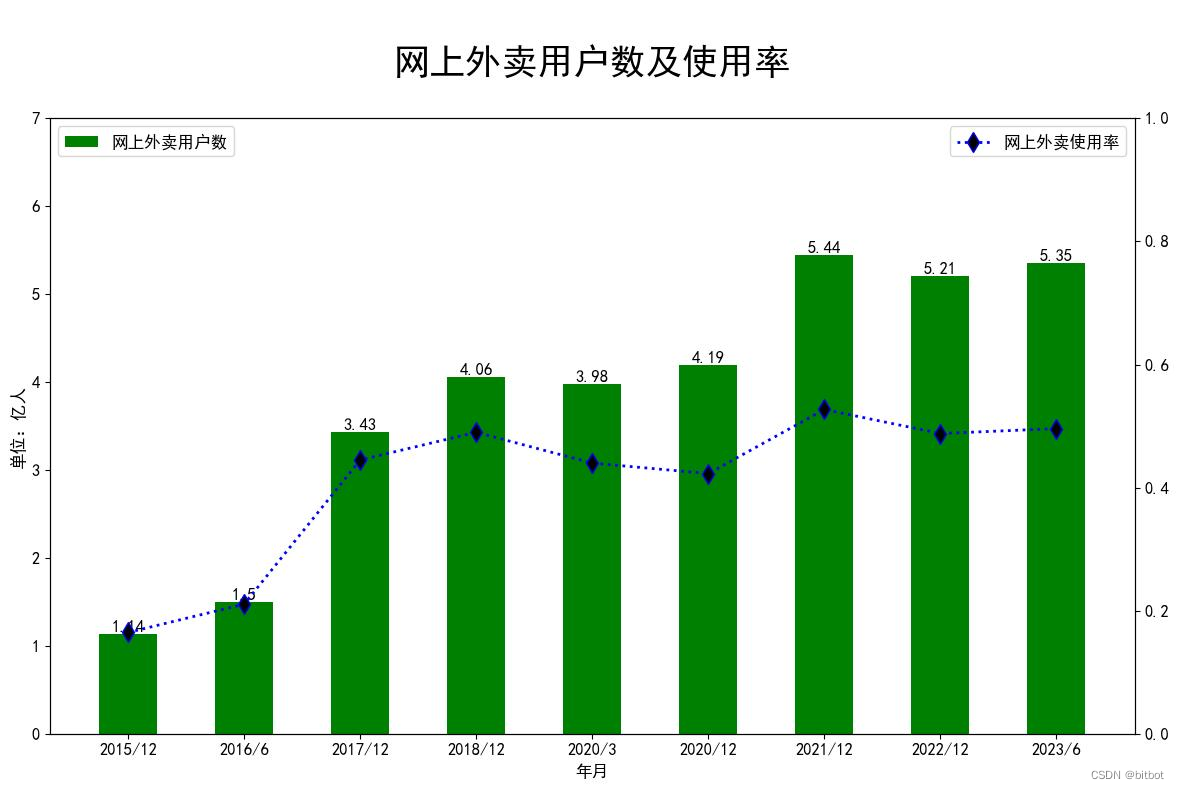
'''网上外卖用户规模及使用率'''
import matplotlib.pyplot as plt
import matplotlib.dates as mdates
import pandas as pd
l = [["2015/12", "1.14亿", "16.5%"], ["2016/6", "1.50亿", "21.1%"], ["2017/12", "3.43亿", "44.5%"], ["2018/12", "4.06亿", "49.0%"],
["2020/3", "3.98亿", "44.0%"], ["2020/12", "4.19亿", "42.3%"], ["2021/12", "5.44亿", "52.7%"], ["2022/12", "5.21亿", "48.8%"],
["2023/6", "5.35亿", "49.6%"]]
for i in l:
i[1] = float(i[1][:-1])
i[2] = float(i[2][:-1])/100
df = pd.DataFrame(l, columns=['Year', 'Population', 'Proportion'])
x = df['Year']
y1 = df['Population']
y2 = df['Proportion']
plt.rcParams['font.sans-serif'] = ['SimHei']
plt.rcParams['axes.unicode_minus'] = False
plt.rcParams.update({'font.size': 12})
plt.figure(figsize=(14, 8))
plt.subplot(111)
plt.bar(x, y1, 0.5, color='g', label='网上外卖用户数', )
for y,p in zip(df['Year'],df['Population']):
plt.text(y, p, str(p), ha='center', va= 'bottom',fontsize=12)
plt.ylim(0,7)
plt.legend(loc='upper left')
plt.ylabel("单位:亿人", fontsize=12, loc="center")
plt.xticks(x)
plt.xlabel("年月", fontsize=12, loc="center")
plt.twinx()
plt.plot(x, y2, ls='dotted', lw=2, color='b', marker='d', ms=10, mfc='k', label='网上外卖使用率')
plt.ylim(0, 1)
plt.legend(loc='upper right')
plt.title('\n网上外卖用户数及使用率\n', fontsize=26, loc='center', color='k')
plt.ylabel("", fontsize=20, loc="center")
plt.show()


 该文章通过数据可视化展示了中国网上外卖用户从2015年至2023年的规模变化以及使用率的增长情况,以柱状图和折线图的形式呈现了关键数据点和趋势。


 1万+
1万+


 被折叠的 条评论
为什么被折叠?
被折叠的 条评论
为什么被折叠?
 到【灌水乐园】发言


