


1、文字以及行内元素居中
水平居中: text-align: center;
垂直居中:line-height: 行高;
        .box{
            width: 200px;
            height: 200px;
            background-color: aquamarine;
            text-align: center;
            line-height: 200px;

        }
2、块级元素的居中方式
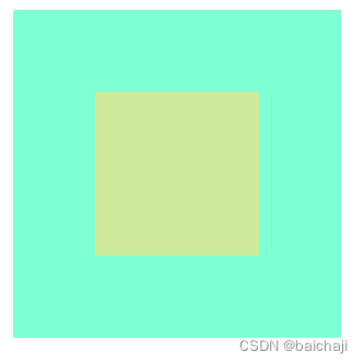
1、利用弹性布局居中元素
给父元素设置弹性布局,在设置水平居中,垂直居中
        .box{
            width: 200px;
            height: 200px;
            background-color: aquamarine;
            display: flex;
            justify-content: center;
            align-items: center;
        }
        .son{
            width: 100px;
            height: 100px;
            background-color: pink;
        }
2、使用定位以及负外边距来设置居中
给父元素设置相对定位,子元素设置绝对定位,再给子盒子设置top left都为50% ,margin-left: -50px;margin-top: -50px;
        .box{
            width: 200px;
            height: 200px;
            background-color: aquamarine;
            position: relative;
        }
        .son{
            width: 100px;
            height: 100px;
            background-color: rgb(241, 120, 140);
            position: absolute;
            top: 50%;
            left: 50%;
            margin-left: -50px;
            margin-top: -50px;
        }
3、利用定位加css位移
给父元素设置相对定位,子元素设置绝对定位,再给子盒子设置top left都为50%,再给子元素设置transform:translate(-50%,-50%)
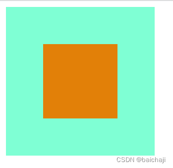
4、使用弹性布局加margin:auto
父元素设置display:flex,子元素 margin: auto
        .box{
            width: 200px;
            height: 200px;
            background-color: aquamarine;
            display: flex;
        }
        .son{
            width: 100px;
            height: 100px;
            background-color: rgb(226, 128, 8);
            margin: auto;
} 
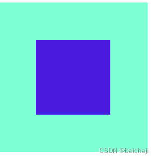
5、使用grid网格布局
给父元素设置弹性布局,display: grid;justify-content: center;align-items: center;
         .box{
            width: 200px;
            height: 200px;
            background-color: aquamarine;
            display: grid;
            justify-content: center;
            align-items: center;
        }
        .son{
            width: 100px;
            height: 100px;
            background-color: rgb(75, 26, 223);

        }


 240
240


 被折叠的 条评论
为什么被折叠?
被折叠的 条评论
为什么被折叠?
 到【灌水乐园】发言


