


view2.0暂不支持使用自定义图标,只能通过修改源码去实现

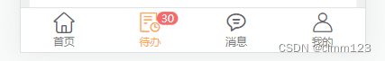
实现后的效果如下
1、先去图标库选择想要的icon加入项目,再生成代码
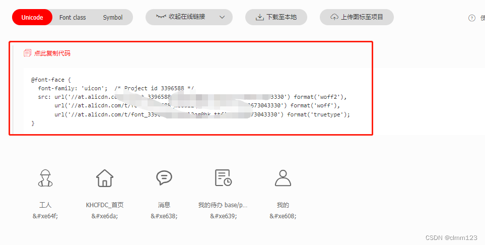
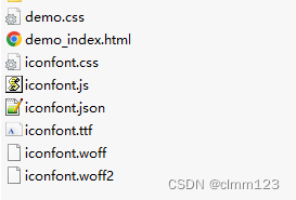
2、再点击下载代码,解压后如下
3、编写test.js文件,并通过 node test.js 执行
let path1 = "./iconfont.json";
let fs = require('fs');
const path = require('path');
let plays = JSON.parse(fs.readFileSync(path1));
const obj = {}
plays.glyphs.forEach((item)=>{
    obj['uicon-'+item.font_class] = '\\'+'u'+item.unicode
})
console.log(obj);
let json = "export default" + JSON.stringify(obj)
json = json.replace(/\\\\/g,'\\')
const r = path.resolve(__dirname,'myicons.js');
fs.writeFile(r,  json, 'utf8', (err) => {
    if (err) {
        console.log('写入文件出错拉!具体错误:' + err)
        return message.error("写入路径失败,请重新输入!")
    } else {
        console.log('ok');
    }
});
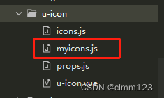
4、生成myicons.js文件
export default{"uicon-home":"\ue6da","uicon-message":"\ue638","uicon-upcoming":"\ue639","uicon-my":"\ue608"}
5、找到/uni_modules/uview-ui/components/u-icon的文件夹
把myicons.js复制到同目录下
6、修改u-icon.vue文件
引入生成的js文件及iconfont在线字体文件,修改获取icon的方法
<template>
	<view class="u-icon" @tap="clickHandler" :class="['u-icon--' + labelPos]">
		<image class="u-icon__img" v-if="isImg" :src="name" :mode="imgMode"
			:style="[imgStyle, $u.addStyle(customStyle)]"></image>
		<text v-else class="u-icon__icon" :class="uClasses" :style="[iconStyle, $u.addStyle(customStyle)]"
			:hover-class="hoverClass">{{icon}}</text>
		<!-- 这里进行空字符串判断,如果仅仅是v-if="label",可能会出现传递0的时候,结果也无法显示 -->
		<text v-if="label !== ''" class="u-icon__label" :style="{
			color: labelColor,
			fontSize: $u.addUnit(labelSize),
			marginLeft: labelPos == 'right' ? $u.addUnit(space) : 0,
			marginTop: labelPos == 'bottom' ? $u.addUnit(space) : 0,
			marginRight: labelPos == 'left' ? $u.addUnit(space) : 0,
			marginBottom: labelPos == 'top' ? $u.addUnit(space) : 0,
		}">{{ label }}</text>
	</view>
</template>

<script>
	// #ifdef APP-NVUE
	// nvue通过weex的dom模块引入字体,相关文档地址如下:
	// https://weex.apache.org/zh/docs/modules/dom.html#addrule
	const fontUrl = 'https://at.alicdn.com/t/font_2225171_8kdcwk4po24.ttf'
	const domModule = weex.requireModule('dom')
	domModule.addRule('fontFace', {
		'fontFamily': "uicon-iconfont",
		'src': `url('${fontUrl}')`
	})

	const myFontUrl = 'https://at.alicdn.com/t/font_3396588_o4th3i91nj.ttf?t=1652412137363'
	const myDomModule = weex.requireModule('dom')
	myDomModule.addRule('fontFace', {
		'fontFamily': "my-uicon-iconfont",
		'src': `url('${myFontUrl}')`
	})

	// #endif

	// 引入图标名称,已经对应的unicode
	import icons from './icons'

	import myicons from './myicons.js'

	import props from './props.js';;

	/**
	 * icon 图标
	 * @description 基于字体的图标集,包含了大多数常见场景的图标。
	 * @tutorial https://www.uviewui.com/components/icon.html
	 * @property {String}			name			图标名称,见示例图标集
	 * @property {String}			color			图标颜色,可接受主题色 (默认 color['u-content-color'] )
	 * @property {String | Number}	size			图标字体大小,单位px (默认 '16px' )
	 * @property {Boolean}			bold			是否显示粗体 (默认 false )
	 * @property {String | Number}	index			点击图标的时候传递事件出去的index(用于区分点击了哪一个)
	 * @property {String}			hoverClass		图标按下去的样式类,用法同uni的view组件的hoverClass参数,详情见官网
	 * @property {String}			customPrefix	自定义扩展前缀,方便用户扩展自己的图标库 (默认 'uicon' )
	 * @property {String | Number}	label			图标右侧的label文字
	 * @property {String}			labelPos		label相对于图标的位置,只能right或bottom (默认 'right' )
	 * @property {String | Number}	labelSize		label字体大小,单位px (默认 '15px' )
	 * @property {String}			labelColor		图标右侧的label文字颜色 ( 默认 color['u-content-color'] )
	 * @property {String | Number}	space			label与图标的距离,单位px (默认 '3px' )
	 * @property {String}			imgMode			图片的mode
	 * @property {String | Number}	width			显示图片小图标时的宽度
	 * @property {String | Number}	height			显示图片小图标时的高度
	 * @property {String | Number}	top				图标在垂直方向上的定位 用于解决某些情况下,让图标垂直居中的用途  (默认 0 )
	 * @property {Boolean}			stop			是否阻止事件传播 (默认 false )
	 * @property {Object}			customStyle		icon的样式,对象形式
	 * @event {Function} click 点击图标时触发
	 * @event {Function} touchstart 事件触摸时触发
	 * @example <u-icon name="photo" color="#2979ff" size="28"></u-icon>
	 */
	export default {
		name: 'u-icon',
		data() {
			return {

			}
		},
		mixins: [uni.$u.mpMixin, uni.$u.mixin, props],
		computed: {
			uClasses() {
				let classes = []
				classes.push(this.customPrefix + '-' + this.name)
				// // uView的自定义图标类名为u-iconfont
				// if (this.customPrefix == 'uicon') {
				// 	classes.push('u-iconfont')
				// } else {
				// 	classes.push(this.customPrefix)
				// }
				// 主题色,通过类配置
				if (this.color && uni.$u.config.type.includes(this.color)) classes.push('u-icon__icon--' + this.color)
				// 阿里,头条,百度小程序通过数组绑定类名时,无法直接使用[a, b, c]的形式,否则无法识别
				// 故需将其拆成一个字符串的形式,通过空格隔开各个类名
				//#ifdef MP-ALIPAY || MP-TOUTIAO || MP-BAIDU
				classes = classes.join(' ')
				//#endif
				return classes
			},
			iconStyle() {
				let style = {}
				style = {
					fontSize: uni.$u.addUnit(this.size),
					lineHeight: uni.$u.addUnit(this.size),
					fontWeight: this.bold ? 'bold' : 'normal',
					// 某些特殊情况需要设置一个到顶部的距离,才能更好的垂直居中
					top: uni.$u.addUnit(this.top)
				}
				// 非主题色值时,才当作颜色值
				if (this.color && !uni.$u.config.type.includes(this.color)) style.color = this.color

				return style
			},
			// 判断传入的name属性,是否图片路径,只要带有"/"均认为是图片形式
			isImg() {
				return this.name.indexOf('/') !== -1
			},
			imgStyle() {
				let style = {}
				// 如果设置width和height属性,则优先使用,否则使用size属性
				style.width = this.width ? uni.$u.addUnit(this.width) : uni.$u.addUnit(this.size)
				style.height = this.height ? uni.$u.addUnit(this.height) : uni.$u.addUnit(this.size)
				return style
			},
			// 通过图标名,查找对应的图标
			icon() {
				// 如果内置的图标中找不到对应的图标,就直接返回name值,因为用户可能传入的是unicode代码
				if (this.myIconObj) {
					return myicons['uicon-' + this.name] || this.name
				} else {
					return icons['uicon-' + this.name] || this.name
				}
			}
		},
		methods: {
			clickHandler(e) {
				this.$emit('click', this.index)
				// 是否阻止事件冒泡
				this.stop && this.preventEvent(e)
			}
		}
	}
</script>

<style lang="scss" scoped>
	@import "../../libs/css/components.scss";

	// 变量定义
	$u-icon-primary: $u-primary !default;
	$u-icon-success: $u-success !default;
	$u-icon-info: $u-info !default;
	$u-icon-warning: $u-warning !default;
	$u-icon-error: $u-error !default;
	$u-icon-label-line-height:1 !default;

	/* #ifndef APP-NVUE */
	// 非nvue下加载字体
	@font-face {
		font-family: 'uicon-iconfont';
		src: url('https://at.alicdn.com/t/font_2225171_8kdcwk4po24.ttf') format('truetype');
	}

	@font-face {
		font-family: 'my-uicon-iconfont';
		src: url('https://at.alicdn.com/t/font_3396588_o4th3i91nj.ttf?t=1652412137363') format('truetype');
	}

	/* #endif */

	.u-icon {
		/* #ifndef APP-NVUE */
		display: flex;
		/* #endif */
		align-items: center;

		&--left {
			flex-direction: row-reverse;
			align-items: center;
		}

		&--right {
			flex-direction: row;
			align-items: center;
		}

		&--top {
			flex-direction: column-reverse;
			justify-content: center;
		}

		&--bottom {
			flex-direction: column;
			justify-content: center;
		}

		&__icon {
			font-family: "my-uicon-iconfont", "uicon-iconfont";
			position: relative;
			@include flex;
			align-items: center;

			&--primary {
				color: $u-icon-primary;
			}

			&--success {
				color: $u-icon-success;
			}

			&--error {
				color: $u-icon-error;
			}

			&--warning {
				color: $u-icon-warning;
			}

			&--info {
				color: $u-icon-info;
			}
		}

		&__img {
			/* #ifndef APP-NVUE */
			height: auto;
			will-change: transform;
			/* #endif */
		}

		&__label {
			/* #ifndef APP-NVUE */
			line-height: $u-icon-label-line-height;
			/* #endif */
		}
	}
</style>
7、props.js文件增加自定义标识
// 自定义图标对象
myIconObj: {
	type: Boolean,
	default: false
}
8、在方法中使用
<u-tabbar-item text="首页" @click="clickTab">
	<u-icon slot="active-icon" :myIconObj="true" name="home" size="24" :color="bgColor" />
</u-tabbar-item>


 7945
7945


 被折叠的 条评论
为什么被折叠?
被折叠的 条评论
为什么被折叠?
 到【灌水乐园】发言


