


CSS3 边框
通过 CSS3,您能够创建圆角边框,向矩形添加阴影,使用图片来绘制边框 - 并且不需使用设计软件,比如 PhotoShop。
border-radius 属性创建圆角:
<!DOCTYPE html>
<html>
<head>

   <title>title</title>
    <meta http-equiv="Content-Type" content="text/html; charset=utf-8">

<style>

/**
 CSS3 圆角边框
 text-align:center ;         文字居中
 border:2px solid #ffff00;   边框大小 、 边框黄色
 padding:10px 40px;          文字与上下间距、 左右间距
 background:#dddddd;         div 背景
 width:350px;                div 宽度
 border-radius:25px;         圆角大小
*/

div
{
text-align:center;
border:2px solid #ffff00;
padding:10px 40px;
background:#dddddd;
width:350px;
border-radius:25px;

}
</style>
</head>


<body>

<div>border-radius 属性允许您向元素添加圆角。</div>

</body>
</html>

CSS3 边框阴影
box-shadow 用于向方框添加阴影:
<!DOCTYPE html>
<html>
<head>

   <title>title</title>
    <meta http-equiv="Content-Type" content="text/html; charset=utf-8">

<style>

/**
 CSS3 边框阴影
 width:300px;                      div 宽度
 height:100px;                     div 高度
 background-color:#ff0000;         div 背景 红色

box-shadow: 10px 10px 5px #888888;       x轴偏移、 y轴偏移 、模糊值 、 阴影颜色
*/

div
{
width:300px;
height:100px;
background-color:#ff0000;
box-shadow: 10px 10px 5px #888888;

}
</style>
</head>


<body>

<div></div>

</body>
</html>

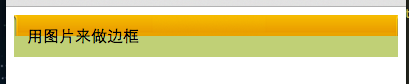
CSS3 边框图片
border-image 属性,您可以使用图片来创建边框:
<!DOCTYPE html>
<html>
<head>

   <title>title</title>
    <meta http-equiv="Content-Type" content="text/html; charset=utf-8">

<style>

/**
 CSS3 边框图片
 border-image-source                 用在边框的图片的路径
 border-image-slice                  图片边框向内偏移。
 border-image-width;                 图片边框的宽度


*/


.test{
	padding:10px;
	border-image-source:url(border.png);
	border-image-slice:27;
	border-image-width:auto;
}
}
</style>
</head>


<body>


<div class="test">用图片来做边框<br />border-image-width:auto;</div>


</body>
</html>


 1698
1698

 被折叠的 条评论
为什么被折叠?
被折叠的 条评论
为什么被折叠?
 到【灌水乐园】发言


