


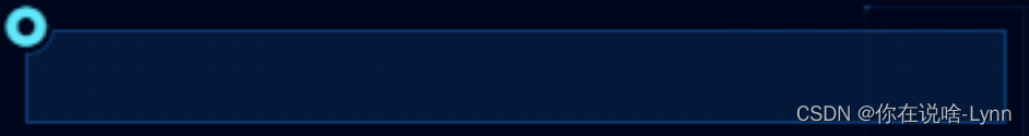
首先我们先画一个弧形缺角背景

<div class="title_rect"></div>
.title_rect {
	width: calc(100% - 8px);
	height: 40px;
	left: 8px;
	top: 8px;
	background: radial-gradient(circle at top left, transparent 12px, rgba(13, 58, 113, 0.36) 0)
	top left;
	overflow: hidden;
	position: relative;
	display: flex;
	justify-content: space-between;
}
这个时候如果给这个盒子加一个边框,并不能构成弧形缺角,会如下图所示:

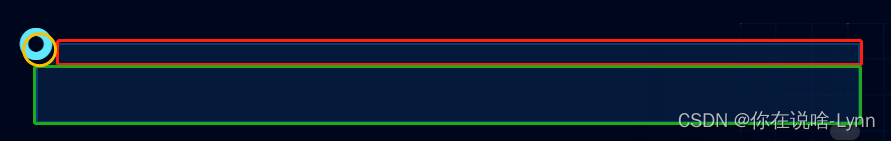
所以只能通过其他方式绘制边框,我们可以把边框拆成三部分:

<div :class="`title`">
  <div class="title_rect">
    <div class="title_rect_inner"></div>
  </div>
</div>
.title_rect {
  width: calc(100% - 8px);
  height: 40px;
  left: 8px;
  top: 8px;
  background: radial-gradient(circle at top left, transparent 12px, rgba(113, 70, 13, 0.36) 0)
    top left;
  overflow: hidden;
  position: relative;

  &_inner {
    position: absolute;
    display: block;
    width: 24px;
    height: 24px;
    background: transparent;
    left: -12px;
    top: -12px;
    border: 1px solid green;
    border-radius: 50%;
  }

  &::after {
    position: absolute;
    content: '';
    display: block;
    width: calc(100%);
    height: 28px;
    top: 12px;
    background: transparent;
    border: 1px solid blue;
    border-width: 0 1px 1px 1px;
  }
  &::before {
    position: absolute;
    content: '';
    display: block;
    width: calc(100% - 12px);
    height: 24px;
    left: 12px;
    background: transparent;
    border: 1px solid red;
    border-width: 1px 1px 0 0;
  }
}
后面就是根据自己需求实现对应的样式,就不具体展示啦。。。


 2004
2004


 被折叠的 条评论
为什么被折叠?
被折叠的 条评论
为什么被折叠?
 到【灌水乐园】发言


