


 文章详细介绍了如何在Vue.js组件中利用CSS实现气泡边框的三角形效果,强调了计算三角形偏移量以确保边框宽度一致的重要性,并对比了正确计算与直接设置偏移值的不同结果。代码示例展示了两种不同的实现方式。
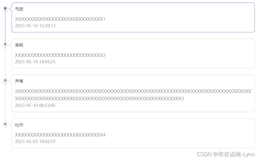
效果一
实现一个这样的功能其实不难,下面直接贴代码。但是案例中的气泡边框的三角形会有一个可能被忽视的问题。我们实现三角形的带边框的效果其实就是由两个三角形组成,紫色的三角形和白色的三角形叠加实现。如何实现一个三角形(下面示例把绿色当做白色)
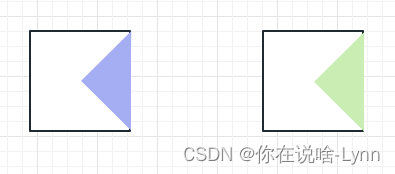
把背景去掉,两个三角形重叠,紫色部分就是我们需要的气泡角。
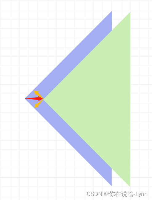
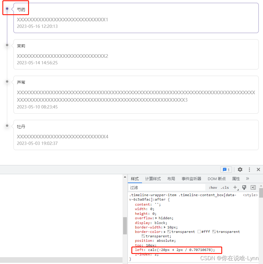
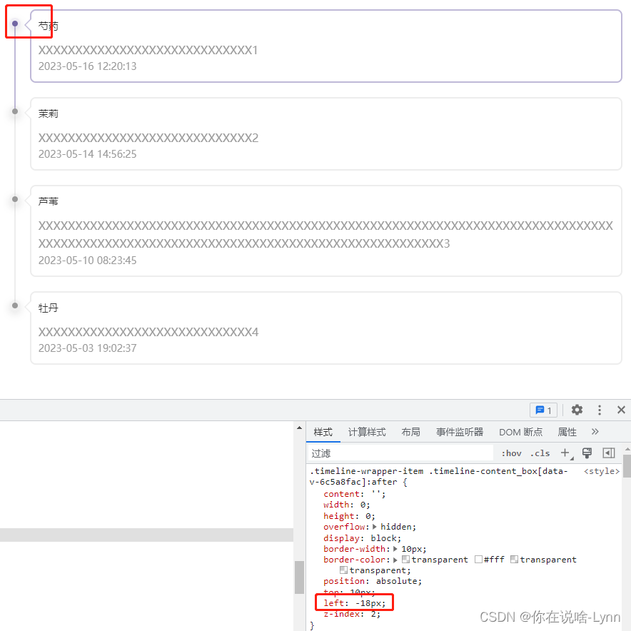
因为我们要保证紫色部分的宽度(也就是下图黄色箭头的距离)是和我们气泡边框的宽度一致为2的话,我们就要求等腰直角三角形的斜边长度就是我们绿色三角形偏移的距离:2px / cos(45deg)。
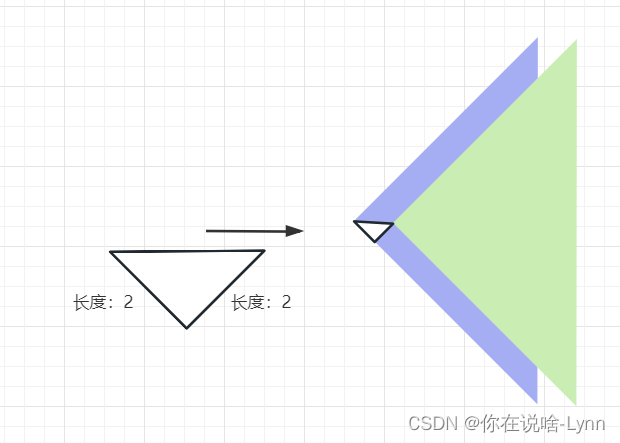
大部分人可能直接设置偏移2px,下面我来展示一下一个是通过计算得出来的偏移值(图1),一个是直接设置2px偏移(图2)
代码
<template>
  <ul class="timeline-wrapper">
    <li class="timeline-wrapper-item" v-for="item in operationList" :key="item.id">
      <div class="out-circle">
        <div class="in-circle"></div>
      </div>
      <div class="timeline-content">
        <div class="timeline-content_box">
          <div class="box-title">{{ item.name }}</div>
          <div class="box-desc">{{ item.remark }}</div>
          <div class="box-date">{{ item.createTime }}</div>
        </div>
      </div>
    </li>
  </ul>
</template>

<script lang="ts">
  import { defineComponent } from 'vue';

  export default defineComponent({
    name: 'OperationRecords',
    components: {},
    props: {
      operationList: {
        type: Array,
        default() {
          return [];
        },
      },
    },
    setup(props) {
      return {};
    },
  });
</script>

<style scoped lang="less">
  .timeline-wrapper {
    list-style: none;
    margin: 0;
    margin-top: 20px;
    padding: 0;

    &-item {
      position: relative;
      margin-left: 16px;
      border-left: 2px solid #ededed;
      &:last-child {
        border-left: 2px solid transparent !important;
      }
      &:first-child {
        border-left: 2px solid #bfb9d8 !important;
      }
      &:not(:first-child) {
        .out-circle {
          background: rgba(153, 153, 153, 0.1) !important;
          box-shadow: 0px 4px 12px 0px rgba(0, 0, 0, 0.1) !important;
          .in-circle {
            background: rgba(153, 153, 153, 1) !important;
            box-shadow: 0px 4px 12px 0px rgba(0, 0, 0, 0.1) !important;
          }
        }

        .timeline-content {
          &_box {
            border: 2px solid #ededed !important;
            &:before {
              border-color: transparent #ededed transparent transparent !important;
            }
          }
        }
      }

      .out-circle {
        position: absolute;
        top: -8px;
        left: -9px;
        width: 16px;
        height: 16px;
        background: rgba(113, 101, 163, 0.1);
        box-shadow: 0px 4px 12px 0px rgba(0, 0, 0, 0.1);
        /*opacity: 0.1;*/
        border-radius: 50%;
        display: flex;
        align-items: center;

        .in-circle {
          width: 8px;
          height: 8px;
          margin: 0 auto;
          background: rgba(113, 101, 163, 1);
          border-radius: 50%;
          box-shadow: 0px 4px 12px 0px rgba(0, 0, 0, 0.1);
        }
      }

      .timeline-content {
        position: relative;
        top: -20px;
        padding: 0 0 20px 20px;
        &_box {
          position: relative;
          border: 2px solid #bfb9d8;
          border-radius: 8px;
          padding: 10px;
          &:before {
            /*伪元素必须添加content*/
            content: '';
            width: 0;
            height: 0;
            overflow: hidden;
            display: block;
            border-width: 10px;
            border-color: transparent #bfb9d8 transparent transparent;
            position: absolute;
            top: 10px;
            left: -20px;
            z-index: 1;
          }
          &:after {
            content: '';
            width: 0;
            height: 0;
            overflow: hidden;
            display: block;
            border-width: 10px;
            border-color: transparent #fff transparent transparent;
            position: absolute;
            top: 10px;
            left: calc(-20px + 2px / cos(45deg));
            z-index: 2;
          }

          .box-title {
            font-size: 14px;
            word-break: break-all;
            margin-bottom: 10px;
            color: #333;
            font-weight: 500;
          }

          .box-date {
            font-size: 14px;
            color: #999999;
          }
          .box-desc {
            font-size: 16px;
            color: #999999;
          }
        }
      }
    }
  }
</style>

</style>
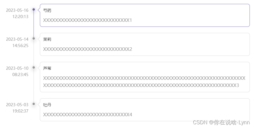
效果二
代码
<template>
  <ul class="timeline-wrapper">
    <li class="timeline-wrapper-item" v-for="item in operationList" :key="item.id">
      <div class="timeline-date">{{ item.createTime }}</div>
      <div class="out-circle">
        <div class="in-circle"></div>
      </div>
      <div class="timeline-content">
        <div class="timeline-content_box">
          <div class="box-title">{{ item.name }}</div>
          <div class="box-desc">{{ item.remark }}</div>
        </div>
      </div>
    </li>
  </ul>
</template>

<script lang="ts">
  import { defineComponent } from 'vue';

  export default defineComponent({
    name: 'OperationRecords',
    components: {},
    props: {
      operationList: {
        type: Array,
        default() {
          return [];
        },
      },
    },
    setup(props) {
      return {};
    },
  });
</script>

<style scoped lang="less">
  .timeline-wrapper {
    list-style: none;
    margin: 0;
    margin-top: 20px;
    padding: 0;

    &-item {
      position: relative;
      margin-left: 16px;
      left: 100px;
      border-left: 2px solid #ededed;
      &:last-child {
        border-left: 2px solid transparent !important;
      }
      &:first-child {
        border-left: 2px solid #bfb9d8 !important;
      }
      &:not(:first-child) {
        .out-circle {
          background: rgba(153, 153, 153, 0.1) !important;
          box-shadow: 0px 4px 12px 0px rgba(0, 0, 0, 0.1) !important;
          .in-circle {
            background: rgba(153, 153, 153, 1) !important;
            box-shadow: 0px 4px 12px 0px rgba(0, 0, 0, 0.1) !important;
          }
        }

        .timeline-content {
          &_box {
            border: 2px solid #ededed !important;
            &:before {
              border-color: transparent #ededed transparent transparent !important;
            }
          }
        }
      }

      .out-circle {
        position: absolute;
        top: -8px;
        left: -9px;
        width: 16px;
        height: 16px;
        background: rgba(113, 101, 163, 0.1);
        box-shadow: 0px 4px 12px 0px rgba(0, 0, 0, 0.1);
        /*opacity: 0.1;*/
        border-radius: 50%;
        display: flex;
        align-items: center;

        .in-circle {
          width: 8px;
          height: 8px;
          margin: 0 auto;
          background: rgba(113, 101, 163, 1);
          border-radius: 50%;
          box-shadow: 0px 4px 12px 0px rgba(0, 0, 0, 0.1);
        }
      }

      .timeline-date {
        width: 100px;
        height: 50px;
        //background: lightpink;
        position: absolute;
        top: -8px;
        left: -119px;
        font-size: 14px;
        color: #999999;
        text-align: right;
      }

      .timeline-content {
        position: relative;
        top: -20px;
        padding: 0 0 20px 20px;
        width: calc(100% - 100px);
        &_box {
          position: relative;
          border: 2px solid #bfb9d8;
          border-radius: 8px;
          padding: 10px;
          &:before {
            /*伪元素必须添加content*/
            content: '';
            width: 0;
            height: 0;
            overflow: hidden;
            display: block;
            border-width: 10px;
            border-color: transparent #bfb9d8 transparent transparent;
            position: absolute;
            top: 10px;
            left: -20px;
            z-index: 1;
          }
          &:after {
            content: '';
            width: 0;
            height: 0;
            overflow: hidden;
            display: block;
            border-width: 10px;
            border-color: transparent #fff transparent transparent;
            position: absolute;
            top: 10px;
            left: calc(-20px + 2px / cos(45deg));
            z-index: 2;
          }

          .box-title {
            font-size: 14px;
            word-break: break-all;
            margin-bottom: 10px;
            color: #333;
            font-weight: 500;
          }

          .box-desc {
            font-size: 16px;
            color: #999999;
          }
        }
      }
    }
  }
</style>
组件使用
<template>
  <div>
     <OperationRecords :operationList="operationList" />
  </div>
</template>

<script lang="ts">
  import { defineComponent, ref } from 'vue';
  import OperationRecords from './OperationRecords.vue';
  export default defineComponent({
    components: {
      OperationRecords,
    },
    setup() {
      const operationList = ref([
        {
          id: 1,
          name: '芍药',
          createTime: '2023-05-16 12:20:13',
          remark: 'XXXXXXXXXXXXXXXXXXXXXXXXXXXXX1',
        },
        {
          id: 2,
          name: '茉莉',
          createTime: '2023-05-14 14:56:25',
          remark: 'XXXXXXXXXXXXXXXXXXXXXXXXXXXXX2',
        },
        {
          id: 3,
          name: '芦苇',
          createTime: '2023-05-10 08:23:45',
          remark:
            'XXXXXXXXXXXXXXXXXXXXXXXXXXXXXXXXXXXXXXXXXXXXXXXXXXXXXXXXXXXXXXXXXXXXXXXXXXXXXXXXXXXXXXXXXXXXXXXXXXXXXXXXXXXXXXXXXXXXXXXXXXXXXXXXXXXXX3',
        },
        {
          id: 4,
          name: '牡丹',
          createTime: '2023-05-03 19:02:37',
          remark: 'XXXXXXXXXXXXXXXXXXXXXXXXXXXXX4',
        },
      ]);

      return {
        operationList,
      };
    },
  });
</script>


 扫一扫
扫一扫


 3万+
3万+

 被折叠的 条评论
为什么被折叠?
被折叠的 条评论
为什么被折叠?
 到【灌水乐园】发言


