


文章目录
概述
# Version
# pip install matplotlib==3.42

import numpy as np
import pandas as pd
import matplotlib.pyplot as plt

if __name__ == '__main__':
    ```Main function```
基础
绘图原理
matplotlib绘图的原理:在画布(figure)上绘制坐标系(axes),其中axes上的各个元素如下:
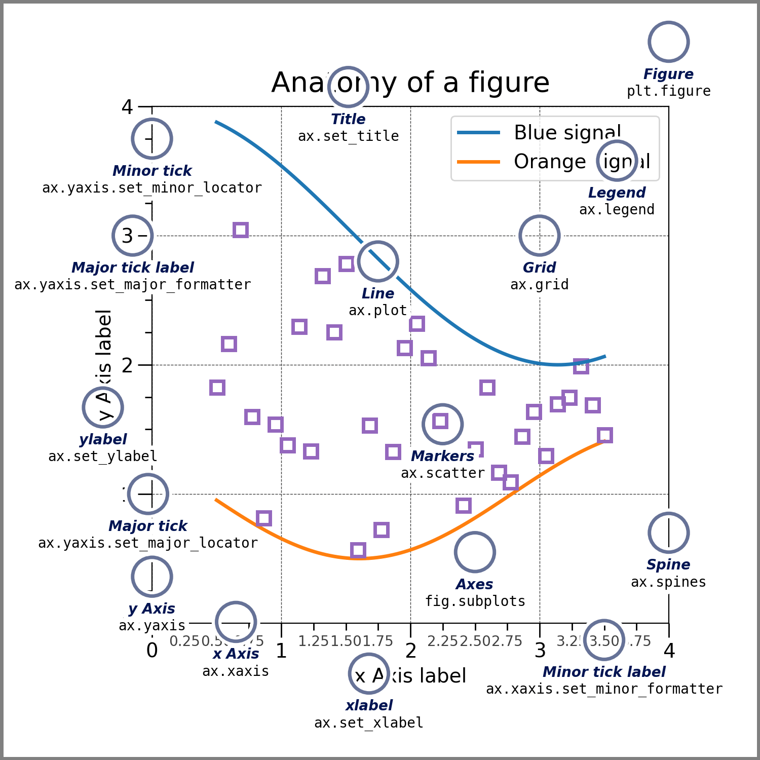
注意区分: Axes:整个坐标系;Axis:坐标系上的坐标轴;Artist:在figure上看到的所有元素都是Artist,包括:Figure,Axes,Axis,Text,Line2D,collections,Path对象等。
作图的方式
基于面向对象
x = np.linspace(0, 2, 100)
# Note that even in the OO-style, we use `.pyplot.figure` to create the figure.
fig, ax = plt.subplots()  # Create a figure and an axes.
ax.plot(x, x, label='linear')  # Plot some data on the axes.
ax.plot(x, x**2, label='quadratic')  # Plot more data on the axes...
ax.plot(x, x**3, label='cubic')  # ... and some more.
ax.set_xlabel('x label')  # Add an x-label to the axes.
ax.set_ylabel('y label')  # Add a y-label to the axes.
ax.set_title("Simple Plot")  # Add a title to the axes.
ax.legend()  # Add a legend.

基于pyplot接口
x = np.linspace(0, 2, 100)
plt.plot(x, x, label='linear')  # Plot some data on the (implicit) axes.
plt.plot(x, x**2, label='quadratic')  # etc.
plt.plot(x, x**3, label='cubic')
plt.xlabel('x label')
plt.ylabel('y label')
plt.title("Simple Plot")
plt.legend()

基于GUI
Figure和Axes整体布局
方式一
plt.figure(figsize=(5, 5)) # 先画一个figure
ax1 = plt.subplot(221) # subplot()只返回一个ax
ax1.set_title('221')
ax2 = plt.subplot(222)
ax2.set_title('222')

ax3 = plt.subplot(212)
ax3.set_title('212')
方式二
fig = plt.figure(constrained_layout= True) # 先画一个figure
ax0 = fig.add_subplot(221) # add_subplot()返回一个ax
ax0.set_title('ax0')
ax1 = fig.add_subplot(222)
ax1.set_title('ax1')
ax2 = fig.add_subplot(313)
ax2.set_title('ax1')
方式三
fig, (ax0, ax1) = plt.subplots(ncols= 2, nrows= 2, constrained_layout=True) # 先画一个figure,同时设计好所有ax,subplots()一次返回全部ax
ax0.set_title('ax0')
ax1.set_title('ax1')
ax2.set_title('ax2')
ax3.set_title('ax3')
Axes中的图形
柱状图
垂直柱状图
matplotlib.pyplot.bar(x, height, width=0.8, bottom=None, *, align='center', data=None, **kwargs)
# =============================================================================
# x, 柱子位置
# height, 柱子高度
# width, 柱子宽度,bar()时,默认0.8
# bottom, 柱子y值的起点,默认为0
# align, 柱子与x轴对齐方式
# color, 柱子颜色
# edgecolor, 柱子边缘颜色
# linewidth, 柱子边缘线宽
# tick_label, 柱子标签
# xerr, 误差
# yerr, 误差
# ecolor, 误差线颜色
# capsize, 误差SD大小
# log, 默认False,y轴取log值
# =============================================================================
import matplotlib.pyplot as plt
import numpy as np

N = 5
menMeans = (20, 35, 30, 35, -27)
womenMeans = (25, 32, 34, 20, -25)
menStd = (2, 3, 4, 1, 2)
womenStd = (3, 5, 2, 3, 3)
ind = np.arange(N)    # the x locations for the groups
width = 0.35       # the width of the bars: can also be len(x) sequence

fig, ax = plt.subplots()

p1 = ax.bar(ind, menMeans, width, yerr=menStd, label='Men')
p2 = ax.bar(ind, womenMeans, width,
            bottom=menMeans, yerr=womenStd, label='Women')

ax.axhline(0, color='grey', linewidth=0.8)
ax.set_ylabel('Scores')
ax.set_title('Scores by group and gender')
ax.set_xticks(ind)
ax.set_xticklabels(('G1', 'G2', 'G3', 'G4', 'G5'))
ax.legend()

# Label with label_type 'center' instead of the default 'edge'
ax.bar_label(p1, label_type='center') # 在柱子上添加标签
ax.bar_label(p2, label_type='center')
ax.bar_label(p2)

plt.show()
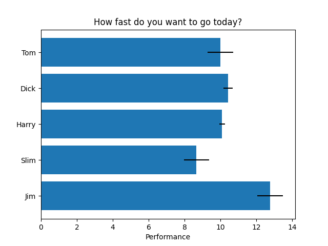
水平柱状图
matplotlib.pyplot.barh(x, height, width=0.8, bottom=None, *, align='center', data=None, **kwargs)
# =============================================================================
# x, 柱子位置
# height, 柱子高度,barh()时,默认0.8
# width, 柱子宽度
# bottom, 柱子y值的起点,默认为0
# align, 柱子与x轴对齐方式
# color, 柱子颜色
# edgecolor, 柱子边缘颜色
# linewidth, 柱子边缘线宽
# tick_label, 柱子标签
# xerr, 误差
# yerr, 误差
# ecolor, 误差线颜色
# capsize, 误差SD大小
# log, 默认False,y轴取log值
# =============================================================================
import matplotlib.pyplot as plt
import numpy as np

# Fixing random state for reproducibility
np.random.seed(19680801)


plt.rcdefaults()
fig, ax = plt.subplots()

# Example data
people = ('Tom', 'Dick', 'Harry', 'Slim', 'Jim')
y_pos = np.arange(len(people))
performance = 3 + 10 * np.random.rand(len(people))
error = np.random.rand(len(people))

ax.barh(y_pos, performance, xerr=error, align='center')
ax.set_yticks(y_pos)
ax.set_yticklabels(people)
ax.invert_yaxis()  # labels read top-to-bottom,反向排序
ax.set_xlabel('Performance')
ax.set_title('How fast do you want to go today?')

plt.show()
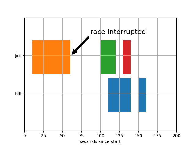
跳跃柱状图
matplotlib.pyplot.broken_barh(xranges, yrange, *, data=None, **kwargs)
import matplotlib.pyplot as plt

fig, ax = plt.subplots()
ax.broken_barh([(110, 30), (150, 10)], (10, 9), facecolors='tab:blue')
ax.broken_barh([(10, 50), (100, 20), (130, 10)], (20, 9),
               facecolors=('tab:orange', 'tab:green', 'tab:red'))
ax.set_ylim(5, 35)
ax.set_xlim(0, 200)
ax.set_xlabel('seconds since start')
ax.set_yticks([15, 25])
ax.set_yticklabels(['Bill', 'Jim'])
ax.grid(True) # 添加网格
ax.annotate('race interrupted', (61, 25),
            xytext=(0.8, 0.9), textcoords='axes fraction',
            arrowprops=dict(facecolor='black', shrink=0.05),
            fontsize=16,
            horizontalalignment='right', verticalalignment='top')

plt.show()
散点图
matplotlib.pyplot.scatter(x, y, s=None, c=None, marker=None, cmap=None, norm=None, vmin=None, vmax=None, alpha=None, linewidths=None, *, edgecolors=None, plotnonfinite=False, data=None, **kwargs)
# =============================================================================
# x, x值
# y, y值
# s, size即每个scatter的大小
# c, color及scatter的颜色
# marker, 默认:rcParams['scatter.marker'](为'o')即scatter形状
# cmap, 默认:rcParams['image.cmap'](default:'viridis')
# norm, default:None即标准化为0到1之间数值
# alpha, default:None即透明度
# linewidth, default:rcParams['lines.linewidth'](default:1.5)即线宽度
# edgecolors:{'face', 'none', None} default:rcParams['scatter.edgecolors'](default:'face')即边线颜色
# =============================================================================
# -*- coding: utf-8 -*-
"""
Created on Tue Jul 13 14:06:16 2021

@author: Bio-windows
"""

import numpy as np
import pandas as pd
import matplotlib.pyplot as plt

if __name__ == '__main__':
    '''main function'''
    np.random.seed(19680801)

    N = 50
    x = np.random.rand(N)
    y = np.random.rand(N)
    colors = np.random.rand(N)
    area = (30 * np.random.rand(N))**2

    fig, ax = plt.subplots()

    ax.scatter(x, y, s=area, c=colors, alpha= 0.5)

    ax.set_title('scatter plot')
    ax.set_xlabel('xLabel')
    ax.set_ylabel('yLabel')
    ax.spines[['top', 'right']].set_visible(False)
线性图
matplotlib.pyplot.plot(*args, scalex=True, scaley=True, data=None, **kwargs)
# =============================================================================
# x,
# y,
# color,
# marker, . , o, ^ < > 1 2 3 4 8 s p P * h H + x X D d | _
# markersize,
# markerfacecolor,
# markeredgecolor,
# linestyle, - -- -. : 线样式
# linewidth, 线宽度
# linecolor, 线颜色
# alpha, 透明度
# label, 这组数据的标签
# =============================================================================
# -*- coding: utf-8 -*-
"""
Created on Tue Jul 13 14:06:16 2021

@author: Bio-windows
"""

import numpy as np
import pandas as pd
import matplotlib.pyplot as plt


if __name__ == '__main__':
    '''main function'''


    x = range(30)
    y = range(30)

    fig, ax = plt.subplots()

    # ax.scatter(x, y, s=area, c=colors, alpha= 0.5)
    # ax.step(x, y)
    ax.plot(x, y, color='grey', marker='o', markersize=2, linestyle='dashed', linewidth=1, alpha=0.5, label='test')
    ax.legend()

    ax.set_title('scatter plot')
    ax.set_xlabel('xLabel')
    ax.set_ylabel('yLabel')
    ax.spines[['top', 'right']].set_visible(False)
阶梯图
matplotlib.pyplot.step(x, y, *args, where='pre', data=None, **kwargs)
# -*- coding: utf-8 -*-
"""
Created on Tue Jul 13 14:06:16 2021

@author: Bio-windows
"""

import numpy as np
import pandas as pd
import matplotlib.pyplot as plt


if __name__ == '__main__':
    '''main function'''


    x = range(30)
    y = range(30)

    fig, ax = plt.subplots()

    # ax.scatter(x, y, s=area, c=colors, alpha= 0.5)
    ax.step(x, y)
    ax.plot(x, y)

    ax.set_title('scatter plot')
    ax.set_xlabel('xLabel')
    ax.set_ylabel('yLabel')
    ax.spines[['top', 'right']].set_visible(False)
频率分布直方图
matplotlib.pyplot.hist(x, bins=None, range=None, density=False, weights=None, cumulative=False, bottom=None, histtype='bar', align='mid', orientation='vertical', rwidth=None, log=False, color=None, label=None, stacked=False, *, data=None, **kwargs)
# =============================================================================
# x, 柱子位置
# =============================================================================
表格直方图
matplotlib.pyplot.table(cellText=None, cellColours=None, cellLoc='right', colWidths=None, rowLabels=None, rowColours=None, rowLoc='left', colLabels=None, colColours=None, colLoc='center', loc='bottom', bbox=None, edges='closed', **kwargs)
# =============================================================================
# x, 柱子位置
# =============================================================================
饼图
matplotlib.pyplot.pie(x, explode=None, labels=None, colors=None, autopct=None, pctdistance=0.6, shadow=False, labeldistance=1.1, startangle=0, radius=1, counterclock=True, wedgeprops=None, textprops=None, center=0, 0, frame=False, rotatelabels=False, *, normalize=None, data=None)
# =============================================================================
# x, 柱子位置
# =============================================================================
轮廓和伪彩色
matplotlib.pyplot.pcolormesh(*args, alpha=None, norm=None, cmap=None, vmin=None, vmax=None, shading=None, antialiased=False, data=None, **kwargs)
# =============================================================================
# x, 柱子位置
# =============================================================================
matplotlib.pyplot.contour(*args, data=None, **kwargs)
# =============================================================================
# x, 柱子位置
# =============================================================================
极坐标图
matplotlib.pyplot.polar(*args, **kwargs)
# =============================================================================
# x, 柱子位置
# =============================================================================
3D
# =============================================================================
# x, 柱子位置
# =============================================================================
图例
matplotlib.pyplot.legend(*args, **kwargs)
# =============================================================================
# x, 柱子位置
# =============================================================================
Axes中的注释(annotate)
matplotlib.pyplot.annotate(text, xy, *args, **kwargs)
# =============================================================================
# x, 柱子位置
# =============================================================================
Axes中的网格(grid)
matplotlib.pyplot.grid(b=None, which='major', axis='both', **kwargs)
# =============================================================================
# x, 柱子位置
# =============================================================================
Axes中的边线(spines)
# =============================================================================
# x, 柱子位置
# =============================================================================


 5万+
5万+

 被折叠的 条评论
为什么被折叠?
被折叠的 条评论
为什么被折叠?
 到【灌水乐园】发言


