


Bootstrap学习(三)——Bootstrap 插件
Bootstrap 插件
Bootstrap 自带 12 种 jQuery 插件,扩展了功能,可以给站点添加更多的互动。
站点引用 Bootstrap 插件的方式有两种:
- 单独引用:使用 Bootstrap 的个别的 *.js 文件。一些插件和 CSS 组件依赖于其他插件。需先弄清这些插件之间的依赖关系。
- 编译(同时)引用:使用 bootstrap.js 或压缩版的 bootstrap.min.js。
所有的插件依赖于 jQuery。所以必须在插件文件之前引用 jQuery。
data 属性
通过 data 属性 API 可以使用所有的 Bootstrap 插件,如果在某些情况下可能需要将此功能关闭,如下操作:
$(document).off('.data-api')如需关闭一个特定的插件,只需要在 data-api 命名空间前加上该插件的名称作为命名空间即可,如下所示:
$(document).off('.alert.data-api')
编程方式的 API
所有公开的 API 都是支持单独或链式调用方式,并且返回其所操作的元素集合(注:和jQuery的调用形式一致)。例如:
$(".btn.danger").button("toggle").addClass("fat")所有的方法都可以接受一个可选的选项对象作为参数,或者一个代表特定方法的字符串,或者不带任何参数(这种情况下,将会初始化插件为默认行为),如下所示:
// 初始化为默认行为
$("#myModal").modal()
 // 初始化为不支持键盘
$("#myModal").modal({ keyboard: false })
// 初始化并立即调用 show
$("#myModal").modal('show')
每个插件在 Constructor 属性上也暴露了其原始的构造函数:$.fn.popover.Constructor。可以直接通过页面元素获取某个特定插件的实例:
$('[rel=popover]').data('popover')
避免命名空间冲突
某些时候 Bootstrap 插件可能需要与其他 UI 框架一起使用。在这种情况下,可能会发生命名空间冲突。可以通过调用插件的 .noConflict 方法恢复其原始值。
// 返回 $.fn.button 之前所赋的值
var bootstrapButton = $.fn.button.noConflict()
// 为 $().bootstrapBtn 赋予 Bootstrap 功能
$.fn.bootstrapBtn = bootstrapButton
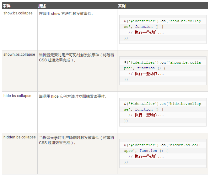
事件
Bootstrap 为大多数插件的独特行为提供了自定义事件。一般来说,这些事件有两种形式:
动词不定式:这会在事件开始时被触发。例如 ex: show。动词不定式事件提供了 preventDefault 功能。这使得在事件开始前可以停止操作的执行。
$('#myModal').on('show.bs.modal', function (e) {
// 阻止模态框的显示
  if (!data) return e.preventDefault()
})
过去分词形式:这会在动作执行完毕之后被触发。例如 ex: shown。
Bootstrap 模态框(Modal)插件
模态框(Modal)是覆盖在父窗体上的子窗体。通常,目的是显示来自一个单独的源的内容,可以在不离开父窗体的情况下有一些互动。子窗体可提供信息、交互等。
用法
切换模态框(Modal)插件的隐藏内容:
- 通过 data 属性:在控制器元素(比如按钮或者链接)上设置属性 data-toggle=”modal”,同时设置 data-target=”#identifier” 或 href=”#identifier” 来指定要切换的特定的模态框(带有 id=”identifier”)。
通过简单的一行 JavaScript 来调用带有 id=”identifier” 的模态框:
$('#identifier').modal(options)
实例
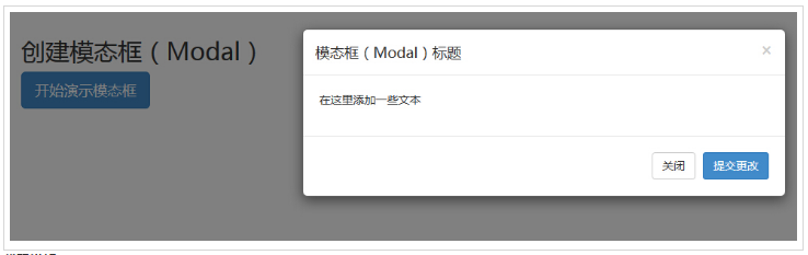
<h2>创建模态框(Modal)</h2>
<!-- 按钮触发模态框 -->
<button class="btn btn-primary btn-lg" data-toggle="modal"
data-target="#myModal">
开始演示模态框
</button>
<!-- 模态框(Modal) -->
<div class="modal fade" id="myModal" tabindex="-1" role="dialog"
aria-labelledby="myModalLabel" aria-hidden="true">
<div class="modal-dialog">
<div class="modal-content">
<div class="modal-header">
<button type="button" class="close"
data-dismiss="modal" aria-hidden="true">
×
</button>
<h4 class="modal-title" id="myModalLabel">
模态框(Modal)标题
</h4>
</div>
<div class="modal-body">
在这里添加一些文本
</div>
<div class="modal-footer">
<button type="button" class="btn btn-default"
data-dismiss="modal">关闭
</button>
<button type="button" class="btn btn-primary">
提交更改
</button>
</div>
</div><!-- /.modal-content -->
</div><!-- /.modal -->
代码讲解:
- 使用模态窗口,需要有某种触发器。可以使用按钮或链接。
- 在 <button> 标签中,data-target=”#myModal” 是在页面上加载的模态框的目标。可以在页面上创建多个模态框,然后为每个模态框创建不同的触发器。不能在同一时间加载多个模块,但可以在页面上创建多个在不同时间进行加载。
在模态框中需要注意两点:
- 第一是 .modal,用来把 ≶div> 的内容识别为模态框。
- 第二是 .fade class。当模态框被切换时,它会引起内容淡入淡出。
aria-labelledby=”myModalLabel”,该属性引用模态框的标题。
- 属性 aria-hidden=”true” 用于保持模态窗口不可见,直到触发器被触发为止(比如点击在相关的按钮上)。
- <div class=”modal-header”>,modal-header 是为模态窗口的头部定义样式的类。
- class=”close”,close 是一个 CSS class,用于为模态窗口的关闭按钮设置样式。
- data-dismiss=”modal”,是一个自定义的 HTML5 data 属性。在这里它被用于关闭模态窗口。
- class=”modal-body”,是 Bootstrap CSS 的一个 CSS class,用于为模态窗口的主体设置样式。
- class=”modal-footer”,是 Bootstrap CSS 的一个 CSS class,用于为模态窗口的底部设置样式。
- data-toggle=”modal”,HTML5 自定义的 data 属性 data-toggle 用于打开模态窗口。
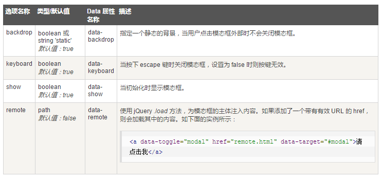
选项
有一些选项可以用来定制模态窗口(Modal Window)的外观和感观,它们是通过 data 属性或 JavaScript 来传递的。下表列出了这些选项:
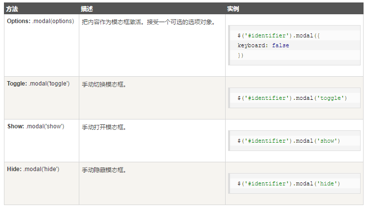
方法
下面是一些可与 modal() 一起使用的有用的方法。
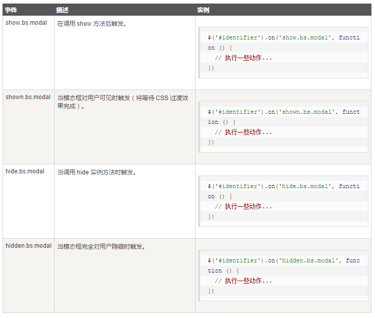
事件
下表列出了模态框中要用到事件。这些事件可在函数中当钩子使用。
Bootstrap 下拉菜单(Dropdown)插件
使用下拉菜单(Dropdown)插件,可以向任何组件(比如导航栏、标签页、胶囊式导航菜单、按钮等)添加下拉菜单。
用法
切换下拉菜单(Dropdown)插件的隐藏内容:
通过 data 属性:向链接或按钮添加 data-toggle=”dropdown” 来切换下拉菜单,如下所示:
<div class="dropdown">
  <a data-toggle="dropdown" href="#">下拉菜单(Dropdown)触发器</a>
  <ul class="dropdown-menu" role="menu" aria-labelledby="dLabel">
    ...
  </ul>
</div>
如果需要保持链接完整(在浏览器不启用 JavaScript 时有用),请使用 data-target 属性代替 href=”#”:
通过 JavaScript:通过 JavaScript 调用下拉菜单切换,请使用下面的方法:
$('.dropdown-toggle').dropdown()
方法
下拉菜单切换有一个简单的方法用来显示或隐藏下拉菜单。
$(".dropdown-toggle").dropdown('toggle');
Bootstrap 滚动监听(Scrollspy)插件
滚动监听(Scrollspy)插件,即自动更新导航插件,会根据滚动条的位置自动更新对应的导航目标。其基本的实现是随着滚动,基于滚动条的位置向导航栏添加 .active class。
用法
向顶部导航添加滚动监听行为:
通过 data 属性:向想要监听的元素(通常是 body)添加 data-spy=”scroll”。然后添加带有 Bootstrap .nav 组件的父元素的 ID 或 class 的属性 data-target。为了它能正常工作,必须确保页面主体中有匹配所要监听链接的 ID 的元素存在。
<body data-spy="scroll" data-target=".navbar-example">
  ...
  <div class="navbar-example">
    <ul class="nav nav-tabs">
      ...
    </ul>
  </div>
  ...
</body>
通过 JavaScript 调用滚动监听,选取要监听的元素,然后调用 .scrollspy() 函数:
$('body').scrollspy({ target: '.navbar-example' })
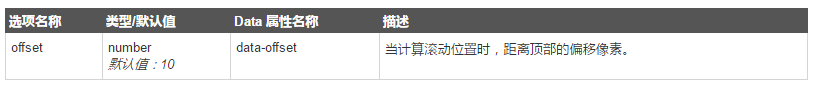
选项
通过 data 属性或 JavaScript 来传递。下表列出了这些选项:
方法
.scrollspy(‘refresh’):当通过 JavaScript 调用 scrollspy 方法时,需要调用 .refresh 方法来更新 DOM。这在 DOM 的任意元素发生变更(即添加或移除了某些元素)时非常有用。下面是使用该方法的语法。
$('[data-spy="scroll"]').each(function () {
  var $spy = $(this).scrollspy('refresh')
})
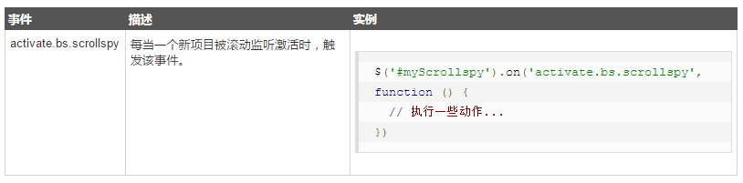
事件
下表列出了滚动监听中要用到事件。这些事件可在函数中当钩子使用。
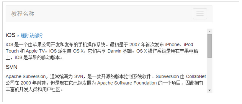
实例
<nav id="myScrollspy" class="navbar navbar-default navbar-static" role="navigation">
<div class="navbar-header">
<button class="navbar-toggle" type="button" data-toggle="collapse"
data-target=".bs-js-navbar-scrollspy">
<span class="sr-only">切换导航</span>
<span class="icon-bar"></span>
<span class="icon-bar"></span>
<span class="icon-bar"></span>
</button>
<a class="navbar-brand" href="#">教程名称</a>
</div>
<div class="collapse navbar-collapse bs-js-navbar-scrollspy">
<ul class="nav navbar-nav">
<li class="active"><a href="#ios">iOS</a></li>
<li><a href="#svn">SVN</a></li>
<li class="dropdown">
<a href="#" id="navbarDrop1" class="dropdown-toggle"
data-toggle="dropdown">
Java <b class="caret"></b>
</a>
<ul class="dropdown-menu" role="menu"
aria-labelledby="navbarDrop1">
<li><a href="#jmeter" tabindex="-1">jmeter</a></li>
<li><a href="#ejb" tabindex="-1">ejb</a></li>
<li class="divider"></li>
<li><a href="#spring" tabindex="-1">spring</a></li>
</ul>
</li>
</ul>
</div>
</nav>
<div data-spy="scroll" data-target="#myScrollspy" data-offset="0"
style="height:200px;overflow:auto; position: relative;">
<div class="section">
<h4 id="ios">iOS<small><a href="#" onclick="removeSection(this);">
× 删除该部分</a></small>
</h4>
<p>iOS 是一个由苹果公司开发和发布的手机操作系统。最初是于 2007 年首次发布 iPhone、iPod Touch 和 Apple
TV。iOS 派生自 OS X,它们共享 Darwin 基础。OS X 操作系统是用在苹果电脑上,iOS 是苹果的移动版本。</p>
</div>
<div class="section">
<h4 id="svn">SVN<small></small></h4>
<p>Apache Subversion,通常缩写为 SVN,是一款开源的版本控制系统软件。Subversion 由 CollabNet 公司在 2000 年创建。但是现在它已经发展为 Apache Software Foundation 的一个项目,因此拥有丰富的开发人员和用户社区。</p>
</div>
<div class="section">
<h4 id="jmeter">jMeter<small><a href="#" onclick="removeSection(this);">
× 删除该部分</a></small>
</h4>
<p>jMeter 是一款开源的测试软件。它是 100% 纯 Java 应用程序,用于负载和性能测试。</p>
</div>
<div class="section">
<h4 id="ejb">EJB</h4>
<p>Enterprise Java Beans(EJB)是一个创建高度可扩展性和强大企业级应用程序的开发架构,部署在兼容应用程序服务器(比如 JBOSS、Web Logic 等)的 J2EE 上。</p>
</div>
<div class="section">
<h4 id="spring">Spring</h4>
<p>Spring 框架是一个开源的 Java 平台,为快速开发功能强大的 Java 应用程序提供了完备的基础设施支持。</p>
<p>Spring 框架最初是由 Rod Johnson 编写的,在 2003 年 6 月首次发布于 Apache 2.0 许可证下。</p>
</div>
</div>
<span id="activeitem" style="color:red;"></span>
<script type="text/javascript">
$(function(){
removeSection = function(e) {
$(e).parents(".section").remove();
$('[data-spy="scroll"]').each(function () {
var $spy = $(this).scrollspy('refresh')
});
}
$("#myScrollspy").scrollspy();
$('#myScrollspy').on('activate.bs.scrollspy', function () {
var currentItem = $(".nav li.active > a").text();
$("#activeitem").html("目前您正在查看 - " + currentItem);
})
});
</script>
创建水平滚动监听
<!DOCTYPE html>
<html>
<head>
  <title>Bootstrap Example</title>
  <meta charset="utf-8">
  <meta name="viewport" content="width=device-width, initial-scale=1">
  <link href="http://libs.baidu.com/bootstrap/3.3.0/css/bootstrap.min.css" rel="stylesheet">
  <script src="http://libs.baidu.com/jquery/2.0.0/jquery.min.js"></script>
  <script src="http://libs.baidu.com/bootstrap/3.3.0/js/bootstrap.min.js"></script>
  <style>
  body {
      position: relative;
  }
  #section1 {padding-top:50px;height:500px;color: #fff; background-color: #1E88E5;}
  #section2 {padding-top:50px;height:500px;color: #fff; background-color: #673ab7;}
  #section3 {padding-top:50px;height:500px;color: #fff; background-color: #ff9800;}
  #section41 {padding-top:50px;height:500px;color: #fff; background-color: #00bcd4;}
  #section42 {padding-top:50px;height:500px;color: #fff; background-color: #009688;}
  </style>
</head>
<body data-spy="scroll" data-target=".navbar" data-offset="50">

<nav class="navbar navbar-inverse navbar-fixed-top">
  <div class="container-fluid">
    <div class="navbar-header">
        <button type="button" class="navbar-toggle" data-toggle="collapse" data-target="#myNavbar">
          <span class="icon-bar"></span>
          <span class="icon-bar"></span>
          <span class="icon-bar"></span>
      </button>
      <a class="navbar-brand" href="#">WebSiteName</a>
    </div>
    <div>
      <div class="collapse navbar-collapse" id="myNavbar">
        <ul class="nav navbar-nav">
          <li><a href="#section1">Section 1</a></li>
          <li><a href="#section2">Section 2</a></li>
          <li><a href="#section3">Section 3</a></li>
          <li class="dropdown"><a class="dropdown-toggle" data-toggle="dropdown" href="#">Section 4 <span class="caret"></span></a>
            <ul class="dropdown-menu">
              <li><a href="#section41">Section 4-1</a></li>
              <li><a href="#section42">Section 4-2</a></li>
            </ul>
          </li>
        </ul>
      </div>
    </div>
  </div>
</nav>

<div id="section1" class="container-fluid">
  <h1>Section 1</h1>
  <p>Try to scroll this section and look at the navigation bar while scrolling! Try to scroll this section and look at the navigation bar while scrolling!</p>
  <p>Try to scroll this section and look at the navigation bar while scrolling! Try to scroll this section and look at the navigation bar while scrolling!</p>
</div>
<div id="section2" class="container-fluid">
  <h1>Section 2</h1>
  <p>Try to scroll this section and look at the navigation bar while scrolling! Try to scroll this section and look at the navigation bar while scrolling!</p>
  <p>Try to scroll this section and look at the navigation bar while scrolling! Try to scroll this section and look at the navigation bar while scrolling!</p>
</div>
<div id="section3" class="container-fluid">
  <h1>Section 3</h1>
  <p>Try to scroll this section and look at the navigation bar while scrolling! Try to scroll this section and look at the navigation bar while scrolling!</p>
  <p>Try to scroll this section and look at the navigation bar while scrolling! Try to scroll this section and look at the navigation bar while scrolling!</p>
</div>
<div id="section41" class="container-fluid">
  <h1>Section 4 Submenu 1</h1>
  <p>Try to scroll this section and look at the navigation bar while scrolling! Try to scroll this section and look at the navigation bar while scrolling!</p>
  <p>Try to scroll this section and look at the navigation bar while scrolling! Try to scroll this section and look at the navigation bar while scrolling!</p>
</div>
<div id="section42" class="container-fluid">
  <h1>Section 4 Submenu 2</h1>
  <p>Try to scroll this section and look at the navigation bar while scrolling! Try to scroll this section and look at the navigation bar while scrolling!</p>
  <p>Try to scroll this section and look at the navigation bar while scrolling! Try to scroll this section and look at the navigation bar while scrolling!</p>
</div>

</body>
</html>

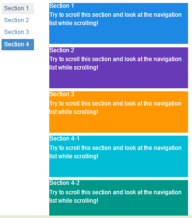
创建垂直滚动监听
<!DOCTYPE html>
<html lang="en">
<head>
  <title>Bootstrap Example</title>
  <meta charset="utf-8">
  <meta name="viewport" content="width=device-width, initial-scale=1">
  <link href="http://libs.baidu.com/bootstrap/3.3.0/css/bootstrap.min.css" rel="stylesheet">
  <script src="http://libs.baidu.com/jquery/2.0.0/jquery.min.js"></script>
  <script src="http://libs.baidu.com/bootstrap/3.3.0/js/bootstrap.min.js"></script>
  <style>
  body {
      position: relative;
  }
  ul.nav-pills {
      top: 20px;
      position: fixed;
  }
  div.col-sm-9 div {
      height: 250px;
      font-size: 28px;
  }
  #section1 {color: #fff; background-color: #1E88E5;}
  #section2 {color: #fff; background-color: #673ab7;}
  #section3 {color: #fff; background-color: #ff9800;}
  #section41 {color: #fff; background-color: #00bcd4;}
  #section42 {color: #fff; background-color: #009688;}

  @media screen and (max-width: 810px) {
    #section1, #section2, #section3, #section41, #section42  {
        margin-left: 150px;
    }
  }
  </style>
</head>
<body data-spy="scroll" data-target="#myScrollspy" data-offset="20">

<div class="container">
  <div class="row">
    <nav class="col-sm-3" id="myScrollspy">
      <ul class="nav nav-pills nav-stacked">
        <li class="active"><a href="#section1">Section 1</a></li>
        <li><a href="#section2">Section 2</a></li>
        <li><a href="#section3">Section 3</a></li>
        <li class="dropdown">
          <a class="dropdown-toggle" data-toggle="dropdown" href="#">Section 4 <span class="caret"></span></a>
          <ul class="dropdown-menu">
            <li><a href="#section41">Section 4-1</a></li>
            <li><a href="#section42">Section 4-2</a></li>
          </ul>
        </li>
      </ul>
    </nav>
    <div class="col-sm-9">
      <div id="section1">
        <h1>Section 1</h1>
        <p>Try to scroll this section and look at the navigation list while scrolling!</p>
      </div>
      <div id="section2">
        <h1>Section 2</h1>
        <p>Try to scroll this section and look at the navigation list while scrolling!</p>
      </div>
      <div id="section3">
        <h1>Section 3</h1>
        <p>Try to scroll this section and look at the navigation list while scrolling!</p>
      </div>
      <div id="section41">
        <h1>Section 4-1</h1>
        <p>Try to scroll this section and look at the navigation list while scrolling!</p>
      </div>
      <div id="section42">
        <h1>Section 4-2</h1>
        <p>Try to scroll this section and look at the navigation list while scrolling!</p>
      </div>
    </div>
  </div>
</div>

</body>
</html>
Bootstrap 标签页(Tab)插件
通过这个插件可以把内容放置在标签页或者是胶囊式标签页甚至是下拉菜单标签页中。
用法
通过以下两种方式启用标签页
通过 data 属性:需要添加 data-toggle=”tab” 或 data-toggle=”pill” 到锚文本链接中。
添加 nav 和 nav-tabs 类到 ul 中,将会应用 Bootstrap 标签样式,添加 nav 和 nav-pills 类到 ul 中,将会应用 Bootstrap 胶囊式样式。<ul class="nav nav-tabs"> <li><a href="#identifier" data-toggle="tab">Home</a></li> ... </ul>通过 JavaScript 来启用标签页,如下所示:
$('#myTab a').click(function (e) {
  e.preventDefault()
  $(this).tab('show')
})
下面的实例演示了以不同的方式来激活各个标签页:
    // 通过名称选取标签页
    $('#myTab a[href="#profile"]').tab('show')

    // 选取第一个标签页
    $('#myTab a:first').tab('show')

    // 选取最后一个标签页
    $('#myTab a:last').tab('show')

    // 选取第三个标签页(从 0 开始索引)
    $('#myTab li:eq(2) a').tab('show')
淡入淡出效果
如果需要为标签页设置淡入淡出效果,请添加 .fade 到每个 .tab-pane 后面。第一个标签页必须添加 .in 类,以便淡入显示初始内容,如下面实例所示:
<div class="tab-content">
  <div class="tab-pane fade in active" id="home">...</div>
  <div class="tab-pane fade" id="svn">...</div>
  <div class="tab-pane fade" id="ios">...</div>
  <div class="tab-pane fade" id="java">...</div>
</div>
方法
.$().tab:该方法可以激活标签页元素和内容容器。标签页需要用一个 data-target 或者一个指向 DOM 中容器节点的 href。
<ul class="nav nav-tabs" id="myTab">
  <li class="active"><a href="#identifier" data-toggle="tab">Home</a></li>
  .....
</ul>
<div class="tab-content">
  <div class="tab-pane active" id="home">...</div>
  .....
</div>
<script>
  $(function () {
    $('#myTab a:last').tab('show')
  })
</script>
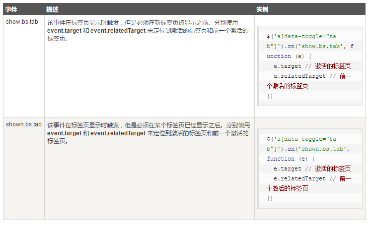
事件
下表列出了标签页(Tab)插件中要用到的事件。这些事件可在函数中当钩子使用。
实例
<hr>
   <p class="active-tab"><strong>激活的标签页</strong>:<span></span></p>
   <p class="previous-tab"><strong>前一个激活的标签页</strong>:<span></span></p>
<hr>
<ul id="myTab" class="nav nav-tabs">
   <li class="active"><a href="#home" data-toggle="tab">
      W3Cschool Home</a></li>
   <li><a href="#ios" data-toggle="tab">iOS</a></li>
   <li class="dropdown">
      <a href="#" id="myTabDrop1" class="dropdown-toggle"
         data-toggle="dropdown">
         Java <b class="caret"></b></a>
      <ul class="dropdown-menu" role="menu" aria-labelledby="myTabDrop1">
         <li><a href="#jmeter" tabindex="-1" data-toggle="tab">jmeter</a></li>
         <li><a href="#ejb" tabindex="-1" data-toggle="tab">ejb</a></li>
      </ul>
   </li>
</ul>
<div id="myTabContent" class="tab-content">
   <div class="tab-pane fade in active" id="home">
      <p>W3Cschoool菜鸟教程是一个提供最新的web技术站点,本站免费提供了建站相关的技术文档,帮助广大web技术爱好者快速入门并建立自己的网站。菜鸟先飞早入行——学的不仅是技术,更是梦想。</p>
   </div>
   <div class="tab-pane fade" id="ios">
      <p>iOS 是一个由苹果公司开发和发布的手机操作系统。最初是于 2007 年首次发布 iPhone、iPod Touch 和 Apple
      TV。iOS 派生自 OS X,它们共享 Darwin 基础。OS X 操作系统是用在苹果电脑上,iOS 是苹果的移动版本。</p>
   </div>
   <div class="tab-pane fade" id="jmeter">
      <p>jMeter 是一款开源的测试软件。它是 100% 纯 Java 应用程序,用于负载和性能测试。</p>
   </div>
   <div class="tab-pane fade" id="ejb">
      <p>Enterprise Java Beans(EJB)是一个创建高度可扩展性和强大企业级应用程序的开发架构,部署在兼容应用程序服务器(比如 JBOSS、Web Logic 等)的 J2EE 上。
      </p>
   </div>
</div>
<script>
   $(function(){
      $('a[data-toggle="tab"]').on('shown.bs.tab', function (e) {
      // 获取已激活的标签页的名称
      var activeTab = $(e.target).text();
      // 获取前一个激活的标签页的名称
      var previousTab = $(e.relatedTarget).text();
      $(".active-tab span").html(activeTab);
      $(".previous-tab span").html(previousTab);
   });
});
</script>

Bootstrap 提示工具(Tooltip)插件
用法
提示工具(Tooltip)插件根据需求生成内容和标记,默认情况下是把提示工具(tooltip)放在它们的触发元素后面。有以下两种方式添加提示工具(tooltip):
通过 data 属性:如需添加一个提示工具(tooltip),只需向一个锚标签添加 data-toggle=”tooltip” 即可。锚的 title 即为提示工具(tooltip)的文本。默认情况下,插件把提示工具(tooltip)设置在顶部。
<a href="#" data-toggle="tooltip" title="Example tooltip">请悬停在我的上面</a>通过 JavaScript 触发提示工具(tooltip):
$('#identifier').tooltip(options)
提示工具(Tooltip)插件不是纯 CSS 插件。如需使用该插件,必须使用 jquery 激活它(读取 javascript)。使用下面的脚本来启用页面中的所有的提示工具(tooltip):
$(function () { $("[data-toggle='tooltip']").tooltip(); });
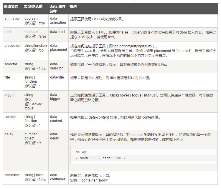
选项
有一些选项是通过 Bootstrap 数据 API(Bootstrap Data API)添加或通过 JavaScript 调用的。下表列出了这些选项:
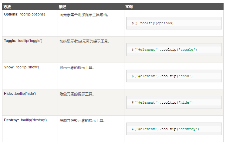
方法
下面是一些提示工具(Tooltip)插件中有用的方法:
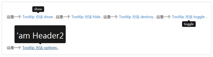
<div style="padding: 100px 100px 10px;">
   这是一个 <a href="#" class="tooltip-show" data-toggle="tooltip"
      title="show">Tooltip 方法 show
   </a>.

   这是一个 <a href="#" class="tooltip-hide" data-toggle="tooltip"
      data-placement="left" title="hide">Tooltip 方法 hide
   </a>.

   这是一个 <a href="#" class="tooltip-destroy" data-toggle="tooltip"
      data-placement="top" title="destroy">Tooltip 方法 destroy
   </a>.

   这是一个 <a href="#" class="tooltip-toggle" data-toggle="tooltip"
      data-placement="bottom" title="toggle">Tooltip 方法 toggle
   </a>.
   <br><br><br><br><br><br>
   <p class="tooltip-options" >
      这是一个 <a href="#" data-toggle="tooltip" title="<h2>'am Header2
         </h2>">Tooltip 方法 options
      </a>.
   </p>

   <script>
      $(function () { $('.tooltip-show').tooltip('show');});
      $(function () { $('.tooltip-hide').tooltip('hide');});
      $(function () { $('.tooltip-destroy').tooltip('destroy');});
      $(function () { $('.tooltip-toggle').tooltip('toggle');});
      $(function () { $(".tooltip-options a").tooltip({html : true });
      });
   </script>
<div>
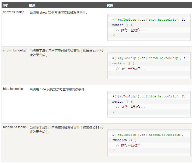
事件
下表列出了提示工具(Tooltip)插件中要用到的事件。这些事件可在函数中当钩子使用。
Bootstrap 弹出框(Popover)插件
弹出框(Popover)与工具提示(Tooltip)类似,提供了一个扩展的视图。如需激活弹出框,用户只需把鼠标悬停在元素上即可。弹出框的内容完全可使用 Bootstrap 数据 API(Bootstrap Data API)来填充。该方法依赖于工具提示(tooltip)。
用法
弹出框(Popover)插件根据需求生成内容和标记,默认情况下是把弹出框(popover)放在它们的触发元素后面。有以下两种方式添加弹出框(popover):
通过 data 属性:如需添加一个弹出框(popover),只需向一个锚/按钮标签添加 data-toggle=”popover” 即可。锚的 title 即为弹出框(popover)的文本。默认情况下,插件把弹出框(popover)设置在顶部。
<a href="#" data-toggle="popover" title="Example popover">
   请悬停在我的上面
</a>
通过 JavaScript 启用弹出框(popover):
$('#identifier').popover(options)
使用下面的脚本来启用页面中的所有的弹出框(popover):
$(function () { $("[data-toggle='popover']").popover(); });
选项
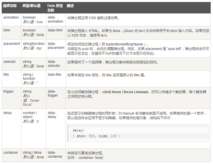
有一些选项是通过 Bootstrap 数据 API(Bootstrap Data API)添加或通过 JavaScript 调用的。下表列出了这些选项:
方法
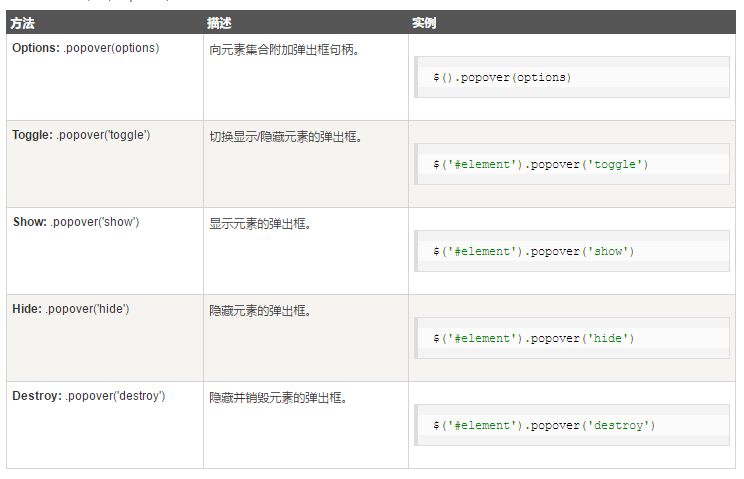
下面是一些弹出框(Popover)插件中有用的方法:
<div class="container" style="padding: 100px 50px 10px;" >
   <button type="button" class="btn btn-default popover-show"
      title="Popover title" data-container="body"
      data-toggle="popover" data-placement="left"
      data-content="左侧的 Popover 中的一些内容 —— show 方法">
      左侧的 Popover
   </button>
   <button type="button" class="btn btn-primary popover-hide"
      title="Popover title" data-container="body"
      data-toggle="popover" data-placement="top"
      data-content="顶部的 Popover 中的一些内容 —— hide 方法">
      顶部的 Popover
   </button>
   <button type="button" class="btn btn-success popover-destroy"
      title="Popover title" data-container="body"
      data-toggle="popover" data-placement="bottom"
      data-content="底部的 Popover 中的一些内容 —— destroy 方法">
      底部的 Popover
   </button>
   <button type="button" class="btn btn-warning popover-toggle"
      title="Popover title" data-container="body"
      data-toggle="popover" data-placement="right"
      data-content="右侧的 Popover 中的一些内容 —— toggle 方法">
      右侧的 Popover
   </button><br><br><br><br><br><br>
   <p class="popover-options">
      <a href="#" type="button" class="btn btn-warning" title="<h2>Title</h2>"
         data-container="body" data-toggle="popover" data-content="
         <h4>Popover 中的一些内容 —— options 方法</h4>">
         Popover
      </a>
   </p>
   <script>
      $(function () { $('.popover-show').popover('show');});
      $(function () { $('.popover-hide').popover('hide');});
      $(function () { $('.popover-destroy').popover('destroy');});
      $(function () { $('.popover-toggle').popover('toggle');});
     $(function () { $(".popover-options a").popover({html : true });});
   </script>
</div>

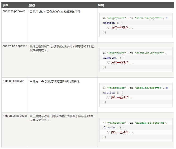
事件
下表列出了弹出框(Popover)插件中要用到的事件。这些事件可在函数中当钩子使用。
Bootstrap 警告框(Alert)插件
警告框(Alert)消息大多是用来想终端用户显示诸如警告或确认消息的信息。使用警告框(Alert)插件,可以向所有的警告框消息添加可取消(dismiss)功能。
用法
通过 data 属性:通过数据 API(Data API)添加可取消功能,只需要向关闭按钮添加 data-dismiss=”alert”,就会自动为警告框添加关闭功能。
<a class="close" data-dismiss="alert" href="#" aria-hidden="true"> × </a>通过 JavaScript 添加可取消功能:
$(".alert").alert()
方法
下面是一些警告框(Alert)插件中有用的方法:

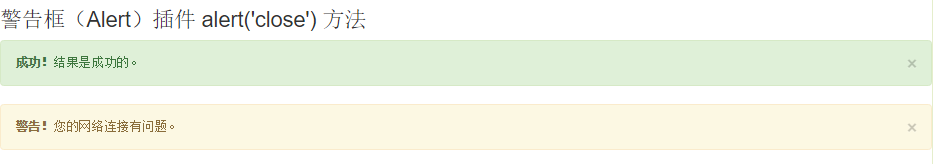
<h3>警告框(Alert)插件 alert('close') 方法</h3>
<div id="myAlert" class="alert alert-success">
<a href="#" class="close" data-dismiss="alert">×</a>
<strong>成功!</strong>结果是成功的。
</div>
<div id="myAlert" class="alert alert-warning">
<a href="#" class="close" data-dismiss="alert">×</a>
<strong>警告!</strong>您的网络连接有问题。
</div>
<script type="text/javascript">
$(function(){
$(".close").click(function(){
$("#myAlert").alert('close');
});
});
</script>
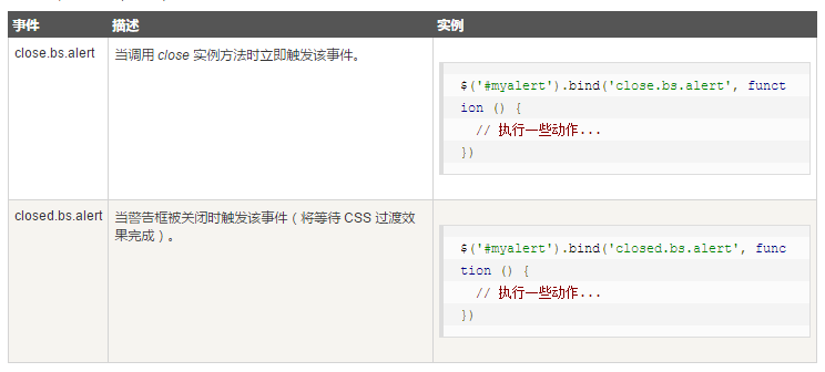
事件
下表列出了警告框(Alert)插件中要用到的事件。这些事件可在函数中当钩子使用。
Bootstrap 按钮(Button)插件
通过按钮(Button)插件,可以添加进一些交互,比如控制按钮状态,或者为其他组件(如工具栏)创建按钮组。
加载状态
如需向按钮添加加载状态,只需要简单地向 button 元素添加 data-loading-text=”Loading…” 作为其属性即可
单个切换
如需激活单个按钮的切换(即改变按钮的正常状态为按压状态,反之亦然),只需向 button 元素添加 data-toggle=”button” 作为其属性即可
复选框(Checkbox)
创建复选框组,并通过向 btn-group 添加 data 属性 data-toggle=”buttons” 来添加复选框组的切换。
单选按钮(Radio)
创建单选按钮组,并通过向 btn-group 添加 data 属性 data-toggle=”buttons” 来添加单选按钮组的切换。
用法
通过 JavaScript 启用按钮(Button)插件,如下所示:
$('.btn').button()
方法
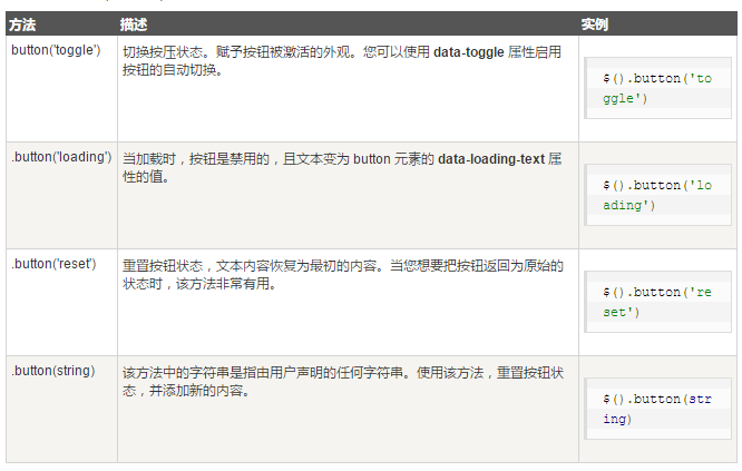
下面是一些按钮(Button)插件中有用的方法:
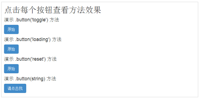
<h2>点击每个按钮查看方法效果</h2>
<h4>演示 .button('toggle') 方法</h4>
<div id="myButtons1" class="bs-example">
   <button type="button" class="btn btn-primary">原始</button>
</div>

<h4>演示 .button('loading') 方法</h4>
<div id="myButtons2" class="bs-example">
   <button type="button" class="btn btn-primary"
      data-loading-text="Loading...">原始
   </button>
</div>

<h4>演示 .button('reset') 方法</h4>
<div id="myButtons3" class="bs-example">
   <button type="button" class="btn btn-primary"
      data-loading-text="Loading...">原始
   </button>
</div>

<h4>演示 .button(string) 方法</h4>
<button type="button" class="btn btn-primary" id="myButton4"
   data-complete-text="Loading finished">请点击我
</button>
<script type="text/javascript">
   $(function () {
      $("#myButtons1 .btn").click(function(){
         $(this).button('toggle');
      });
   });
   $(function() {
      $("#myButtons2 .btn").click(function(){
         $(this).button('loading').delay(1000).queue(function() {
         });
      });
   });
   $(function() {
      $("#myButtons3 .btn").click(function(){
         $(this).button('loading').delay(1000).queue(function() {
            $(this).button('reset');
         });
      });
   });
   $(function() {
      $("#myButton4").click(function(){
         $(this).button('loading').delay(1000).queue(function() {
            $(this).button('complete');
         });
      });
   });
</script>
Bootstrap 折叠(Collapse)插件
折叠(Collapse)插件可以很容易地让页面区域折叠起来
使用折叠(Collapse)插件:
创建可折叠的分组或折叠面板(accordion)
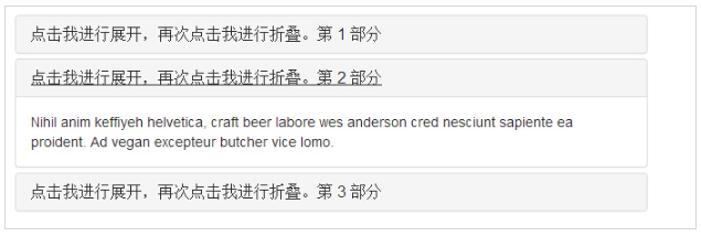
<div class="panel-group" id="accordion">
  <div class="panel panel-default">
    <div class="panel-heading">
      <h4 class="panel-title">
        <a data-toggle="collapse" data-parent="#accordion"
          href="#collapseOne">
          点击我进行展开,再次点击我进行折叠。第 1 部分
        </a>
      </h4>
    </div>
    <div id="collapseOne" class="panel-collapse collapse in">
      <div class="panel-body">
        Nihil anim keffiyeh helvetica, craft beer labore wes anderson
        cred nesciunt sapiente ea proident. Ad vegan excepteur butcher
        vice lomo.
      </div>
    </div>
  </div>
  <div class="panel panel-default">
    <div class="panel-heading">
      <h4 class="panel-title">
        <a data-toggle="collapse" data-parent="#accordion"
          href="#collapseTwo">
          点击我进行展开,再次点击我进行折叠。第 2 部分
        </a>
      </h4>
    </div>
    <div id="collapseTwo" class="panel-collapse collapse">
      <div class="panel-body">
        Nihil anim keffiyeh helvetica, craft beer labore wes anderson
        cred nesciunt sapiente ea proident. Ad vegan excepteur butcher
        vice lomo.
      </div>
    </div>
  </div>
  <div class="panel panel-default">
    <div class="panel-heading">
      <h4 class="panel-title">
        <a data-toggle="collapse" data-parent="#accordion"
          href="#collapseThree">
          点击我进行展开,再次点击我进行折叠。第 3 部分
        </a>
      </h4>
    </div>
    <div id="collapseThree" class="panel-collapse collapse">
      <div class="panel-body">
        Nihil anim keffiyeh helvetica, craft beer labore wes anderson
        cred nesciunt sapiente ea proident. Ad vegan excepteur butcher
        vice lomo.
      </div>
    </div>
  </div>
</div>
1.data-toggle="collapse" 添加到您想要展开或折叠的组件的链接上。
2.href 或 data-target 属性添加到父组件,它的值是子组件的 id。
3.data-parent 属性把折叠面板(accordion)的 id 添加到要展开或折叠的组件的链接上。
创建不带 accordion 标记的简单的可折叠组件(collapsible)
<button type="button" class="btn btn-primary" data-toggle="collapse"
   data-target="#demo">
   简单的可折叠组件
</button>

<div id="demo" class="collapse in">
  Nihil anim keffiyeh helvetica, craft beer labore wes anderson
  cred nesciunt sapiente ea proident. Ad vegan excepteur butcher
  vice lomo.
</div>
用法
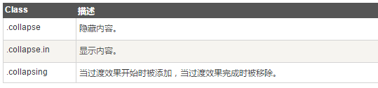
下表列出了折叠(Collapse)插件用于处理繁重的伸缩的 class:
通过以下两种方式使用折叠(Collapse)插件:
通过 data 属性:向元素添加 data-toggle=”collapse” 和 data-target,自动分配可折叠元素的控制。data-target 属性接受一个 CSS 选择器,并会对其应用折叠效果。请确保向可折叠元素添加 class .collapse。如果希望它默认情况下是打开的,添加额外的 class .in。
为了向可折叠控件添加类似折叠面板的分组管理,请添加 data 属性 data-parent=”#selector”。
通过 JavaScript 激活 collapse 方法
$('.collapse').collapse()
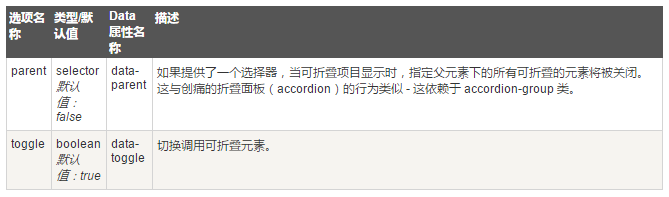
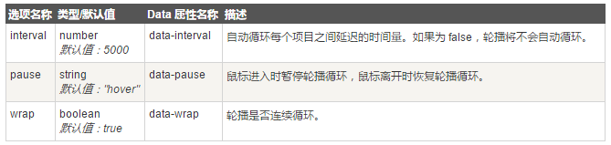
选项
有一些选项是通过 data 属性或 JavaScript 来传递的。下表列出了这些选项:
方法
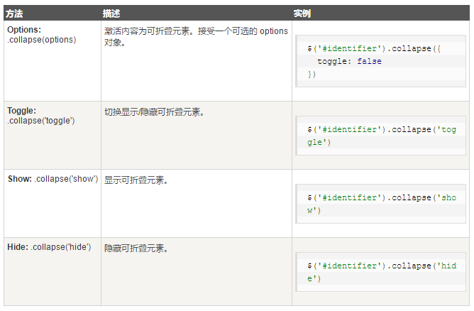
下面是一些折叠(Collapse)插件中有用的方法:
事件
下表列出了折叠(Collapse)插件中要用到的事件。这些事件可在函数中当钩子使用。
Bootstrap 轮播(Carousel)插件
Bootstrap 轮播(Carousel)插件是一种灵活的响应式的向站点添加滑块的方式。
用法
通过 data 属性:使用 data 属性可以很容易控制轮播(Carousel)的位置。
- 属性 data-slide 接受关键字 prev 或 next,用来改变幻灯片相对于当前位置的位置。
- 使用 data-slide-to 来向轮播传递一个原始滑动索引,data-slide-to=”2” 将把滑块移动到一个特定的索引,索引从 0 开始计数。
- data-ride=”carousel” 属性用于标记轮播在页面加载时就开始动画播放。
轮播(Carousel)可通过 JavaScript 手动调用
$('.carousel').carousel()
选项
有一些选项是通过 data 属性或 JavaScript 来传递的。下表列出了这些选项:
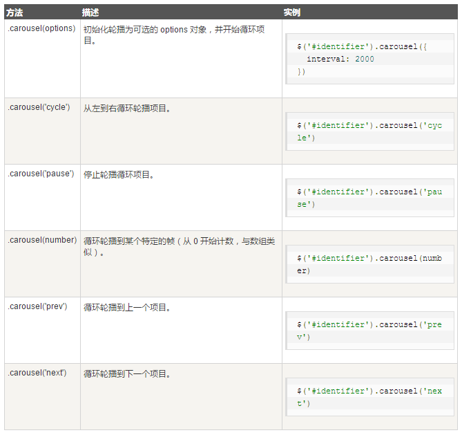
方法
下面是一些轮播(Carousel)插件中有用的方法:
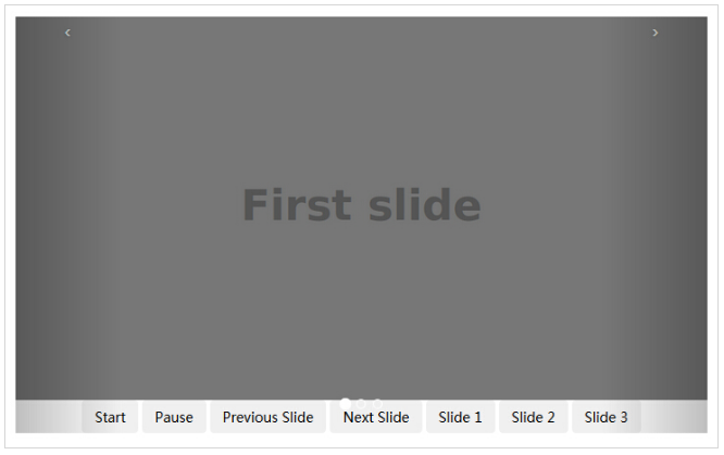
<div id="myCarousel" class="carousel slide">
<!-- 轮播(Carousel)指标 -->
<ol class="carousel-indicators">
<li data-target="#myCarousel" data-slide-to="0"
class="active"></li>
<li data-target="#myCarousel" data-slide-to="1"></li>
<li data-target="#myCarousel" data-slide-to="2"></li>
</ol>
<!-- 轮播(Carousel)项目 -->
<div class="carousel-inner">
<div class="item active">
<img src="/wp-content/uploads/2014/07/slide1.png" alt="First slide">
</div>
<div class="item">
<img src="/wp-content/uploads/2014/07/slide2.png" alt="Second slide">
</div>
<div class="item">
<img src="/wp-content/uploads/2014/07/slide3.png" alt="Third slide">
</div>
</div>
<!-- 轮播(Carousel)导航 -->
<a class="carousel-control left" href="#myCarousel"
data-slide="prev">‹</a>
<a class="carousel-control right" href="#myCarousel"
data-slide="next">›</a>
<!-- 控制按钮 -->
<div style="text-align:center;">
<input type="button" class="btn start-slide" value="Start">
<input type="button" class="btn pause-slide" value="Pause">
<input type="button" class="btn prev-slide" value="Previous Slide">
<input type="button" class="btn next-slide" value="Next Slide">
<input type="button" class="btn slide-one" value="Slide 1">
<input type="button" class="btn slide-two" value="Slide 2">
<input type="button" class="btn slide-three" value="Slide 3">
</div>
</div>
<script>
$(function(){
// 初始化轮播
$(".start-slide").click(function(){
$("#myCarousel").carousel('cycle');
});
// 停止轮播
$(".pause-slide").click(function(){
$("#myCarousel").carousel('pause');
});
// 循环轮播到上一个项目
$(".prev-slide").click(function(){
$("#myCarousel").carousel('prev');
});
// 循环轮播到下一个项目
$(".next-slide").click(function(){
$("#myCarousel").carousel('next');
});
// 循环轮播到某个特定的帧
$(".slide-one").click(function(){
$("#myCarousel").carousel(0);
});
$(".slide-two").click(function(){
$("#myCarousel").carousel(1);
});
$(".slide-three").click(function(){
$("#myCarousel").carousel(2);
});
});
</script>
事件
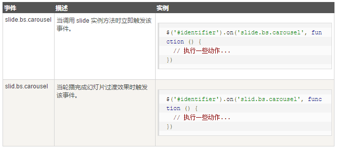
下表列出了轮播(Carousel)插件中要用到的事件。这些事件可在函数中当钩子使用。
Bootstrap 附加导航(Affix)插件
附加导航(Affix)插件允许某个
用法
通过 data 属性或者通过 JavaScript 来使用附加导航(Affix)插件。
通过 data 属性:如需向元素添加附加导航(Affix)行为,只需要向需要监听的元素添加 data-spy=”affix” 即可。使用偏移来定义何时切换元素的锁定和移动。
    <ul class="nav nav-tabs nav-stacked" data-spy="affix" data-offset-top="125">
        <li class="active"><a href="#section-1">第一部分</a></li>
        <li><a href="#section-2">第二部分</a></li>
        <li><a href="#section-3">第三部分</a></li>
        <li><a href="#section-4">第四部分</a></li>
        <li><a href="#section-5">第五部分</a></li>
    </ul>
通过 JavaScript 手动为某个元素添加附加导航(Affix)
$('#myAffix').affix({
   offset: {
      top: 100, bottom: function () {
         return (this.bottom =
            $('.bs-footer').outerHeight(true))
         }
      }
})
通过 CSS 定位
附加导航(Affix)插件在三种 class 之间切换,每种 class 都呈现了特定的状态: .affix、.affix-top 和 .affix-bottom。
- 在开始时,插件添加 .affix-top 来指示元素在它的最顶端位置。这个时候不需要任何的 CSS 定位。
- 当滚动经过添加了附加导航(Affix)的元素时,应触发实际的附加导航(Affix)。此时 .affix 会替代 .affix-top,同时设置 position: fixed;(由 Bootstrap 的 CSS 代码提供)。
- 如果定义了底部偏移,当滚动到达该位置时,应把 .affix 替换为 .affix-bottom。由于偏移是可选的,假如设置了该偏移,则要求同时设置适当的 CSS。在这种情况下,请在必要的时候添加 position: absolute;。
参考:http://www.runoob.com/bootstrap/bootstrap-plugins-overview.html


 586
586


 被折叠的 条评论
为什么被折叠?
被折叠的 条评论
为什么被折叠?
 到【灌水乐园】发言


