


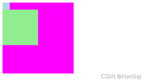
em
- em先找自身是否有font-size大小,如果没有就找父元素,总的来说就是em相对应父元素
css
.div1{
   font-size: 100px;
    width: 200px;
    height: 200px;
    background-color: magenta;
}
.div2{
    font-size: 20px;
    /*该元素有font-size,所以1em = 20px*/
    width: 1em;
    height: 1em;
    background-color: lightblue;
}
.div3{
    /*该元素没有font-size,所以找父元素,父元素有font-size=100px
    所以1em = 100px*/
    width: 1em;
    height: 1em;
    background-color: lightgreen;
}
html
<div class="div1">
     <div class="div2"></div>
     <div class="div3"></div>
 </div>
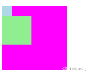
rem
em相对于父元素,那rem呢?r就是指root,也就是根元素,也就是html元素,其中根元素的font-size默认为16px
案例1
css
html{
    font-size: 30px;
}
.div4{
    width: 200px;
    height: 200px;
    background-color: magenta;
}
.div5{
    /* 根元素中font-size = 30px ,所以1rem=30px*/
    width: 1rem;
    height: 1rem;
    background-color: lightblue;
}
.div6{
    /* 根元素中font-size = 30px ,所以3rem=90px*/
    width: 3rem;
    height: 3rem;
    background-color: lightgreen;
}
html
<div class="div4">
    <div class="div5"></div>
    <div class="div6"></div>
</div>
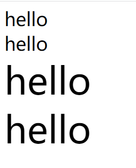
案例2
css
html{
   font-size: 30px;
}
.p1{
	/*1rem = 30px*/
    font-size: 1rem;
}
.p2{
    font-size: 30px;
}
.p3{
	/*2rem = 60px*/
    font-size: 2rem;
}
.p4{
    font-size: 60px;
}
span{
	display:block;
}
html
<span class="p1">hello</span>
<span class="p2">hello</span>
<span class="p3">hello</span>
<span class="p4">hello</span>
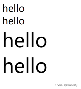
案例3
css
html{
    font-size: 2rem;
    /*默认为1rem = 16px,所以2rem = 32px*/
}
.p1{
	/*1rem = 32px*/
    font-size: 1rem;
}
.p2{
    font-size: 32px;
}
.p3{
	/*2rem = 64px*/
    font-size: 2rem;
}
.p4{
    font-size: 64px;
}
span{
	dispaly:block;
}
html
<span class="p1">hello</span>
<span class="p2">hello</span>
<span class="p3">hello</span>
<span class="p4">hello</span>


 350
350


 被折叠的 条评论
为什么被折叠?
被折叠的 条评论
为什么被折叠?
 到【灌水乐园】发言


