


第一个echarts
注意
- 根据 ECharts 官方文档,ECharts 3.x 版本兼容 Vue 2.x。因此,您可以使用 ECharts 3.x 版本与 Vue 2.x 配合使用。
- 给div设置宽高,不然图表不会显示
<template>
  <div>
    <div id="main" style="width: 600px;height:400px;" ref="myEchart"></div>
  </div>
</template>

<script>
import * as echarts from 'echarts'
export default {
  mounted(){
    const myChart = echarts.init(this.$refs.myEchart);

      // 使用刚指定的配置项和数据显示图表。
      myChart.setOption({
        title: {
          text: 'ECharts 入门示例'
        },
        tooltip: {},
        legend: {
          data: ['销量']
        },
        xAxis: {
          data: ['衬衫', '羊毛衫', '雪纺衫', '裤子', '高跟鞋', '袜子']
        },
        yAxis: {},
        series: [
          {
            name: '销量',
            type: 'bar',
            data: [5, 20, 36, 10, 10, 20]
          }
        ]
      });
  }
}
</script>

<style scoped>

</style>
柱状图及常用属性
title
        title: {
          text: '第一个echarts',
          link:"http://www.baidu.com",
          subtext:"副标题",
          target:"self",//在当前页面打开
          backgroundColor:"red",
          borderColor:"orange",
          borderWidth:"5",
          // textStyle:{
          //   backgroundColor:"red",
          //   borderColor:"orange",
          //   borderWidth:"5",
          // },
          x:"center",
          subtextStyle:{
            color:"white"
          }
        },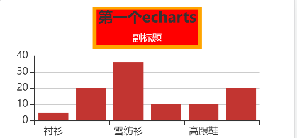
注意:
- 主标题不建议使用textStyle,不然会变成下面这样

toolTip
注意:
- 3.x版本默认是鼠标click触发toolTip属性,另外在移动端,鼠标移入不会触发mousemove
<template>
  <div>
    <div id="main" style="width: 100%;height:200px;" ref="myEchart"></div>
  </div>
</template>

<script>
import  echarts from 'echarts'
export default {
  mounted(){
    const myChart = echarts.init(this.$refs.myEchart);

      // 使用刚指定的配置项和数据显示图表。
      myChart.setOption({
        title: {
          text: '第一个echarts',
          link:"http://www.baidu.com",
          subtext:"副标题",
          target:"self",//在当前页面打开
          backgroundColor:"red",
          borderColor:"orange",
          borderWidth:"5",
          // textStyle:{
          //   backgroundColor:"red",
          //   borderColor:"orange",
          //   borderWidth:"5",
          // },
          x:"center",
          subtextStyle:{
            color:"white"
          }
        },
        tooltip: {
          // trigger:"item",//放到图形上触发
          trigger:"axis",//坐标轴上触发
          triggerOn:"mousemove",//默认是click属性
          axisPointer:{
            // type:"cross"//鼠标移入触发图形十字定位效果
            type:"shadow"//鼠标移入触发图形阴影效果
          },
          formatter(params){
            return params[0].data.value+"<br>"+params[0].data.date
          }
        },
        legend: {
          data: ['销量']
        },
        xAxis: {
          data: ['衬衫', '羊毛衫', '雪纺衫', '裤子', '高跟鞋', '袜子']
        },
        yAxis: {},
        series: [
          {
            name: '销量',
            type: 'bar',
            data: [
              {value:"5",date:"2020-1-1"},
              {value:"6",date:"2020-1-2"},
              {value:"7",date:"2020-1-3"},
              {value:"8",date:"2020-1-4"},
              {value:"9",date:"2020-1-5"},
              {value:"10",date:"2020-1-6"},
            ]
          }
        ]
      });
  }
}
</script>

<style scoped>

</style>
legend
        legend: {
          data: ['销量'],
          show:true,
          top:"5%",
          itemWidth:20,
          itemHeight:10,
          textStyle:{
            color:"red"
          }
        },
series
series: [
          {
            name: '销量',
            type: 'bar',
            data: yData,
            markPoint:{
              data:[
                {
                  name: '最大值',
                  type: 'max'
                }
              ]
            }
          }
        ]
注意
- 使用series下的markPoint中max,min属性时,不能设置Yaxis的值,否则会报以下的错误,
[Vue warn]: Error in mounted hook: "TypeError: coordArr[targetCoordIndex].toFixed is not a function"
水平柱状图
        xAxis: {
          type:"value"
        },
        yAxis: {
          data: ['衬衫', '羊毛衫', '雪纺衫', '裤子', '高跟鞋', '袜子'],
          type:"category"
        },
在xAis和yAis中有一个type属性,用来设置轴类型。category是类目轴,value是数据轴
设置barItem的颜色
        series: [
          {
            name: '销量',
            type: 'bar',
            data: yData,
            itemStyle:{
              // color:"red",//给所用bar-item设置颜色
              normal:{
                color:function(params) {
                    let colorList=[
                      "red",
                      "blue",
                      "pink",
                      "orange",
                      "yellow",
                      "green"
                    ]
                    return colorList[params.dataIndex]
                  }
              }
            },
            markPoint:{
              data:[
                {
                  name: '最大值',
                  type: 'max'
                },
                {
                  name: '最小值',
                  type: 'min'
                }
              ]
            },
            markLine:{
              data:[
                {
                  type:"average",
                  name:"平均值"
                }
              ]

            }
          }
        ]
饼图
<template>
      <div ref="pie" id="pie"></div>
</template>

<script>
import * as echarts from 'echarts'

export default {
  mounted(){
    const myEcharts = echarts.init(this.$refs.pie);
    const myData=[
      {value:"50",name:"衣服"},
      {value:"20",name:"家电"},
      {value:"60",name:"日化"},
      {value:"80",name:"数码"},
    ]
    let option={
      title:{
        text:"饼状图",
        left:"center"
      },
      legend:{
        orient: 'vertical',
        left: "left",
        data:myData.map(item => item.name)//取出myData中的所有值
      },
      series:[
        {
          name:"销量统计",
          type:"pie",
          data:myData,
          radius:["80%","40%"],
          label:{
            show:true,
            position:"inside"
          },
          roseType:"area"//南丁格尔图,使饼状图变得立体起来
        }
      ]
    }
    myEcharts.setOption(option);

  }
}
</script>

<style>
    #pie{
        width: 100%;
        height: 500px;
        border: 1px solid black;
    }
</style>
注意
- 要保证legend中的data与series中name相同


 1987
1987


 被折叠的 条评论
为什么被折叠?
被折叠的 条评论
为什么被折叠?
 到【灌水乐园】发言


