


用CSS实现一个简单的立方体:
可以使用弹性盒子模型,先对父级div进行立体化(3D)操作,然后对多个子div进行操作(翻转,平移等),还可以给父级div加上CSS动画,使整体更加酷炫。
大体效果如图:
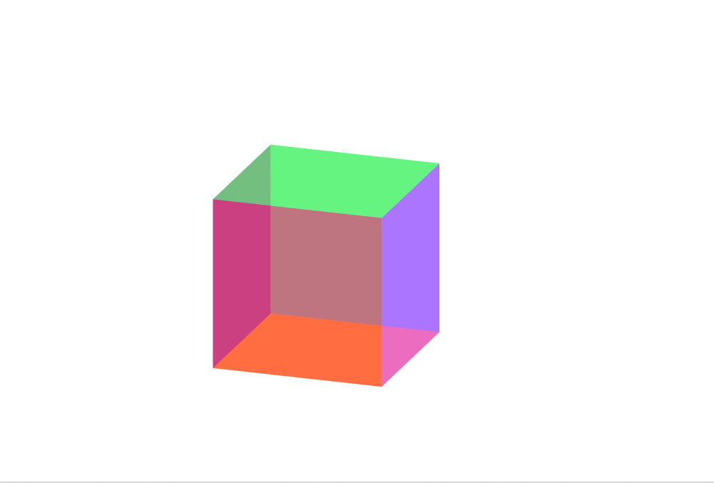
其中我对子div使用了透明度效果opacity,使其可以看到整体情况。大家如果感兴趣,可以在子div中加入img标签添加图片,然后将opacity效果删除,就会得到个图片构成的立方体。
代码如下:
<!DOCTYPE html>
<html lang="en">
<head>
    <meta charset="UTF-8">
    <meta http-equiv="X-UA-Compatible" content="IE=edge">
    <meta name="viewport" content="width=device-width, initial-scale=1.0">
    <title>cube</title>
    <style>
        .cube{
                width: 1000px;
                height: 1000px;
                background-color: white;
                transform: rotateX(-45deg) rotateY(45deg);
                transform-style: preserve-3d;
                animation: OK 3s ease  infinite  backwards;
        }
        .front{
                width: 200px;
                height: 200px;
                background-color:red ;
                opacity: 0.5;
                position: absolute;
                right: 500px;
                bottom: 300px;
                transform: translateZ(200px);
        }
        .bottom{
                width: 200px;
                height: 200px;
                background-color:rgb(255, 179, 0) ;
                opacity: 0.5;
                position: absolute;
                right: 500px;
                bottom: 300px;
                transform: rotateX(90deg)
                translateY(100px)
                translateZ(-100px);
        }
        .over{
                width: 200px;
                height: 200px;
                background-color:rgb(77, 255, 0) ;
                opacity: 0.5;
                position: absolute;
                right: 500px;
                bottom: 300px;
                transform: rotateX(90deg)
                translateY(100px)
                translateZ(100px);
        }
        .after{
                width: 200px;
                height: 200px;
                background-color:rgb(0, 213, 255) ;
                opacity: 0.5;
                position: absolute;
                right: 500px;
                bottom: 300px;

        }
        .left{
                width: 200px;
                height: 200px;
                background-color:rgb(47, 0, 255) ;
                opacity: 0.5;
                position: absolute;
                right: 500px;
                bottom: 300px;
                transform: translateZ(100px)
                translateX(-100px)
                rotateY(90deg);
        }
        .right{
                width: 200px;
                height: 200px;
                background-color:rgb(217, 0, 255) ;
                opacity: 0.5;
                position: absolute;
                right: 500px;
                bottom: 300px;
                transform: translateZ(100px)
                translateX(100px)
                rotateY(90deg);
        }
        @keyframes OK
        {
                0%{
                        transform: rotateX(0deg)
                        rotateY(0deg);
                }
                100%
                {
                        transform: rotateX(360deg)
                        rotateY(360deg);
                }

        }
    </style>
</head>
<body>
    <div class="cube">
        <div class="front"></div>
        <div class="bottom"></div>
        <div class="after"></div>
        <div class="over"></div>
        <div class="left"></div>
        <div class="right"></div>
    </div>
</body>
</html>


 扫一扫
扫一扫


 2807
2807

 被折叠的 条评论
为什么被折叠?
被折叠的 条评论
为什么被折叠?
 到【灌水乐园】发言


