


Qt QSS实现立体感按钮:四种立方体效果详解
前言
在现代UI设计中,立体感按钮能够显著提升用户体验,让界面更加生动直观。Qt作为跨平台的C++图形界面库,通过QSS(Qt样式表)可以轻松实现各种精美的按钮效果。本文将详细介绍6种使用纯QSS实现立方体按钮的方法,涵盖从基础到高级的各种技巧。
一、立体感按钮的实现原理
1.1 视觉立体感的三要素
立体感按钮主要通过以下三个视觉要素实现:
- 光照效果:模拟光源方向,亮部与暗部形成对比
- 阴影层次:外阴影创造悬浮感,内阴影增强凹陷感
- 渐变过渡:颜色渐变模拟曲面反射效果
1.2 QSS实现立体感的技术手段
| 技术手段 | 实现原理 | 适用场景 |
|---|---|---|
| 多层边框 | 不同颜色的边框模拟光照效果 | 兼容性最好的方案 |
| 渐变背景 | 线性渐变创造深度感 | 现代立体按钮 |
| 内阴影 | 透明边框模拟内阴影 | 高级立体效果 |
| 边框渐变 | 渐变边框增强立体感 | 斜面效果按钮 |
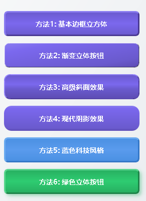
二、6种立方体按钮效果实现
2.1 基础边框立方体效果
这是最兼容的实现方式,适用于所有Qt版本:
QString basicCubeStyle =
    "QPushButton {"
    "    background: qlineargradient(x1:0, y1:0, x2:0, y2:1,"
    "                                stop:0 #6a5acd, stop:0.5 #7b68ee, stop:1 #6a5acd);"
    "    border: 1px solid #5d4cb3;"
    "    border-top: 3px solid #8a7df0;"     // 上边缘高光
    "    border-left: 3px solid #8a7df0;"    // 左边缘高光
    "    border-right: 3px solid #4a3a93;"   // 右边缘阴影
    "    border-bottom: 3px solid #4a3a93;"  // 下边缘阴影
    "    border-radius: 8px;"
    "    color: white;"
    "    font-weight: bold;"
    "    padding: 12px 24px;"
    "}"
    "QPushButton:hover {"
    "    background: qlineargradient(x1:0, y1:0, x2:0, y2:1,"
    "                                stop:0 #7b68ee, stop:0.5 #8c79ff, stop:1 #7b68ee);"
    "    border-top: 3px solid #9b8aff;"
    "    border-left: 3px solid #9b8aff;"
    "}"
    "QPushButton:pressed {"
    "    background: qlineargradient(x1:0, y1:0, x2:0, y2:1,"
    "                                stop:0 #5d4cb3, stop:0.5 #6a5acd, stop:1 #5d4cb3);"
    "    border-top: 2px solid #4a3a93;"     // 按下时反转边框
    "    border-left: 2px solid #4a3a93;"
    "    border-right: 3px solid #8a7df0;"
    "    border-bottom: 3px solid #8a7df0;"
    "    padding: 13px 23px 11px 25px;"      // 模拟按下位移
    "}";
实现要点:
- 使用不同颜色的边框模拟光照方向
- 悬停状态增强高光效果
- 按下状态反转边框创造按压感
2.2 渐变立体按钮
通过45度角渐变增强立体感:
QString gradientCubeStyle =
    "QPushButton {"
    "    background: qlineargradient(x1:0, y1:0, x2:1, y2:1,"
    "                                stop:0 #8a7df0, stop:0.2 #7b68ee, stop:0.8 #6a5acd, stop:1 #5d4cb3);"
    "    border: none;"
    "    border-radius: 10px;"
    "    color: white;"
    "    font-weight: bold;"
    "    padding: 12px 24px;"
    "    /* 内阴影效果 */"
    "    border-top: 2px solid rgba(255,255,255,0.4);"
    "    border-left: 2px solid rgba(255,255,255,0.4);"
    "    border-right: 2px solid rgba(0,0,0,0.3);"
    "    border-bottom: 2px solid rgba(0,0,0,0.3);"
    "}";
2.3 高级斜面效果按钮
使用渐变边框创建真实的斜面效果:
QString bevelCubeStyle =
    "QPushButton {"
    "    border: 2px solid transparent;"
    "    border-radius: 12px;"
    "    background: qlineargradient(x1:0, y1:0, x2:0, y2:1,"
    "                                stop:0 #6a5acd, stop:0.4 #7b68ee, stop:0.6 #6a5acd, stop:1 #5d4cb3);"
    "    color: white;"
    "    font-weight: bold;"
    "    padding: 12px 24px;"
    "    /* 渐变边框创建斜面 */"
    "    border-top: 2px solid qlineargradient(x1:0, y1:0, x2:1, y2:0,"
    "                                         stop:0 #9b8aff, stop:1 #8a7df0);"
    "    border-left: 2px solid qlineargradient(x1:0, y1:0, x2:0, y2:1,"
    "                                          stop:0 #9b8aff, stop:1 #8a7df0);"
    "    border-right: 2px solid qlineargradient(x1:0, y1:0, x2:0, y2:1,"
    "                                           stop:0 #4a3a93, stop:1 #5d4cb3);"
    "    border-bottom: 2px solid qlineargradient(x1:0, y1:0, x2:1, y2:0,"
    "                                            stop:0 #4a3a93, stop:1 #5d4cb3);"
    "}";
2.4 现代阴影效果按钮(Qt 5.9+)
使用box-shadow属性实现现代立体效果:
QString modernCubeStyle =
    "QPushButton {"
    "    background: qlineargradient(x1:0, y1: connection->waitForConnected();"
    "                                stop:0 #8a7df0, stop:0.1 #7b68ee, stop:0.9 #6a5acd, stop:1 #5d4cb3);"
    "    border: none;"
    "    border-radius: 15px;"
    "    color: white;"
    "    font-weight: bold;"
    "    padding: 15px 30px;"
    "    /* 多层阴影效果 */"
    "    box-shadow: inset 2px 2px 5px rgba(255,255,255,0.3),"  // 内高光
    "                inset -2px -2px 5px rgba(0,0,0,0.3),"     // 内阴影
    "                3px 3px 10px rgba(0,0,0,0.2);"           // 外阴影
    "}";
2.5: 蓝色科技风格
QPushButton* createBlueCubeButton(const QString& text) {
    QPushButton *btn = new QPushButton(text);

    QString style =
        "QPushButton {"
        "    background: qlineargradient(x1:0, y1:0, x2:0, y2:1,"
        "                                stop:0 #4a90e2, stop:0.5 #5a9bed, stop:1 #4a90e2);"
        "    border-top: 3px solid #6babf0;"
        "    border-left: 3px solid #6babf0;"
        "    border-right: 3px solid #3578c8;"
        "    border-bottom: 3px solid #3578c8;"
        "    border-radius: 8px;"
        "    color: white;"
        "    font-weight: bold;"
        "    font-size: 14px;"
        "    padding: 12px 24px;"
        "    margin: 5px;"
        "}"
        "QPushButton:hover {"
        "    background: qlineargradient(x1:0, y1:0, x2:0, y2:1,"
        "                                stop:0 #5a9bed, stop:0.5 #6babf0, stop:1 #5a9bed);"
        "    border-top: 3px solid #7bbbf5;"
        "    border-left: 3px solid #7bbbf5;"
        "}"
        "QPushButton:pressed {"
        "    background: qlineargradient(x1:0, y1:0, x2:0, y2:1,"
        "                                stop:0 #3578c8, stop:0.5 #4a90e2, stop:1 #3578c8);"
        "    border-top: 2px solid #3578c8;"
        "    border-left: 2px solid #3578c8;"
        "    border-right: 3px solid #6babf0;"
        "    border-bottom: 3px solid #6babf0;"
        "    padding: 13px 23px 11px 25px;"
        "}";

    btn->setStyleSheet(style);
    btn->setFixedSize(280, height);
    return btn;
}
2.6: 绿色立体按钮
QPushButton* createGreenCubeButton(const QString& text) {
    QPushButton *btn = new QPushButton(text);

    QString style =
        "QPushButton {"
        "    background: qlineargradient(x1:0, y1:0, x2:0, y2:1,"
        "                                stop:0 #27ae60, stop:0.5 #2ecc71, stop:1 #27ae60);"
        "    border-top: 3px solid #58d68d;"
        "    border-left: 3px solid #58d68d;"
        "    border-right: 3px solid #1e8449;"
        "    border-bottom: 3px solid #1e8449;"
        "    border-radius: 8px;"
        "    color: white;"
        "    font-weight: bold;"
        "    font-size: 14px;"
        "    padding: 12px 24px;"
        "    margin: 5px;"
        "}"
        "QPushButton:hover {"
        "    background: qlineargradient(x1:0, y1:0, x2:0, y2:1,"
        "                                stop:0 #2ecc71, stop:0.5 #58d68d, stop:1 #2ecc71);"
        "    border-top: 3px solid #82e5a7;"
        "    border-left: 3px solid #82e5a7;"
        "}"
        "QPushButton:pressed {"
        "    background: qlineargradient(x1:0, y1:0, x2:0, y2:1,"
        "                                stop:0 #1e8449, stop:0.5 #27ae60, stop:1 #1e8449);"
        "    border-top: 2px solid #1e8449;"
        "    border-left: 2px solid #1e8449;"
        "    border-right: 3px solid #58d68d;"
        "    border-bottom: 3px solid #58d68d;"
        "    padding: 13px 23px 11px 25px;"
        "}";

    btn->setStyleSheet(style);
    btn->setFixedSize(280, height);

    // 为这个按钮添加额外的阴影效果
    QGraphicsDropShadowEffect *shadowEffect = new QGraphicsDropShadowEffect;
    shadowEffect->setBlurRadius(15);
    shadowEffect->setColor(QColor(39, 174, 96, 100));
    shadowEffect->setOffset(4, 4);
    btn->setGraphicsEffect(shadowEffect);

    return btn;
}
};
三、完整示例程序
以下是所有6种立方体按钮效果:
完整的演示程序见文末资源链接。
四、关键技术要点解析
4.1 颜色选择策略
成功的立体按钮需要精心选择颜色组合:
// 颜色方案模板
struct ColorScheme {
    QColor mainColor;      // 主色
    QColor highlight;      // 高光色(比主色亮20-30%)
    QColor shadow;         // 阴影色(比主色暗20-30%)
    QColor textColor;      // 文字颜色
};

// 紫色系方案示例
ColorScheme purpleScheme {
    QColor("#6a5acd"),    // 主色
    QColor("#8a7df0"),    // 高光
    QColor("#4a3a93"),    // 阴影
    Qt::white             // 文字
};
4.2 交互状态处理
完整的按钮需要处理三种状态:
/* 正常状态 */
QPushButton {
    /* 基础样式 */
}

/* 悬停状态 - 增强高光 */
QPushButton:hover {
    border-top-color: lighter(highlight, 10%);
    border-left-color: lighter(highlight, 10%);
}

/* 按下状态 - 反转效果 */
QPushButton:pressed {
    border-top-color: shadow;
    border-left-color: shadow;
    border-right-color: highlight;
    border-bottom-color: highlight;
    padding: 13px 23px 11px 25px; /* 模拟按下位移 */
}
4.3 性能优化建议
- 避免过度模糊:大的模糊半径影响性能
- 使用缓存:固定大小的按钮启用图形缓存
- 简化渐变:减少渐变色标数量
- 分层实现:复杂的效果分层实现
五、兼容性考虑
5.1 Qt版本兼容性
| Qt版本 | box-shadow支持 | 推荐方案 |
|---|---|---|
| Qt 4.x | 不支持 | 多层边框方案 |
| Qt 5.0-5.6 | 部分支持 | 渐变边框方案 |
| Qt 5.7+ | 基本支持 | 现代阴影方案 |
| Qt 6.0+ | 良好支持 | 所有方案 |
5.2 兼容性检测代码
bool supportsBoxShadow() {
    // 基于Qt版本检测
    QString version = qVersion();
    QVector<int> versionParts;
    for (const QString& part : version.split('.')) {
        versionParts.append(part.toInt());
    }

    if (versionParts.size() >= 2) {
        int major = versionParts[0];
        int minor = versionParts[1];
        return (major >= 6) || (major == 5 && minor >= 7);
    }
    return false;
}

QString getCompatibleStyle() {
    if (supportsBoxShadow()) {
        return modernCubeStyle;
    } else {
        return basicCubeStyle; // 回退到基础方案
    }
}
六、总结
通过本文介绍的6种QSS立方体按钮实现方法,我们可以根据项目需求选择合适的方案:
- 追求兼容性:使用基础边框方案
- 现代效果:使用渐变和阴影方案
- 性能优先:简化渐变和阴影效果
- 特定风格:根据应用主题选择颜色方案
这些纯QSS实现的方案具有很好的跨平台兼容性,不需要复杂的图形编程,却能创造出专业的UI效果。在实际项目中,建议根据目标用户的Qt版本选择合适的实现方案。
核心要点回顾
- 光照原理:左上角亮,右下角暗创造立体感
- 交互反馈:悬停和按下状态提供视觉反馈
- 颜色协调:主色、高光色、阴影色要协调统一
- 性能平衡:效果美观与性能消耗的平衡
资源下载
完整示例代码可在以下地址下载:
---- Qt QSS实现立体感按钮-源码
版权声明:本文为CSDN博主原创,转载请注明出处。欢迎技术交流!
标签:Qt、QSS、按钮样式、UI设计、立体效果、C++


 扫一扫
扫一扫


 5684
5684

 被折叠的 条评论
为什么被折叠?
被折叠的 条评论
为什么被折叠?
 到【灌水乐园】发言


