


Android:View体系
一. 示图坐标系
1.View简介
View是Android所有控件的基类,同时ViewGroup也是继承自View,看下面这张图我们就会有一个直观的了解:
2.Android坐标系
在Android中,将屏幕的左上角的顶点作为Android坐标系的原点,这个原点向右是X轴正方向,原点向下是Y轴正方向。
3.View坐标系
View坐标系以父视图到左上角为坐标原点,过原点的水平直线为X轴,向右为正方向;过原点的垂线为Y轴,向下为正方向。
getTop(); //View的顶边到其Parent View的顶边的距离,即View的顶边与View坐标系的X轴之间的距离
getLeft(); //View的左边到其Parent View的左边的距离,即View的左边与View坐标系的Y轴之间的距离
getBottom(); //View的底边到其Parent View的顶边的距离,即View的底边与View坐标系的X轴之间的距离
getRight(); //View的右边到其Parent View的左边的距离,即View的右边与View坐标系的Y轴之间的距离
getHeight():获取View自身高度
getWidth():获取View自身宽度

我们看上图那个深蓝色的点,假设就是我们触摸的点,我们知道无论是View还是ViewGroup,最终的点击事件都会由onTouchEvent(MotionEvent event)方法来处理,MotionEvent也提供了各种获取焦点坐标的方法:
getX():获取点击事件距离控件左边的距离,即视图坐标
getY():获取点击事件距离控件顶边的距离,即视图坐标
getRawX():获取点击事件距离整个屏幕左边距离,即绝对坐标
getRawY():获取点击事件距离整个屏幕顶边的的距离,即绝对坐标
二 .View滑动的6种方法
1.Layout()
view进行绘制的时候会调用onLayout()方法来设置显示的位置,因此我们同样也可以通过修改View的left、top、right、bottom这四种属性来控制View的坐标。首先我们要自定义一个View,在onTouchEvent()方法中获取触摸点的坐标:
public boolean onTouchEvent(MotionEvent event) {
    //获取到手指处的横坐标和纵坐标
    int x = (int) event.getX();
    int y = (int) event.getY();

    switch (event.getAction()) {
        case MotionEvent.ACTION_DOWN:
            lastX = x;
            lastY = y;
            break;
…
接下来我们在ACTION_MOVE事件中计算偏移量,再调用layout()方法重新放置这个自定义View的位置就好了:
        case MotionEvent.ACTION_MOVE:
            //计算移动的距离
            int offsetX = x - lastX;
            int offsetY = y - lastY;
            //调用layout方法来重新放置它的位置
            layout(getLeft()+offsetX, getTop()+offsetY,
                    getRight()+offsetX , getBottom()+offsetY);
            break;
当我们每次移动时都会调用layout()方法来对自己重新布局,从而达到移动View的效果。
自定义View的全部代码(CustomView.Java):
package com.example.liuwangshu.moonviewslide;
import android.content.Context;
import android.util.AttributeSet;
import android.view.MotionEvent;
import android.view.View;
public class CustomView extends View {
	private int lastX;
	private int lastY;
public CustomView(Context context, AttributeSet attrs, int defStyleAttr) {
    super(context, attrs, defStyleAttr);
 }
public CustomView(Context context, AttributeSet attrs) {
    super(context, attrs);
 }
public CustomView(Context context) {
    super(context);
 }
public boolean onTouchEvent(MotionEvent event) {
    //获取到手指处的横坐标和纵坐标
    int x = (int) event.getX();
    int y = (int) event.getY();

    switch (event.getAction()) {
        case MotionEvent.ACTION_DOWN:
            lastX = x;
            lastY = y;
            break;

        case MotionEvent.ACTION_MOVE:
            //计算移动的距离
            int offsetX = x - lastX;
            int offsetY = y - lastY;
            //调用layout方法来重新放置它的位置
            layout(getLeft()+offsetX, getTop()+offsetY,
                    getRight()+offsetX , getBottom()+offsetY);
            break;
    }
    	return true;
 }
 }
布局中引用自定义View:
<?xml version="1.0" encoding="utf-8"?>
<LinearLayout xmlns:android="http://schemas.android.com/apk/res/android"
xmlns:tools="http://schemas.android.com/tools"
android:layout_width="match_parent"
android:layout_height="match_parent"
android:orientation="vertical">

<com.example.liuwangshu.moonviewslide.CustomView
    android:id="@+id/customview"
    android:layout_width="80dp"
    android:layout_height="80dp"
    android:layout_margin="50dp"
    android:background="@android:color/holo_red_light" />
</LinearLayout>
```
offsetLeftAndRight()与offsetTopAndBottom()
这两种方法和layout()方法效果方法差不多,使用也差不多,我们将ACTION_MOVE中的代码替换成如下代码:
在这里插入代码片 case MotionEvent.ACTION_MOVE:
                //计算移动的距离
                int offsetX = x - lastX;
                int offsetY = y - lastY;
                //对left和right进行偏移
                offsetLeftAndRight(offsetX);
                //对top和bottom进行偏移
                offsetTopAndBottom(offsetY);
                break;
LayoutParams(改变布局参数)
LayoutParams主要保存了一个View的布局参数,因此我们可以通过LayoutParams来改变View的布局的参数从而达到了改变View的位置的效果。同样的我们将ACTION_MOVE中的代码替换成如下代码:
 LinearLayout.LayoutParams layoutParams= (LinearLayout.LayoutParams) getLayoutParams();
                layoutParams.leftMargin = getLeft() + offsetX;
                layoutParams.topMargin = getTop() + offsetY;
                setLayoutParams(layoutParams);
因为父控件是LinearLayout,所以我们用了LinearLayout.LayoutParams,如果父控件是RelativeLayout则要使用RelativeLayout.LayoutParams。除了使用布局的LayoutParams外,我们还可以用ViewGroup.MarginLayoutParams来实现:
ViewGroup.MarginLayoutParams layoutParams = (ViewGroup.MarginLayoutParams) getLayoutParams();
            layoutParams.leftMargin = getLeft() + offsetX;
            layoutParams.topMargin = getTop() + offsetY;
            setLayoutParams(layoutParams);
动画
可以采用View动画来移动,在res目录新建anim文件夹并创建translate.xml:
<?xml version="1.0" encoding="utf-8"?>
<set xmlns:android="http://schemas.android.com/apk/res/android">
    <translate android:fromXDelta="0" android:toXDelta="300" android:duration="1000"/>
</set>
在Java代码中引用:
mCustomView.setAnimation(AnimationUtils.loadAnimation(this, R.anim.translate));当然使用属性动画移动那就更简单了,我们让CustomView在1000毫秒内沿着X轴像右平移300像素:
ObjectAnimator.ofFloat(mCustomView,"translationX",0,300).setDuration(1000).start();scollTo与scollBy
scollTo(x,y)表示移动到一个具体的坐标点,而scollBy(dx,dy)则表示移动的增量为dx、dy。其中scollBy最终也是要调用scollTo的。scollTo、scollBy移动的是View的内容,如果在ViewGroup中使用则是移动他所有的子View。我们将ACTION_MOVE中的代码替换成如下代码:
((View)getParent()).scrollBy(-offsetX,-offsetY);Scroller
我们用scollTo/scollBy方法来进行滑动时,这个过程是瞬间完成的,所以用户体验不大好。这里我们可以使用Scroller来实现有过度效果的滑动,这个过程不是瞬间完成的,而是在一定的时间间隔完成的。Scroller本身是不能实现View的滑动的,它需要配合View的computeScroll()方法才能弹性滑动的效果。
在这里我们实现CustomView平滑的向右移动。
首先我们要初始化Scroller:
public CustomView(Context context, AttributeSet attrs) {
    super(context, attrs);
    mScroller = new Scroller(context);
}
接下来重写computeScroll()方法,系统会在绘制View的时候在draw()方法中调用该方法,这个方法中我们调用父类的scrollTo()方法并通过Scroller来不断获取当前的滚动值,每滑动一小段距离我们就调用invalidate()方法不断的进行重绘,重绘就会调用computeScroll()方法,这样我们就通过不断的移动一个小的距离并连贯起来就实现了平滑移动的效果:
 @Override
    public void computeScroll() {
        super.computeScroll();
        if(mScroller.computeScrollOffset()){
            ((View) getParent()).scrollTo(mScroller.getCurrX(),mScroller.getCurrY());
             //通过不断的重绘不断的调用computeScroll方法
             invalidate();
        }
    }
调用Scroller.startScroll()方法。我们在CustomView中写一个smoothScrollTo()方法,调用Scroller.startScroll()方法,在2000毫秒内沿X轴平移delta像素:
public void smoothScrollTo(int destX,int destY){
        int scrollX=getScrollX();
        int delta=destX-scrollX;
        //1000秒内滑向destX
        mScroller.startScroll(scrollX,0,delta,0,2000);
        invalidate();
    }
最后我们在ViewSlideActivity.java中调用CustomView的smoothScrollTo()方法:
 //使用Scroll来进行平滑移动
          mCustomView.smoothScrollTo(-400,0);
三.属性动画
1.工作原理
在一定时间间隔内,通过不断对值进行改变,并不断将该值赋给对象的属性,从而实现该对象在该属性上的动画效果
2.工作逻辑

3.具体使用
(1.两个使用方法类:ValueAnimator 类 & ObjectAnimator 类
(2.两个辅助使用类:插值器 & 估值器
4.ValueAnimator类
ValueAnimator不提供任何动画效果,它更像一个数值发生器,用来产生一定规律数字,从而让调用者来控制动画的实现过程。通常情况下,在ValueAnimator的AnimatorUpdateListener中监听数值的变化,从而完成动画的变换:

ValueAnimator mValueAnimator=ValueAnimator.ofFloat(0,100);
mValueAnimator.setTarget(view);
mValueAnimator.setDuration(1000).start();
mValueAnimator.addUpdateListener(new ValueAnimator.AnimatorUpdateListener() {
            @Override
            public void onAnimationUpdate(ValueAnimator animation) {
                Float mFloat=(Float)animation.getAnimatedValue();
            }
        });
    }
5.ObjectAnimator类
ObjectAnimator是属性动画最重要的类,创建一个ObjectAnimator只需通过他的静态工厂类直接返还一个ObjectAnimator对象。参数包括一个对象和对象的属性名字,但这个属性必须有get和set函数,内部会通过java反射机制来调用set函数修改对象的属性值。
来看看平移动画是如何实现的:
ObjectAnimator mObjectAnimator=ObjectAnimator.ofFloat(view,"translationX",200);
mObjectAnimator.setDuration(300);
mObjectAnimator.start();
过ObjectAnimator 的静态工厂方法,创建一个ObjectAnimator 对象,第一个对象是要操作的View,第二个参数则是要操纵的属性,最后一个参数是一个可变的数组参数,需要传进去一个该属性变化的一个取值的过程,这里设置了一个参数,变化到200。与视图动画一样,也可以给属性动画设置显示时长,差值器等属性。在使用ObjectAnimator的时候,有一个非常重要,那就是是要操纵的属性必须要有get,set方法,不然ObjectAnimator 就无法起效。下面就是一些常用的可以直接使用的属性动画的属性值:
translationX和translationY:这两个属性作为增量控制View对象从他的布局容器的左上角开始位置。
rotation、rotationX、rotationY:这三个属性控制View对象围绕它的支点进行2D和3D旋转。
PrivotX和PrivotY:控制View对象的支点位置,围绕这个支点进行旋转和缩放变换处理。默认该支点位置就是View对象的中心点。
alpha:透明度,默认是1(不透明),0代表完全透明。
x和y:描述View对象在它容器中的最终位置,它是最初的做上角坐标和translationX,translationY值的累计的和。
从上面的工作原理可以看出:ObjectAnimator与 ValueAnimator类的区别:
ValueAnimator 类是先改变值,然后 手动赋值 给对象的属性从而实现动画;是 间接 对对象属性进行操作;
ObjectAnimator 类是先改变值,然后 自动赋值 给对象的属性从而实现动画;是 直接 对对象属性进行操作;
6.插值器

7.估值器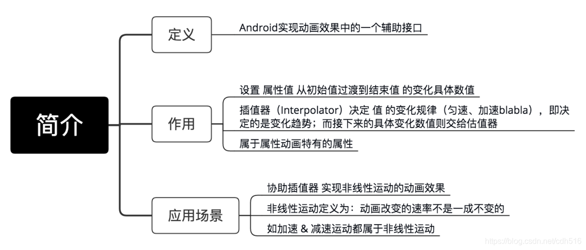
8.两者区别:

9.动画
完整的动画具有start,Repeat,End,Cancel四个过程:
ObjectAnimator animator=ObjectAnimator.ofFloat(view,"alpha",1.5f);
        animator.addListener(new Animator.AnimatorListener() {
            @Override
            public void onAnimationStart(Animator animation) {
            }
            @Override
            public void onAnimationEnd(Animator animation) {
            }
            @Override
            public void onAnimationCancel(Animator animation) {
            }
            @Override
            public void onAnimationRepeat(Animator animation) {
            }
        });
    }
android也提供了AnimatorListenterAdaper来让我门选择必要的事件进行监听:
ObjectAnimator animator=ObjectAnimator.ofFloat(view,"alpha",1.5f);
        animator.addListener(new AnimatorListenerAdapter() {
            @Override
            public void onAnimationEnd(Animator animation) {
                super.onAnimationEnd(animation);
            }
        });
10.组合动画-AnimatorSet
这个类提供了一个play()方法,如果我们向这个方法中传入一个Animator对象(ValueAnimator或ObjectAnimator)将会返回一个AnimatorSet.Builder的实例,AnimatorSet.Builder中包括以下四个方法:
after(Animator anim) 将现有动画插入到传入的动画之后执行
after(long delay) 将现有动画延迟指定毫秒后执行
before(Animator anim) 将现有动画插入到传入的动画之前执行
with(Animator anim) 将现有动画和传入的动画同时执行
ObjectAnimator animator1 = ObjectAnimator.ofFloat(mCustomView, "translationX", 0.0f, 200.0f, 0f);
ObjectAnimator animator2 = ObjectAnimator.ofFloat(mCustomView, "scaleX", 1.0f, 2.0f);
ObjectAnimator animator3 = ObjectAnimator.ofFloat(mCustomView, "rotationX", 0.0f, 90.0f, 0.0F);
AnimatorSet set=new AnimatorSet();
set.setDuration(1000);
set.play(animator1).with(animator2).after(animator3);
set.start();四.自定义View
1.自定义View简介
自定义View按照笔者的划分,分为两大类,一种是自定义View,一种是自定义ViewGroup;其中自定义View又分为继承View和继承系统控件两种。这篇文章首先先了解下两大类的其中一种:自定义View。
2.2.继承系统控件的自定义View
这种自定义View在系统控件的基础上进行拓展,一般是添加新的功能或者修改显示的效果,一般情况下我们在onDraw()方法中进行处理。
public class InvalidTextView extends TextView {
    private Paint mPaint = new Paint(Paint.ANTI_ALIAS_FLAG);

    public InvalidTextView(Context context) {
        super(context);
        initDraw();
    }

    public InvalidTextView(Context context, AttributeSet attrs) {
        super(context, attrs);
        initDraw();
    }

    public InvalidTextView(Context context, AttributeSet attrs, int defStyleAttr) {
        super(context, attrs, defStyleAttr);
        initDraw();
    }

    private void initDraw() {
        mPaint.setColor(Color.RED);
        mPaint.setStrokeWidth((float) 1.5);
    }

    @Override
    protected void onDraw(Canvas canvas) {
        super.onDraw(canvas);
        int width = getWidth();
        int height = getHeight();
        canvas.drawLine(0, height / 2, width, height / 2, mPaint);
    }
}
这个自定义View继承TextView,并且在onDraw()方法中画了一条红色的横线,接下来在布局中引用这个InvalidTextView:
<com.example.liuwangshu.mooncustomview.InvalidTextView
    android:id="@+id/iv_text"
    android:layout_width="200dp"
    android:layout_height="100dp"
    android:background="@android:color/holo_blue_light"
    android:gravity="center"
    android:textSize="16sp"
    android:layout_centerHorizontal="true"
    />
3.3.继承View的自定义View
继承View的自定义View实现起来要稍微复杂一些,不只是要实现onDraw()方法,而且在实现过程中还要考虑到wrap_content属性以及padding属性的设置;为了方便配置自己的自定义View还会对外提供自定义的属性,另外如果要改变触控的逻辑,还要重写onTouchEvent()等触控事件的方法。
按照上面的例子我们再写一个RectView类继承View来画一个正方形:
public class RectView extends View {
    private Paint mPaint = new Paint(Paint.ANTI_ALIAS_FLAG);
    private int mColor=Color.RED;
    public RectView(Context context) {
        super(context);
        initDraw();
    }

    public RectView(Context context, AttributeSet attrs) {
        super(context, attrs);
        initDraw();
    }

    public RectView(Context context, AttributeSet attrs, int defStyleAttr) {
        super(context, attrs, defStyleAttr);
        initDraw();
    }

    private void initDraw() {
        mPaint.setColor(mColor);
        mPaint.setStrokeWidth((float) 1.5);
    }

    @Override
    protected void onDraw(Canvas canvas) {
        super.onDraw(canvas);
        int width = getWidth();
        int height = getHeight();
        canvas.drawRect(0, 0, width, height, mPaint);
    }
}
在布局中引用RectView:
<com.example.liuwangshu.mooncustomview.RectView
      android:id="@+id/rv_rect"
      android:layout_width="200dp"
      android:layout_height="200dp"
      android:layout_below="@id/iv_text"
      android:layout_marginTop="50dp"
      android:layout_centerHorizontal="true"/>
4.自定义组合控件
1.组合控件的xml布局
我们现在就自定义一个顶部的标题栏,当然实现标题栏有很多的方法,我们来看看自定义组合控件如何去实现。首先我们先定义我们组合控件的布局(view_customtitle.xml):
<?xml version="1.0" encoding="utf-8"?>
<RelativeLayout xmlns:android="http://schemas.android.com/apk/res/android"
    android:id="@+id/layout_titlebar_rootlayout"
    android:layout_width="fill_parent"
    android:layout_height="45dp"
    >

    <ImageView
        android:id="@+id/iv_titlebar_left"
        android:layout_width="wrap_content"
        android:layout_height="fill_parent"
        android:layout_alignParentLeft="true"
        android:layout_centerInParent="true"
        android:paddingLeft="15dp"
        android:paddingRight="15dp"
        android:src="@drawable/ico_return"
       />
    <TextView
        android:id="@+id/tv_titlebar_title"
        android:layout_width="wrap_content"
        android:layout_height="wrap_content"
        android:layout_centerInParent="true"
        android:maxEms="11"
        android:singleLine="true"
        android:ellipsize="end"
        android:textStyle="bold"/>
    <ImageView
        android:id="@+id/iv_titlebar_right"
        android:layout_width="wrap_content"
        android:layout_height="fill_parent"
        android:layout_alignParentRight="true"
        android:layout_centerInParent="true"
        android:src="@drawable/title_right"
        android:gravity="center"
        android:padding="15dp"
        />
    </RelativeLayout>
2.组合控件的Java代码
接下来我们写java代码,因为我们的组合控件整体布局是RelativeLayout,所以我们的组合控件要继承RelativeLayout:
public class TitleBar extends RelativeLayout {
    private ImageView iv_titlebar_left;
    private ImageView iv_titlebar_right;
    private TextView tv_titlebar_title;
    private RelativeLayout layout_titlebar_rootlayout;
    private int mColor= Color.BLUE;
    private int mTextColor= Color.WHITE;
    public TitleBar(Context context) {
        super(context);
        initView(context);
    }

    public TitleBar(Context context, AttributeSet attrs) {
        super(context, attrs);
        initView(context);
    }

    public TitleBar(Context context, AttributeSet attrs, int defStyleAttr) {
        super(context, attrs, defStyleAttr);
        initView(context);
    }

    public void initView(Context context){
        LayoutInflater.from(context).inflate(R.layout.view_customtitle, this, true);
        iv_titlebar_left= (ImageView) findViewById(R.id.iv_titlebar_left);
        iv_titlebar_right= (ImageView) findViewById(R.id.iv_titlebar_right);
        tv_titlebar_title= (TextView) findViewById(R.id.tv_titlebar_title);
        layout_titlebar_rootlayout= (RelativeLayout) findViewById(R.id.layout_titlebar_rootlayout);
        //设置背景颜色
        layout_titlebar_rootlayout.setBackgroundColor(mColor);
        //设置标题文字颜色
        tv_titlebar_title.setTextColor(mTextColor);
    }
    public void setTitle(String titlename){
        if(!TextUtils.isEmpty(titlename)) {
            tv_titlebar_title.setText(titlename);
        }
    }

    public void setLeftListener(OnClickListener onClickListener){
        iv_titlebar_left.setOnClickListener(onClickListener);
    }
    public void setRightListener(OnClickListener onClickListener){
        iv_titlebar_right.setOnClickListener(onClickListener);
    }
}
3.自定义属性
1.在values目录下创建 attrs.xml:
<?xml version="1.0" encoding="utf-8"?>
<resources>
    <declare-styleable name="TitleBar">
        <attr name="title_text_color" format="color" />
        <attr name="title_bg" format="color" />
        <attr name="title_text" format="string" />
    </declare-styleable>
</resources>
2.我们定义了三个属性,分别用来设置顶部标题栏的背景颜色、标题文字颜色和标题文字。为了引入自定义属性我们需要在TitleBar的构造函数中解析自定义属性的值:
public TitleBar(Context context, AttributeSet attrs) {
       super(context, attrs);
       TypedArray mTypedArray=context.obtainStyledAttributes(attrs,R.styleable.TitleBar);
       mColor=mTypedArray.getColor(R.styleable.TitleBar_title_bg,Color.BLUE);
       mTextColor=mTypedArray.getColor(R.styleable.TitleBar_title_text_color, Color.WHITE);
       titlename=mTypedArray.getString(R.styleable.TitleBar_title_text);
       //获取资源后要及时回收
       mTypedArray.recycle();
       initView(context);
   }
3.贴上修改后TitleBar的完整的代码:
import android.content.Context;
import android.content.res.TypedArray;
import android.graphics.Color;
import android.text.TextUtils;
import android.util.AttributeSet;
import android.view.LayoutInflater;
import android.widget.ImageView;
import android.widget.RelativeLayout;
import android.widget.TextView;

public class TitleBar extends RelativeLayout {
    private ImageView iv_titlebar_left;
    private ImageView iv_titlebar_right;
    private TextView tv_titlebar_title;
    private RelativeLayout layout_titlebar_rootlayout;
    private int mColor = Color.BLUE;
    private int mTextColor = Color.WHITE;
    private String titlename;

    public TitleBar(Context context) {
        super(context);
        initView(context);
    }

    public TitleBar(Context context, AttributeSet attrs) {
        super(context, attrs);
        initTypedArray(context, attrs);
        initView(context);
    }


    public TitleBar(Context context, AttributeSet attrs, int defStyleAttr) {
        super(context, attrs, defStyleAttr);
        initTypedArray(context, attrs);
        initView(context);
    }

    private void initTypedArray(Context context, AttributeSet attrs) {
        TypedArray mTypedArray = context.obtainStyledAttributes(attrs, R.styleable.TitleBar);
        mColor = mTypedArray.getColor(R.styleable.TitleBar_title_bg, Color.BLUE);
        mTextColor = mTypedArray.getColor(R.styleable.TitleBar_title_text_color, Color.WHITE);
        titlename = mTypedArray.getString(R.styleable.TitleBar_title_text);
        //获取资源后要及时回收
        mTypedArray.recycle();
    }

    private void initView(Context context) {
        LayoutInflater.from(context).inflate(R.layout.view_customtitle, this, true);
        iv_titlebar_left = (ImageView) findViewById(R.id.iv_titlebar_left);
        iv_titlebar_right = (ImageView) findViewById(R.id.iv_titlebar_right);
        tv_titlebar_title = (TextView) findViewById(R.id.tv_titlebar_title);
        layout_titlebar_rootlayout = (RelativeLayout) findViewById(R.id.layout_titlebar_rootlayout);
        //设置背景颜色
        layout_titlebar_rootlayout.setBackgroundColor(mColor);
        //设置标题文字颜色
        tv_titlebar_title.setTextColor(mTextColor);
        setTitle(titlename);
    }

    public void setTitle(String titlename) {
        if (!TextUtils.isEmpty(titlename)) {
            tv_titlebar_title.setText(titlename);
        }
    }

    public void setLeftListener(OnClickListener onClickListener) {
        iv_titlebar_left.setOnClickListener(onClickListener);
    }

    public void setRightListener(OnClickListener onClickListener) {
        iv_titlebar_right.setOnClickListener(onClickListener);
    }
}
4.xml中引用组合控件
1.接下来在我们引用组合控件的布局,使用自定义属性需要添加schemas: xmlns:app=”http://schemas.android.com/apk/res-auto”,其中app是 我们自定义的名字,当然我们也可以取其他的名字:
<?xml version="1.0" encoding="utf-8"?>
<LinearLayout xmlns:android="http://schemas.android.com/apk/res/android"
android:layout_width="match_parent"
android:layout_height="match_parent"
android:orientation="vertical">

<com.example.liuwangshu.mooncustomgroup.TitleBar
    xmlns:app="http://schemas.android.com/apk/res-auto"
    android:id="@+id/title"
    android:layout_width="match_parent"
    android:layout_height="45dp"
    app:title_text="自定义组合控件"
    app:title_bg="@android:color/holo_orange_dark"
    app:title_text_color="@android:color/holo_blue_dark">
</com.example.liuwangshu.mooncustomgroup.TitleBar>
</LinearLayout>
5.调用组合控件
在主界面调用我们自定义的TitleBar,并设置了左右两遍按钮的点击事件:
import android.app.Activity;
import android.os.Bundle;
import android.view.View;
import android.widget.Toast;

public class MainActivity extends Activity {
    private TitleBar mTitleBar;
    @Override
    protected void onCreate(Bundle savedInstanceState) {
        super.onCreate(savedInstanceState);
        setContentView(R.layout.activity_main);
        mTitleBar= (TitleBar) this.findViewById(R.id.title);
//      mTitleBar.setTitle("自定义组合控件");

        mTitleBar.setLeftListener(new View.OnClickListener() {
            @Override
            public void onClick(View v) {
                Toast.makeText(MainActivity.this, "点击左键", Toast.LENGTH_SHORT).show();
            }
        });

        mTitleBar.setRightListener(new View.OnClickListener() {
            @Override
            public void onClick(View v) {
                Toast.makeText(MainActivity.this, "点击右键", Toast.LENGTH_SHORT).show();
            }
        });
    }
}
查看运行结果:


 2119
2119

 被折叠的 条评论
为什么被折叠?
被折叠的 条评论
为什么被折叠?
 到【灌水乐园】发言


