


在本章,你将学习到如何创建buttons和toolbars, 以及如何处理事件,使用户可以跟Ext JS UI进行交互
Event-driven development
在我们学习组件之前,我们需要明白背后的event和listeners是如何工作的。首先你要学习什么是观察者模式(observable pattern).
简单来讲,观察者模式是允许实体或者对像,彼此使用事件进行通信。当某个行为发生在一个对像或者组件上,这个对像应该广播这个事件给它的监听者。
举例来说,当一个button被点击后,它触发一个click事件。当grid的一行被点击,grid触发itemclick事件。所有的组件都定义了事件,它们在一个行为出现时触发。
触发事件的组件并不知道谁监听了它的消息,它的职责只是让别人知道发生了什么。然后,其它组件才做出相应的处理,或者什么也不做
Ext.util.Obserable,这个基础类允许我们从一个指定的对像或者组件中,添加,触发,监听事件。并且当事件发生时,执行相应的行为。
Ext JS library中的所有widget 都混合了Ext.util.Observable类,因此所有的widgets,都可以触发和监听事件
通过Ext.util.Observable, 我们可以在自定义组件上,定义和 触发一个新的事件。如下所示
Ext.define('Myapp.sample.Employee',{
    mixins: {observable: 'Ext.util.Observable'},
    Code.....
    constructor: function( config ){
        Code.....
        this.mixins.observable.constructor.call( this, config );
    },
    quitJob: function(){
        this.fireEvent('quit', this.getName(), new Date(), 2,
            1, 'more params...' );
    }
});
在上面的代码中,Employee类包含了mixin -Ext.util.Observable类。因此,在constructor函数中,可以通过this.mixins.observable.constructor.call(this, config)进行初始化。这就意味着,Ext.util.Observable将能够注意在employee类中任何时候发生的任何事件。
了解更多mixins,可以查看http://docs.sencha.com/extjs/5.1/5.1.1-apidocs/#!/api/Ext.Mixin
当quitJob函数被调用时,它将触发一个quit事件,并且传递this.getName(), new Date, 2, 1, ‘more params’参数.
在之前的Ext JS版本中,我们通过addEvent(…)方法创建或者定义这个类的事件。如果你从版本4升级过来,你需要注意这个改变。Version 5 具有更好的灵活性。
现在我们需要监听’quit’事件。在Ext JS 中,我们有一个 listeners属性,它就是用于这个目的(listen/handle events).
var patricia = Ext.create('Myapp.sample.Employee', {
   name:'Patricia',
   lastName:'Diaz',
   age:21,
   isOld:false,
   listeners:{
       'quit':function(EmployeeName, quitDate, param, paramb, paramc){
           console.log('Event quit launched');
           console.log('Employee:' + EmployeeName);
           console.log('Date:'+ Ext.util.Format.date(
                           quitDate,'Y-m-d H:i'));
           console.log('Param :' + param);
           console.log('Param B:' + paramb);
           console.log('Param C:' + paramc);
       }
   }
});
console.log(Myapp.CompanyConstants.welcomeEmployee(patricia));
    patricia.quitJob();
});
另一个常用的方法是使用on方法来监听事件,它是addListener 缩写
patricia.on({
    'quit':function(EmployeeName, quitDate, param, paramb, paramc){
        console.log('Event quit launched');
        console.log('Employee:' + EmployeeName);
        console.log('Date:' + Ext.util.Format.date(quitDate,
        'Y-m-d H:i'));
        console.log('Param :' + param);
        console.log('Param B:' + paramb);
        console.log('Param C:' + paramc);
    }
});
patricia.quitJob();非常重要的一点是监听器要在期望执行的方法之前添加. 在我们上面的例子中,Employee类在调用quitJob方法时,只负责广播事件。这个类自己不关心谁监听了quit事件。但在这个类之外,定义了一个对像,它监听了这个事件。
在Ext JS中可以添加,触发,监听自定义事件是它非常强大的一个特性
Creating a simple button
现在你基本知道如何处理事件,现在我们开始使用component和widgets. 我们从button开始讲起。为了创建按纽,我们将需要使用Ext.button.Button类。让我们创建第一个button.
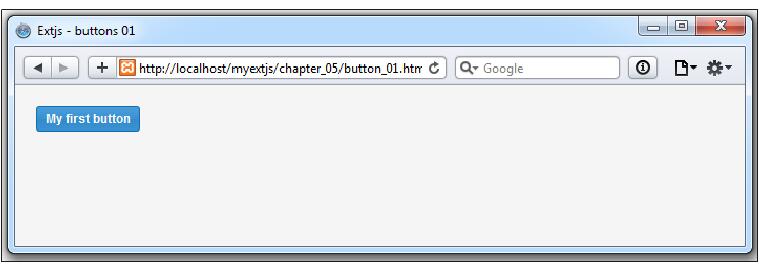
var myButton = Ext.create('Ext.button.Button', {
    text:'My first button',
    tooltip:'Click me...!',
    renderTo:Ext.getBody()
});
在这段代码中,我们创建了一个Button类的实例,并且传递了一些配置给它。通常一个button有许多的配置。
text属性用于设置button渲染在document时,显示的文本(DOM).
renderTo属性允许我们设置按钮在DOM中渲染的位置
默认情况下,button有一个scale属性的值为small. 我们可以将它设置为medium和large. scale属性使得我们可以定义按钮的大小。
var myButton = Ext.create('Ext.button.Button', {
    text:'My first small button',
    scale:'small',
    renderTo:Ext.getBody()
});
var myButtonB = Ext.create('Ext.button.Button', {
    text:'My first medium button',
    scale:'medium',
    renderTo:Ext.getBody()
});
var myButtonC = Ext.create('Ext.button.Button', {
    text:'My first large button',
    scale:'large',
    renderTo:Ext.getBody()
});
Setting icons on buttons
我们在应用程序中经常看到,使用不同的icons来区分按纽。为了设置icon(images),我们将使用iconCls属性来设置css样式,它将以背景的形式,添加图片。在上面的代码中,我们讨论过scale属性,它分别对应以下的icon size
| Scale | Size |
|---|---|
| Small | 16 x 16 pixels |
| Medium | 24 x 24 pixels |
| Large | 32 x 32 pixels |
接下来,我们在html中创建以下css样式
.addicon-16{
    background:transparent url('images/add_16x16.png') center 0
    no-repeat !important;
}
.addicon-24{
    background:transparent url('images/add_24x24.png') center 0
    no-repeat !important;
}
.addicon-32{
    background:transparent url('images/add_32x32.png') center 0
    no-repeat !important;
}
JS代码
var myButton = Ext.create('Ext.button.Button', {
    text:'My first small button',
    iconCls:'addicon-16',
    scale:'small',
    renderTo:Ext.getBody()
});
var myButtonB = Ext.create('Ext.button.Button', {
    text:'My first medium button',
    iconCls:'addicon-24',
    scale:'medium',
    renderTo:Ext.getBody()
});
var myButtonC = Ext.create('Ext.button.Button',{
    text:'My first large button',
    iconCls:'addicon-32',
    scale:'large',
    renderTo:Ext.getBody()
});
Icon alignment on buttons
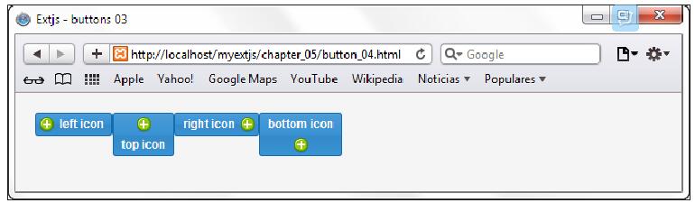
默认情况下, icon是左边对齐的。但我们可以设置它的位置为top, buttom, 和右侧对齐。如下所示
var myButtonA = Ext.create('Ext.button.Button',{
    text:'left icon',
    iconCls:'addicon-16',
    iconAlign:'left',
    renderTo:Ext.getBody()
});
var myButtonB = Ext.create('Ext.button.Button',{
    text:'top icon',
    iconCls:'addicon-16',
    iconAlign:'top',
    renderTo:Ext.getBody()
});
var myButtonC = Ext.create('Ext.button.Button',{
    text:'right icon',
    iconCls:'addicon-16',
    iconAlign:'right',
    renderTo:Ext.getBody()
});
var myButtonD = Ext.create('Ext.button.Button',{
    text:'bottom icon',
    iconCls:'addicon-16',
    iconAlign:'bottom',
    renderTo:Ext.getBody()
});
Handling button events
创建完一个按钮后,我们想要在点击时,添加一些行为。在以后的章节中,我们将看到如何在MVVM模式中,监听事件。对于现在,我们可以直接监听 button上的事件。
Button通过mixin使用了Observable类,我们可以使用addListener方法监听事件
每一个组件有许多已经定义好的事件。你可以查看document了解定义了哪些事件,事件何时触发的描述,以及监听器会接受到的参数。在这里,Button类包含了一个click event, 它在button被点击时触发。我们可以使用on(addListener方法的简写)来监听事件.
myButtonA.on('click', function(){
    Ext.Msg.alert("Click event", "You clicked left icon button..!");
});
我们还有更多的事件可以监听,比如show,hide,enable, disable等等,更多的事件名称,可以参考Ext JS文档
我们可以为相同的事件,定义任意多的监听器,当事件触发时,所有的监听器都将被执行.
Segmented buttons
在Ext JS 5添加了一个 segemented buttons. 可以对组件进行分组。实际上,它是一个特殊的容器,包含多个按钮。为此,我们需要使用Ext.button.Segmented类,它的用法跟任何其它container的使用类似。
var mySegmentedbuttons = Ext.create('Ext.button.Segmented',{
    renderTo:'segmentedbuttons',
    vertical:false,
    items:[{
        xtype: 'button', text:'1st button', iconCls:'addicon-16'
    },{
        text:'2nd button', iconCls:'addicon-16'
    },{
        text:'3th button', iconCls:'addicon-16'
    },{
        text:'4th button', iconCls:'addicon-16'
    }]
});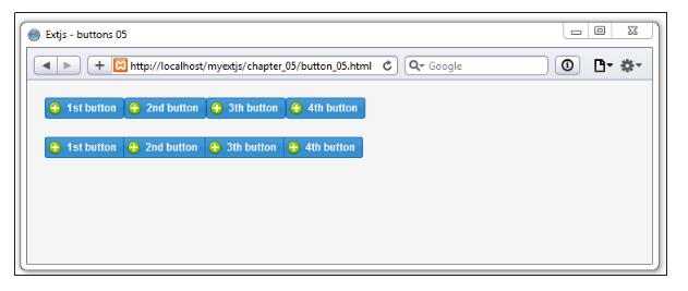
你会注意到,上图中的第二行按钮是以segmented button容器的形式渲染的,它比第一行看起来更美观,对比于第一行的按钮,第二行的按钮只有第一个和最后一个带圆角。
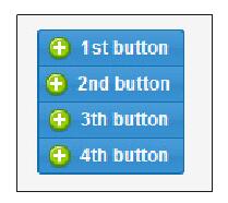
我们也可以设置vertical为true, 效果如下
默认情况下,Ext.button.Segmented类将它每一个项(item)视为一个按钮。在上面的代码中,我们设置为第一个按钮设置了xtype属性,其它三个按钮则没有这个属性。Ext JS依然将每一个项作为button进行配置。
Adding menus
我们可以为button添加menu履性,创建菜单,使用户可以选择不同的选项。
var myButton = Ext.create('Ext.button.Button',{
    text:'Add payment method...',
    iconCls:'addicon-32',
    iconAlign:'left',
    scale:'large',
    renderTo:'normalbuttons',
    menu:[
        {text:'Master Card'},
        {text:'Visa'},
        {text:'PayPal'},
        {text:'Other...'}
    ]
});
在上面的代码中, menu属性接收一个对像数组。这个数组用于创建Ext.menu.Menu类的实例。Ext.menu.Menu类负责管理和显示菜单。
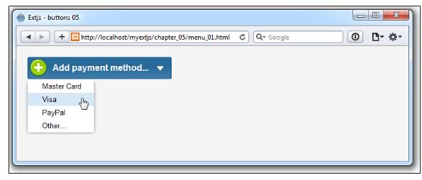
在上面的代码中,我们是直接使用对像常量创建我们的菜单。如果你想使用构告函数,而不是直接量(literals), 我们应该创建Ext.menu.Menu和Ext.menu.Item的实例,如下所示
//Step 1
var menuItemA = Ext.create('Ext.menu.Item',{text:'Master card'});
//Step 2
var menu = Ext.create('Ext.menu.Menu',{
    items : [ //Step 3
        menuItemA, // Variable
        Ext.create('Ext.menu.Item',{text:'Visa'}), // constructor
        {text:'Paypal'} //object config
    ]
});
var myButton = Ext.create('Ext.button.Button',{
    text:'Add payment method...',
    iconCls:'addicon-32',
    iconAlign:'left',
    scale:'large',
    renderTo:'normalbuttons',
    menu:menu
});
当我们创建完menu, 我们将它赋值给button的menu属性。当这个按钮创建时,它会发现menu属性不是一个数组,而是一个Menu类的实例。
接下来,我们可以为每一个菜单项添加监听器,查看Ext.menu.Item类的文档,我们可以知道,它有一个click 事件, 在这里我们有很多的方法来添加监听器.
var myButton = Ext.create('Ext.button.Button',{
    text:'Add payment method...',
    iconCls:'addicon-32',
    iconAlign:'left',
    scale:'large',
    renderTo:'normalbuttons',
    menu:[{
        text:'Master Card',
        listeners:{ // Option 1
            click:function(){
                Ext.Msg.alert("Click event", "You selected Master Card..!");
            }
        }
    },{
        text:'Visa', //Option 2
        handler: onMenuItemClick
    },{
        text:'PayPal',
        listeners:{ //Option 3
            'click':{fn: onMenuItemClick , single:true}
        }
    },{
        text:'Other...',
        handler: onMenuItemClick
    }]
});
function onMenuItemClick (itemBtn, Event){
    var optionString = itemBtn.text;
    Ext.Msg.alert("Click event","You selected " + optionString +
            " ..!");
}- Option 1, 我们添加了一个listeners属性
- Option 2, 我们使用hander属性,这个属性将click event绑定到onMenuItemClick
- Option 3, 我们在次使用listeners属性,但对于click event.我们传递了一个配置对像,它有两个属性:fn 和 single。fn属性用于指定处理函数。single用于指定处理函数只执行一次,在第一次执行完后,Ext JS将删除这个处理函数
Toolbars
我们已经学习了基础的button和menus后,接下来可以学习下一个组件,toolbar. 工具栏在我们的应用程序中非常普遍,它用来访问应用程序的modules, windows等等。toolbar组件实际上是一个容器,可以按照我们需要的方法排列我们的按钮。
从Ext JS 4开始,我们可以在容器的任一方向(north, south, east and west)上定义toolbar. 也可以在container的每边上都定义一个toolbar.
接下来我们创建一个简单的例子,toolbar位于panel的top位置。
var myPanel = Ext.create( 'Ext.panel.Panel' ,{
    title: 'My first toolbar...',
    width: 450,
    height: 200,
    dockedItems: [{ //Step 1
        xtype : 'toolbar',
        dock: 'top', //Step 2
        items: [
            {text: 'New record'},
            {text: 'Edit record'},
            {text: 'Remove record'}
        ]
    }],
    renderTo:Ext.getBody()
});- 在第一步,我们定义了dockedItems属性。在这个属性里,我们可以定义一个组件数组。任何的组件可以固定(placed) or 停靠(docked) 在panel的四个边上(left, top, right, button).
- 在第二步,我们定义了toolbar在哪停靠(docked). 在这里,它的值为top. 如果dock属性没有定义,默认为top.
docked items通常为toolbars, 但我们也可以定义其它组件,比如grids, panels, 和forms. 在toolbar属性中的items数组中,默认的组件为button. 这也是为什么我们没有明确设置xtype的原因。
我们也可以添加其它的组件到toolbar, 比如textfield, combo box, 和 radiobutton
接下来,我们添加更多带图标的按纽
items:[
    {text:'New', iconCls:'addicon-16'},
    {text:'Edit', iconCls:'editicon-16'},
    {text:'Remove', iconCls:'deleteicon-16'},
    {text:'Export', iconCls:'export-16'},
    {text:'Print', iconCls:'print-16'},
    {text:'Help', iconCls:'help-16'}
]
css
.addicon-16{ background:transparent url('../images/add_16x16.png')
center 0 no-repeat !important; }
.deleteicon-16{ background:transparent url('../images/delete.png')
center 0 no-repeat !important; }
.editicon-16{ background:transparent url('../images/pencil.png')
center 0 no-repeat !important; }
.help-16{ background:transparent url('../images/help.png') center 0
no-repeat !important; }
.print-16{ background:transparent url('../images/printer.png') center
0 no-repeat !important; }
.export-16{ background:transparent url('../images/page_go.png') center
0 no-repeat !important; }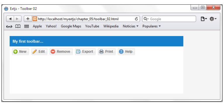
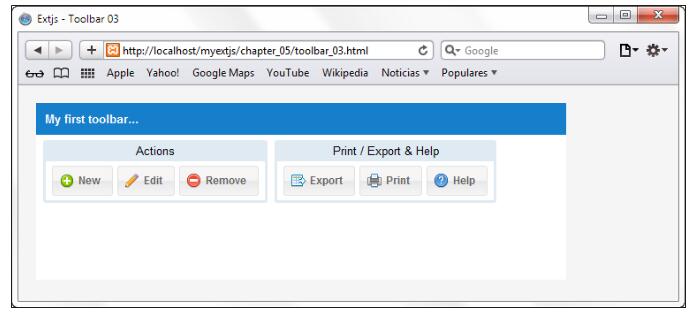
Toolbar button groups
我们可以使用Ext.container.ButtonGroup类我们可以toolbar中的buttons进行分组。Ext.container.ButtonGroup是Ext.panel.Panel的一个子类。
var myPanel = Ext.create('Ext.panel.Panel',{
    title:'My first toolbar...',
    width:600,
    height:200,
    dockedItems:[{ //Step 1
        xtype : 'toolbar',
        dock: 'top', //Step 2
        items:[
            { xtype:'buttongroup',
                title:'Actions',
                items:[
                    {text: 'New', iconCls: 'addicon-16'},
                    {text: 'Edit', iconCls: 'editicon-16'},
                    {text: 'Remove', iconCls: 'deleteicon-16'}
                ]
            },{
                xtype: 'buttongroup',
                title: 'Print / Export & Help',
                items:[
                    {text: 'Export', iconCls: 'export-16'},
                    {text: 'Print', iconCls: 'print-16'},
                    {text: 'Help', iconCls: 'help-16'}
                ]
            }
        ]
    }],
    renderTo:Ext.getBody()
});
我们在这里添加了两个按钮组,而不是直接将按钮添加到toolbar, 如下所示
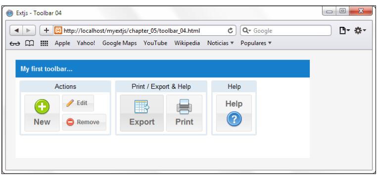
默认情况下, buttongroup以水平排列按钮(每个组有3列). 我们可以通过columns属性改变它的列的大小
var myPanel = Ext.create('Ext.panel.Panel',{
    title:'My first toolbar...',
    width:600,
    height:200,
    dockedItems:[{ //Step 1
        xtype : 'toolbar',
        dock: 'top', //Step 2
        items:[
            { xtype:'buttongroup',
                title:'Actions',
                columns:2,
                items:[
                    {text:'New', iconCls:'addicon-32', scale:'large',
                        rowspan:2, iconAlign:'top' },
                    {text:'Edit', iconCls:'editicon-16'},
                    {text:'Remove', iconCls:'deleteicon-16'}
                ]
            },{
                xtype:'buttongroup', title:'Print / Export & Help',
                defaults:{scale:'large', iconAlign:'top'},
                items:[
                    {text:'Export', iconCls:'export-32'},
                    {text:'Print', iconCls:'print-32'}
                ]
            },{
                xtype:'buttongroup', title:'Help',
                items:[
                    {text:'Help', iconCls:'help-32', scale:'large',
                        iconAlign:'bottom' }
                ]
            }
        ]
    }],
    renderTo:Ext.getBody()
});
在上面的代码中,我们设置了columns属性为2。这意味着在这个组中的按钮被组织成两列。在这里有一个非常重要的是新按钮的rowspan属性。它的值为2,这表示新按钮使用两行
The breadcrumb bar
Ext JS 5新添加了breadcrumb bar. 它用于显示一个分展的数据 TreeStore.
Ext.define('Myapp.sample.store.mainMenu', {
    extend: 'Ext.data.TreeStore',
    root: {
        text: 'My app',
        expanded: true,
        children: [{
            text: 'Modules',
            expanded: true,
            children: [
                {leaf: true, text: 'Employees'},
                {leaf: true, text: 'Customers'},
                {leaf: true, text: 'Products'}
            ]
        },{
            text: 'Market',
            expanded: true,
            children: [
                {leaf: true, text: 'Sales'},
                {leaf: true, text: 'Budgets'},
                {leaf: true, text: 'SEO'},
                {leaf: true, text: 'Statistics'}
            ]
        },{
            text: 'Support',
            iconCls:'help-16',
            children: [
                {leaf: true, text: 'Submit a ticket'},
                {leaf: true, text: 'Forum'},
                {leaf: true, text: 'Visit our web site'}
            ]
        },
            {leaf: true, text: 'Reports'},
            {leaf: true, text: 'Charts'}
        ]
    }
});- 新的Myapp.sample.store.mainMenu扩展于Ext.data.TreeStore类
- store类中的root属性为TreeStore将要包含初始化的node/data model以及它的子节点/data model, 它们可以为node数组,也可以是data models.
你会注意到, 在root属性中的数据的结构类似于树的结构。它将被breadcrumb bar解析,用来创建按钮,menus, submenus。
var myMenuStore = Ext.create('Myapp.sample.store.mainMenu',{});
var myPanel = Ext.create('Ext.panel.Panel',{
    title:'My first breadcrumb bar...',
    width:600,
    height:200,
    dockedItems:[{ //Step 2
        xtype : 'breadcrumb',
        dock: 'top',
        store: myMenuStore,
        showIcons: true,
        selection: myMenuStore.getRoot().childNodes[2].childNodes[0]
    }],
    renderTo:Ext.getBody()
});
第一步,创建一个Myapp.sample.store.mainMenu的实例, 然后我们接着创建一个myPanel容器。
类似于使用toolbar, 现在我们设置xtype为breadcrumb. 它有以下的属性
- store: myMenuStore属性用来指示breadcrumb从哪里获取数据,然后创建相应的组件(buttons, menus)
- showIcons: true属性将用来控制是否在buttons中显示图标
- selection属性用来设置初步选定的node/data model. 我们可以使用root,将它设置为store中的第一个元素,或者像我们一样,设置为myMenuStore.getRoot().childNodes[2].childNodes[0], 它表示”Submit a ticket” 节点
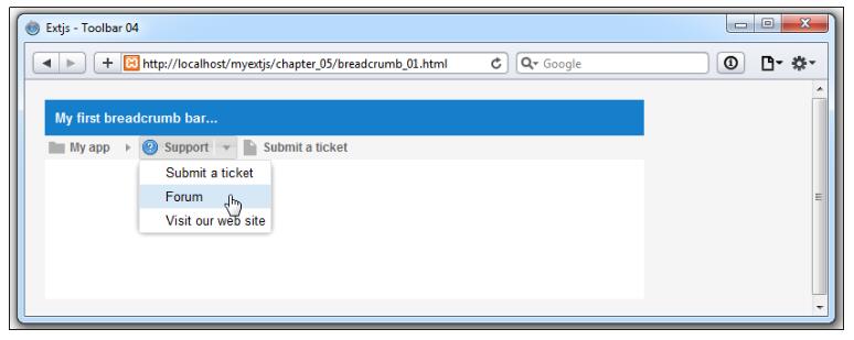
Handling selections in the breadcrumb bar
我们现在已经创建完了breadcrumb, 但我们需要在它的选择做相应的事件监听。它有一个selectionchange事件,它每次在我们点击按钮或者菜单项时触发
dockedItems:[{
    xtype : 'breadcrumb',
    dock: 'top',
    store: myMenuStore,
    showIcons: true,
    selection: myMenuStore.getRoot().childNodes[2].childNodes[0],
    listeners:{
        'selectionchange':{
            fn:function(mybreadcrumb, node, eOpts){
                var panel = mybreadcrumb.up('panel');
                panel.update( 'This is the zone for:<b>' + node.data.text +
                        '</b>' );
            },
            delay:200
        }
    }
}],
处理函数将按受三个参数,第一个是mybreadcrumb实例,第二个是选择的节点(data model), 第三个参数是一个可选的对像,它将传递给Ext.util.Obserable.addListener监听器。
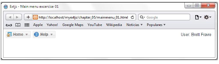
The main menu for our application
在接下来,我们将创建一个应用程序的主菜单。如下图所示
如截图所示,我们创建了一个toolbar,停靠在top位置。别一个toolbar停靠在bottom位置。 第一个toolbar将包含两个按钮(每一个按钮有自己的菜单)以及一个用来显示用户名的text item, Ext.toolbar.TextItem. 第二个toolbar有一个text item和一个help button.
为了练习,我们需要将整个组件占居整个浏览器。目前为此,我们都是使用panel作为容器,但现在,我们将使用Viewport.
Ext.container.Viewport组件将占用所有可用的空间,并且监听resize事件。
Ext.define('MyApp.view.Viewport',{
    extend: 'Ext.container.Viewport',
    layout: 'fit',
    initComponent: function(){
        var me = this;
        me.items = [{
            xtype: 'panel',
        }];
        me.callParent();
    }
});
Viewport类继承于container组件,所以我们也可以使用layout进行布局,在这里,我们使用的是fit layout. 因为我们想要将viewport的子元素最大化为浏览器。
我们之前提到过,如果我们想要依靠一个组件到四个边中的一边,我们需要使用一个panel. 下面的代码将添加一个空的panel到Viewport.
me.items = [{
    xtype: 'panel',
}];
然后为这个空 panel,指定docked items
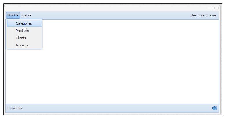
dockedItems: [{
    xtype: 'toolbar', docked:'top',
    items: [{
        text: 'Home', iconCls: 'home-16',
        menu:[
            {text: 'Categories', iconCls: 'categories-16'},
            {text: 'Products', iconCls: 'products-16'},
            {text: 'Clients', iconCls: 'clients-16' },
            {text: 'Invoices', iconCls: 'invoices-16'}
        ]
    },{
        text: 'Help', iconCls: 'help-16',
        menu: {
            xtype: 'menu',
            items: [
                {xtype: 'menuitem', text: 'Submit a support ticket'},
                {xtype: 'menuitem', text: 'Forum'},
                {xtype: 'menuitem', text: 'About...'}
            ]
        }
    },
        {xtype: 'tbfill'},
        {xtype: 'tbtext', text: 'User: Brett Fravre'}
    ]
}]
在上面的toolbar中,我们添加了两个新的元素
- tbfill or Ext.toolbar.Fill: 它是一个占位符元素,会强制将接下来的元素渲染到最右侧
- tbtext or Ext.toolbar.TextItem: 渲染一个文本或者html元素
接下来,创建这个Viewport实例
Ext.onReady(function(){
    Ext.create("MyApp.view.Viewport");
});
在Viewport中我们不需要renderTo属性。因为它会自动获取document body.
接下来,我们创建bottom toolbar
dockedItems : [{
    xtype : 'toolbar', docked:'top',
//your code here…
},
    {
        xtype : 'toolbar', dock:'bottom',
        items : [
            {xtype: 'tbtext', text: '<b>Status :</b>Connected'},
            {xtype: 'tbfill' },
            {text:'', iconCls: 'help-16'}
        ]
    }]
Example
自定义一个button基础类
/**
 * Created by robin on 2016/9/6.
 * 自定义Button基础类
 * btnStyle的值可以为blue, grey, green, red, orange,用于设置按纽的颜色, 默认为default
 * htmlEncode 是否对按钮的文字进行html编码,默认为true
 * @cfg {number} indent:  setFormItemIndent使用,调整button的缩进
 */
Ext.define('Cms.ux.Button', {
    extend: 'Ext.button.Button',
    alias: 'widget.cms_button',
    btnStyle: "default", //custom configuration, 指定按钮的样式,区别于cls, 统一添加样式
    htmlEncode: true, //custom configuration  调用Ext.util.Format.htmlEncode格式化按钮文字
    requires: [
        "Cms.ux.Utils",
    ],
    constructor: function (config) {
        this.callParent(arguments); //参数必须为类数组 [config]
        this.updateButtonStyle(config);
        //如果button类型为menu
        if (this.menu) {
            this.menu.cls = this.menu.cls ? this.menu.cls + " syno-ux-button-menu" : "syno-us-button-menu";
            this.menu.shadow = false;
        }

    },
    updateButtonStyle: function (config) {
        this.addCls("cms-ux-button");
        switch (this.btnStyle) {
            case "blue":
                this.addCls("cms-ux-button-blue");
                this.minWidth = 80; //minWidth is configuration option
                break;
            case "grey":
                this.addCls("cms-ux-button-grey");
                this.minWidth = 80; //minWidth is configuration option
                break
            case "green":
                this.addCls("cms-ux-button-green");
                this.minWidth = 80; //minWidth is configuration option
                break;
            case "red":
                this.addCls("cms-ux-button-red");
                this.minWidth = 80; //minWidth is configuration option
                break;
            case "orange":
                this.addCls("cms-ux-button-orange");
                this.minWidth = 80; //minWidth is configuration option
                break;
            default:
                this.addCls("cms-ux-button-default");
        }
    },
    applyText: function (t) {
        console.log("text")
        if (this.htmlEncode) {
            t = Ext.util.Format.htmlEncode(t);
        }

        return t;
    },
    /**
     * 此方法主要在button渲染后调用, 整个方法的实现,可以查看Ext.button.Button.setText源文件
     * version 6 源代码中没有此方法, 它是config中的属性,所有自动生成setText方法
     * version 3 源代码中有这个方法
     *
     * @param {string}
     */
    /*
     setText: function (t) {
     this.text = t;
     //如果在渲染后调用onRender,afterRender
     if (this.el) {

     if (this.htmlEncode) {
     //this.btnEl返回可点击的部分(最里面的元素),而不是整个button,然后更新文字
     //this.btnEl没有出现在Ext js 6的文档中,但是在源代码里,同时在Ext js 3.4.0也存在
     //this.btnEl是一个Ext.Element元素,所以可以调用update更新它的内容
     this.btnEl.update(Ext.util.Format.htmlEncode(t))
     } else {
     this.btnEl.update(t || ' ');
     }
     //setButtonClass是一个内部方法,所以在文档中没有这个方法, 需要查看源文件
     this.setButtonClass();
     }
     //version 6 没有此方法
     this.doAutoWidth();
     this.fireEvent("textchanged", this, t)
     }*/

    onRender: function () {
        this.callParent(arguments);
        Cms.ux.Utils.setFormItemIndent(this);
    },
    getAriaEl: function () {
        return this.btnEl;
    }

});
/**
* Created by robin on 2016/9/7.
* @class Cms.ux.Utils
* 参考Ext.util.Format写法
*/
Ext.define('Cms.ux.Utils', function () {
var me;
return {
singleton: true,
constructor: function () {
me = this;
},
/**
*
* @param element 需要缩进的元素 1级缩进30, 2级缩进30
*/
setFormItemIndent: function (el) {
var indent = el.indent || 0;
var m = indent * 30;
/* 如果元素为textfield, 则它有label属性, 获取到labelEl元素, Ext.dom.Element, version 3 为label属性*/
if (el.labelEl && !el.hideLabel) {
//d.ownerCt 获取这个组件的容器, 如Ext.form.field.Text labelAlign
if (el.ownerCt && "top" === el.ownerCt.labelAlign) {
el.label.setStyle({
"margin-left": m + "px"
})
} else {
//labelWidth是一个配置项, 整个w等于indent + labelWidth
var w = el.labelWidth || d.ownerCt.labelWidth || 180;
d.label.setStyle({
"margin-left": m + "px",
width: w - m + "px"
})
}
} else {
if (el.wrap) {
el.wrap.setStyle({
"margin-left": m + "px"
})
} else {
el.getEl().setStyle({
"margin-left": m + "px"
})
}
}
//设置按钮的等级
if (el instanceof Cms.ux.Button) {
//设置按钮最内层(可点击)元素的aria-level属性, btnEl可以查看源代码,文档中没有
el.btnEl.set({
"aria-level": indent + 1
});
if (el.arrowBtnEl) {
el.arrowBtnEl.set({
'aria-level': indent + 1
})
}
} else {
el.getEl().set({
"aria-level": indent + 1
})
}
return el;
}
}
});


 扫一扫
扫一扫
 632
632

 被折叠的 条评论
为什么被折叠?
被折叠的 条评论
为什么被折叠?
 到【灌水乐园】发言


