


ConstraintLayout简介
ConstraintLayout从发布到现在也得有两年的时间了,但是目前在项目中却很少用到他。今天闲下来记录一下,以后可以用来解决一些布局的嵌套问题。
ConstraintLayout是RelativeLayout的升级版本,但是比RelativeLayout更加强调约束,它能让你的布局更加扁平化,一般来说一个界面一层就够了。
而且它可以直接在布局编辑页面通过拖拖拖的方式就可以把控件摆放好,但是我还是习惯手写。
在Android Studio中可以很方便的将目前的布局直接转换成ConstraintLayout,可以在布局的编辑页面上直接右键然后选择就可以了。
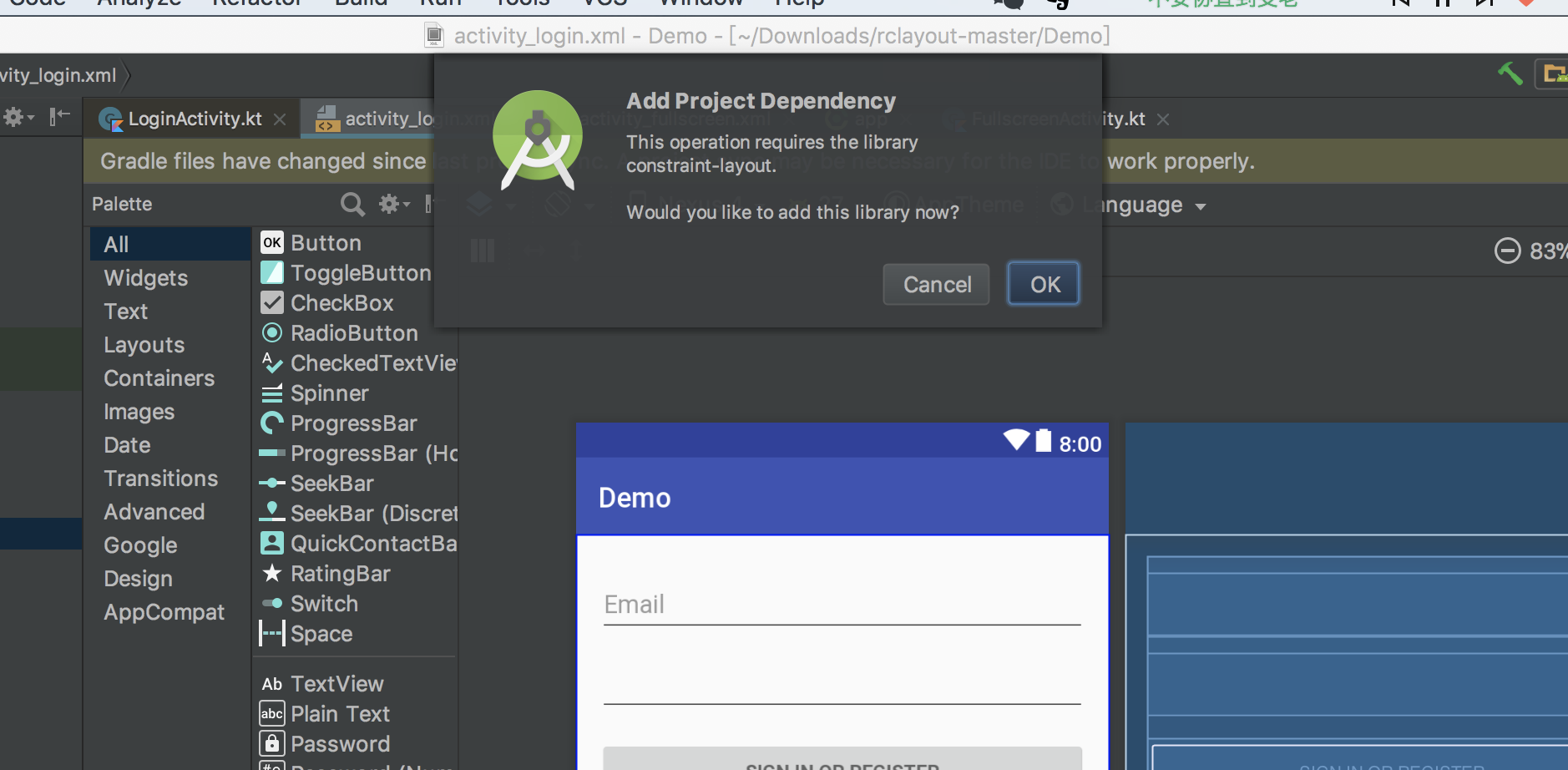
当然项目中要添加它的依赖,目前最新版本:
implementation 'com.android.support.constraint:constraint-layout:1.1.0'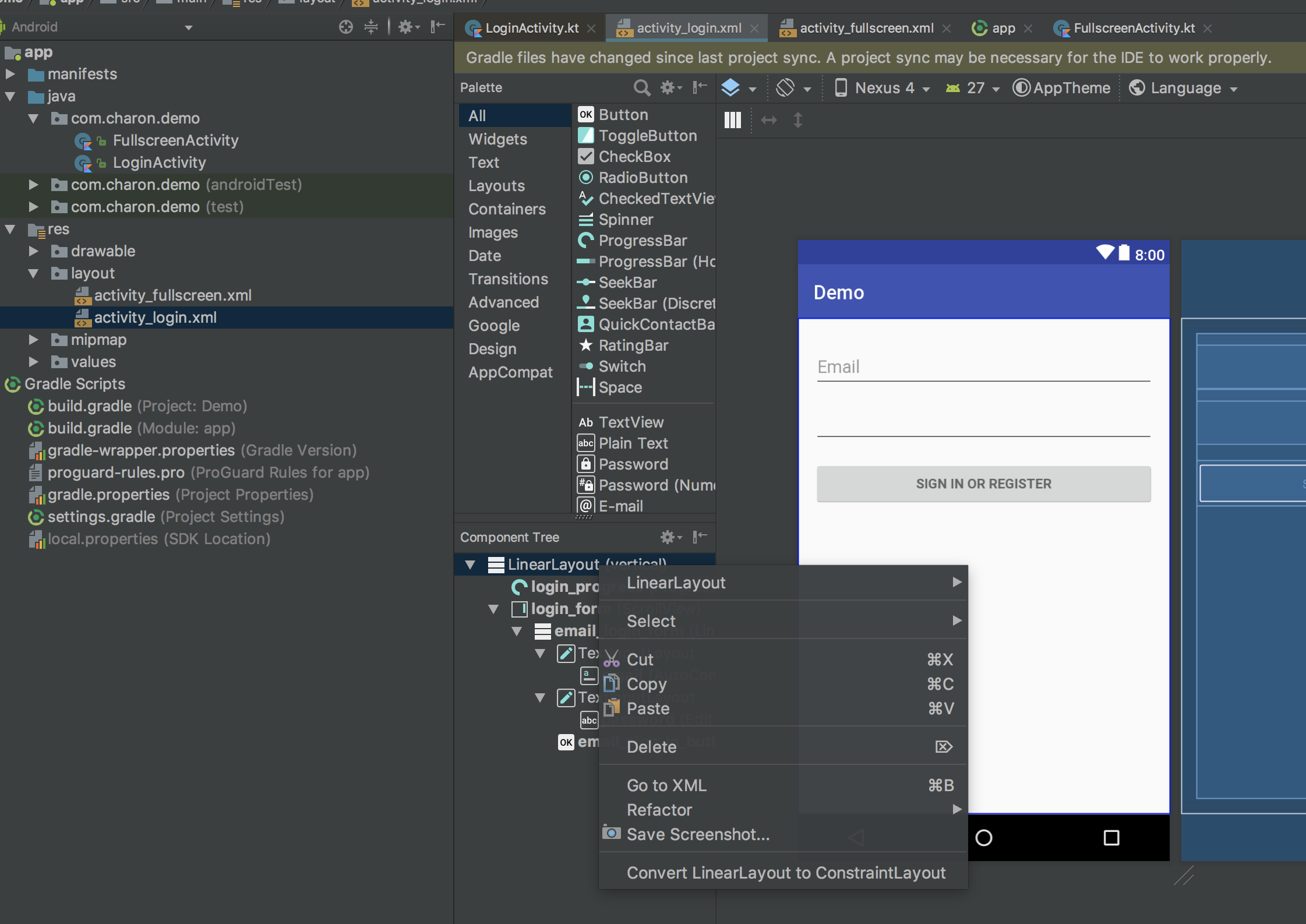
然后会提示添加ConstraintLayout支持库。
相对于传统布局ConstraintLayout在以下方面提供了一些新的特性:
相对定位
这个和
RelativeLayout比较像,就是一个控件相对于另一个控件的位置约束关系:- 横向:
Left、Right、Start、End 纵向:
Top、Bottom、Baseline(文本底部的基准线)<Button android:id="@+id/buttonA" ... /> <Button android:id="@+id/buttonB" ... // 这样系统就会知道B的左侧被约束在A的右侧 app:layout_constraintLeft_toRightOf="@+id/buttonA" />常用的有:
* layout_constraintLeft_toLeftOf          // 左边左对齐
* layout_constraintLeft_toRightOf         // 左边右对齐
* layout_constraintRight_toLeftOf         // 右边左对齐
* layout_constraintRight_toRightOf        // 右边右对齐
* layout_constraintTop_toTopOf            // 上边顶部对齐
* layout_constraintTop_toBottomOf         // 上边底部对齐
* layout_constraintBottom_toTopOf         // 下边顶部对齐
* layout_constraintBottom_toBottomOf      // 下边底部对齐
* layout_constraintBaseline_toBaselineOf  // 文本内容基准线对齐
* layout_constraintStart_toEndOf          // 起始边向尾部对齐
* layout_constraintStart_toStartOf        // 起始边向起始边对齐
* layout_constraintEnd_toStartOf          // 尾部向起始边对齐
* layout_constraintEnd_toEndOf            // 尾部向尾部对齐
上面的这些属性需要结合
id才能进行约束,这些id可以指向控件也可以指向父容器(也就是ConstraintLayout),比如:<Button android:id="@+id/buttonB" ... app:layout_constraintLeft_toLeftOf="parent" />
- 横向:
外边距
* android:layout_marginStart
* android:layout_marginEnd
* android:layout_marginLeft
* android:layout_marginTop
* android:layout_marginRight
* android:layout_marginBottom
// 这里的gone margin指的是B向A添加约束后,如果A的可见性变为GONE,这时候B的外边距可以改变,也就是B的外边距根据A的可见性分为两种状态。
* layout_goneMarginStart
* layout_goneMarginEnd
* layout_goneMarginLeft
* layout_goneMarginTop
* layout_goneMarginRight
* layout_goneMarginBottom
居中和倾向
居中
在RelativeLayout中我们可以centerHorizontal等来进行居中操作,但是在ConstraintLayout中没有类似的方法。<android.support.constraint.ConstraintLayout ...> <Button android:id="@+id/button" ... app:layout_constraintLeft_toLeftOf="parent" app:layout_constraintRight_toRightOf="parent/> <android.support.constraint.ConstraintLayout/>这种情况就感觉像是控件两边有两个反向相等大小的力在拉动它一样,所以才会产生控件居中的效果。
倾向
在这种约束是同向相反的情况下,默认控件是居中的,但是也可以像拔河一样,让两个约束的力大小不等,这样就产生了倾向,其属性是:* layout_constraintHorizontal_bias * layout_constraintVertical_bias下面这段代码就是让左边占30%,右边占70%(默认两边各占50%),这样左边就会短一些,如图5所示,此时代码是这样的:
<android.support.constraint.ConstraintLayout ...>
    <Button android:id="@+id/button" ...
        app:layout_constraintHorizontal_bias="0.3"
        app:layout_constraintLeft_toLeftOf="parent"
        app:layout_constraintRight_toRightOf="parent/>
<android.support.constraint.ConstraintLayout/>
可见性的表现
ConstraintLayout对可见性被标记View.GONE的控件(后称GONE控件)有特殊的处理。一般情况下,GONG控件是不可见的,且不再是布局的一部分,但是在布局计算上,ConstraintLayout与传统布局有一个很重要的区别:- 传统布局下,
GONE控件的尺寸会被认为是0(当做点来处理) - 在
ConstraintLayout中,GONE控件尺寸仍然按其可见时的大小计算,但是其外边距大小按0计算
- 传统布局下,
尺寸约束
ConstraintLayout本身可以定义自己的最小尺寸:android:minWidth设置布局的最小宽度android:minHeight设置布局的最小高度
这些最小尺寸当
ConstraintLayout被设置为WRAP_CONTENT时有效。控件的尺寸可以通过
android:layout_width和android:layout_height来设置,有三种方式:- 使用固定值
- 使用
WRAP_CONTENT - 使用0dp(相当于
MATCH_CONSTRAINT)
为什么不用
MATCH_PARENT呢? 这是因为:Important: MATCH_PARENT is not supported for widgets contained in a ConstraintLayout, though similar behavior can be defined by using MATCH_CONSTRAINT with the corresponding left/right or top/bottom constraints being set to “parent”.比例
这里的比例指的是宽高比,通过设置比例,让宽高的其中一个随另一个变化。为了实现比例,需要让控件宽或高受约束,且尺寸设置为0dp(也可以是MATCH_CONSTRAINT),实现代码如下:<Button android:layout_width="wrap_content" android:layout_height="0dp" app:layout_constraintTop_toTopOf="parent" app:layout_constraintDimensionRatio="1:1" />上述代码中,按钮的高度满足受约束且设置为0dp的条件,所以其尺寸会按照比例随宽度调整。
比例的设置有两种格式:
- 宽度与高度的比,可理解为受约束的一方尺寸:另一方尺寸
- 受约束的一方尺寸/另一方尺寸得到的浮点数值
ChainChain是一系列双向连接的控件连接在一起的形态(可以理解成一个包含几个子View的LinearLayout)
横向上,Chain头部是Chain最左边的控件;纵向上,Chain头部是Chain最顶部的控件。Chain样式:
当对Chain的第一个元素设置layout_constraintHorizontal_chainStyle或layout_constraintVertical_chainStyle属性,
Chain就会根据特定的样式(默认样式为CHAIN_SPREAD)进行相应变化,样式类型如下:CHAIN_SPREAD元素被分散开(默认样式)- 在
CHAIN_SPREAD模式下,如果一些控件被设置为MATCH_CONSTRAINT,那么控件将会把所有剩余的空间均分后“吃掉” CHAIN_SPREAD_INSIDE:Chain两边的元素贴着父容器,其他元素在剩余的空间中采用CHAIN_SPREAD模式CHAIN_PACKED:Chain中的所有控件合并在一起后在剩余的空间中居中
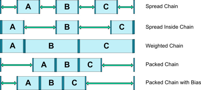
带权重的
Chain:
默认的Chain会在空间里平均散开。如果其中有一个或多个元素使用了MATCH_CONSTRAINT属性,那么他们会将剩余的空间平均填满。
属性layout_constraintHorizontal_height和layout_constraintVertical_weight控制使用MATCH_CONSTRAINT的元素如何均分空间。
例如,一个Chain中包含两个使用MATCH_CONSTRAINT的元素,第一个元素使用的权重为2,第二个元素使用的权重为1,
那么被第一个元素占用的空间是第二个元素的2倍。辅助工具
android.support.constraint.Guideline该类比较简单,主要用于辅助布局,即类似为辅助线,横向的、纵向的。
该布局是不会显示到界面上的。所以其有个属性为:
android:orientation取值为vertical和horizontal.除此以外,还差个属性,决定该辅助线的位置:
layout_constraintGuide_beginlayout_constraintGuide_endlayout_constraintGuide_percent
可以通过上面3个属性其中之一来确定属性值位置。
begin=30dp,即可认为距离顶部30dp的地方有个辅助线,
根据orientation来决定是横向还是纵向。end=30dp,即为距离底部。percent=0.8即为距离顶部80%。好了,下面看一个例子,在一个布局的右下角添加浮点按钮,我决定通过两根辅助线来定位,一根横向距离底部80%,一个纵向距离顶部80%,浮点按钮就定位在他们交叉的地方。
<android.support.constraint.ConstraintLayout
    ...
    tools:context="com.zhy.constrantlayout_learn.MainActivity">
    <android.support.constraint.Guideline
        android:id="@+id/guideline_h"
        android:layout_width="wrap_content"
        android:layout_height="wrap_content"
        android:orientation="horizontal"
        app:layout_constraintGuide_percent="0.8" />
    <android.support.constraint.Guideline
        android:id="@+id/guideline_w"
        android:layout_width="wrap_content"
        android:layout_height="wrap_content"
        android:orientation="vertical"
        app:layout_constraintGuide_percent="0.8" />
    <TextView
        android:layout_width="60dp"
        android:layout_height="60dp"
        android:background="#612"
        app:layout_constraintLeft_toRightOf="@id/guideline_w"
        app:layout_constraintTop_toBottomOf="@id/guideline_h" />
</....>
ConstraintLayout究竟有什么用呢?
ConstraintLayout允许您构建复杂的布局,而不必嵌套View和ViewGroup元素。
它可以有效地解决布局嵌套过多的问题。我们平时编写界面,复杂的布局总会伴随着多层的嵌套,而嵌套越多,
程序的性能也就越差。ConstraintLayout则是使用约束的方式来指定各个控件的位置和关系的,
它有点类似于RelativeLayout,但远比RelativeLayout要更强大。
ConstraintLayout在测量/布局阶段的性能比 RelativeLayout大约高40%。
你的star是我的动力!!!


 5316
5316


 被折叠的 条评论
为什么被折叠?
被折叠的 条评论
为什么被折叠?
 到【灌水乐园】发言


