


带进度边框的自定义TextView
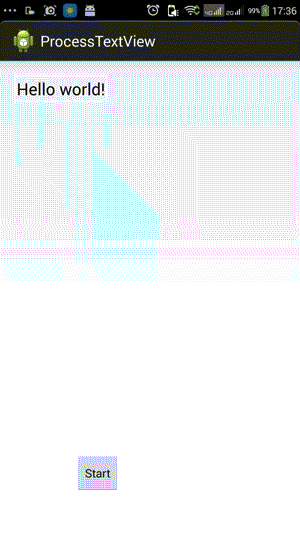
下文中有些Progress笔误写成了Process。就不改了效果图:
继承TextView进行自定义View。并增加几个自定义的属性。
- 进度条的颜色
- 进度条背景颜色
- 进度条宽度
values下面新建一个attrs.xml
<?xml version="1.0" encoding="utf-8"?>
<resources>
    <declare-styleable name="ProgressView">
        <attr name="backgroundColor" format="color"/>
        <attr name="progressColor" format="color"/>
        <attr name="progressWidth" format="dimension"></attr>
    </declare-styleable>
</resources>
然后获取属性:
        TypedArray mTypedArray=context.obtainStyledAttributes(attrs,R.styleable.ProgressView);
        progressColor=mTypedArray.getColor(R.attr.progressColor, Color.GREEN);
        backgroundColor=mTypedArray.getColor(R.attr.backgroundColor, Color.TRANSPARENT);
        progressWidth=mTypedArray.getDimension(R.attr.progressWidth, 5);
在layout的XML中使用
    <com.example.processtextview.ProcessTextView
        android:id="@+id/myTextView"
        android:layout_width="wrap_content"
        android:layout_height="wrap_content"
        android:text="@string/hello_world"

        custom:backgroundColor ="@color/whitesmoke"
        custom:progressColor ="@color/orange"
        custom:progressWidth ="4dp"
        />
2.
在原有的基础上,在TextView的矩形边框处,绘制4根线作为进度条的背景。
然后根据Process来绘制进度。
示例代码:
ProcessTextView
package com.example.processtextview;

import android.content.Context;
import android.content.res.TypedArray;
import android.graphics.Canvas;
import android.graphics.Color;
import android.graphics.Paint;
import android.graphics.Paint.Style;
import android.graphics.Path;
import android.util.AttributeSet;
import android.util.TypedValue;
import android.widget.TextView;

public class ProcessTextView extends TextView {
    private int progressColor;
    private int backgroundColor;
    private float progressWidth;

    private double progress = 0;
    private final Paint progressPaint;
    private final Paint backgroundPaint;
    private Canvas canvas;

    private int canvasWidth, canvasHight;

    public ProcessTextView(Context context) {
        this(context, null);
    }

    public ProcessTextView(Context context, AttributeSet attrs) {
        this(context, attrs, 0);
    }

    public ProcessTextView(Context context, AttributeSet attrs, int defStyle) {
        super(context, attrs, defStyle);
        TypedArray mTypedArray = context.obtainStyledAttributes(attrs,
                R.styleable.ProcessTextView);
        try {
            progressColor = mTypedArray.getColor(
                    R.styleable.ProcessTextView_progressColor, Color.GREEN);
            backgroundColor = mTypedArray.getColor(
                    R.styleable.ProcessTextView_backgroundColor,
                    Color.TRANSPARENT);
            progressWidth = mTypedArray.getDimension(
                    R.styleable.ProcessTextView_progressWidth, 5);
        } finally {
            mTypedArray.recycle();
        }

        backgroundPaint = new Paint();
        backgroundPaint.setColor(backgroundColor);
        backgroundPaint.setStrokeWidth(progressWidth);
        backgroundPaint.setAntiAlias(true);
        backgroundPaint.setStyle(Style.STROKE);

        progressPaint = new Paint();
        progressPaint.setColor(progressColor);
        progressPaint.setStrokeWidth(progressWidth);
        progressPaint.setAntiAlias(true);
        progressPaint.setStyle(Style.STROKE);

        // 把内边距设为进度条宽度,防止遮盖文字
        this.setPadding((int) progressWidth, (int) progressWidth,
                (int) progressWidth, (int) progressWidth);
    }

    @Override
    protected void onDraw(Canvas canvas) {
        this.canvas = canvas;
        super.onDraw(canvas);
        this.canvasWidth = canvas.getWidth();
        this.canvasHight = canvas.getHeight();
        drawBackgroundProcess();
        drawProcess();
    }

    @Override
    protected void onMeasure(int widthMeasureSpec, int heightMeasureSpec) {
        // TODO Auto-generated method stub
        super.onMeasure(widthMeasureSpec, heightMeasureSpec);
    }

    protected void drawBackgroundProcess() {
        Path backgroundPath = new Path();
        backgroundPath.moveTo(0, progressWidth / 2);
        backgroundPath.lineTo(canvasWidth - progressWidth / 2,
                progressWidth / 2);
        backgroundPath.lineTo(canvasWidth - progressWidth / 2, canvasHight
                - progressWidth / 2);
        backgroundPath.lineTo(progressWidth / 2, canvasHight
                - progressWidth / 2);
        backgroundPath.lineTo(progressWidth / 2, 0);
        canvas.drawPath(backgroundPath, backgroundPaint);
    }

    protected void drawProcess() {
        if(this.progress<0) return;
        if(this.progress>100) this.progress=100;
        Path processPath = new Path();
        processPath.moveTo(0, progressWidth / 2);
        //根据不同情况来设定path
        if (this.progress <= (50 * canvasWidth) / (canvasWidth + canvasHight)) {// 只需要画顶边
            processPath.lineTo((float) ((canvasWidth + canvasHight)*this.progress/50),
                progressWidth / 2);
        } else if (this.progress > (50 * canvasWidth)
                / (canvasWidth + canvasHight)
                && this.progress <= 50) {//画到右边
            processPath.lineTo(canvasWidth - progressWidth / 2,
                    progressWidth / 2);
            processPath.lineTo(canvasWidth - progressWidth / 2, (float) ((canvasWidth + canvasHight)*this.progress/50-canvasWidth));
        } else if (this.progress > 50
                && this.progress <= 50 + (50 * canvasWidth)
                        / (canvasWidth + canvasHight)) {//画到底边
            processPath.lineTo(canvasWidth - progressWidth / 2,
                    progressWidth / 2);
            processPath.lineTo(canvasWidth - progressWidth / 2, canvasHight
                    - progressWidth / 2);
            processPath.lineTo((float) (2*canvasWidth+canvasHight-(canvasWidth + canvasHight)*this.progress/50), canvasHight
                    - progressWidth / 2);
        } else {//画到左边
            processPath.lineTo(canvasWidth - progressWidth / 2,
                    progressWidth / 2);
            processPath.lineTo(canvasWidth - progressWidth / 2, canvasHight
                    - progressWidth / 2);
            processPath.lineTo(progressWidth / 2, canvasHight
                    - progressWidth / 2);
            processPath.lineTo(progressWidth / 2, (float) (2*canvasWidth+2*canvasHight-(canvasWidth + canvasHight)*this.progress/50));
        }

        canvas.drawPath(processPath, progressPaint);
    }


    // Setter And Getter

    public int getProgressColor() {
        return progressColor;
    }

    public void setProgressColor(int progressColor) {
        this.progressColor = progressColor;
    }

    public int getBackgroundColor() {
        return backgroundColor;
    }

    public void setBackgroundColor(int backgroundColor) {
        this.backgroundColor = backgroundColor;
    }

    public float getProgressWidth() {
        return progressWidth;
    }

    public void setProgressWidth(float progressWidth) {
        this.progressWidth = progressWidth;
    }

    public double getProgress() {
        return progress;
    }

    public void setProgress(double progress) {
        this.progress = progress;
        this.postInvalidate();
    }

    // Util Method below
    public static int convertDpToPx(float dp, Context context) {
        return (int) TypedValue.applyDimension(TypedValue.COMPLEX_UNIT_DIP, dp,
                context.getResources().getDisplayMetrics());
    }
}
MainActivity
package com.example.processtextview;

import android.os.Bundle;
import android.os.Handler;
import android.app.Activity;
import android.util.Log;
import android.view.Menu;
import android.view.View;
import android.view.View.OnClickListener;
import android.widget.Button;

public class MainActivity extends Activity {
    Handler mHandler =new Handler();
    @Override
    protected void onCreate(Bundle savedInstanceState) {
        super.onCreate(savedInstanceState);
        setContentView(R.layout.activity_main);
        final ProcessTextView processView=(ProcessTextView) findViewById(R.id.myTextView);
        Button bt=(Button)findViewById(R.id.button1);
        bt.setOnClickListener(new OnClickListener() {

            @Override
            public void onClick(View v) {


                Thread back=new Thread(new Runnable() {

                    @Override
                    public void run() {
                        int i=0;
                        while(i<100){
                            try {
                                Thread.sleep(100);
                            } catch (InterruptedException e) {
                                // TODO Auto-generated catch block
                                e.printStackTrace();
                            }
                            processView.setProgress(i++);
                            Log.e("WhatEver", "Process:"+i);
                        }

                    }
                });
                back.start();
            }
        });

    }

    @Override
    public boolean onCreateOptionsMenu(Menu menu) {
        // Inflate the menu; this adds items to the action bar if it is present.
        getMenuInflater().inflate(R.menu.main, menu);
        return true;
    }

}
布局文件
<RelativeLayout xmlns:android="http://schemas.android.com/apk/res/android"
    xmlns:custom="http://schemas.android.com/apk/res/com.example.processtextview"
    xmlns:tools="http://schemas.android.com/tools"
    android:layout_width="match_parent"
    android:layout_height="match_parent"
    android:paddingBottom="@dimen/activity_vertical_margin"
    android:paddingLeft="@dimen/activity_horizontal_margin"
    android:paddingRight="@dimen/activity_horizontal_margin"
    android:paddingTop="@dimen/activity_vertical_margin"
    tools:context=".MainActivity" >

    <!--android:padding="4dip" -->
    <com.example.processtextview.ProcessTextView
        android:id="@+id/myTextView"
        android:layout_width="wrap_content"
        android:layout_height="wrap_content"
        android:text="@string/hello_world"
        android:textSize="20sp"

        custom:backgroundColor ="@color/whitesmoke"
        custom:progressColor ="@color/orange"
        custom:progressWidth ="4dip"
        />

    <Button
        android:id="@+id/button1"
        style="?android:attr/buttonStyleSmall"
        android:layout_width="wrap_content"
        android:layout_height="wrap_content"
        android:layout_alignLeft="@+id/myTextView"
        android:layout_alignParentBottom="true"
        android:layout_marginBottom="32dp"
        android:layout_marginLeft="74dp"
        android:text="Start" />

</RelativeLayout>
后记:
1,如果想做一个可以应用在任意矩形View组件上的进度条,比如Button,ImageView等。则可以换一个思路,再做一个单独的View来绘制进度条和进度条背景。而在构造函数中将需要包围进度条的组件传递进去。虽然操作麻烦点,但是可以很好地适用与各种组件。比如点击按钮后产生进度加载的效果。
2,如果组件的图形上不是一个矩形,而是一个比如带圆角矩形,或者圆形。这个绘制还是继承比较好一点,然后根据它绘制圆角的方式,在外围追加一个进度条。


 扫一扫
扫一扫
 1215
1215

 被折叠的 条评论
为什么被折叠?
被折叠的 条评论
为什么被折叠?
 到【灌水乐园】发言


