


CSS布局(一)
很经典的一道面试题,可以用很多方法实现:
题如:
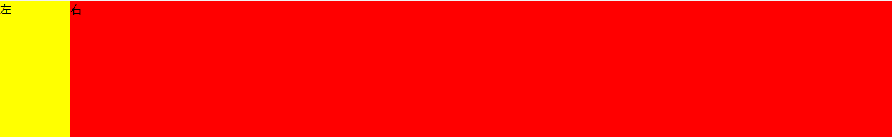
实现两个div布局,高度为200px,左边固定div宽度100px,右边div自适应。
eg:
<!DOCTYPE html>
<html lang="en">
<head>
	<meta charset="UTF-8">
	<title>Flex</title>
	<style>
		*{
			margin: 0;
			padding: 0;
		}
		.container{
			width: 100%;
			height: 200px;
			display: flex;
			flex-direction: row;
		}
		.left{
			flex-basis:100px;
			background-color: yellow;
			height: 100%;
		}
		.right{
			background-color: red;
			flex-grow: 1;
		}
	</style>
</head>
<body>
	<div class="container">
		<div class="left">左</div>
		<div class="right">右</div>
	</div>
</body>
</html>eg:
<!DOCTYPE html>
<html lang="en">
<head>
	<meta charset="UTF-8">
	<title>Cala</title>
	<style>
		*{
			margin: 0;
			padding: 0;
		}
		.container{
			width: 100%;
			height: 200px;
		}
		.left{
			float: left;
			width: 100px;
			height: 200px;
			background-color: yellow;
		}
		.right{
			float: left;
			width: calc(100% - 100px);
			height: 200px;
			background-color: red;
		}
	</style>
</head>
<body>
	<div class="container">
		<div class="left">左</div>
		<div class="right">右</div>
		<div style="clear:both"></div>
	</div>
</body>
</html>
3.使用float
eg:
<!DOCTYPE html>
<html lang="en">
<head>
	<meta charset="UTF-8">
	<title>Float</title>
	<style>
		*{
			margin: 0;
			padding: 0;
		}
		.wrapper{
			width: 100%;
			height: 200px;
		}
		.left{
			float: left;
			width: 100px;
			height: 200px;
			background-color: red;
		}
		.right{
			float: left;
			margin-left: -100px;
			width: 100%;
			height: 200px;
		}
		.rightContent{
			margin-left: 100px;
			background-color: blue;
			height: 200px;
		}

		/*还可以使用这一种,更简单,效果一样
		*{
			margin: 0;
			padding: 0;
		}
		.container{
			width: 100%;
			height: 200px;
		}
		.left{
			float: left;
			width: 100px;
			background-color: yellow;
			height: 100%;
		}
		.right{
			margin-left: 100px;
			background-color: red;
			height: 100%;
		}
		*/
	</style>
</head>
<body>
	<div class="wrapper">
		<div class="left">左</div>
		<div class="right">
			<div class="rightContent">右</div>
		</div>
		<div style="clear:both"></div>
	</div>
</body>
</html>
4.使用Position
eg:
<!DOCTYPE html>
<html lang="en">
<head>
	<meta charset="UTF-8">
	<title>Position</title>
	<style>
		*{
			margin: 0;
			padding: 0;
		}
		.container{
			width: 100%;
			position: relative;
		}
		.left{
			position: absolute;
			background-color: red;
			height: 200px;
			width: 100px;
			left: 0;
		}
		.right{
			position: absolute;
			background-color: blue;
			height: 200px;
			left: 100px;
			right: 0;
		}
	</style>
</head>
<body>
	<div class="container">
		<div class="left"></div>
		<div class="right"></div>
	</div>
</body>
</html>


 扫一扫
扫一扫
 457
457

 被折叠的 条评论
为什么被折叠?
被折叠的 条评论
为什么被折叠?
 到【灌水乐园】发言


