


随着技术的发展,开发的复杂度也越来越高,传统开发方式将一个系统做成了整块应用,经常出现的情况就是一个小小的改动或者一个小功能的增加可能会引起整体逻辑的修改,造成牵一发而动全身。通过组件化开发,可以有效实现单独开发,单独维护,而且他们之间可以随意的进行组合。大大提升开发效率低,降低维护成本。
组件化对于任何一个业务场景复杂的前端应用以及经过多次迭代之后的产品来说都是必经之路。组件化要做的不仅仅是表面上看到的模块拆分解耦,其背后还有很多工作来支撑组件化的进行,例如结合业务特性的模块拆分策略、模块间的交互方式和构建系统等等 。
本文给大家介绍的一款组件是:
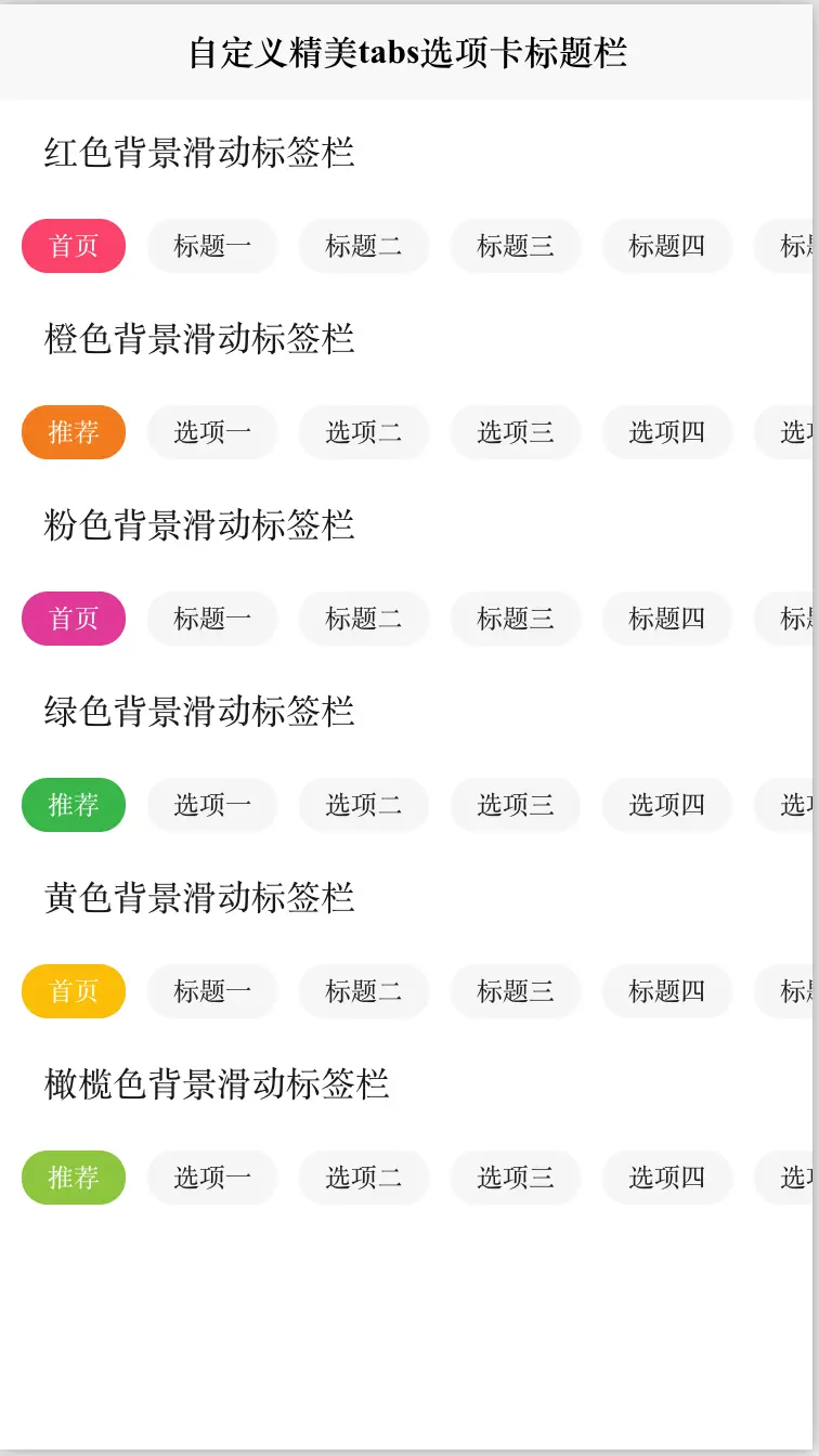
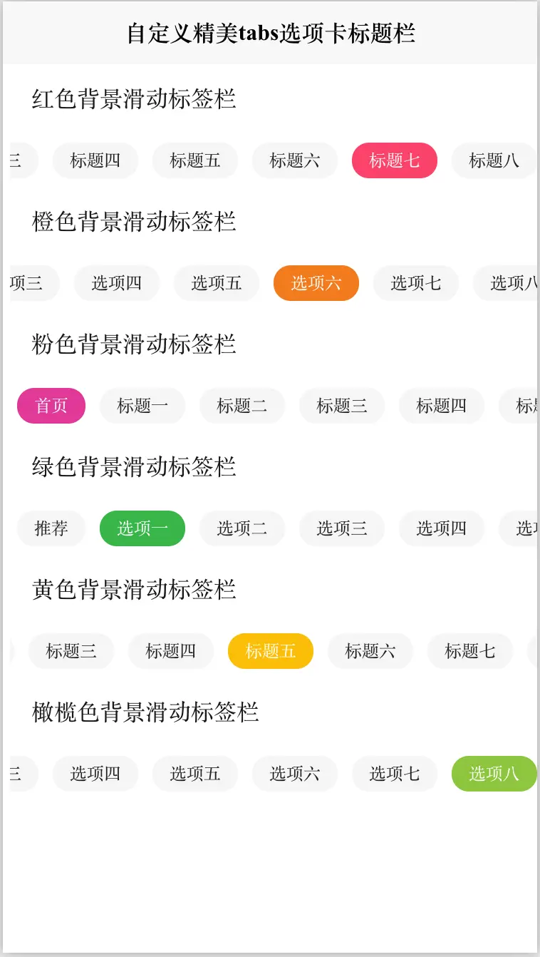
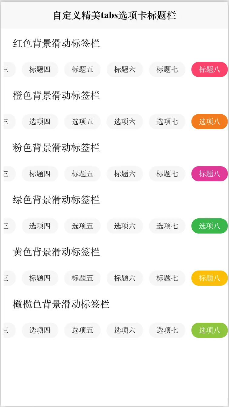
前端Vue自定义可自由滚动精美tabs选项卡标签栏标题栏 可设置背景颜色,
效果图如下:

# cc-scrollTag
#### 使用方法
```使用方法
<!-- tabChange: tab选择事件 tagList:tab数据 bgColor:标签背景颜色-->
<cc-scrollTag @tabChange="tabChange" :tagsList="tagList" bgColor="#FA436A"></cc-scrollTag>
```
#### HTML代码实现部分
```html
<template>
<view class="content">
<view style="height: 22px;margin: 12px 20px;">红色背景滑动标签栏</view>
<!-- tabChange: tab选择事件 tagList:tab数据 bgColor:标签背景颜色-->
<cc-scrollTag @tabChange="tabChange" :tagsList="tagList" bgColor="#FA436A"></cc-scrollTag>
<view style="height: 22px;margin: 12px 20px;">橙色背景滑动标签栏</view>
<!-- tabChange: tab选择事件 tagList:tab数据 bgColor:标签背景颜色-->
<cc-scrollTag @tabChange="tabChange" :tagsList="tagListTwo" bgColor="#f37b1d"></cc-scrollTag>
<view style="height: 22px;margin: 12px 20px;">粉色背景滑动标签栏</view>
<!-- tabChange: tab选择事件 tagList:tab数据 bgColor:标签背景颜色-->
<cc-scrollTag @tabChange="tabChange" :tagsList="tagList" bgColor="#e03997"></cc-scrollTag>
<view style="height: 22px;margin: 12px 20px;">绿色背景滑动标签栏</view>
<!-- tabChange: tab选择事件 tagList:tab数据 bgColor:标签背景颜色-->
<cc-scrollTag @tabChange="tabChange" :tagsList="tagListTwo" bgColor="#39b54a"></cc-scrollTag>
<view style="height: 22px;margin: 12px 20px;">黄色背景滑动标签栏</view>
<!-- tabChange: tab选择事件 tagList:tab数据 bgColor:标签背景颜色-->
<cc-scrollTag @tabChange="tabChange" :tagsList="tagList" bgColor="#fbbd08"></cc-scrollTag>
<view style="height: 22px;margin: 12px 20px;">橄榄色背景滑动标签栏</view>
<!-- tabChange: tab选择事件 tagList:tab数据 bgColor:标签背景颜色-->
<cc-scrollTag @tabChange="tabChange" :tagsList="tagListTwo" bgColor="#8dc63f"></cc-scrollTag>
</view>
</template>
<script>
export default {
data() {
return {
tagList: [
'首页', '标题一', '标题二', '标题三', '标题四',
'标题五', '标题六',
'标题七', '标题八'
],
tagListTwo: [
'推荐',
'选项一',
'选项二',
'选项三',
'选项四',
'选项五',
'选项六',
'选项七',
'选项八',
],
}
},
onLoad() {
},
methods: {
tabChange: function(t) {
console.log("tab选择序列 = " + JSON.stringify(t));
},
}
}
</script>
<style>
.content {
display: flex;
flex-direction: column;
}
</style>
```
阅读全文下载完整组件代码请关注微信公众号: 前端组件开发

欢迎加入我们的前端组件学习交流群,可添加群主微信,审核通过后入群。


 936
936


 被折叠的 条评论
为什么被折叠?
被折叠的 条评论
为什么被折叠?
 到【灌水乐园】发言


