


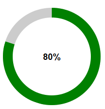
 这张图就是我们常见的原形进度条,接下来写一下我的制作过程。
首先,构建圆弧,我们先看一下他的html结构。
<div class="circle">
	    <div class="pie_left"><div class="left"></div></div>
	    <div class="pie_right"><div class="right"></div></div>
	    <div class="mask"><span>0</span>%</div>
    </div>
结构很简单如上述代码所示,其实原形进度条的就是有左右俩个半圆弧组成的。接下来我们闲来看看半圆弧怎么形成的。依右半圆为例子。
.circle{
			width:200px;
			display:inline-block;
			height:200px;
			margin:20px;
			position: relative;
			background: #ccc;
			border-radius: 50%;
		}
.pie_right{
			width:200px;
			height:200px;
			position: absolute;
			top:0px;
			left:0px;
		}
.right{
			position: absolute;
			left:0px;
			top:0px;
			border-radius:50%;
			background: green;
			width:100%;
			height:100%;

		}
.pie_right, .right{
			clip:rect(0, auto, auto, 100px);
		}
这样如图所示: 灰色部分是外层circle,绿色部分是右半圆弧,其实它是整个园只不过对它进行了切割 在css 中添加了“clip:rect(0, auto, auto, 100px);”这样就把它左半边的切除了(clip属性使用: http://www.w3school.com.cn/cssref/pr_pos_clip.asp),接着在css中添加“transform: rotate(-100deg);”圆弧就会旋转了如下图所示:

半圆弧原理就是这样,下面是完整的css 样式:
	.circle{
			width:200px;
			display:inline-block;
			height:200px;
			margin:20px;
			position: relative;
			background: #ccc;
			border-radius: 50%;
		}
	.pie_left, .pie_right{
			width:200px;
			height:200px;
			position: absolute;
			top:0px;
			left:0px;
		}
	.left, .right{
			position: absolute;
			left:0px;
			top:0px;
			border-radius:50%;
			background: green;
			transform:rotate(-180px);
			width:100%;
			height:100%;
			transform: rotate(-180deg);
		}
	.pie_left, .left{
			clip: rect(auto, 100px, auto, auto);
			 /*clip:rect(0,100px,auto,0);*/
		}
	.pie_right, .right{
			clip:rect(0, auto, auto, 100px);
		}
	.mask{
			position: absolute;
			top:20px;
			left:20px;
			width:160px;
			height:160px;
			line-height: 160px;
			font-size:18px;
			font-weight: 600;
			border-radius: 50%;
			background: #fff;
			text-align: center
		}
如图:
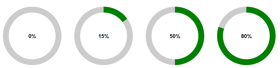
接下来就是旋转角度了,也就是左右两个圆弧旋转角度的问题了,如果0%的话两个圆弧都是隐藏不显示的,所以刚开始我们默认两圆弧的旋转角度为“-180deg"。圆弧的旋转角度是有里面的数字百分比决定的。从0%-100%,这样就是每1%占3.6deg,而在50%以内的话只有右半圆弧转动,左半圆弧不显示。这样的话下面我们用jquery来实现圆弧的转动。
<script type="text/javascript">
  	$(function () {
  		$(".circle").each(function(){
  			var num=$(this).find(".mask span").text()*3.6;
  			if(num<=180){
  				// $(this).find(".right").css("transform","rotate("+(num-180)+"deg)");
  				$(this).find(".right").css({"transform":"rotate("+(num-180)+"deg)","transition": "transform 0.5s ease"});
  			}else{
  				$(this).find(".right").css({"transform":"rotate(0deg)", "transition": "transform 0.5s ease-in"});
  				 $(this).find(".left").css({"transform":"rotate("+(num-360)+"deg)","transition": "transform 0.2s 0.5s ease-in"});
  				// $(this).find(".right").css("transform","rotate(0deg)");
  				// $(this).find(".left").css("transform","rotate("+(num-360)+"deg)");
  			}
  		})
  	})

  </script>
这样一来就可以了.


 1654
1654


 被折叠的 条评论
为什么被折叠?
被折叠的 条评论
为什么被折叠?
 到【灌水乐园】发言


