


 实现类似这样的等待动画效果。
第一步:如何画一个大圈,可以尝试先画两个个正方形重叠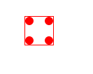
            #circlebox{
				width: 40px;
				height: 40px;
				border: 1px solid red;
				margin: 100px;
				position: absolute;

			}
			#circlebox p{
				width: 12px;
				height: 12px;
				border-radius: 50%;
				background-color: #FF0000;
				position: absolute;
			}
            #circlebox p:nth-of-type(1){
				left: 0;
				top: 0;
			}
			#circlebox p:nth-of-type(2){
				right: 0;
				top: 0;
			}
			#circlebox p:nth-of-type(3){
				right: 0;
				bottom: 0;
			}
			#circlebox p:nth-of-type(4){
				left: 0;
				bottom: 0;
			}
<div id="circlebox">
<p></p>
<p></p>
<p></p>
<p></p>
</div>
<div id="circlebox">
<p></p>
<p></p>
<p></p>
<p></p>
</div>然后让第二个正方形旋转45deg。
            #circlebox:nth-of-type(2){
				transform: rotate(45deg);
			}
再将两个正方形的边框去掉:/* border: 1px solid red; */就得到了一个大圈啦
第二步:让所有小圆都会变大变小 ,这里使用了CSS3 的@keyframes和scale方法
@keyframes创建动画是通过逐步改变从一个CSS样式设定到另一个。
在动画过程中,您可以更改CSS样式的设定多次。
指定的变化时发生时使用%,或关键字"from"和"to",这是和0%到100%相同。
0%是开头动画,100%是当动画完成。
使用scale()方法来将元素根据中心原点进行缩放。
            @keyframes move{
				0%{transform: scale(0);}
				50%{transform: scale(1);}
				100%{transform: scale(0);}
			}
在#circlebox p{}添加animation: move 1.5s infinite linear;让小圆在1.5s内循环变大变小
			#circlebox p{
				width: 12px;
				height: 12px;
				border-radius: 50%;
				background-color: #FF0000;
				position: absolute;
				animation: move 1.5s infinite linear;
			}
效果:


第三步:完成上面的动画之后,要让每个小圆变大变小随时间而定,我们让第一个圆0.1s后开始变化,第二个圆0.3s后开始变化。。。。第八个圆1.5s后开始变化,这样刚好符合上面定义的 1.5s循环动画。这里需要注意的是,第二个圆实际上是第二个div里面的第一个p标签。
			#circlebox:nth-of-type(1) p:nth-of-type(1){
				animation-delay: 0.1s;
			}
			#circlebox:nth-of-type(2) p:nth-of-type(1){
				animation-delay: 0.3s;
			}
			#circlebox:nth-of-type(1) p:nth-of-type(2){
				animation-delay: 0.5s;
			}
			#circlebox:nth-of-type(2) p:nth-of-type(2){
				animation-delay: 0.7s;
			}
			#circlebox:nth-of-type(1) p:nth-of-type(3){
				animation-delay: 0.9s;
			}
			#circlebox:nth-of-type(2) p:nth-of-type(3){
				animation-delay: 1.1s;
			}
			#circlebox:nth-of-type(1) p:nth-of-type(4){
				animation-delay: 1.3s;
			}
			#circlebox:nth-of-type(2) p:nth-of-type(4){
				animation-delay: 1.5s;
			}

 这样就完成了加载等待的动画效果啦,这是顺时针变化的,如果想让它逆时针变化的话,只需要将每个小圆的动画延时时间改为负的就行,(负的表示提前变化),这样就会从第8个圆开始变化,然后第7个、第6个。。。。。。


 2627
2627


 被折叠的 条评论
为什么被折叠?
被折叠的 条评论
为什么被折叠?
 到【灌水乐园】发言


