


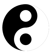
 旋转太极图
旋转太极图
太极图可由6个部分组成:
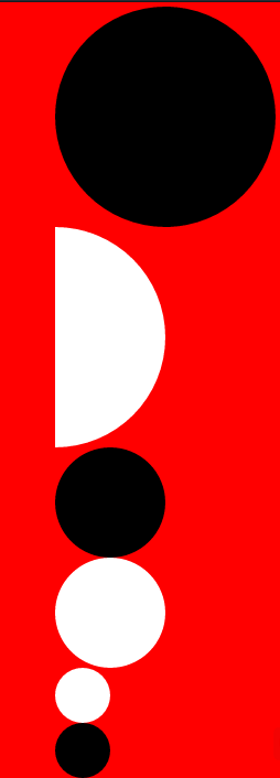
将图片的位置放在合适的位置就能组成一张太极图。
首先在div容器内画上以上的6图案:
		<div id="box">
			<ul id="vessel">
				<li></li>
				<li></li>
				<li></li>
				<li></li>
				<li></li>
				<li></li>
			</ul>
		</div>
#box{
width: 300px;
height: 300px;
border: 10px red hidden;
margin-left: 100px;
margin-top: 50px;
position: relative;
}
#box #vessel{
width: 300px;
height: 300px;
list-style: none;
margin-left: 50px;
margin-top: 50px;
position: relative;
}
#box #vessel li:nth-of-type(1){
width: 200px;
height: 200px;
background-color: black;
border-radius: 50%;
position: absolute;
}
#box #vessel li:nth-of-type(2){
width: 100px;
height: 200px;
background-color: white;
border-radius: 0 100px 100px 0;
position: absolute;
right: 100px;
}
#box #vessel li:nth-of-type(3){
width: 100px;
height: 100px;
background-color: black;
border-radius: 50%;
position: absolute;
left: 50px;
}
#box #vessel li:nth-of-type(4){
width: 100px;
height: 100px;
background-color: white;
border-radius: 50%;
position: absolute;
left: 50px;
top: 100px;
}
#box #vessel li:nth-of-type(5){
width: 50px;
height: 50px;
background-color: white;
border-radius: 50%;
position: absolute;
left: 75px;
top: 25px;
}
#box #vessel li:nth-of-type(6){
width: 50px;
height: 50px;
background-color: black;
border-radius: 50%;
position: absolute;
left: 75px;
top: 125px;
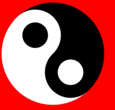
}完成后就能组成
接下来让图片旋转就行了
创建动画
@keyframes Rotate{
from{transform: rotate(0deg);}
to{transform: rotate(360deg);}
}
让整个DIV饶中心旋转就OK啦 在#box样式内加
animation: Rotate 2s infinite linear;
transform-origin: 150px 100px;
搞定.


 312
312

 被折叠的 条评论
为什么被折叠?
被折叠的 条评论
为什么被折叠?
 到【灌水乐园】发言


