


上一篇完成对数据的采集,现在我们来对数据分析和展示
我们将用到百度的echarts,官网为http://echarts.baidu.com/
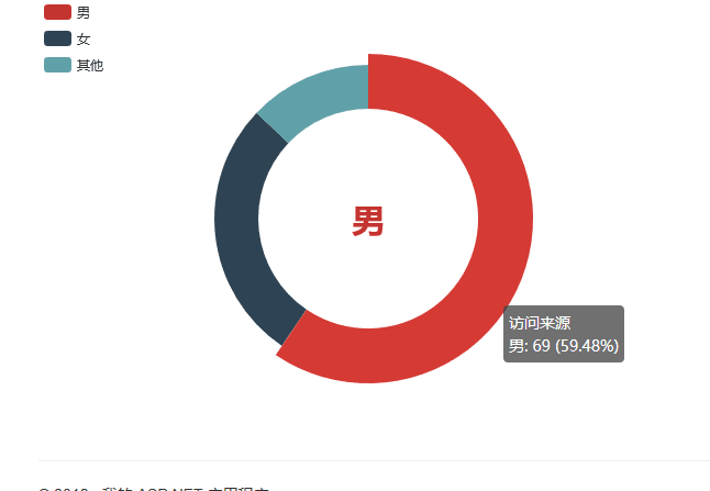
男女比列分析
在friden类中Sex属性表示性别,1表示男性,2表示女性,还有些用户没有填写用0表示
首先构建数据库上下文对象
WeChartContex DataBase = new WeChartContex();接下来创建Action来分析了
public ActionResult AnalyseForSex()
        {

            int ManCount = DataBase.Fridens.Where(f => f.Sex == 1).Count();
            int WoManCount = DataBase.Fridens.Where(f => f.Sex == 2).Count();
            int OthersCount = DataBase.Fridens.Where(f => f.Sex == 0).Count();
            ViewData["man"] = ManCount;
            ViewData["woman"] = WoManCount;
            ViewData["other"] = OthersCount;
            return View();
        }
先统计各个性别好友的数量,把数据交给视图,现在来完成视图
<input type="text" value="@ViewData["man"]" id="man" style="display:none" />
<input type="text" value="@ViewData["woman"]" id="woman" style="display:none" />
<input type="text" value="@ViewData["other"]" id="other" style="display:none" />
  <!-- 为ECharts准备一个具备大小(宽高)的Dom -->
<div id="main" style="width: 600px;height:400px;"></div>
<script src="~/Scripts/echarts.min.js"></script>
<script type="text/javascript">
    window.onload = function () {
        var manvalue=$("#man").val();
        var womanvalue=$("#woman").val();
        var OTERVALUE=$("#other").val();
        var myChart = echarts.init(document.getElementById('main'));
        option = {
            tooltip: {
                trigger: 'item',
                formatter: "{a} <br/>{b}: {c} ({d}%)"
            },
            legend: {
                orient: 'vertical',
                x: 'left',
                data: ['男', '女', '其他']
            },
            series: [
                {
                    name: '访问来源',
                    type: 'pie',
                    radius: ['50%', '70%'],
                    avoidLabelOverlap: false,
                    label: {
                        normal: {
                            show: false,
                            position: 'center'
                        },
                        emphasis: {
                            show: true,
                            textStyle: {
                                fontSize: '30',
                                fontWeight: 'bold'
                            }
                        }
                    },
                    labelLine: {
                        normal: {
                            show: false
                        }
                    },
                    data: [
                        { value:manvalue,name: '男' },
                        { value: womanvalue, name: '女' },
                        { value: OTERVALUE, name: '其他' },

                    ]
                }
            ]

        };
        myChart.setOption(option);
    }
</script>
注意需要引用echarts.min.js,我们来看看效果
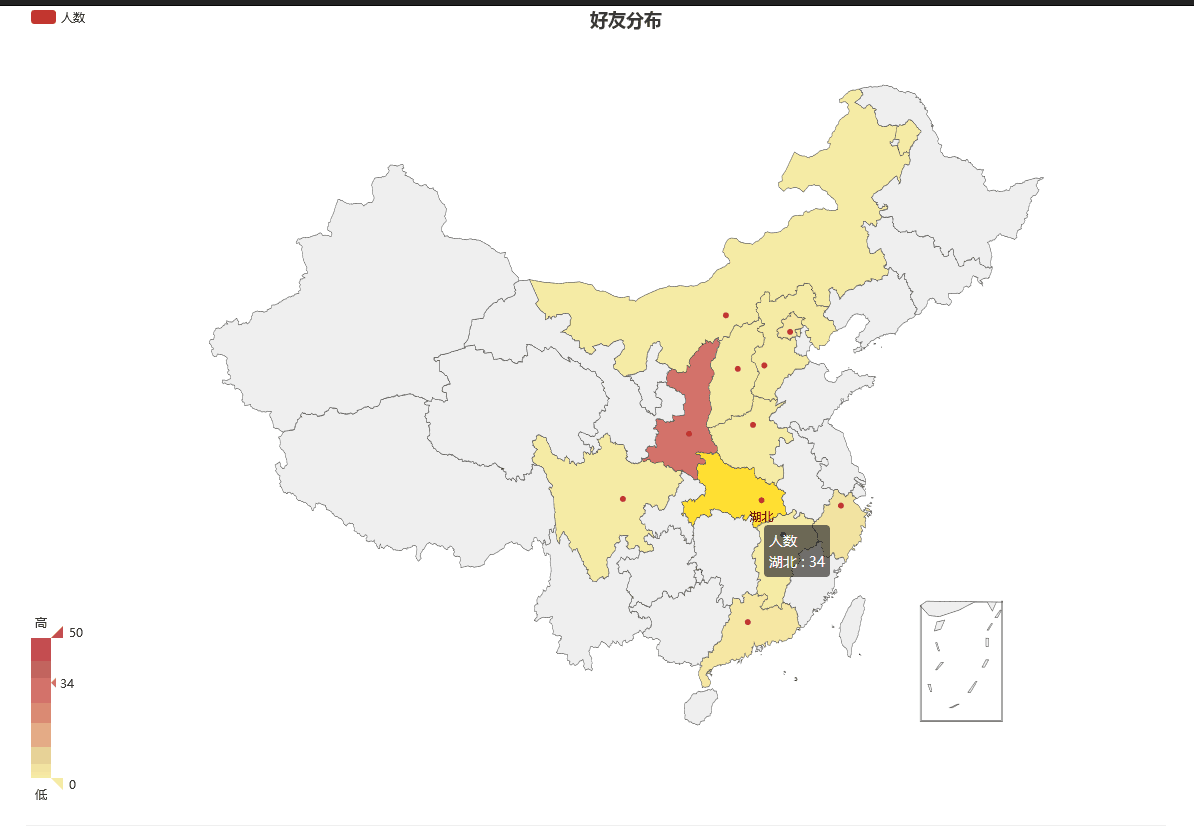
分析好友的地域分布
创建Action
public ActionResult AnalyseforProvince()
        {
            return View();
        }
还有一个提供身份信息的Action
 public ActionResult Province()
        {
            string sql = "select province as name, count(*) as value from Friends group by province";
          List<Province> list=  DataBase.Database.SqlQuery<Province>(sql).ToList();
          return Json(list);
        }
这里有个Province类来承接数据库查询到的数据
 public class Province
    {
        public string name { get; set; }
        public int value { get; set; }
    }
接下来完善view
<div id="main" style="width:1200px;height:800px;"></div>

<script src="~/Scripts/echarts.min.js"></script>
<script src="~/Scripts/china.js"></script>
 <!-- 为ECharts准备一个具备大小(宽高)的Dom -->
<script src="~/Scripts/jquery-1.10.2.min.js"></script>

<script>
    var chart = echarts.init(document.getElementById('main'));

    $.ajax({
        type: "post",
        url: "../DataAnalyse/Province",
        success: function (msg)
        {
            var server = [{
                name: 'number',
                type: 'map',
                map: 'china',
                data: msg
            }]
            option = {
                title: {
                    text: '好友分布',
                    subtext: '',
                    left: 'center'
                },
                tooltip: {
                    trigger: 'item'
                },
                legend: {
                    orient: 'vertical',
                    left: 'left',
                    data: ['人数']
                },
                visualMap: {
                    min: 0,
                    max: 50,
                    left: 'left',
                    top: 'bottom',
                    text: ['高', '低'],           // 文本,默认为数值文本
                    calculable: true
                },
                toolbox: {
                    show: true,
                    orient: 'vertical',
                    left: 'right',
                    top: 'center',
                    feature: {
                        dataView: { readOnly: false },
                        restore: {},
                        saveAsImage: {}
                    }
                },
                series: [{
                    name: '人数',
                    type: 'map',
                    map: 'china',
                    data:msg
                }]
            };
            chart.setOption(option);
        }
    })

</script>
NOTE:不但要引用echarts.min.js还要引用china.js
看看效果
完工了!!!


 1200
1200

 被折叠的 条评论
为什么被折叠?
被折叠的 条评论
为什么被折叠?
 到【灌水乐园】发言


