


Android 图像绘制系列文章
Android图像绘制之Bitmap
Android 图像绘制之 Drawable
Android 图像绘制之 Drawable(二)
不要冲动去自定义 View
记得当初学习 Android 的时候,接触到自定义 View 的时候,感觉逼格好高。后来公司要开发一个锁屏界面 ,科长让我接下这个任务带领同事开发,吓得我当时就接受了这个任务。然后在跌跌撞撞中完成了,效果我还算满意。但是后来我仔细回想下开发过程,很多问题我都给自己一个问号。那么今天我提一个问题,为什么要自定义 View?
举个常见例子,我想显示一张圆形图片。说实话,当初的我第一想法就是继承 View,重写 onDraw() 方法。后来回想下,MDZZ,Android 能不能智能点,这也需要我自定义 View,万一再要显示一张圆形纯背景色,我岂不又要自定义 View。 其实我可以告诉你,绘制简单的图形,以及显示静态的图片,可以用 Drawable,而不用自定义 View。例如显示一张圆形图片,我其实可以用 RoundBitmapDrawable,这个后面我们会看到。
Drawable是什么
查了下官方文档,Drawable 是一个抽象的概念,“something that can be drawn”,就我的理解话,Drawable 是一种媒介,它可以把内容绘制到 Canvas 上。
如果你还没理解,举个例子,BitmapDrawable 包装了一个 Bitmap,如果你还不了解 Bitmap,请看我的文章 Android 图像绘制之 Bitmap。其实 BitmapDrawable 最终也是调用了 Canvas 的 drawBitmap() 方法来把 Bitmap 绘制图像到 View 中的。
Drawable的实现类
查了下 Drawable 的实现类,如ShapeDrawable,BitmapDrawable,ClipDrawable,RoundBitmapDrawable,StateListDrawableRoateDrawable。从类的名子来看,大致可以猜到这些类是干嘛的吧,是不是有种相见恨晚的感觉,那么本篇文章就是介绍这些类。当然网上很多文章都有写过,本篇文章不注重抠每个细节,但是会让你感受到这个类到底实际中有何用。
GradientDrawable
一个创建图形的 Drawable,图形包括直线(line), 椭圆(oval),圆形(oval,当椭圆的宽高相等的时候就是圆形),矩形(rectangle),圆环(ring)。不过在这之前,我需要你对 Paint 有所了解,目前我还没有写关于 Paint 的文章,我希望你能从其他文章了解下,这样能更好理解 GradientDrawable 。
GradientDrawable 它在 XML 文件中对应的根节点为 <Shape>,但是它生成的不是 ShapeDrawable,而是 GradientDrawable,但是又达到了 ShapeDrawable 的效果, 我查了下官方文档,没有错,这 TM 就有点搞事了。如果有人知道,可以告诉我为什么。
直线
<?xml version="1.0" encoding="utf-8"?>
<shape
    xmlns:android="http://schemas.android.com/apk/res/android"
    android:shape="line">
    <stroke android:width="5dp" android:color="#ffff0000"/>
</shape>
椭圆或者圆形
<?xml version="1.0" encoding="utf-8"?>
<shape    xmlns:android="http://schemas.android.com/apk/res/android"
android:shape="oval">
<stroke android:width="5dp" android:color="#ffff0000"/>
</shape>
如果我把定义宽和高相等的话就是圆形
<?xml version="1.0" encoding="utf-8"?>
<shape    xmlns:android="http://schemas.android.com/apk/res/android"
android:shape="oval">
    <stroke android:width="1dp" android:color="#ffff0000"/>
    <size android:width="100dp" android:height="100dp"/>
</shape>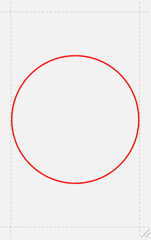
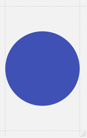
如果不用 Stroke( 描边,对应 Paint.STROKE ),而用Solid (填充,对应 Paint.FILL),会出现实心圆形。
填充的颜色也可以搞个渐变色
<?xml version="1.0" encoding="utf-8"?>
<shape
    xmlns:android="http://schemas.android.com/apk/res/android"
    android:shape="oval">
<gradient
    android:startColor="@color/colorAccent"
    android:endColor="@color/colorPrimary"/>
<size
    android:width="100dp"
    android:height="100dp"/>
</shape>
矩形
<?xml version="1.0" encoding="utf-8"?>
<shape
    xmlns:android="http://schemas.android.com/apk/res/android"
    android:shape="rectangle">
<corners
    android:radius="10dp"/>

<stroke
    android:width="1dp"
    android:color="@color/colorAccent"/>
<size
    android:width="100dp"
    android:height="100dp"/>
</shape>
圆环
<?xml version="1.0" encoding="utf-8"?>
<shape
    xmlns:android="http://schemas.android.com/apk/res/android"
    android:innerRadius="100dp"
    android:shape="ring"
    android:thickness="10dp"
    android:useLevel="false">
<solid
    android:color="@color/colorAccent"/>
</shape>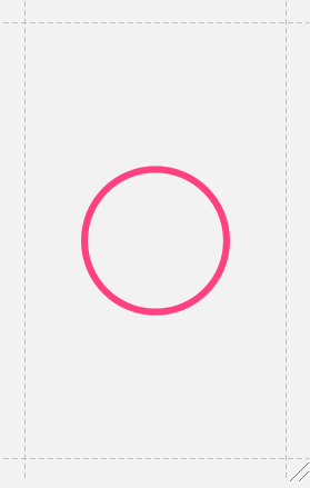
- 这里要说下这个 useLevel, 只有在 LevelListDrawable 中才设置 true,这里要设置 false,否则显示不出来。
- 其实 GradientDrawable 或者说是 ShapeDrawable 的绘制原理就是利用 Canvas.drawCircle() ,Canvas.drawRect() 等等方法(Canvas 我将在后面的文章介绍)。
BitmapDrawable
BitmapDrawable 主要是用于图片的平铺( tileMode )显示,我们先看看没有设置 tileMode 的 BitmapDrawable
<?xml version="1.0" encoding="utf-8"?>
<bitmap
    xmlns:android="http://schemas.android.com/apk/res/android"
    android:antialias="true"
    android:dither="true"
    android:filter="true"
    android:mipMap="true"
    android:src="@drawable/sample_1">
</bitmap>
antialias:抗锯齿
dither:抗抖动,当位图的像素配置与屏幕不同时(例如 ARGB_8888 的位图和 RGB_565 的屏幕)
filter:过滤。当位图收缩或者拉伸,为了使外观平滑使用过滤
mipMap:一种图像处理技术 ,主要用于在图片缩小时,还要获得高质量图片。
BitmapDrawable 的侧重功能属性在于 android:tileMode=["disabled" | "clamp" | "repeat" | "mirror"]
disable:不解释,默认不平铺
clamp:当位图小于实际显示区域的时候,边缘的颜色拉伸
repeat:当位图小于实际显示区域的时候,水平和垂直方向,重复显示图片
mirror:当位图小于实际显示区域的时候,水平和垂直方向,以镜像的方式(或者说对称的方式)重复显示图片
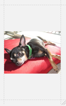
为了说明 tileMode ,先看一张原图

repeat
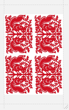
mirror

Clamp
这个就有点意思了,我看到了一个实际用法(参考博客http://blog.csdn.net/u012702547/article/details/51594131)
不会 PS 是硬伤,只能借用下别人的图了。但是我们主要学习这个实际中怎么应用。
原图是这样

clamp 平铺后
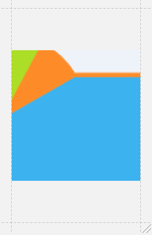
把它应用到 TextView 背景后
<TextView
    android:id="@+id/image_view"
    android:layout_width="match_parent"
    android:layout_height="match_parent"
    android:background="@drawable/bitmapfile"
    android:padding="40dp"
    android:text="@string/bitmap_clamp_text"
    android:textSize="20sp"/>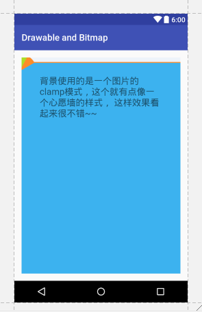
LayerListDrawable
图层列表,就像我们平时把一张照片放在另外一张照片上,最后的照片在最上面。 LayerListDrawable 就是这样设计的。
<?xml version="1.0" encoding="utf-8"?>
<layer-list xmlns:android="http://schemas.android.com/apk/res/android">
<item>
    <shape android:shape="oval">
        <solid android:color="@color/colorAccent"/>
    </shape>
</item>
    <item android:width="64dp" android:height="64dp">
        <bitmap
            android:gravity="center"
            android:src="@android:drawable/ic_input_add"/>
    </item>
</layer-list>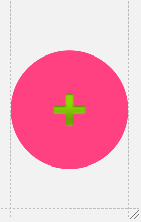
这个是不是有点像 FloatingActionButton,把这个设置为 Button 的背景,然后设置 android:elevation,是不是就 perfect了。
使用注意事项
- 我们用 <item> 控制显示的大小和位置,而用<item> 的子节点控制显示区域,如 <bitmap>,<shape>,<nine-path> 等等 Drawable
- 不用<item>显示图片因为图片会根据显示区域缩放,如果我们将图片放在子节点中,例如 <bitmap>,就算图片小于显示区域也不会放大。
StateListDrawable
在 MD 设计之前,大家应该有个印象,在点击像 ListView 的 Item 的时候,是没有波纹效果的,我们往往会自己设计一个简单的效果,就是点击 Item 的时候,背景切换个颜色。而这个就是用 StateListDrawable。
<?xml version="1.0" encoding="utf-8"?>
<selector xmlns:android="http://schemas.android.com/apk/res/android">
  <item android:state_pressed="true">
    <shape>
        <corners android:radius="10dp"/>
        <solid android:color="@color/colorAccent"/>
    </shape>
  </item>

  <item>
    <shape>
        <corners android:radius="10dp"/>
        <stroke
            android:width="1dp"
            android:color="#685252"/>
    </shape>
  </item>
</selector>
设置为 Button 的 background 后效果如下

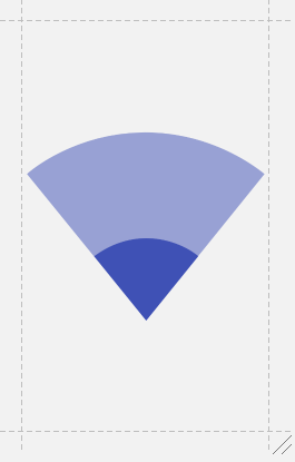
LevelListDrawable
根据等级(level)来显示图片。典型的应用就是 WIFI 信号。用 setLevel()来控制 level,根据 level 所在的范围显示相应的图片。
<?xml version="1.0" encoding="utf-8"?>
<level-list xmlns:android="http://schemas.android.com/apk/res/android">
    <item android:maxLevel="0" android:drawable="@drawable/ic_wifi_signal_1" />
    <item android:maxLevel="2" android:drawable="@drawable/ic_wifi_signal_2" />
    <item android:maxLevel="5" android:drawable="@drawable/ic_wifi_signal_3" />
    <item android:maxLevel="9" android:drawable="@drawable/ic_wifi_signal_4" />
</level-list>
maxLevel = 0 就是默认图片,看下默认效果
现在给 ImageView 背景
    <ImageView
        android:layout_centerInParent="true"
        android:id="@+id/wifi_image"
        android:onClick="onClickWifi"
        android:background="@drawable/level_list_drawable"
        android:layout_width="200dp"
        android:layout_height="200dp"/>
    private static int i = 1;
    public void onClickWifi(View view) {
        ImageView imageView = (ImageView) findViewById(R.id.wifi_image);
        imageView.getBackground().setLevel(i++ % 10);
    }
现在效果,每点击一次 ImageView,level 改变一次。第一次点击 ,level 是1,显示 maxLevel="2" 图片,再点击一次,level 是2,还是显示 maxLevel="2" 图片,依此类推,出现如下效果
TransitionDrawable
在两个图像之间,通过改变 alpha 来交替显示。
<?xml version="1.0" encoding="utf-8"?>
<transition xmlns:android="http://schemas.android.com/apk/res/android">
    <item>
        <shape>
            <solid android:color="@color/colorAccent"/>
        </shape>
    </item>

    <item>
        <bitmap android:src="@drawable/sample_1"/>
    </item>
</transition>
为 ImageView 设置这个背景
    <ImageView
        android:id="@+id/transition"
        android:layout_width="match_parent"
        android:layout_height="wrap_content"
        android:background="@drawable/transition_drawable"
        android:onClick="onClickTransition"/>
实现点击事件
    private boolean isReverse;
    public void onClickTransition(View view) {
        ImageView imageView = (ImageView) findViewById(R.id.transition);
        TransitionDrawable drawable = (TransitionDrawable) imageView.getBackground();
        if (!isReverse) {
            drawable.startTransition(2000);
            isReverse = true;
        } else {
            drawable.reverseTransition(2000);
            isReverse = false;
        }
    }
InsetDrawable
看这个命名,意思是 插入式的 Drawable。也就是说,可以按照指定的位置(left,top,right,bottom)来显示图片
<?xml version="1.0" encoding="utf-8"?>
<inset
    xmlns:android="http://schemas.android.com/apk/res/android"
    android:drawable="@drawable/sample_1"
    android:insetLeft="20dp"
    android:insetRight="10dp"
    android:insetTop="10dp"/>
    <ImageView
        android:layout_width="wrap_content"
        android:layout_height="wrap_content"
        android:layout_centerInParent="true"
        android:background="@color/colorAccent"
        android:src="@drawable/inset_drawable"/>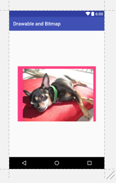
可以看到 left , top , right 有明显的 padding
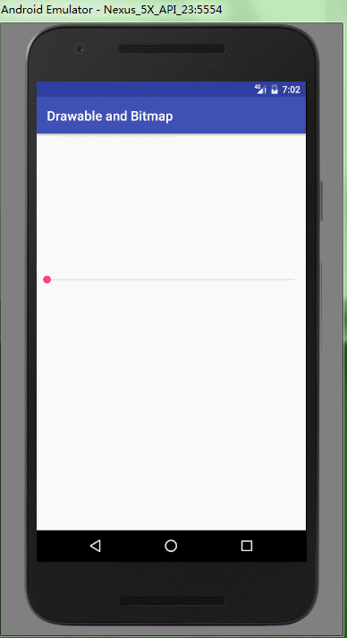
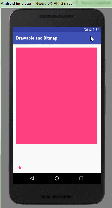
ClipDrawable
从名字上看,意思是可以裁减的 Drawable。
<?xml version="1.0" encoding="utf-8"?>
<clip
    xmlns:android="http://schemas.android.com/apk/res/android"
    android:clipOrientation="horizontal"
    android:drawable="@drawable/sample_1"
    android:gravity="center">
</clip>
clipOrientation 控制裁减的方向
gravity 控制从哪里开始裁减
布局文件
<?xml version="1.0" encoding="utf-8"?>
<LinearLayout xmlns:android="http://schemas.android.com/apk/res/android"
              android:layout_width="match_parent"
              android:layout_height="match_parent"
              android:orientation="vertical">

    <ImageView
        android:id="@+id/clip_image"
        android:background="@drawable/clip_drawable"
        android:layout_width="match_parent"
        android:layout_height="wrap_content"/>

    <SeekBar
        android:layout_width="match_parent"
        android:layout_height="wrap_content"
        android:id="@+id/seekBar2"/>
</LinearLayout>
Java Code
        final ImageView imageView = (ImageView) findViewById(R.id.clip_image);
        SeekBar seekBar = (SeekBar) findViewById(R.id.seekBar2);
        seekBar.setMax(10000);
        seekBar.setOnSeekBarChangeListener(new SeekBar.OnSeekBarChangeListener() {
            @Override
            public void onProgressChanged(SeekBar seekBar, int i, boolean b) {
                imageView.getBackground().setLevel(i);
            }

            @Override
            public void onStartTrackingTouch(SeekBar seekBar) {

            }

            @Override
            public void onStopTrackingTouch(SeekBar seekBar) {

            }
        });
ScaleDrawable
意思是可缩放的 Drawable。不过用起来有点费劲。
<?xml version="1.0" encoding="utf-8"?>
<RelativeLayout
    xmlns:android="http://schemas.android.com/apk/res/android"
    android:layout_width="match_parent"
    android:layout_height="match_parent"
    android:padding="16dp">


    <ImageView
        android:id="@+id/scale_image"
        android:layout_width="match_parent"
        android:layout_height="450dp"
        android:background="#FF4081"
        android:src="@drawable/scale_drawable"/>

    <SeekBar
        android:layout_alignParentBottom="true"
        android:id="@+id/seekBar3"
        android:layout_width="match_parent"
        android:layout_height="wrap_content"
        android:layout_gravity="bottom"/>
</RelativeLayout>
scaleGravity 控制显示的位置
    <ImageView
        android:id="@+id/scale_image"
        android:layout_width="match_parent"
        android:layout_height="450dp"
        android:background="#FF4081"
        android:src="@drawable/scale_drawable"/>
基本设置已经完毕,但是就是不显示,我们需要控制 ScaleDrawable 的 Level,我们加入一个 SeekBar 控制 Level
        final ImageView imageView = (ImageView) findViewById(R.id.scale_image);
        SeekBar seekBar = (SeekBar) findViewById(R.id.seekBar3);
        seekBar.setMax(10000);
        seekBar.setOnSeekBarChangeListener(new SeekBar.OnSeekBarChangeListener() {
            @Override
            public void onProgressChanged(SeekBar seekBar, int i, boolean b) {
                imageView.getDrawable().setLevel(i);
            }

            @Override
            public void onStartTrackingTouch(SeekBar seekBar) {

            }

            @Override
            public void onStopTrackingTouch(SeekBar seekBar) {

            }
        });
    }
level 控制缩小的比例的,level 值是从 0 到 10000,0代表不显示,从1开始控制图片放大,10000就是原图,看下面效果演示
- android:level 属性在 API 24 版本后,可以在 XML 文件中添加
- android:useIntrinsicSizeAsMinimum="true",这个设置为 true 后,就会一直显示原图的大小。
- 如果你想知道为什么,可以探究源码 ScaleDrawable.java 的 onBoundsChange() 方法
结束
通过本篇文章,我们要达到两点效果,一是 Drawable 是什么,二是为什么要用 Drawable。
由于篇幅原因,现在就介绍这么多,在下篇会把 NinePathDrawable,ColorDrawable,RoundBitmapDrawable,VectorDrawable 也加进来。同时在后面的文章中,我会介绍如何自定义 Drawable,让大家逐步感受到其实不用自定义 View 也能做很多事情。
作者:不惜留恋_
链接:https://www.jianshu.com/p/4cd87e3c43d6
来源:简书
著作权归作者所有。商业转载请联系作者获得授权,非商业转载请注明出处。


 723
723


 被折叠的 条评论
为什么被折叠?
被折叠的 条评论
为什么被折叠?
 到【灌水乐园】发言


