


封装dialog组件
组件参数及事件
参数支持:
| 参数名 | 参数描述 | 参数类型 | 默认值 |
|---|---|---|---|
| title | 对话框标题 | string | 提示 |
| width | 宽度 | string | 50% |
| top | 与顶部的距离 | string | 15vh |
| visible | 是否显示dialog(支持sync修饰符) | boolean | false |
事件支持:
| 事件名 | 事件描述 |
|---|---|
| opened | 模态框显示事件 |
| closed | 模态框关闭事件 |
插槽说明:
| 插槽名称 | 插槽描述 |
|---|---|
| default | dialog的内容 |
| title | dialog的标题 |
| footer | dialog的底部操作区 |
基本结构
在components目录下创建dialog.vue,内容如下:
<template>
  <div class="g-dialog">对话框</div>
</template>

<script>
export default {
  name: 'GDialog'
}
</script>

<style>
</style>
然后布局基本内容,其中一个dialog基本分为三部分:头部(header)、内容(body)和底部(footer)
<template>
  <div class="g-dialog_wrapper">
    <div class="g-dialog">
      <!-- dialog的头部header -->
      <div class="g-dialog_header">
        <span class="g-dialog_title">提示</span>
        <g-button class="g-dialog_headerbtn">
          <i class="g-icon">X</i>
        </g-button>
      </div>
      <!-- dialog的内容body -->
      <div class="g-dialog_body">
        <span>这是一段信息</span>
      </div>
      <!-- dialog的底部footer -->
      <div class="g-dialog_footer">
        <g-button>取消</g-button>
        <g-button type="primary">确定</g-button>
      </div>
    </div>
  </div>
</template>
其样式为
<style lang="scss" scoped>
.g-dialog_wrapper{
  position: fixed;
  top: 0;
  right: 0;
  bottom: 0;
  left: 0;
  overflow: auto;
  margin: 0;
  z-index: 2001;
  background-color: rgba(0,0,0,0.5);
  .g-dialog{
    position: relative;
    margin: 15vh auto 50px;
    background: #fff;
    border-radius: 2px;
    box-shadow: 0 1px 3px rgba(0,0,0,0.3);
    box-sizing: border-box;
    width: 30%;
    &_header{
      padding: 20px 20px 10px;
      .one-dialog_title{
        line-height: 24px;
        font-size: 18px;
        color: #303133;
      }
      .g-dialog_headerbtn{
        position: absolute;
        top: 20px;
        right: 20px;
        padding: 0;
        background: transparent;
        border: none;
        outline: none;
        cursor: pointer;
        font-size: 16px;
        .g-icon-close{
          color:909399
        }
      }
    }
    &_body{
      padding: 30px 20px;
      color: #606266;
      font-size: 14px;
      word-break: break-all;
    }
    &_footer{
      padding: 10px 20px 20px;
      text-align: right;
      box-sizing: border-box;
      ::v-deep .one-button:first-child{
        margin-right: 20px;
      }
    }
  }
}
</style>
在main.js中注册,然后在app.vue中引用

title属性
将标题span标签放到slot插槽下,这样便于控制span的内容和样式
<template>
  <div class="g-dialog_wrapper">
    <div class="g-dialog">
      <!-- dialog的头部header -->
      <div class="g-dialog_header">
        <slot name="title">
          <!-- 将span放到slot内,这样不仅可以定义title文本,还可以定义样式等 -->
          <span class="g-dialog_title">
            {{title}}
          </span>
        </slot>
        <g-button class="g-dialog_headerbtn">
          <i class="g-icon">X</i>
        </g-button>
      </div>
      <!-- dialog的内容body -->
      <div class="g-dialog_body">
        <span>这是一段信息</span>
      </div>
      <!-- dialog的底部footer -->
      <div class="g-dialog_footer">
        <g-button>取消</g-button>
        <g-button type="primary">确定</g-button>
      </div>
    </div>
  </div>
</template>
通过父组件传值及通过slot指定组件自定义title内容和样式
<template>
  <div id="app">
    <g-dialog>
      <!-- 使用v-slot指定插槽进行编辑 -->
      <template v-slot:title>
        <h3 style="color:red">标题</h3>
      </template>
    </g-dialog>
  </div>
</template>
在子组件接收参数

效果如下:

width属性和top属性
第一步:父组件传值

第二步:子组件接收值

第三步:绑定属性

第四步:查看效果

dialog内容
body内容可能是除span以外的其他内容,比如列表等,所以在这里使用插,并且在这里使用匿名插槽,使用匿名插槽的好处就是在使用时不需要使用template标签指定内容,直接在组件标签下编写内容即可。
第一步:使用插槽

第二步:父组件布局

第三步:浏览器查看效果

底部内容
footer中使用slot具名插槽,在父组件中的定义底部内容。
第一步:子组件中使用具名插槽,如果有footer内容则显示,没有则不显示,通过v-if来设置

第二步:父组件中自定义footer插槽内容

第三步:浏览器查看

dialog的显示与隐藏
第一步:父组件传值

其中在对话框按钮中通过点击事件来显示对话框,同时“确定”按钮和“取消”按钮控制对话框的关闭通过点击事件。
:visible="visible"是向子组件中传值,传visible值是否显示。
第二步:子组件接收值

子组件在props中接收一个布尔值。
第三步:绑定属性
为子组件绑定visible属性,控制对话框的显示与隐藏
第四步:浏览器查看效果

通过点击“对话框”按钮弹出对话框,并可以使用“确定”按钮和“取消”按钮关闭对话框。
但是却不能通过点击“X”号来关闭对话框,因为它属于子组件的按钮,而现在点击发生在父组件。
下面说通过“X”号和空白区域来达到关闭对话框的功能
第一步:为按钮注册事件

this.$emit()向父组件传值,把false传过去,“close”是父组件定义的函数名。
第二步:父组件接收子组件传值

在父组件中定义一个close函数,函数内的value参数是从子组件传过来的,控制对话框的关闭事件。
sync修饰符的使用
改变子类的handleClose方法内的内容,它的绑定事件源不变

接着是在父组件中使用sync

浏览器查看效果,通过点击“X”号和空白可以实现关闭对话框

使用动画实现过渡效果
使用transition包裹一个元素后,这个元素就会被自动添加类名,vue官网有动画说明。

接着设置该动画的效果
.dialog-fade-enter-active{
  animation: fade .3s;
}
.dialog-fade-leave-active{
  animation: fade .3s reverse;
}
@keyframes fade{
  0% {
    opacity: 0;
    transform: translateY(-20px);
  }
  100%{
    opacity: 1;
    transform: translateY(0);
  }
}
完整代码
子组件dialog.vue
<template>
<transition name="dialog-fade">
<!-- self表示只点击自己才触发 -->
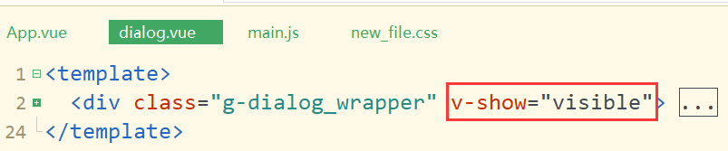
<div class="g-dialog_wrapper" v-show="visible" @click.self="handleClose">
<div class="g-dialog" :style="{width: width, top: top}">
<!-- dialog的头部header -->
<div class="g-dialog_header">
<slot name="title">
<span class="g-dialog_title">{{title}}</span>
</slot>
<g-button class="g-dialog_headerbtn" @click="handleClose">
<i class="g-icon">X</i>
</g-button>
</div>
<!-- dialog的内容body -->
<div class="g-dialog_body">
<!-- 使用插槽 -->
<slot></slot>
</div>
<!-- dialog的底部footer -->
<div class="g-dialog_footer" v-if="$slots.footer">
<slot name="footer"></slot>
</div>
</div>
</div>
</transition>
</template>
<script>
export default {
name: 'GDialog',
props: {
title: {
type: String,
default: '提示'
},
width: {
type: String,
default: '50%'
},
top: {
type: String,
default: '200px'
},
visible: {
type: Boolean,
default: false
}
},
methods: {
handleClose () {
this.$emit('update:visible', false)
}
}
}
</script>
<style lang="less">
.g-dialog_wrapper{
position: fixed;
top: 0;
right: 0;
bottom: 0;
left: 0;
overflow: auto;
margin: 0;
z-index: 2001;
background-color: rgba(0,0,0,0.5);
.g-dialog{
position: relative;
margin: 15vh auto 50px;
background: #fff;
border-radius: 2px;
box-shadow: 0 1px 3px rgba(0,0,0,0.3);
box-sizing: border-box;
width: 30%;
&_header{
padding: 20px 20px 10px;
.one-dialog_title{
line-height: 24px;
font-size: 18px;
color: #303133;
}
.g-dialog_headerbtn{
position: absolute;
top: 20px;
right: 20px;
padding: 0;
background: transparent;
border: none;
outline: none;
cursor: pointer;
font-size: 16px;
.g-icon-close{
color:909399
}
}
}
&_body{
padding: 30px 20px;
color: #606266;
font-size: 14px;
word-break: break-all;
}
&_footer{
padding: 10px 20px 20px;
text-align: right;
box-sizing: border-box;
::v-deep .one-button:first-child{
margin-right: 20px;
}
}
}
}
.dialog-fade-enter-active{
animation: fade .3s;
}
.dialog-fade-leave-active{
animation: fade .3s reverse;
}
@keyframes fade{
0% {
opacity: 0;
transform: translateY(-20px);
}
100%{
opacity: 1;
transform: translateY(0);
}
}
</style>
父组件App.vue
<template>
  <div id="app">
    <g-button type="primary" @click="visible = true">对话框</g-button>
    <g-dialog :visible.sync="visible">
      <ul>
        <li>唐僧</li>
        <li>孙悟空</li>
        <li>猪八戒</li>
        <li>沙僧</li>
      </ul>
      <template v-slot:footer>
        <g-button type="primary" @click="visible = false">确定</g-button>
        <g-button @click="visible = false">取消</g-button>
      </template>
    </g-dialog>
  </div>
</template>

<script>
export default {
  data () {
    return {
      visible: false
    }
  },
  methods: {
  }
}
</script>

<style lang="scss" scoped>

</style>
效果


 4万+
4万+


 被折叠的 条评论
为什么被折叠?
被折叠的 条评论
为什么被折叠?
 到【灌水乐园】发言


