


说明
查找了网络上各位大佬写的大致类型的文章,页面布局和网页布局大致上是可以一起讨论的。它们都指的是在设计网站或应用时,页面上各个元素(如导航栏、内容区、侧边栏、页脚等)的排列方式和结构。
不过,也可以根据上下文理解为:
网页布局(Web Layout):通常强调网页的整体设计和结构,包括不同页面之间的一致性、响应式设计和跨浏览器兼容性等。网页布局更多地涉及整个网站或多个页面的布局设计。在这里我认为是指固定宽度布局,流式布局,栅格化布局和响应式布局等布局方式。
页面布局(Page Layout):可以理解为单个页面的设计结构,强调页面内的内容组织和视觉效果,关注特定页面上各个模块和元素的排布,在这里我认为是页眉,导航栏,内容区,侧边栏,页脚等。
简单来说,网页布局可以看作是多个页面设计的集合,而页面布局则更侧重单一页面的具体结构设计。两者的概念相近,具体含义可能会因为上下文的不同而有所变化。
所以我们这里就简单介绍一下HTML页面布局通常包括的主要部分以及一下经典的布局案例。
HTML页面布局的主要部分
| 部分 | 位置 | 作用 | 元素 |
|---|---|---|---|
| 页眉(Header) | 通常包含网站的logo、导航菜单、联系信息或搜索框等。 | 作用 | <header>, <nav>, ``等。 |
| 导航栏(Navigation Bar) | 通常位于页面的顶部或侧边。 | 为用户提供网站各个部分的链接。 | <nav>, <ul>,<li>, <a> 等。 |
| 内容区(Content Area) | 页面的主要部分。 | 显示网页的主要内容,如文章、图片、视频等。 | <main>, <article>, <section>,<div>等。 |
| 侧边栏(Sidebar) | 通常位于页面的左右两侧。 | 显示次要内容或附加信息,如广告、推荐文章、社交媒体链接等。 | <aside>, <div> 等。 |
| 页脚(Footer) | 页面的底部。 | 通常包含版权信息、链接、联系信息或网站地图等。 | <footer>, <address>, <small> 等。 |
| 面包屑导航(Breadcrumbs) | 通常位于页面内容的上方或页眉下方。 | 提供用户当前所在位置的层级导航,方便返回上一级页面。 | <nav>, <ul>, <li>, <a> 等。 |
| 呼叫行动按钮(Call to Action, CTA) | 可以位于页面的不同位置,通常在内容区或侧边栏。 | 引导用户进行特定操作,如“购买”、“注册”、“了解更多”等。 | <button>,<a> 等。 |
| 表单(Forms) | 通常位于内容区或侧边栏。 | 用于用户输入信息并提交,如登录表单、搜索框、注册表单等。 | <form>, <input>, <label>, <textarea> 等。 |
| 图片/视频区(Media Section) | 根据页面设计,可在内容区、侧边栏等。 | 展示图片、视频、音频等多媒体内容。 | <img>, <video>, <audio> 等。 |
| 广告区域(Ad Section) | 通常位于侧边栏、内容区、页脚或头部区域。 | 展示广告内容。 | <div>, <iframe> 等。 |
常见的页面布局案例
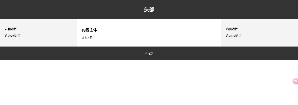
三栏布局
通常用于信息量较大的网站,如门户网站或新闻网站
效果演示
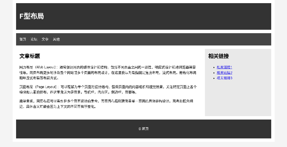
F型布局
通常用于内容较多的网页,如博客文章、新闻网站,在线杂志,教育类网站等。研究表明,用户在浏览网页时,眼睛通常会先横向扫视页面的顶部,然后垂直向下扫视左侧的内容,最后再在页面的中部或下部横向扫视。这种浏览路径类似于字母“F”的形状,因此称为F型布局。
效果演示
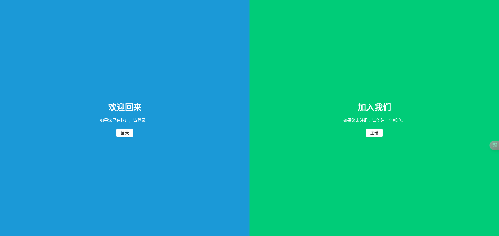
分屏布局
分屏布局(Split Screen Layout)是一种将页面分成两个或更多垂直或水平部分的布局方式。每个部分(屏)可以展示不同的内容或功能,同时保持页面的整洁和有序。这种布局常用于需要突出两个主要内容块或对比展示不同信息的场景。一般用于:
电商网站:一侧展示产品信息,另一侧展示产品图片或视频。
教育平台:一侧展示课程介绍,另一侧展示报名或登录选项。
服务页面:一侧介绍服务内容,另一侧展示服务优势或客户评价。
效果演示
单页布局
单页布局(Single Page Layout),也称为单页面应用(Single Page Application, SPA),是一种将所有内容集中在一个页面上的布局方式。通过滚动或点击导航链接,用户可以在同一页面内浏览不同的内容部分,而无需加载新的页面。单页布局常用于产品展示、个人作品集、宣传页等场景。
效果演示
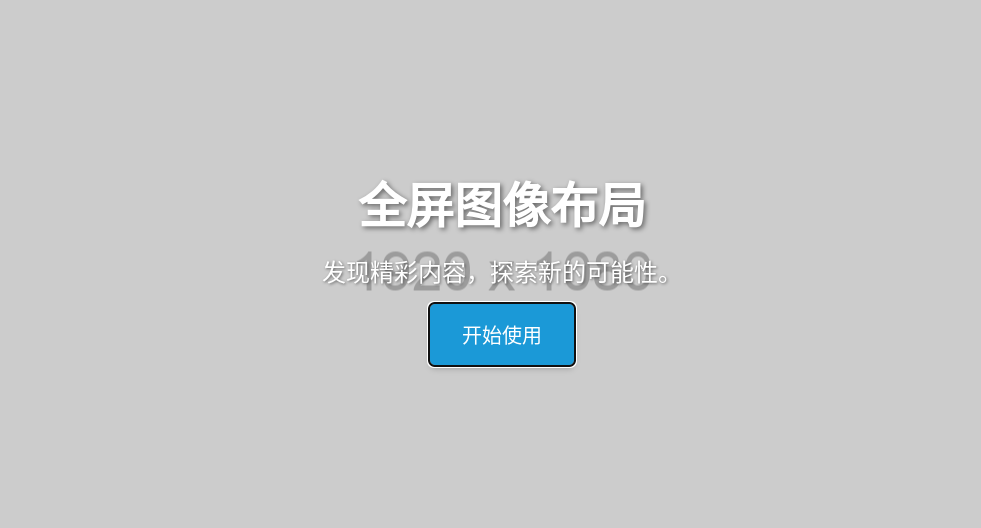
全屏图像布局
全屏图像布局(Full-Screen Image Layout)是一种将图像充满整个页面或浏览器窗口的布局方式,通常用于创造视觉冲击力强的设计效果。此类布局常见于网站的首页、封面页或背景,摄影作品展示,品牌宣传,登陆页面,组合导航等。以大尺寸、高质量的图像作为背景,结合简洁的文字和导航元素,让用户专注于关键内容。
效果演示
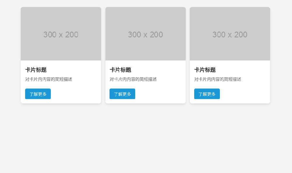
卡片布局
卡片布局(Card Layout)是一种将内容组织成独立的卡片形式的布局方式。每个卡片通常包含图像、标题、文本和操作按钮等内容,排列在页面上,形成网格或流式布局。卡片布局以其清晰、有序的设计风格,被广泛用于展示产品、文章、社交媒体,用户档案内容等。
效果演示


 3305
3305

 被折叠的 条评论
为什么被折叠?
被折叠的 条评论
为什么被折叠?
 到【灌水乐园】发言


