


RatingBar
<RatingBar
android:id="@+id/ratingBar1"
android:layout_width="wrap_content"
android:numStars="10"
android:rating="3"
AutoCompleteTextView
android:completionHint="下拉菜单的提示标题"
android:completionThreshold="2"//用来设置自动匹配的最低字符数
android:dropDownHeight="80dp"//下拉菜单的高度,宽度类似
completionThreshold:它的值决定了你在AutoCompleteTextView至少输入几个字符,它才会具有自动提示的功能。另,默认最多提示20条。
dropDownAnchor:它的值是一个View的ID,指定后,AutoCompleteTextView会在这个View下弹出自动提示。
android:dropDownAnchor="@+id/sp1_page5" 后边的id是spinner的id
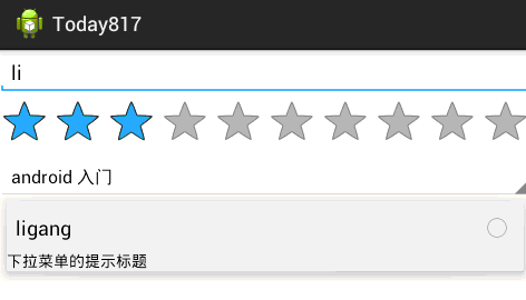
Spinner
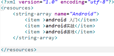
android:entries="@array/Android" 使用数组资源设置下拉列表框的列表资源。
首先设置数组资源
自定义按钮图标和自定义进度条图标。。。
Button样式修改的是Button的背景(Background)属性。
android:background="@drawable/mybutton"
新建Android XML文件,类型选Drawable,根结点选selector,文件名就mybutton
在selector结点里写上三种状态时显示的背景图片(按下、获取焦点,正常)
<?xml version="1.0" encoding="utf-8"?>
<selector xmlns:android="http://schemas.android.com/apk/res/android" >
<item android:state_pressed="true"
    android:drawable="@drawable/picture56"></item>
 <item android:state_focused="true"
     android:drawable="@drawable/picture4"></item>
<item android:drawable="@drawable/picture4"></item>
</selector>
进度条的自定义:新建Android XML文件,类型选Drawable,根结点选layer-list,文件名myprogressbar.xml
调用方法:android:progressDrawable="@drawable/myprogressbar"
<?xml version="1.0" encoding="utf-8"?>
<layer-list xmlns:android="http://schemas.android.com/apk/res/android" >
    <item android:id="@android:id/background"
        android:drawable="@drawable/picture56"></item>
<item android:id="@android:id/progress"
    android:drawable="@drawable/picture4"></item>
</layer-list>


 695
695

 被折叠的 条评论
为什么被折叠?
被折叠的 条评论
为什么被折叠?
 到【灌水乐园】发言


