


CSS元素的定位和浮动
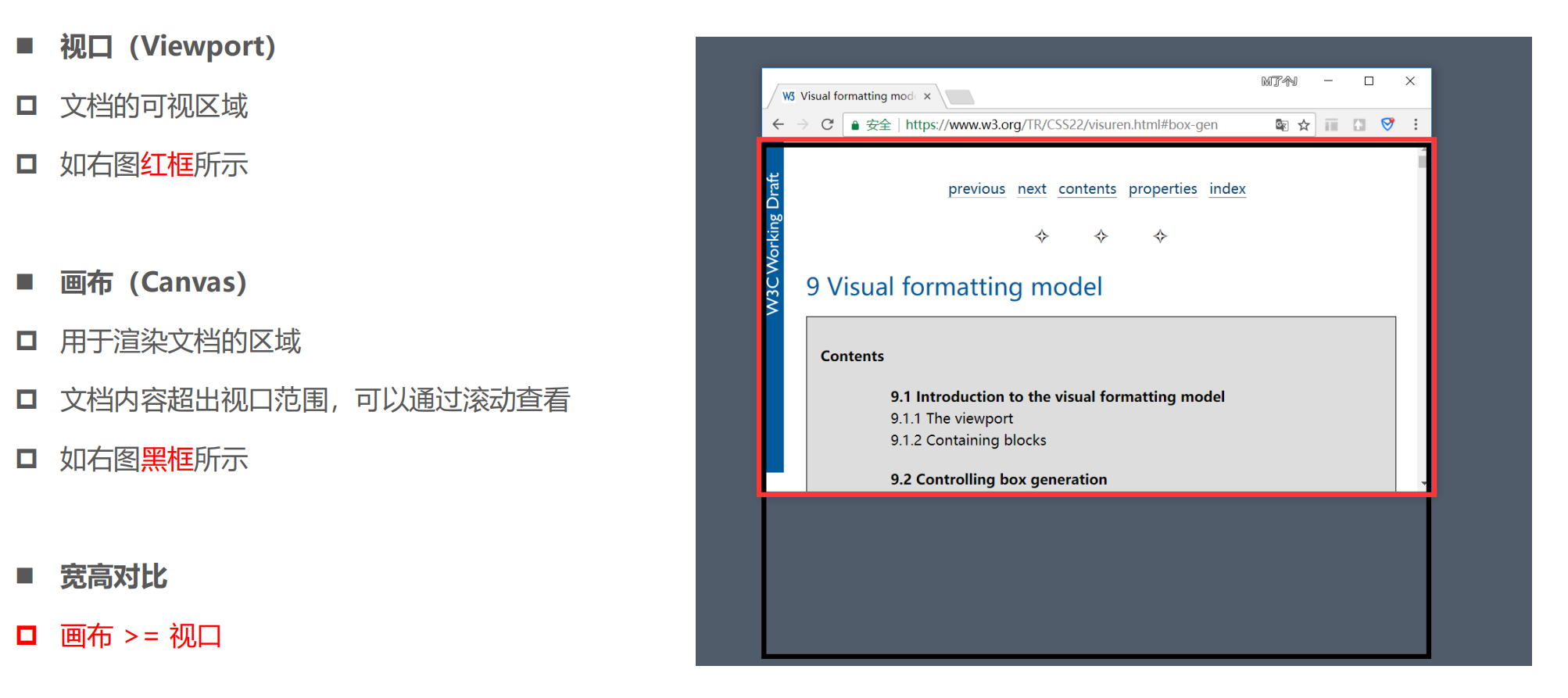
画布和窗口的区别
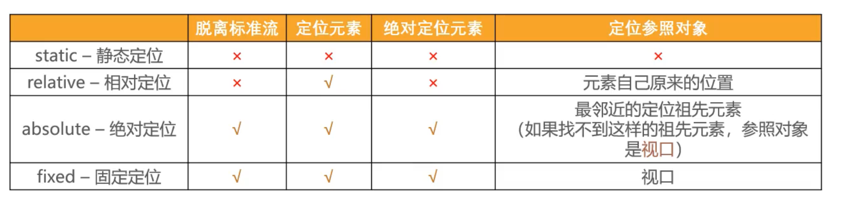
position
标准流布局
相对定位
固定定位
绝对定位
- 元素脱离标准流
- absolute
- left/right/top/right
- 定位参考对象是最邻近的定位祖先元素
- 如果找不到这样的祖先元素,参考对象是画布
- absolute
<!DOCTYPE html>
<html lang="en">
  <head>
    <meta charset="UTF-8" />
    <meta http-equiv="X-UA-Compatible" content="IE=edge" />
    <meta name="viewport" content="width=device-width, initial-scale=1.0" />
    <title>Document</title>
    <style>
      strong {
        position: absolute;
      }
    </style>
  </head>
  <body>
    <span>我是span元素</span>
    <strong>我是strong元素</strong>
    <img src="../images/gouwujie01.jpg" alt="" />
    <div>我是div元素</div>
  </body>
</html>
<!DOCTYPE html>
<html lang="en">
  <head>
    <meta charset="UTF-8" />
    <meta http-equiv="X-UA-Compatible" content="IE=edge" />
    <meta name="viewport" content="width=device-width, initial-scale=1.0" />
    <title>Document</title>
    <style>
      .box {
        width: 800px;
        height: 600px;
        background-color: #0f0;
      }

      strong {
        position: absolute;
        right: 0;
        top: 0;
      }

      img {
        width: 100px;
        height: 100px;
      }
    </style>
  </head>
  <body>
    <div class="box">
      <span>我是span元素</span>
      <strong>我是strong元素</strong>
      <img src="../images/gouwujie01.jpg" alt="" />
      <div>我是div元素</div>
    </div>
  </body>
</html>
<!DOCTYPE html>
<html lang="en">
  <head>
    <meta charset="UTF-8" />
    <meta http-equiv="X-UA-Compatible" content="IE=edge" />
    <meta name="viewport" content="width=device-width, initial-scale=1.0" />
    <title>Document</title>
    <style>
      .container {
        width: 1000px;
        height: 800px;
        background-color: #f00;
        position: fixed;
        top: 0;
      }

      .box {
        width: 800px;
        height: 600px;
        background-color: #0f0;
      }

      strong {
        position: absolute;
        right: 0;
        top: 0;
      }

      img {
        width: 100px;
        height: 100px;
      }
    </style>
  </head>
  <body>
    <div>哈哈哈哈</div>
    <div class="container">
      <div class="box">
        <span>我是span元素</span>
        <strong>我是strong元素</strong>
        <img src="../images/gouwujie01.jpg" alt="" />
        <div>我是div元素</div>
      </div>
    </div>
    <div>呵呵呵呵</div>
  </body>
</html>
<!DOCTYPE html>
<html lang="en">
  <head>
    <meta charset="UTF-8" />
    <meta http-equiv="X-UA-Compatible" content="IE=edge" />
    <meta name="viewport" content="width=device-width, initial-scale=1.0" />
    <title>Document</title>
    <style>
      .container {
        width: 1000px;
        height: 800px;
        background-color: #f00;
        position: relative;
        top: 0;
      }

      .box {
        width: 800px;
        height: 600px;
        background-color: #0f0;
        position: relative;
      }

      strong {
        position: absolute;
        right: 0;
        top: 0;
      }

      img {
        width: 100px;
        height: 100px;
      }
    </style>
  </head>
  <body>
    <div>哈哈哈哈</div>
    <div class="container">
      <div class="box">
        <span>我是span元素</span>
        <strong>我是strong元素</strong>
        <img src="../images/gouwujie01.jpg" alt="" />
        <div>我是div元素</div>
      </div>
    </div>
    <div>呵呵呵呵</div>
  </body>
</html>
<!DOCTYPE html>
<html lang="en">
  <head>
    <meta charset="UTF-8" />
    <meta http-equiv="X-UA-Compatible" content="IE=edge" />
    <meta name="viewport" content="width=device-width, initial-scale=1.0" />
    <title>Document</title>
    <style>
      .container {
        width: 1000px;
        height: 800px;
        background-color: #f00;
        position: relative;
        top: 0;
      }

      .box {
        width: 800px;
        height: 600px;
        background-color: #0f0;
        position: relative;
        /* 不知道为什么无效 */
        right: 0;
        bottom: 0;
      }

      strong {
        position: absolute;
        right: 0;
        top: 0;
      }

      img {
        width: 100px;
        height: 100px;
      }
    </style>
  </head>
  <body>
    <div>哈哈哈哈</div>
    <div class="container">
      <div class="box">
        <span>我是span元素</span>
        <strong>我是strong元素</strong>
        <img src="../images/gouwujie01.jpg" alt="" />
        <div>我是div元素</div>
      </div>
    </div>
    <div>呵呵呵呵</div>
  </body>
</html>
定位元素
- position的值不为static的元素
- 也就是position的值为relative,absolute,fixed的元素
<!DOCTYPE html>
<html lang="en">
  <head>
    <meta charset="UTF-8" />
    <meta http-equiv="X-UA-Compatible" content="IE=edge" />
    <meta name="viewport" content="width=device-width, initial-scale=1.0" />
    <title>Document</title>
    <style>
      .container {
        width: 800px;
        height: 800px;
        background-color: #f00;
        position: relative;
      }

      .box {
        width: 500px;
        height: 500px;
        background-color: #0f0;
        position: absolute;
        right: 0;
        bottom: 0;
      }

      strong {
        position: absolute;
        left: 0;
        bottom: 0;
      }

      img {
        width: 100px;
      }
    </style>
  </head>
  <body>
    <div class="container">
      <div class="box">
        <span>我是span元素</span>
        <strong>我是strong元素</strong>
        <img src="../images/gouwujie01.jpg" alt="" />
        <div>我是div元素</div>
      </div>
    </div>
  </body>
</html>
绝对定位元素的特点
- 可以随意设置宽高
- 宽度默认由内容决定
- 不再受标准流的约束
- 不再严格按照从上到下,从左到右排布
- 不再严格区分块级,行内级,行内块级的很多特性都会消失
- 不再给父元素汇报宽高数据
- 脱离元素的内部还是按照标准流布局
- position的值为abosolute和fixed
- 定位参照对象的宽度
- left + right + margin-left + margin-right + 绝对定位元素的实际占用宽度
- 800 = 0 + 0 + 0 + 0 + 800
- 定位参照对象的高度
- top + bottom + margin-top + margin-bottom + 绝对定位元素的实际占用高度
<!DOCTYPE html>
<html lang="en">
  <head>
    <meta charset="UTF-8" />
    <meta http-equiv="X-UA-Compatible" content="IE=edge" />
    <meta name="viewport" content="width=device-width, initial-scale=1.0" />
    <title>Document</title>
    <style>
      .container {
        width: 800px;
        height: 800px;
        background-color: #f00;
        position: relative;
      }

      .box {
        width: 500px;
        height: 500px;
        background-color: #0f0;
        position: absolute;
        right: 0;
        bottom: 0;
      }

      strong {
        position: absolute;
        left: 0;
        bottom: 0;
        width: 200px;
        height: 60px;
        background-color: #00f;
      }

      img {
        width: 100px;
      }
    </style>
  </head>
  <body>
    <div class="container">
      <div class="box">
        <span>我是span元素</span>
        <strong>我是strong元素</strong>
        <img src="../images/gouwujie01.jpg" alt="" />
        <div>我是div元素</div>
      </div>
    </div>
  </body>
</html>
<!DOCTYPE html>
<html lang="en">
  <head>
    <meta charset="UTF-8" />
    <meta http-equiv="X-UA-Compatible" content="IE=edge" />
    <meta name="viewport" content="width=device-width, initial-scale=1.0" />
    <title>Document</title>
    <style>
      .box {
        background-color: #f00;
      }

      .box strong {
        position: absolute;
      }
    </style>
  </head>
  <body>
    <div class="box">
      <strong>我是strong元素</strong>
    </div>
  </body>
</html>
<!DOCTYPE html>
<html lang="en">
  <head>
    <meta charset="UTF-8" />
    <meta http-equiv="X-UA-Compatible" content="IE=edge" />
    <meta name="viewport" content="width=device-width, initial-scale=1.0" />
    <title>Document</title>
    <style>
      .box {
        background-color: #f00;
      }

      .box strong {
        position: absolute;
        width: 200px;
        height: 200px;
        background-color: #0f0;
      }
    </style>
  </head>
  <body>
    <div class="box">
      <strong>
        <span>我是strong元素</span>
        <i>我是i元素</i>
      </strong>
    </div>
  </body>
</html>
<!DOCTYPE html>
<html lang="en">
  <head>
    <meta charset="UTF-8" />
    <meta http-equiv="X-UA-Compatible" content="IE=edge" />
    <meta name="viewport" content="width=device-width, initial-scale=1.0" />
    <title>Document</title>
    <style>
      .box {
        width: 800px;
        height: 300px;
        background-color: #f00;
        position: relative;
      }

      .container {
        /* width: 200px; */
        height: 100px;
        background-color: #0f0;
        position: absolute;
        /* top: 0; */
        right: 0;
        bottom: 0;
        left: 0;
        /* left: 0; */
        /* margin: auto; */
      }
    </style>
  </head>
  <body>
    <div class="box">
      <div class="container"></div>
    </div>
  </body>
</html>
<!DOCTYPE html>
<html lang="en">
  <head>
    <meta charset="UTF-8" />
    <meta http-equiv="X-UA-Compatible" content="IE=edge" />
    <meta name="viewport" content="width=device-width, initial-scale=1.0" />
    <title>Document</title>
    <style>
      .box {
        width: 800px;
        height: 300px;
        background-color: #f00;
        position: relative;
      }

      .container {
        /* width: 200px; */
        height: 100px;
        background-color: #0f0;
        position: absolute;
        /* top: 0; */
        /* right: 0; */
        width: 100%;
        bottom: 0;
        left: 0;
        /* left: 0; */
        /* margin: auto; */
      }
    </style>
  </head>
  <body>
    <div class="box">
      <div class="container"></div>
    </div>
  </body>
</html>
<!DOCTYPE html>
<html lang="en">
  <head>
    <meta charset="UTF-8" />
    <meta http-equiv="X-UA-Compatible" content="IE=edge" />
    <meta name="viewport" content="width=device-width, initial-scale=1.0" />
    <title>Document</title>
    <style>
      .box {
        width: 800px;
        height: 300px;
        background-color: #f00;
        position: relative;
      }

      .container {
        width: 200px;
        height: 100px;
        background-color: #0f0;
        position: absolute;
        left: 0;
        right: 0;
        bottom: 0;
        margin: 0 auto;
      }
    </style>
  </head>
  <body>
    <div class="box">
      <div class="container"></div>
    </div>
  </body>
</html>
<!DOCTYPE html>
<html lang="en">
  <head>
    <meta charset="UTF-8" />
    <meta http-equiv="X-UA-Compatible" content="IE=edge" />
    <meta name="viewport" content="width=device-width, initial-scale=1.0" />
    <title>Document</title>
    <style>
      .box {
        width: 800px;
        height: 300px;
        background-color: #f00;
        position: relative;
      }

      .container {
        width: 200px;
        height: 100px;
        background-color: #0f0;
        position: absolute;
        left: 0;
        right: 0;
        bottom: 0;
        top: 0;
        margin: auto;
      }
    </style>
  </head>
  <body>
    <div class="box">
      <div class="container"></div>
    </div>
  </body>
</html>
<!DOCTYPE html>
<html lang="en">
  <head>
    <meta charset="UTF-8" />
    <meta http-equiv="X-UA-Compatible" content="IE=edge" />
    <meta name="viewport" content="width=device-width, initial-scale=1.0" />
    <title>Document</title>
    <style>
      .box {
        width: 800px;
        height: 300px;
        background-color: #f00;
        position: relative;
      }

      .container {
        /* width: 200px; */
        height: 100px;
        background-color: #0f0;
        position: absolute;
        left: 0;
        right: 0;
        bottom: 0;
        top: 0;
        /* 宽度未设置的情况下,优先分配给width,使其盛满所谓的定位元素 */
        margin: auto;
      }
    </style>
  </head>
  <body>
    <div class="box">
      <div class="container"></div>
    </div>
  </body>
</html>
<!DOCTYPE html>
<html lang="en">
  <head>
    <meta charset="UTF-8" />
    <meta http-equiv="X-UA-Compatible" content="IE=edge" />
    <meta name="viewport" content="width=device-width, initial-scale=1.0" />
    <title>Document</title>
    <style>
      .box {
        width: 800px;
        height: 300px;
        background-color: #f00;
        position: relative;
      }

      .container {
        /* width: 200px; */
        height: 100px;
        background-color: #0f0;
        position: absolute;
        left: 0;
        right: 0;
        bottom: 0;
        top: 0;
        margin: auto;
      }
    </style>
  </head>
  <body>
    <div class="box">
      <div class="container"></div>
    </div>
  </body>
</html>
<!DOCTYPE html>
<html lang="en">
  <head>
    <meta charset="UTF-8" />
    <meta http-equiv="X-UA-Compatible" content="IE=edge" />
    <meta name="viewport" content="width=device-width, initial-scale=1.0" />
    <title>Document</title>
    <style>
      .box {
        width: 800px;
        height: 300px;
        background-color: #f00;
        position: relative;
      }

      .container {
        /* width: 200px; */
        height: 100px;
        background-color: #0f0;
        position: absolute;
        left: 0;
        right: 0;
        bottom: 0;
        margin: auto;
      }
    </style>
  </head>
  <body>
    <div class="box">
      <div class="container"></div>
    </div>
  </body>
</html>
绝对定位的练习
<!DOCTYPE html>
<html lang="en">
  <head>
    <meta charset="UTF-8" />
    <meta http-equiv="X-UA-Compatible" content="IE=edge" />
    <meta name="viewport" content="width=device-width, initial-scale=1.0" />
    <title>Document</title>
    <style>
      * {
        padding: 0;
        margin: 0;
      }

      a {
        text-decoration: none;
        color: #333;
        outline: none;
      }

      .item {
        width: 140px;
        height: 140px;
        margin: 0 auto;
      }

      .item .top {
        background-color: red;
        position: relative;
      }

      .item .top img {
        /* 将图片下面的多出来的区域去掉 */
        /* vertical-align: top; */
        display: block;
      }

      .item .top .cover {
        position: absolute;
        top: 0;
        right: 0;
        bottom: 0;
        left: 0;
        background-image: url("../images/coverall.png");
        background-repeat: no-repeat;
        background-position: 0 0;
      }

      .item .top .info {
        color: #fff;
        position: absolute;
        padding-left: 10px;
        left: 0;
        right: 0;
        bottom: 0;
        height: 27px;
        line-height: 27px;
        font-size: 12px;
        background-image: url("../images/coverall.png");
        background-position: 0 -537px;
      }

      .item .top .info .icon-music {
        display: inline-block;
        position: relative;
        /* margin-left: 10px; */
        top: 1px;
        width: 14px;
        height: 11px;
        background-image: url("../images/iconall.png");
        background-repeat: no-repeat;
        background-position: 0 -24px;
      }

      .item .top .info .count {
        margin-left: 4px;
      }

      .item .top .info .icon-play {
        position: absolute;
        display: inline-block;
        top: 0;
        bottom: 0;
        right: 10px;
        margin: auto 0;
        width: 16px;
        height: 17px;
        background-image: url("../images/iconall.png");
        background-repeat: no-repeat;
        background-position: 0 0;
      }

      .item .bottom {
        display: block;
        font-size: 14px;
      }

      .item .bottom:hover {
        text-decoration: underline;
      }
    </style>
  </head>
  <body>
    <div class="item">
      <div class="top">
        <img src="../images/109951166884472394.jpg" alt="" />
        <a class="cover" href="#"></a>
        <div class="info">
          <i class="icon-music"></i>
          <span class="count">62万</span>
          <i class="icon-play"></i>
        </div>
      </div>
      <a class="bottom" href="#">短视频变装神曲【舞曲 卡点 慢摇】</a>
    </div>
  </body>
</html>
<!DOCTYPE html>
<html lang="en">
  <head>
    <meta charset="UTF-8" />
    <meta http-equiv="X-UA-Compatible" content="IE=edge" />
    <meta name="viewport" content="width=device-width, initial-scale=1.0" />
    <title>Document</title>
    <style>
      * {
        padding: 0;
        margin: 0;
      }

      a {
        text-decoration: none;
        color: #333;
        outline: none;
      }

      .coverall {
        background-image: url("../images/coverall.png");
        background-repeat: no-repeat;
      }

      .iconall {
        background-image: url("../images/iconall.png");
        background-repeat: no-repeat;
      }

      .item {
        width: 140px;
        height: 140px;
        margin: 0 auto;
      }

      .item .top {
        background-color: red;
        position: relative;
      }

      .item .top img {
        /* 将图片下面的多出来的区域去掉 */
        /* vertical-align: top; */
        display: block;
      }

      .item .top .cover {
        position: absolute;
        top: 0;
        right: 0;
        bottom: 0;
        left: 0;
        background-position: 0 0;
      }

      .item .top .info {
        color: #fff;
        position: absolute;
        padding-left: 10px;
        left: 0;
        right: 0;
        bottom: 0;
        height: 27px;
        line-height: 27px;
        font-size: 12px;
        background-position: 0 -537px;
      }

      .item .top .info .icon-music {
        display: inline-block;
        position: relative;
        top: 1px;
        width: 14px;
        height: 11px;
        background-position: 0 -24px;
      }

      .item .top .info .count {
        margin-left: 4px;
      }

      .item .top .info .icon-play {
        position: absolute;
        top: 0;
        bottom: 0;
        right: 10px;
        margin: auto 0;
        width: 16px;
        height: 17px;
        background-position: 0 0;
      }

      .item .bottom {
        display: block;
        font-size: 14px;
      }

      .item .bottom:hover {
        text-decoration: underline;
      }
    </style>
  </head>
  <body>
    <div class="item">
      <div class="top">
        <img src="../images/109951166884472394.jpg" alt="" />
        <a class="cover coverall" href="#"></a>
        <div class="info coverall">
          <i class="icon-music iconall"></i>
          <span class="count">62万</span>
          <i class="icon-play iconall"></i>
        </div>
      </div>
      <a class="bottom" href="#">短视频变装神曲【舞曲 卡点 慢摇】</a>
    </div>
  </body>
</html>
粘性定位
- static
- 相对于最近的滚动祖先包含滚动视口的
<!DOCTYPE html>
<html lang="en">
  <head>
    <meta charset="UTF-8" />
    <meta http-equiv="X-UA-Compatible" content="IE=edge" />
    <meta name="viewport" content="width=device-width, initial-scale=1.0" />
    <title>Document</title>
    <style>
      .nav {
        background-color: #f00;
        color: #fff;
        /* position: relative;
        top: 0;
        left: 0;
        right: 0; */
        position: sticky;
        top: 0;
      }
    </style>
  </head>
  <body>
    <h1>我是标题</h1>
    <div class="nav">
      <span>电脑</span>
      <span>手机</span>
      <span>衣服</span>
      <span>鞋子</span>
    </div>
    <ul>
      <li>电脑列表1</li>
      <li>电脑列表2</li>
      <li>电脑列表3</li>
      <li>电脑列表4</li>
      <li>电脑列表5</li>
      <li>电脑列表6</li>
      <li>电脑列表7</li>
      <li>电脑列表8</li>
      <li>电脑列表9</li>
      <li>电脑列表10</li>
      <li>电脑列表11</li>
      <li>电脑列表12</li>
      <li>电脑列表13</li>
      <li>电脑列表14</li>
      <li>电脑列表15</li>
      <li>电脑列表16</li>
      <li>电脑列表17</li>
      <li>电脑列表18</li>
      <li>电脑列表19</li>
      <li>电脑列表20</li>
      <li>电脑列表21</li>
      <li>电脑列表22</li>
      <li>电脑列表23</li>
      <li>电脑列表24</li>
      <li>电脑列表25</li>
      <li>电脑列表26</li>
      <li>电脑列表27</li>
      <li>电脑列表28</li>
      <li>电脑列表29</li>
      <li>电脑列表30</li>
      <li>电脑列表31</li>
      <li>电脑列表32</li>
      <li>电脑列表33</li>
      <li>电脑列表34</li>
      <li>电脑列表35</li>
      <li>电脑列表36</li>
      <li>电脑列表37</li>
      <li>电脑列表38</li>
      <li>电脑列表39</li>
      <li>电脑列表40</li>
      <li>电脑列表41</li>
      <li>电脑列表42</li>
      <li>电脑列表43</li>
      <li>电脑列表44</li>
      <li>电脑列表45</li>
      <li>电脑列表46</li>
      <li>电脑列表47</li>
      <li>电脑列表48</li>
      <li>电脑列表49</li>
      <li>电脑列表50</li>
      <li>电脑列表51</li>
      <li>电脑列表52</li>
      <li>电脑列表53</li>
      <li>电脑列表54</li>
      <li>电脑列表55</li>
      <li>电脑列表56</li>
      <li>电脑列表57</li>
      <li>电脑列表58</li>
      <li>电脑列表59</li>
      <li>电脑列表60</li>
      <li>电脑列表61</li>
      <li>电脑列表62</li>
      <li>电脑列表63</li>
      <li>电脑列表64</li>
      <li>电脑列表65</li>
      <li>电脑列表66</li>
      <li>电脑列表67</li>
      <li>电脑列表68</li>
      <li>电脑列表69</li>
      <li>电脑列表70</li>
      <li>电脑列表71</li>
      <li>电脑列表72</li>
      <li>电脑列表73</li>
      <li>电脑列表74</li>
      <li>电脑列表75</li>
      <li>电脑列表76</li>
      <li>电脑列表77</li>
      <li>电脑列表78</li>
      <li>电脑列表79</li>
      <li>电脑列表80</li>
      <li>电脑列表81</li>
      <li>电脑列表82</li>
      <li>电脑列表83</li>
      <li>电脑列表84</li>
      <li>电脑列表85</li>
      <li>电脑列表86</li>
      <li>电脑列表87</li>
      <li>电脑列表88</li>
      <li>电脑列表89</li>
      <li>电脑列表90</li>
      <li>电脑列表91</li>
      <li>电脑列表92</li>
      <li>电脑列表93</li>
      <li>电脑列表94</li>
      <li>电脑列表95</li>
      <li>电脑列表96</li>
      <li>电脑列表97</li>
      <li>电脑列表98</li>
      <li>电脑列表99</li>
      <li>电脑列表100</li>
    </ul>
  </body>
</html>
<!DOCTYPE html>
<html lang="en">
  <head>
    <meta charset="UTF-8" />
    <meta http-equiv="X-UA-Compatible" content="IE=edge" />
    <meta name="viewport" content="width=device-width, initial-scale=1.0" />
    <title>Document</title>
    <style>
      .box {
        width: 500px;
        height: 500px;
        margin: 100px auto 0;
        overflow: scroll;
        background-color: #ccc;
      }

      .nav {
        background-color: #f00;
        color: #fff;
        position: sticky;
        top: 0;
      }
    </style>
  </head>
  <body>
    <div class="box">
      <h1>我是标题</h1>
      <div class="nav">
        <span>电脑</span>
        <span>手机</span>
        <span>衣服</span>
        <span>鞋子</span>
      </div>
      <ul>
        <li>电脑列表1</li>
        <li>电脑列表2</li>
        <li>电脑列表3</li>
        <li>电脑列表4</li>
        <li>电脑列表5</li>
        <li>电脑列表6</li>
        <li>电脑列表7</li>
        <li>电脑列表8</li>
        <li>电脑列表9</li>
        <li>电脑列表10</li>
        <li>电脑列表11</li>
        <li>电脑列表12</li>
        <li>电脑列表13</li>
        <li>电脑列表14</li>
        <li>电脑列表15</li>
        <li>电脑列表16</li>
        <li>电脑列表17</li>
        <li>电脑列表18</li>
        <li>电脑列表19</li>
        <li>电脑列表20</li>
        <li>电脑列表21</li>
        <li>电脑列表22</li>
        <li>电脑列表23</li>
        <li>电脑列表24</li>
        <li>电脑列表25</li>
        <li>电脑列表26</li>
        <li>电脑列表27</li>
        <li>电脑列表28</li>
        <li>电脑列表29</li>
        <li>电脑列表30</li>
        <li>电脑列表31</li>
        <li>电脑列表32</li>
        <li>电脑列表33</li>
        <li>电脑列表34</li>
        <li>电脑列表35</li>
        <li>电脑列表36</li>
        <li>电脑列表37</li>
        <li>电脑列表38</li>
        <li>电脑列表39</li>
        <li>电脑列表40</li>
        <li>电脑列表41</li>
        <li>电脑列表42</li>
        <li>电脑列表43</li>
        <li>电脑列表44</li>
        <li>电脑列表45</li>
        <li>电脑列表46</li>
        <li>电脑列表47</li>
        <li>电脑列表48</li>
        <li>电脑列表49</li>
        <li>电脑列表50</li>
        <li>电脑列表51</li>
        <li>电脑列表52</li>
        <li>电脑列表53</li>
        <li>电脑列表54</li>
        <li>电脑列表55</li>
        <li>电脑列表56</li>
        <li>电脑列表57</li>
        <li>电脑列表58</li>
        <li>电脑列表59</li>
        <li>电脑列表60</li>
        <li>电脑列表61</li>
        <li>电脑列表62</li>
        <li>电脑列表63</li>
        <li>电脑列表64</li>
        <li>电脑列表65</li>
        <li>电脑列表66</li>
        <li>电脑列表67</li>
        <li>电脑列表68</li>
        <li>电脑列表69</li>
        <li>电脑列表70</li>
        <li>电脑列表71</li>
        <li>电脑列表72</li>
        <li>电脑列表73</li>
        <li>电脑列表74</li>
        <li>电脑列表75</li>
        <li>电脑列表76</li>
        <li>电脑列表77</li>
        <li>电脑列表78</li>
        <li>电脑列表79</li>
        <li>电脑列表80</li>
        <li>电脑列表81</li>
        <li>电脑列表82</li>
        <li>电脑列表83</li>
        <li>电脑列表84</li>
        <li>电脑列表85</li>
        <li>电脑列表86</li>
        <li>电脑列表87</li>
        <li>电脑列表88</li>
        <li>电脑列表89</li>
        <li>电脑列表90</li>
        <li>电脑列表91</li>
        <li>电脑列表92</li>
        <li>电脑列表93</li>
        <li>电脑列表94</li>
        <li>电脑列表95</li>
        <li>电脑列表96</li>
        <li>电脑列表97</li>
        <li>电脑列表98</li>
        <li>电脑列表99</li>
        <li>电脑列表100</li>
      </ul>
    </div>
  </body>
</html>
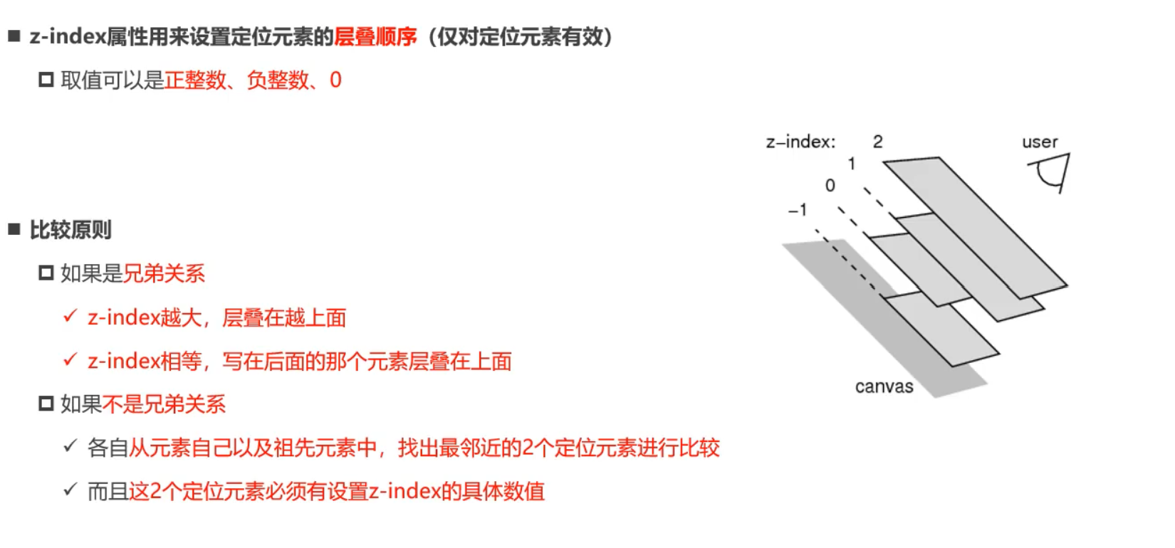
z-index
- 用来设置定位元素的层叠顺序
- 仅对定位元素有效
- 取值
- 正整数
- 0
- 负整数
<!DOCTYPE html>
<html lang="en">
  <head>
    <meta charset="UTF-8" />
    <meta http-equiv="X-UA-Compatible" content="IE=edge" />
    <meta name="viewport" content="width=device-width, initial-scale=1.0" />
    <title>Document</title>
    <style>
      .item {
        position: absolute;
        width: 100px;
        height: 100px;
        left: 0;
        top: 0;
        background-color: #f00;
      }

      .box2 {
        left: 20px;
        top: 20px;
        background-color: #0f0;
        z-index: -1;
      }

      .box3 {
        left: 40px;
        top: 40px;
        background-color: #00f;
      }
    </style>
  </head>
  <body>
    <div class="item box1">1</div>
    <div class="item box2">2</div>
    <div class="item box3">3</div>
  </body>
</html>
<!DOCTYPE html>
<html lang="en">
  <head>
    <meta charset="UTF-8" />
    <meta http-equiv="X-UA-Compatible" content="IE=edge" />
    <meta name="viewport" content="width=device-width, initial-scale=1.0" />
    <title>Document</title>
    <style>
      .item {
        position: absolute;
        width: 100px;
        height: 100px;
        left: 0;
        top: 0;
        background-color: #f00;
      }

      .box2 {
        left: 20px;
        top: 20px;
        background-color: #0f0;
        z-index: -1;
      }

      .box3 {
        left: 40px;
        top: 40px;
        background-color: #00f;
      }
    </style>
  </head>
  <body>
    <div class="item box1">1</div>
    <div class="container">
      <div class="item box2">2</div>
    </div>
    <div class="item box3">3</div>
  </body>
</html>
<!DOCTYPE html>
<html lang="en">
  <head>
    <meta charset="UTF-8" />
    <meta http-equiv="X-UA-Compatible" content="IE=edge" />
    <meta name="viewport" content="width=device-width, initial-scale=1.0" />
    <title>Document</title>
    <style>
      .item {
        position: absolute;
        width: 100px;
        height: 100px;
        left: 0;
        top: 0;
        background-color: #f00;
      }

      .box2 {
        left: 20px;
        top: 20px;
        background-color: #0f0;
        z-index: -1;
      }

      .box3 {
        left: 40px;
        top: 40px;
        background-color: #00f;
      }

      .info {
        position: absolute;
        /* 无效,因为z-index比较关系的问题 */
        z-index: 999;
      }
    </style>
  </head>
  <body>
    <div class="item box1">1</div>
    <div class="container">
      <div class="item box2">
        <div class="info">哈哈哈</div>
      </div>
    </div>
    <div class="item box3">3</div>
  </body>
</html>
浮动
认识浮动
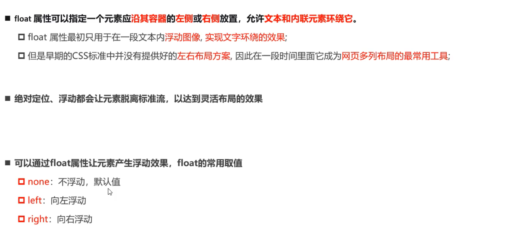
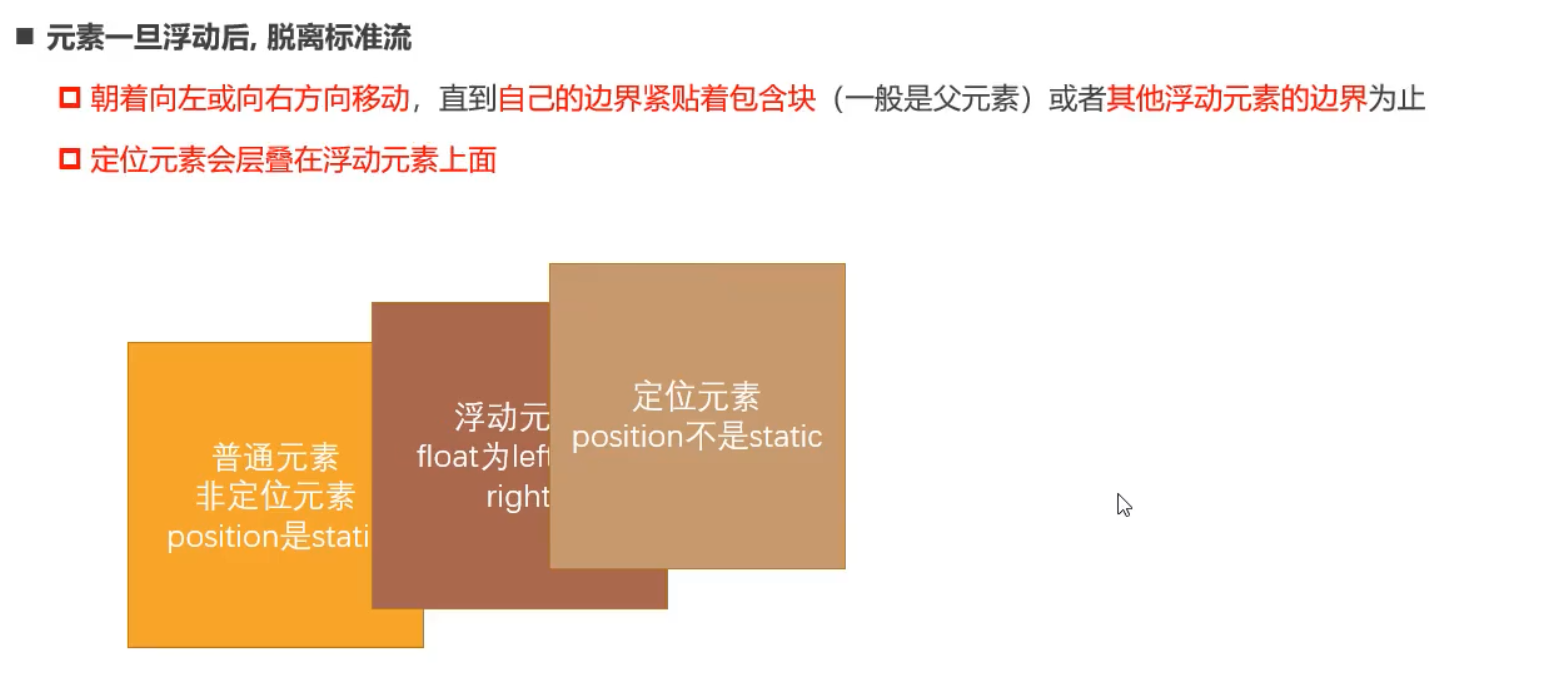
规则一
- 元素一旦浮动后,脱离标准流
- 朝着向左或者向右方向,直到自己的边界紧贴着包含块(一般是父元素)或者其他浮动元素的边界为止
- 定位元素会层叠在浮动元素上面
<!DOCTYPE html>
<html lang="en">
  <head>
    <meta charset="UTF-8" />
    <meta http-equiv="X-UA-Compatible" content="IE=edge" />
    <meta name="viewport" content="width=device-width, initial-scale=1.0" />
    <title>Document</title>
    <style>
      * {
        padding: 0;
        margin: 0;
      }

      .item1,
      .item2 {
        background-color: #f00;
      }

      .item1 {
        /* 定位脱离标准流 */
        position: fixed;
        left: 0;
        top: 10px;
        /* 脱离标准流 */
        /* float: left; */
        background-color: #0f0;
      }
    </style>
  </head>
  <body>
    <div class="item1">1</div>
    <div class="item2">2</div>
  </body>
</html>
<!DOCTYPE html>
<html lang="en">
  <head>
    <meta charset="UTF-8" />
    <meta http-equiv="X-UA-Compatible" content="IE=edge" />
    <meta name="viewport" content="width=device-width, initial-scale=1.0" />
    <title>Document</title>
    <style>
      * {
        padding: 0;
        margin: 0;
      }

      .item1,
      .item2 {
        background-color: #f00;
      }

      .item1 {
        /* 定位脱离标准流 */
        /* position: fixed;
        left: 0;
        top: 10px; */
        /* 脱离标准流 */
        float: left;
        background-color: #0f0;
      }
    </style>
  </head>
  <body>
    <div class="item1">1</div>
    <div class="item2">2</div>
  </body>
</html>
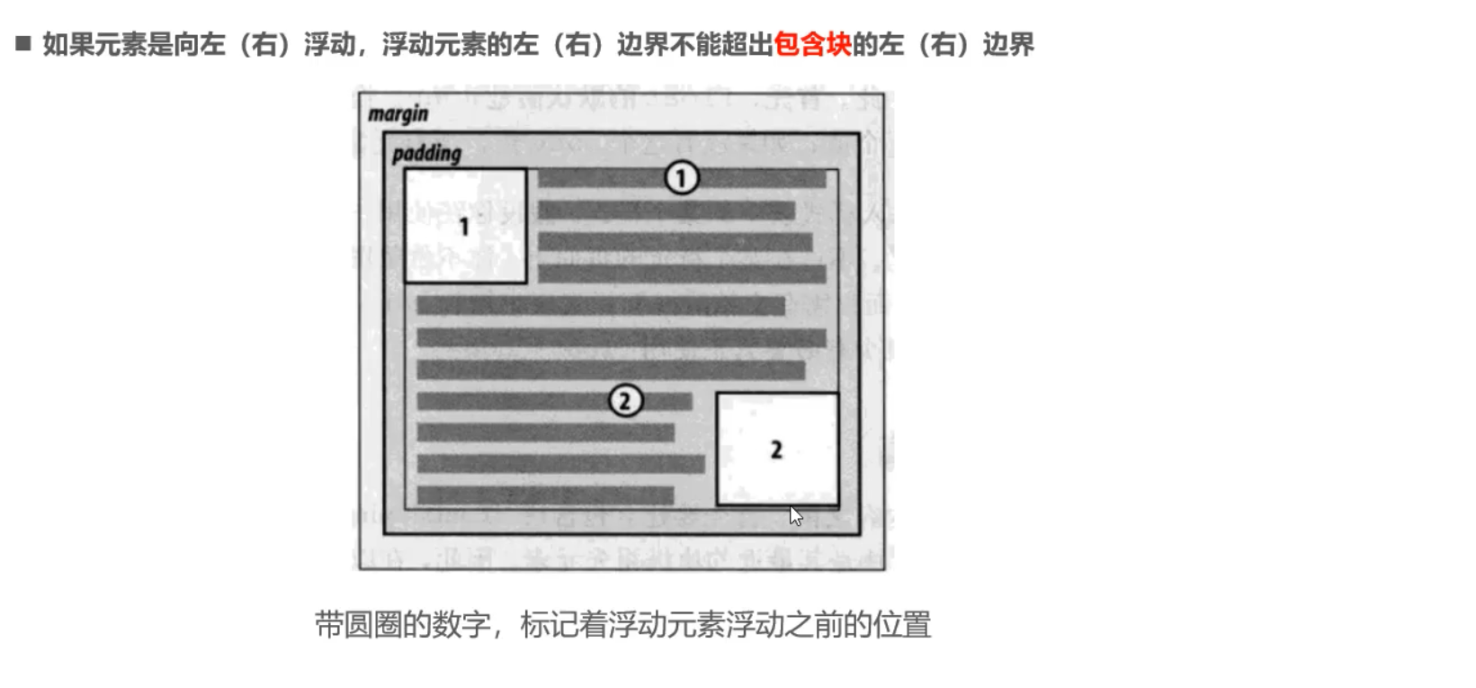
规则二
- 如果元素是向左(右)浮动,浮动元素的左(右)边界不能超出包含块的左(右)边界
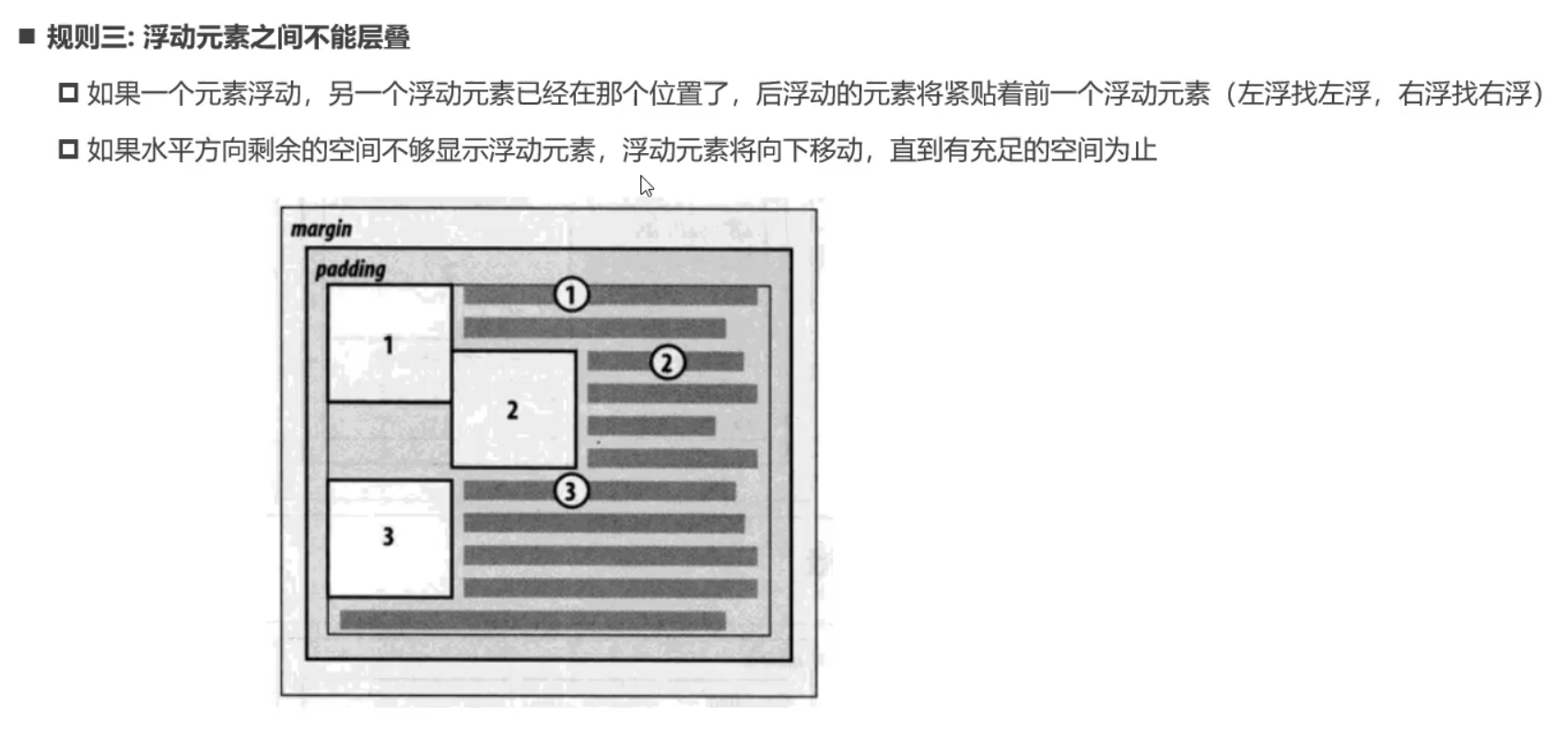
规则三
- 浮动元素之间不能重叠
<!DOCTYPE html>
<html lang="en">
  <head>
    <meta charset="UTF-8" />
    <meta http-equiv="X-UA-Compatible" content="IE=edge" />
    <meta name="viewport" content="width=device-width, initial-scale=1.0" />
    <title>Document</title>
    <style>
      .item {
        width: 100px;
        height: 100px;
        background-color: #f00;
      }

      .box1 {
        float: left;
        background-color: #0f0;
        margin-left: 20px;
      }

      .box2 {
        float: left;
      }

      .box3 {
        float: left;
      }
    </style>
  </head>
  <body>
    <!-- 浮动元素之间不能层叠 -->
    <div class="item box1">1</div>
    <div class="item box2">2</div>
    <div class="item box3">3</div>
  </body>
</html>
<!DOCTYPE html>
<html lang="en">
  <head>
    <meta charset="UTF-8" />
    <meta http-equiv="X-UA-Compatible" content="IE=edge" />
    <meta name="viewport" content="width=device-width, initial-scale=1.0" />
    <title>Document</title>
    <style>
      .container {
        width: 500px;
        height: 500px;
        background-color: orange;
      }

      .item {
        width: 100px;
        height: 100px;
        background-color: #f00;
      }

      .box1 {
        float: left;
        background-color: #0f0;
        margin-left: 20px;
      }

      .box2 {
        float: left;
      }

      .box3 {
        float: left;
      }

      .box4 {
        width: 200px;
        height: 100px;
        background-color: purple;
        float: left;
      }
    </style>
  </head>
  <body>
    <div class="container">
      <div class="item box1">1</div>
      <div class="item box2">2</div>
      <div class="item box3">3</div>
      <div class="item box4">4</div>
    </div>
  </body>
</html>
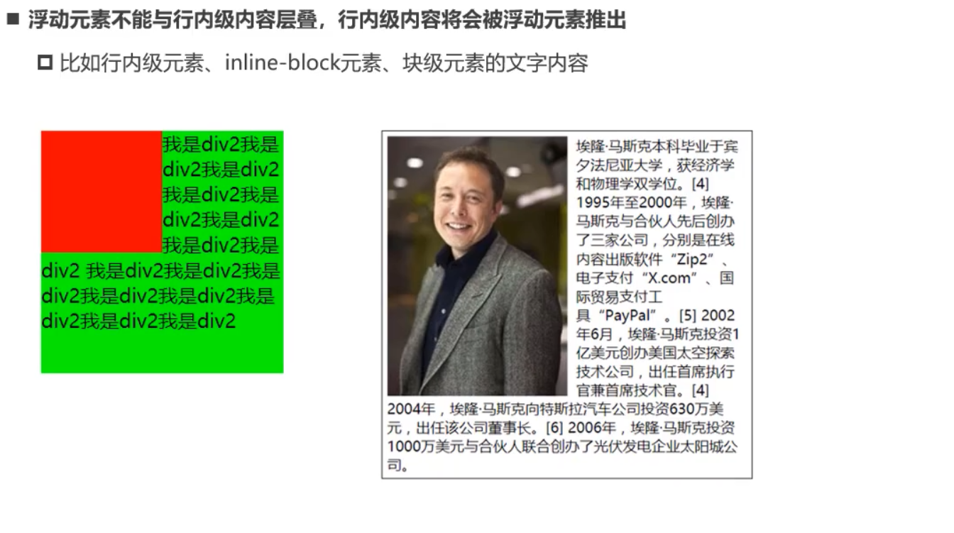
规则四
- 浮动元素不能与行内级内容层叠,行内级内容将会被浮动元素推出
<!DOCTYPE html>
<html lang="en">
  <head>
    <meta charset="UTF-8" />
    <meta http-equiv="X-UA-Compatible" content="IE=edge" />
    <meta name="viewport" content="width=device-width, initial-scale=1.0" />
    <title>Document</title>
    <style>
      .box {
        width: 1000px;
        height: 400px;
        background-color: orange;
      }

      .box strong {
        float: left;
      }
    </style>
  </head>
  <body>
    <div class="box">
      <span>我是span元素</span>
      <strong>我是strong元素</strong>
      <i>我是i元素</i>
      <div>我是普通的内容</div>
    </div>
  </body>
</html>
<!DOCTYPE html>
<html lang="en">
  <head>
    <meta charset="UTF-8" />
    <meta http-equiv="X-UA-Compatible" content="IE=edge" />
    <meta name="viewport" content="width=device-width, initial-scale=1.0" />
    <title>Document</title>
    <style>
      .box {
        width: 500px;
        background-color: orange;
      }

      .box img {
        float: left;
      }
    </style>
  </head>
  <body>
    <div class="box">
      Lorem ipsum dolor sit amet consectetur adipisicing elit. Vero perferendis
      consequuntur nisi similique reiciendis nostrum repudiandae quos tenetur
      corrupti veritatis rerum voluptatibus nam doloribus odit id eum, autem
      quis beatae.
      <img src="../images/109951166884472394.jpg" alt="" />
      Lorem ipsum dolor sit, amet consectetur adipisicing elit. Optio rerum
      recusandae totam officia rem debitis, odio inventore exercitationem modi
      eum reiciendis quis vel! Pariatur magnam tenetur doloremque explicabo ea
      autem.
    </div>
  </body>
</html>
<!DOCTYPE html>
<html lang="en">
  <head>
    <meta charset="UTF-8" />
    <meta http-equiv="X-UA-Compatible" content="IE=edge" />
    <meta name="viewport" content="width=device-width, initial-scale=1.0" />
    <title>Document</title>
    <style>
      .box {
        width: 500px;
        background-color: orange;
      }

      .box img {
        float: left;
      }
    </style>
  </head>
  <body>
    <div class="box">
      <img src="../images/109951166884472394.jpg" alt="" />
      Lorem ipsum dolor sit, amet consectetur adipisicing elit. Optio rerum
      recusandae totam officia rem debitis, odio inventore exercitationem modi
      eum reiciendis quis vel! Pariatur magnam tenetur doloremque explicabo ea
      autem.lorem Lorem ipsum, dolor sit amet consectetur adipisicing elit. Ipsa
      rerum ratione reprehenderit nostrum autem atque earum vitae, sunt, odit
      est reiciendis beatae nesciunt officia assumenda voluptate, consequuntur
      eum cum dolor.
    </div>
  </body>
</html>
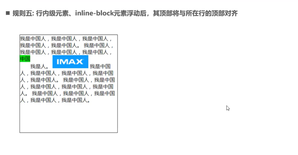
规则五
行内元素造成的间隙
删除换行符
父元素设置font-size
<!DOCTYPE html>
<html lang="en">
  <head>
    <meta charset="UTF-8" />
    <meta http-equiv="X-UA-Compatible" content="IE=edge" />
    <meta name="viewport" content="width=device-width, initial-scale=1.0" />
    <title>Document</title>
    <style>
      .box {
        font-size: 0;
      }
      span {
        background-color: orange;
        /* float: left; */
        font-size: 16px;
      }
    </style>
  </head>
  <body>
    <div class="box">
      <span>aaa</span>
      <span>bbb</span>
      <span>ccc</span>
    </div>
  </body>
</html>
行内元素浮动
<!DOCTYPE html>
<html lang="en">
  <head>
    <meta charset="UTF-8" />
    <meta http-equiv="X-UA-Compatible" content="IE=edge" />
    <meta name="viewport" content="width=device-width, initial-scale=1.0" />
    <title>Document</title>
    <style>
      /* .box {
        font-size: 0;
      } */
      span {
        background-color: orange;
        float: left;
        /* font-size: 16px; */
      }
    </style>
  </head>
  <body>
    <div class="box">
      <span>aaa</span>
      <span>bbb</span>
      <span>ccc</span>
    </div>
  </body>
</html>
flex布局
<!DOCTYPE html>
<html lang="en">
  <head>
    <meta charset="UTF-8" />
    <meta http-equiv="X-UA-Compatible" content="IE=edge" />
    <meta name="viewport" content="width=device-width, initial-scale=1.0" />
    <title>Document</title>
    <style>
      .box {
        display: flex;
      }

      span {
        background-color: orange;
      }
    </style>
  </head>
  <body>
    <div class="box">
      <span>aaa</span>
      <span>bbb</span>
      <span>ccc</span>
    </div>
  </body>
</html>
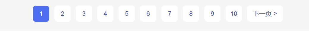
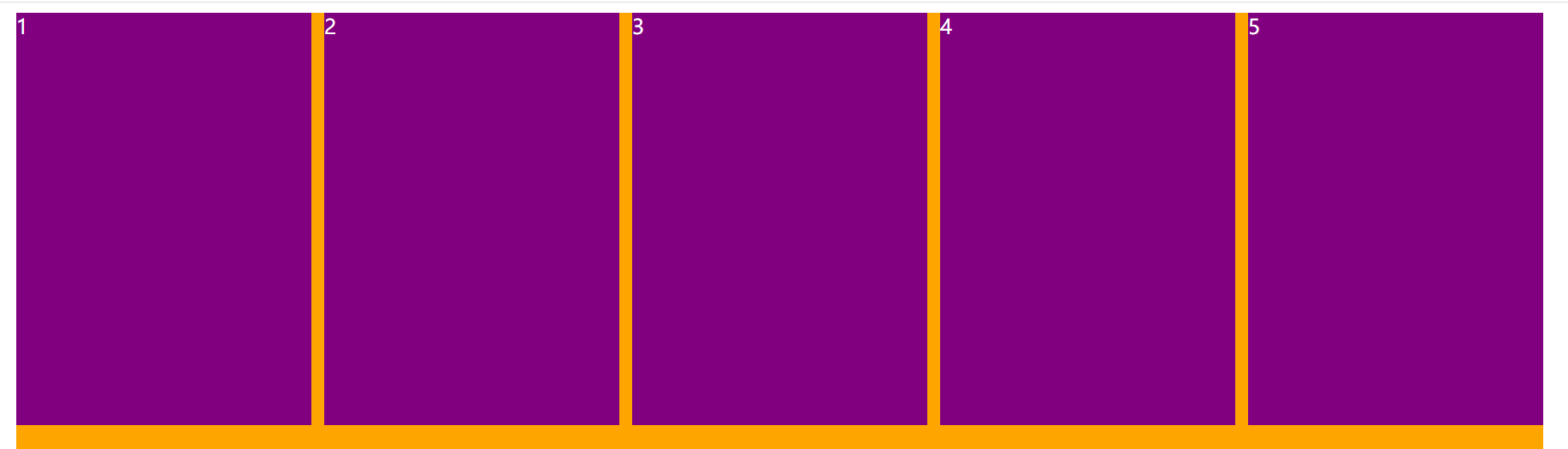
浮动案例
<!DOCTYPE html>
<html lang="en">
<head>
<meta charset="UTF-8" />
<meta http-equiv="X-UA-Compatible" content="IE=edge" />
<meta name="viewport" content="width=device-width, initial-scale=1.0" />
<title>Document</title>
<style>
ul,
li {
padding: 0;
margin: 0;
}
ul {
list-style-type: none;
}
a {
text-decoration: none;
color: #333;
}
body {
background-color: #f2f2f2;
}
ul > li {
float: left;
margin-right: 16px;
}
ul > li > a {
display: inline-block;
width: 36px;
height: 36px;
text-align: center;
line-height: 36px;
background-color: #fff;
border-radius: 6px;
color: #3951b3;
font-size: 14px;
}
ul > li > a:hover,
ul > li.active > a {
background-color: blue;
color: #fff;
}
ul > li > a.next {
width: 80px;
}
</style>
</head>
<body>
<ul>
<li class="item active"><a href="#">1</a></li>
<li class="item"><a href="#">2</a></li>
<li class="item"><a href="#">3</a></li>
<li class="item"><a href="#">4</a></li>
<li class="item"><a href="#">5</a></li>
<li class="item"><a href="#">6</a></li>
<li class="item"><a href="#">7</a></li>
<li class="item"><a href="#">8</a></li>
<li class="item"><a href="#">9</a></li>
<li class="item"><a href="#">10</a></li>
<li class="item"><a class="next" href="#">下一页></a></li>
</ul>
</body>
</html>
<!DOCTYPE html>
<html lang="en">
  <head>
    <meta charset="UTF-8" />
    <meta http-equiv="X-UA-Compatible" content="IE=edge" />
    <meta name="viewport" content="width=device-width, initial-scale=1.0" />
    <title>Document</title>
    <style>
      .content {
        width: 1190px;
        margin: 0 auto;
        background-color: orange;
        height: 800px;
      }

      .box {
        margin-right: -10px;
      }

      .item {
        float: left;
        width: 230px;
        height: 322px;
        color: #fff;
        margin-right: 10px;
        background-color: purple;
      }

      /* .item:last-child {
        margin-right: 0;
      } */

      /* .item:nth-of-type(5n) {
        margin-right: 0;
      } */

      /* .item.last-item {
        margin-right: 0;
      } */
    </style>
  </head>
  <body>
    <div class="content">
      <div class="box">
        <div class="item item1">1</div>
        <div class="item item2">2</div>
        <div class="item item3">3</div>
        <div class="item item4">4</div>
        <div class="item item5 last-item">5</div>
      </div>
    </div>
  </body>
</html>
<!DOCTYPE html>
<html lang="en">
  <head>
    <meta charset="UTF-8" />
    <meta http-equiv="X-UA-Compatible" content="IE=edge" />
    <meta name="viewport" content="width=device-width, initial-scale=1.0" />
    <title>Document</title>
    <style>
      .content {
        width: 1190px;
        margin: 0 auto;
        background-color: orange;
        height: 800px;
      }

      .box {
        margin: 0 -5px;
      }

      .item {
        float: left;
        width: 230px;
        height: 322px;
        color: #fff;
        margin: 0 5px;
        background-color: purple;
      }
    </style>
  </head>
  <body>
    <div class="content">
      <div class="box">
        <div class="item item1">1</div>
        <div class="item item2">2</div>
        <div class="item item3">3</div>
        <div class="item item4">4</div>
        <div class="item item5">5</div>
      </div>
    </div>
  </body>
</html>
<!DOCTYPE html>
<html lang="en">
  <head>
    <meta charset="UTF-8" />
    <meta http-equiv="X-UA-Compatible" content="IE=edge" />
    <meta name="viewport" content="width=device-width, initial-scale=1.0" />
    <title>Document</title>
    <style>
      .content {
        width: 1190px;
        margin: 0 auto;
        background-color: orange;
        height: 800px;
      }

      .box {
        margin-right: -10px;
      }

      .item {
        float: left;
        width: 230px;
        height: 322px;
        color: #fff;
        /* margin: 0 5px; */
        margin-right: 10px;
        background-color: purple;
      }
    </style>
  </head>
  <body>
    <div class="content">
      <div class="box">
        <div class="item item1">1</div>
        <div class="item item2">2</div>
        <div class="item item3">3</div>
        <div class="item item4">4</div>
        <div class="item item5">5</div>
      </div>
    </div>
  </body>
</html>


 228
228


 被折叠的 条评论
为什么被折叠?
被折叠的 条评论
为什么被折叠?
 到【灌水乐园】发言


