


<!DOCTYPE html>
<html>
<head>
<meta name="viewport" content="width=device-width, initial-scale=1">
<style>
i {
border: solid black;
border-width: 0 1px 1px 0;
display: inline-block;
padding: 3px;
}
.right {
transform: rotate(-45deg);
-webkit-transform: rotate(-45deg);
}
.left {
transform: rotate(135deg);
-webkit-transform: rotate(135deg);
}
.up {
transform: rotate(-135deg);
-webkit-transform: rotate(-135deg);
}
.down {
transform: rotate(45deg);
-webkit-transform: rotate(45deg);
}
</style>
</head>
<body>
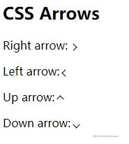
<h2>CSS Arrows</h2>
<p>Right arrow: <i class="right"></i></p>
<p>Left arrow: <i class="left"></i></p>
<p>Up arrow: <i class="up"></i></p>
<p>Down arrow: <i class="down"></i></p>
</body>
</html>
文章来源:纯CSS实现上下左右箭头(>)
http://www.webkaka.com/tutorial/html/2019/090451/
<!DOCTYPE html>
<html>
<head>
<meta charset="utf-8">
<title>菜鸟教程(runoob.com)</title>
<style>
.pre {
position: relative;
width: 30px;
height: 30px;
background-color: rgba(0, 0, 0, 0.6);
cursor: pointer;
}
.pre::before {
content: "";
width: 10px;
height: 10px;
border: solid #fff;
border-width: 2px 2px 0 0;
transform: translate(-50%, -50%) rotate(-45deg);
position: absolute;
left: 50%;
top: 70%;
}
.next {
position: relative;
width: 30px;
height: 30px;
background-color: rgba(0, 0, 0, 0.6);
cursor: pointer;
}
.next::before {
content: "";
width: 10px;
height: 10px;
border: solid #fff;
border-width: 0 0 2px 2px;
transform: translate(-50%, -50%) rotate(-45deg);
position: absolute;
left: 50%;
top: 70%;
}
.left {
position: relative;
width: 30px;
height: 30px;
background-color: rgba(0, 0, 0, 0.6);
cursor: pointer;
}
.left::before {
content: "";
width: 10px;
height: 10px;
border: solid #fff;
border-width: 2px 0 0 2px ;
transform: translate(-50%, -50%) rotate(-45deg);
position: absolute;
left: 50%;
top: 70%;
}
.right {
position: relative;
width: 30px;
height: 30px;
background-color: rgba(0, 0, 0, 0.6);
cursor: pointer;
}
.right::before {
content: "";
width: 10px;
height: 10px;
border: solid #fff;
border-width: 0 2px 2px 0 ;
transform: translate(-50%, -50%) rotate(-45deg);
position: absolute;
left: 50%;
top: 70%;
}
</style>
</head>
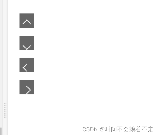
<body>
<p class="pre"></p>
<p class="next"></p>
<p class="left"></p>
<p class="right"></p>
</body>
</html>
<!DOCTYPE html>
<html lang="en">

<head>
    <meta charset="UTF-8">
    <meta http-equiv="X-UA-Compatible" content="IE=edge">
    <meta name="viewport" content="width=device-width, initial-scale=1.0">
    <title>Document</title>
    <style>
        ul {
            list-style: none;
            color: #666;
            margin: 100px auto;
            padding: 0;
        }

        li {
            width: 400px;
            font-size: 30px;
            height: 50px;
            border-bottom: 1px solid #999;
            line-height: 50px;
            margin: 0 auto;
            position: relative;
        }

        li::after {
            width: 10px;
            height: 10px;
            border-top: 2px solid;
            border-right: 2px solid;
            border-color: #ccc;
            content: '';
            position: absolute;
            right: 11px;
            top: 20px;
            transform: rotate(45deg);
        }
    </style>
</head>

<body>
    <ul>
        <li>我是第1个内容content</li>
        <li>我是第2个内容content</li>
        <li>我是第3个内容content</li>
        <li>我是第4个内容content</li>
        <li>我是第5个内容content</li>
    </ul>
</body>

</html>


 扫一扫
扫一扫


 1845
1845

 被折叠的 条评论
为什么被折叠?
被折叠的 条评论
为什么被折叠?
 到【灌水乐园】发言


