


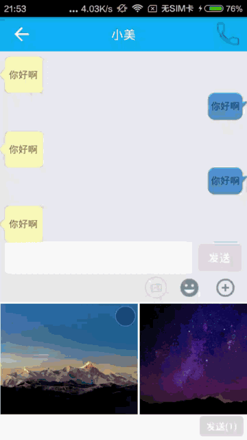
最近一直在做即时通讯,当然少不了发图片了, 既然要发图片,我连忙打开qq,看看qq发图片是个什么效果,看起来确实不错,我就照着qq仿写了一个,其中选择图片时,图片的右上角有一个标记选了多少张图片的数字,我一时兴起就想自定义一个view来实现这种效果,虽然可以通过定义一个selector然后定义shape给textView去设置这个背景来实现,后面会提及一下,但是这种效果我想通过自定义控件来实现,先看一张效果图。
第一种方式:通过selector的方式:photo_selector.xml
<?xml version="1.0" encoding="utf-8"?>
<selector xmlns:android="http://schemas.android.com/apk/res/android" >
    <item android:state_enabled="true">
        <shape android:shape="oval">
            <stroke android:color="#FFFFFF" android:width="1dp"/>
            <solid android:color="@color/title_bg"/>
        </shape>
    </item>

    <item android:state_enabled="false">
        <shape android:shape="oval">
            <stroke android:color="@color/white" android:width="1dp"/>
            <solid android:color="@color/half_trans_bg"/>
        </shape>
    </item>
</selector>
在布局文件中的textView
    <TextView
        android:id="@+id/tv_point"
        android:layout_width="30dp"
        android:layout_height="30dp"
        android:textColor="#FFFFFF"
        android:gravity="center"
        android:clickable="true"
        android:text="1"
        android:background="@drawable/photo_selector"/>
然后在Activity测试代码
tv = (TextView) findViewById(R.id.tv_point); public void click1(View v) {
tv.setEnabled(true);
tv.setText("4");
}
public void click2(View v) {
tv.setEnabled(false);
tv.setText("");
} tv.setOnClickListener(new View.OnClickListener() {
@Override
public void onClick(View v) {
if (tv.isEnabled()) {
tv.setEnabled(false);
}else {
tv.setEnabled(true);
}
}
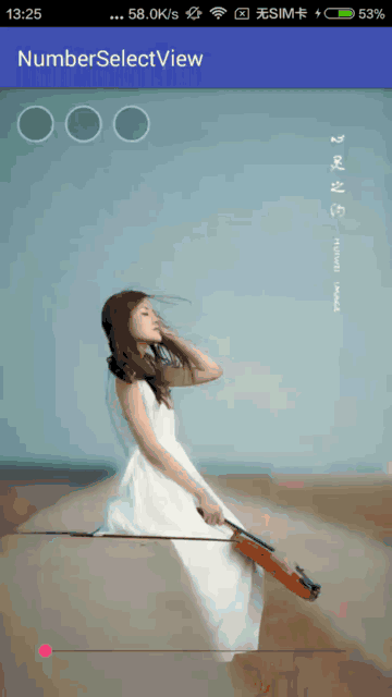
});第二种方式:自定义View
效果图如下:
①自定义属性:
        TypedArray typedArray = context.obtainStyledAttributes(attrs, R.styleable.NumberSelectView);
        mBackgroundColorNormal = typedArray.getColor(R.styleable.NumberSelectView_backgroundColorNormal, Color.parseColor("#33000000"));
        mBackgroundColorSelect = typedArray.getColor(R.styleable.NumberSelectView_getBackgroundColorSelect, Color.parseColor("#ff5f62"));
        mTextColor = typedArray.getColor(R.styleable.NumberSelectView_textColor, Color.parseColor("#FFFFFF"));
        mStrokeColor = typedArray.getColor(R.styleable.NumberSelectView_strokeColor, Color.parseColor("#66FFFFFF"));
        mStrokeWidth = typedArray.getDimension(R.styleable.NumberSelectView_strokeWidth, UIUtils.dp2px(context, 2.0f));
        mSolidRadius = typedArray.getDimension(R.styleable.NumberSelectView_solidRadius, UIUtils.dp2px(context, 15.0f));
        mTextSize = typedArray.getDimension(R.styleable.NumberSelectView_textSize, UIUtils.sp2px(context, 14.0f));
        text = typedArray.getString(R.styleable.NumberSelectView_text);
        typedArray.recycle();//回收很重要
attr.xml
<span style="white-space:pre">	</span><?xml version="1.0" encoding="utf-8"?>
<span style="white-space:pre">	</span><resources>
    <span style="white-space:pre">	</span><declare-styleable name="NumberSelectView">
       <span style="white-space:pre">	</span> <attr name="backgroundColorNormal" format="color" />
        <attr name="getBackgroundColorSelect" format="color" />
        <attr name="strokeColor" format="color" />
        <attr name="textColor" format="color" />
        <attr name="strokeWidth" format="dimension" />
        <attr name="solidRadius" format="dimension" />
        <attr name="textSize" format="dimension" />
        <attr name="text" format="string"/>
    <span style="white-space:pre">	</span></declare-styleable>
<span style="white-space:pre">	</span></resources>
②重新onMeasure方法
<span style="white-space:pre">	</span>@Override
    protected void onMeasure(int widthMeasureSpec, int heightMeasureSpec) {
        int exceptWidth = (int) ((mSolidRadius + mStrokeWidth) * 2) + getPaddingLeft() + getPaddingRight();
        int exceptHight = (int) ((mSolidRadius + mStrokeWidth) * 2) + getPaddingTop() + getPaddingBottom();
        widthMeasureSpec = MeasureSpec.makeMeasureSpec(exceptWidth, MeasureSpec.EXACTLY);
        heightMeasureSpec = MeasureSpec.makeMeasureSpec(exceptHight,MeasureSpec.EXACTLY);
        super.onMeasure(widthMeasureSpec, heightMeasureSpec);
    }
    @Override
    protected void onDraw(Canvas canvas) {
        drawCircle(canvas);//画实心圆
        drawRing(canvas);//画圆环
        drawText(canvas);//画文本
    }
(1)drawCircle方法
    private void drawCircle(Canvas canvas) {
        if (!isSelected) {
            canvas.drawCircle(mCenterX, mCenterY, mSolidRadius, mSolidPaint);
        } else {
            mSolidPaint.setColor(mBackgroundColorSelect);
            canvas.drawCircle(mCenterX, mCenterY, mSolidRadius, mSolidPaint);
            mSolidPaint.setColor(mBackgroundColorNormal);
        }

    }
(2)drawRing方法
    private void drawRing(Canvas canvas) {
        RectF rectF = new RectF();
        rectF.top = mCenterY - mRingRadius;
        rectF.bottom = mCenterY + mRingRadius;
        rectF.left = mCenterX - mRingRadius;
        rectF.right = mCenterX + mRingRadius;
        canvas.drawArc(rectF, 0, 360, false, mStrokePaint);
    }
    private void drawText(Canvas canvas) {
        Rect bounds = new Rect();
        mTextPaint.getTextBounds(text, 0, text.length(), bounds);
        float x = (getMeasuredWidth() - bounds.width()) / 2;
        float y = (getMeasuredHeight() + bounds.height()) /2;
        if (isSelected) {
            canvas.drawText(text, x, y, mTextPaint);
        } else {
            canvas.drawText("", x, y, mTextPaint);
        }
    }
初始化方法
    /**
     * 初始化操作
     */
    private void init() {
        if(TextUtils.isEmpty(text)){
            text = "1";
        }

        mRingRadius = mSolidRadius + mStrokeWidth / 2;
        setClickable(true);
        setOnClickListener(new OnClickListener() {
            @Override
            public void onClick(View v) {
                if(listener != null){
                    listener.onClick(isSelected);
                }
                toggle();
            }
        });

        mStrokePaint = new Paint(Paint.ANTI_ALIAS_FLAG);
        mStrokePaint.setColor(mStrokeColor);
        mStrokePaint.setStyle(Paint.Style.STROKE);
        mStrokePaint.setStrokeWidth(mStrokeWidth);

        mSolidPaint = new Paint(Paint.ANTI_ALIAS_FLAG);
        mSolidPaint.setColor(mBackgroundColorNormal);
        mSolidPaint.setStyle(Paint.Style.FILL);

        mTextPaint = new Paint(Paint.ANTI_ALIAS_FLAG);
        mTextPaint.setColor(mTextColor);
        mTextPaint.setTextSize(mTextSize);
    }
完整的类NumberSelectView如下:
package com.cool.numberselectview;

import android.content.Context;
import android.content.res.TypedArray;
import android.graphics.Canvas;
import android.graphics.Color;
import android.graphics.Paint;
import android.graphics.Rect;
import android.graphics.RectF;
import android.text.TextUtils;
import android.util.AttributeSet;
import android.util.Log;
import android.view.View;

/**
 * Created by cool on 2016/9/27.
 */

public class NumberSelectView extends View {

    private int mBackgroundColorNormal;
    private int mBackgroundColorSelect;
    private int mTextColor;
    private int mStrokeColor;
    private float mStrokeWidth;
    private float mSolidRadius;//实心圆半径
    private float mRingRadius;//圆环半径
    private float mTextSize;

    private int mCenterX;//圆心x坐标
    private int mCenterY;//圆心y坐标

    private Paint mStrokePaint;//圆环画笔
    private Paint mSolidPaint;//背景填充画笔
    private Paint mTextPaint;//文字画笔

    private String text;//要画的数字
    private boolean isSelected;//是否已经被选上

    private OnOnStateChangeListener listener;

    public void setOnStateChangeListener(OnOnStateChangeListener listener) {
        this.listener = listener;
    }

    public interface OnOnStateChangeListener {
        void onClick(boolean isSelected);
    }


    public NumberSelectView(Context context) {
        this(context, null);
    }

    public NumberSelectView(Context context, AttributeSet attrs) {
        this(context, attrs, 0);
    }

    public NumberSelectView(Context context, AttributeSet attrs, int defStyleAttr) {
        super(context, attrs, defStyleAttr);
        TypedArray typedArray = context.obtainStyledAttributes(attrs, R.styleable.NumberSelectView);
        mBackgroundColorNormal = typedArray.getColor(R.styleable.NumberSelectView_backgroundColorNormal, Color.parseColor("#33000000"));
        mBackgroundColorSelect = typedArray.getColor(R.styleable.NumberSelectView_getBackgroundColorSelect, Color.parseColor("#ff5f62"));
        mTextColor = typedArray.getColor(R.styleable.NumberSelectView_textColor, Color.parseColor("#FFFFFF"));
        mStrokeColor = typedArray.getColor(R.styleable.NumberSelectView_strokeColor, Color.parseColor("#66FFFFFF"));
        mStrokeWidth = typedArray.getDimension(R.styleable.NumberSelectView_strokeWidth, UIUtils.dp2px(context, 2.0f));
        mSolidRadius = typedArray.getDimension(R.styleable.NumberSelectView_solidRadius, UIUtils.dp2px(context, 15.0f));
        mTextSize = typedArray.getDimension(R.styleable.NumberSelectView_textSize, UIUtils.sp2px(context, 14.0f));
        text = typedArray.getString(R.styleable.NumberSelectView_text);
        typedArray.recycle();//回收很重要
        init();
    }

    /**
     * 初始化操作
     */
    private void init() {
        if(TextUtils.isEmpty(text)){
            text = "1";
        }

        mRingRadius = mSolidRadius + mStrokeWidth / 2;
        setClickable(true);
        setOnClickListener(new OnClickListener() {
            @Override
            public void onClick(View v) {
                if(listener != null){
                    listener.onClick(isSelected);
                }
                toggle();
            }
        });

        mStrokePaint = new Paint(Paint.ANTI_ALIAS_FLAG);
        mStrokePaint.setColor(mStrokeColor);
        mStrokePaint.setStyle(Paint.Style.STROKE);
        mStrokePaint.setStrokeWidth(mStrokeWidth);

        mSolidPaint = new Paint(Paint.ANTI_ALIAS_FLAG);
        mSolidPaint.setColor(mBackgroundColorNormal);
        mSolidPaint.setStyle(Paint.Style.FILL);

        mTextPaint = new Paint(Paint.ANTI_ALIAS_FLAG);
        mTextPaint.setColor(mTextColor);
        mTextPaint.setTextSize(mTextSize);
    }

    @Override
    protected void onDraw(Canvas canvas) {
        drawCircle(canvas);//画实心圆
        drawRing(canvas);//画圆环
        drawText(canvas);//画文本
    }

    private void drawText(Canvas canvas) {
        Rect bounds = new Rect();
        mTextPaint.getTextBounds(text, 0, text.length(), bounds);
        float x = (getMeasuredWidth() - bounds.width()) / 2;
        float y = (getMeasuredHeight() + bounds.height()) /2;
        if (isSelected) {
            canvas.drawText(text, x, y, mTextPaint);
        } else {
            canvas.drawText("", x, y, mTextPaint);
        }
    }

    private void drawRing(Canvas canvas) {
        RectF rectF = new RectF();
        rectF.top = mCenterY - mRingRadius;
        rectF.bottom = mCenterY + mRingRadius;
        rectF.left = mCenterX - mRingRadius;
        rectF.right = mCenterX + mRingRadius;
        canvas.drawArc(rectF, 0, 360, false, mStrokePaint);
    }

    private void drawCircle(Canvas canvas) {
        if (!isSelected) {
            canvas.drawCircle(mCenterX, mCenterY, mSolidRadius, mSolidPaint);
        } else {
            mSolidPaint.setColor(mBackgroundColorSelect);
            canvas.drawCircle(mCenterX, mCenterY, mSolidRadius, mSolidPaint);
            mSolidPaint.setColor(mBackgroundColorNormal);
        }

    }

    @Override
    protected void onMeasure(int widthMeasureSpec, int heightMeasureSpec) {
        int exceptWidth = (int) ((mSolidRadius + mStrokeWidth) * 2) + getPaddingLeft() + getPaddingRight();
        int exceptHight = (int) ((mSolidRadius + mStrokeWidth) * 2) + getPaddingTop() + getPaddingBottom();
        widthMeasureSpec = MeasureSpec.makeMeasureSpec(exceptWidth, MeasureSpec.EXACTLY);
        heightMeasureSpec = MeasureSpec.makeMeasureSpec(exceptHight,MeasureSpec.EXACTLY);
        super.onMeasure(widthMeasureSpec, heightMeasureSpec);
    }

    @Override
    protected void onSizeChanged(int w, int h, int oldw, int oldh) {
        mCenterX = w / 2;//获取圆心x坐标
        mCenterY = h / 2;//获取圆心y坐标
    }

    private void toggle() {
        isSelected = !isSelected;
        invalidate();
    }

    public void setViewText(String text,boolean isViewClick) {
        this.text = text;
        if(!isViewClick){
            if (TextUtils.isEmpty(text)) {
                isSelected = false;
            } else {
                isSelected = true;
            }
        }

        invalidate();
    }
    public String getViewText(){
        return text;
    }
    public boolean isViewSelected() {
        return isSelected;
    }
}
源码下载链接: https://github.com/coolfuwei/NumberSelectView


 2746
2746

 被折叠的 条评论
为什么被折叠?
被折叠的 条评论
为什么被折叠?
 到【灌水乐园】发言


