


目录
导入库:
import matplotlib as mpl
import matplotlib.pyplot as plt
import numpy as np
画图的两种基本方式:
1.面向对象方式 (OO-style):创建图或者图和坐标系,然后设置
fig = plt.figure()  # an empty figure with no Axes
fig, ax = plt.subplots()  # a figure with a single Axes
fig, axs = plt.subplots(2, 2)  # a figure with a 2x2 grid of Axes
x = np.linspace(0, 2, 100) # Sample data.
fig, ax = plt.subplots(figsize=(5, 2.7), layout='constrained')
ax.plot(x, x, label='linear') # Plot some data on the axes.
ax.plot(x, x**2, label='quadratic') # Plot more data on the axes...
ax.set_xlabel('x label') # Add an x-label to the axes.
ax.set_ylabel('y label') # Add a y-label to the axes.
ax.set_title("Simple Plot") # Add a title to the axes.
ax.legend(); # Add a legend.2.pyplot方式:
x = np.linspace(0, 2, 100)  # Sample data.

plt.figure(figsize=(5, 2.7), layout='constrained')
plt.plot(x, x, label='linear')  # Plot some data on the (implicit) axes.
plt.plot(x, x**2, label='quadratic')  # etc.
plt.plot(x, x**3, label='cubic')
plt.xlabel('x label')
plt.ylabel('y label')
plt.title("Simple Plot")
plt.legend();
画点与线
fig,ax=plt.subplots(figsize=(3,2))
ax.scatter([1,2],[3,4])
ax.vlines(x=1.5,ymin=3.25,ymax=3.75)
ax.hlines(y=3.5,xmin=1.25,xmax=1.75)
ax.plot([1,2],[4,3]) 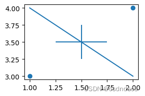
标注文字
fig,axes=plt.subplots(1,2,figsize=(8,2))
axes[0].set_xlim(0,10)
axes[0].set_ylim(0,10)
axes[1].set_xlim(0,10)
axes[1].set_ylim(0,10)
axes[0].text(4,5, "axes[0].transData:\n(4,5)", transform=axes[0].transData)
axes[1].text(0.1, 0.5, "axes[1].transAxes:\n(0.1, 0.5)", transform=axes[1].transAxes)
axes[1].text(0.14, 0.2, "fig.transFigure:\n(0.14, 0.2)", transform=fig.transFigure)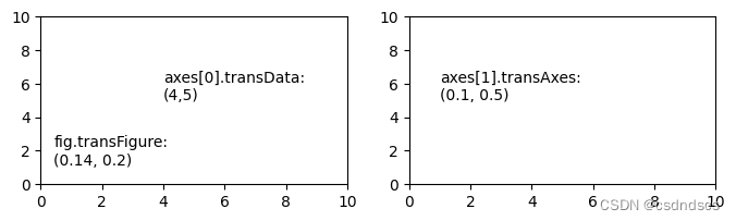
坐标系设置
设置坐标系的边框
ax.spines['top'].set_visible(False) #隐藏边框
ax.spines['bottom'].set_visible(False)
ax.spines['right'].set_visible(False)
ax.spines['left'].set_visible(False)

ax.spines['left'].set_color('red') #设置左边框颜色
隐藏坐标系
fig,ax=plt.subplots(1,3,figsize=(12,2.5))
ax[1].axis('off')
设置网格线
ax.grid(b=None, which='major', axis='both',color = 'color', linestyle = 'linestyle', linewidth = number)- b:可选,默认为 None,可以设置布尔值,true 为显示网格线,false 为不显示,如果设置 **kwargs 参数,则值为 true。
- which:可选,可选值有 'major'、'minor' 和 'both',默认为 'major',表示应用更改的网格线。
- axis:可选,设置显示哪个方向的网格线,可以是取 'both'(默认),'x' 或 'y',分别表示两个方向,x 轴方向或 y 轴方向。
-
color:'b' 蓝色,'m' 洋红色,'g' 绿色,'y' 黄色,'r' 红色,'k' 黑色,'w' 白色,'c' 青绿色,'#008000' RGB 颜色符串。
-
linestyle:'‐' 实线,'‐‐' 破折线,'‐.' 点划线,':' 虚线。
linewidth:设置线的宽度,可以设置一个数字。
共享坐标轴
fig,[ax1,ax2]=plt.subplots(2,1,sharex=True)    #共享x轴
fig,[ax1,ax2]=plt.subplots(1,2,sharey=True)    #共享y轴
双坐标轴
import numpy as np

fig,ax=plt.subplots(figsize=(5,3))
ax2=ax.twinx()
data1=np.array(range(10))**2
data2=np.array(range(10))**3
ax.plot(data1,label='square_legend',color='red')
ax.tick_params(axis='y',labelcolor='red')
ax.set_ylabel('square',color='red')
ax2.plot(data2,label='cubic_legend',color='green')
ax2.tick_params(axis='y',labelcolor='green')
ax2.set_ylabel('cubic',color='green')
#合并图例,并将图例的右上角放在坐标系的(0.7,1)位置处
fig.legend(loc='upper right', bbox_to_anchor=(0.7,1), bbox_transform=ax.transAxes)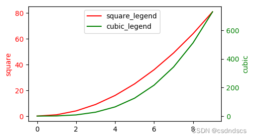
画不同大小的多个坐标系:网格布局
import matplotlib.gridspec as gridspec
fig=plt.figure(figsize=(12,2.5))
gs = gridspec.GridSpec(1,5)
ax = fig.add_subplot(gs[0,0]),fig.add_subplot(gs[0,1:3]),fig.add_subplot(gs[0,3:])
ax[0].plot([4,3,2,1])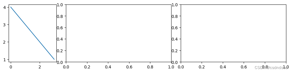
调节子图间距
1.自动调节:fig.tight_layout()
fig=plt.figure(figsize=(12,2.5))
gs = gridspec.GridSpec(1,5)
ax = fig.add_subplot(gs[0,0]),fig.add_subplot(gs[0,1:3]),fig.add_subplot(gs[0,3:])
ax[0].plot([4,3,2,1])
fig.tight_layout()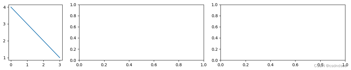
2.手动设置间距:fig.subplots_adjust(wspace=0,hsapce=0)
fig,ax=plt.subplots(2,2,figsize=(4,2))
fig.subplots_adjust(wspace=0,hspace=0)
多张图片无缝拼接展示
设置figsize宽高比满足图片拼接后的矩形宽高比,手动设置坐标系间距为0即可:
fig,ax=plt.subplots(2,4,figsize=(4,2))
fig.subplots_adjust(wspace=0,hspace=0)
for i in range(2):
    for j in range(4):
        ax[i][j].set_xticks([])
        ax[i][j].set_yticks([])
设置坐标系透明度
import matplotlib.gridspec as gridspec
fig=plt.figure(figsize=(7,2))
gs = gridspec.GridSpec(1,3)
ax1,ax2=fig.add_subplot(gs[0,0]),fig.add_subplot(gs[0,1:])
ax1.axis('off')
long_str='This is a long string\nThis is a long string\nThis is a long stringThis is a long string\nThis is a long string'
ax1.text(0.1, 0.1, long_str, transform=fig.transFigure)
ax2.patch.set_alpha(0.6) 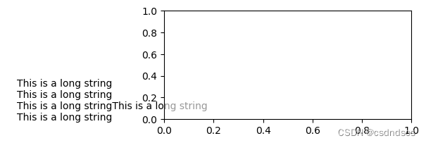
坐标轴及标签设置
设置坐标轴标签及刻度字体
单独设置:
fig,ax=plt.subplots(figsize=(5,2))
ax.set_ylabel('Y',fontdict={'size':20,'family':'Times New Roman','color':'g'})
ax.set_xlabel('X',fontdict={'size':20,'family':'Times New Roman','color':'r'})
ax.set_xticklabels(labels=[1,2,3,4,5,6],size=15,color='r',family='Times New Roman')
ax.set_yticklabels(labels=[1,2,3,4,5,6],size=10,color='g',family='Times New Roman')
总体设置:
parameters = {'xtick.labelsize': 16,'ytick.labelsize': 16,'axes.titlesize': 18}    #修改参数
plt.rcParams.update(parameters)    #更新参数
#plt.rc('font',family='Times New Roman',size=20)    #设置字体类型,大小
#plt.rcdefaults() #恢复默认值
#plt.rcParamsDefault #查看默认值
设置坐标轴标签据离坐标轴距离
ax.set_xlabel('x label',labelpad=50) #设置x轴标签据x轴距离为50点设置坐标轴刻度及文字颜色
fig,ax=plt.subplots(figsize=(4,2))
ax.spines['left'].set_color('red') #设置边框颜色
ax.tick_params(axis='y',colors='red') #设置刻度颜色 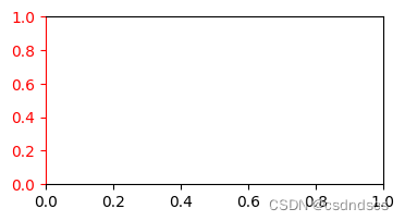
隐藏坐标轴刻度
fig,(ax1,ax2)=plt.subplots(1,2,figsize=(4,1))
ax1.set_xticks([])
ax2.set_yticks([])
图例设置
设置图例字体大小
plt.legend(fontsize=16)
ref:https://blog.csdn.net/weixin_44560088/article/details/107165510


 3148
3148


 被折叠的 条评论
为什么被折叠?
被折叠的 条评论
为什么被折叠?
 到【灌水乐园】发言


