


css 网格布局
This article was updated in July, 2018 to reflect improved browser support for CSS Grid Layout.
本文于2018年7月进行了更新,以反映出改进的浏览器对CSS Grid Layout的支持。
As web applications become more and more complex, we need a more natural way to do advanced layouts easily without hacky solutions that use floats and other less burdensome techniques. An exciting new solution for creating layouts comes with the CSS Grid Layout Module.
随着Web应用程序变得越来越复杂,我们需要一种更自然的方法来轻松地进行高级布局,而又不会使用使用浮点数和其他负担较小的技术的hacky解决方案。 CSS网格布局模块提供了一个令人兴奋的创建布局的新解决方案。
In this introductory tutorial, I’ll introduce you to this relatively new CSS feature, I’ll discuss the current browser support, and I’ll show you using some examples how the CSS Grid Layout Module works.
在本入门教程中,我将向您介绍此相对较新CSS功能,将讨论当前的浏览器支持,并通过一些示例向您展示CSS网格布局模块的工作方式。
什么是CSS网格布局模块? (What is the CSS Grid Layout Module?)
The core idea behind the Grid Layout is to divide a web page into columns and rows, along with the ability to position and size the building block elements based on the rows and columns we have created in terms of size, position, and layer.
网格布局的核心思想是将网页分为行和列,并具有根据我们在尺寸,位置和层方面创建的行和列来定位和设置构建块元素的能力。
The grid also gives us a flexible way to change the position of elements with only CSS without any change to the HTML. This can be used with media queries to alter the layout at different breakpoints.
网格还为我们提供了一种灵活的方法,仅使用CSS即可更改元素的位置,而无需更改HTML。 可以与媒体查询一起使用,以更改不同断点处的布局。
浏览器支持 (Browser Support)
Before we can dive more into Grid Layout, it’s important to take a look at the status of browser support.
在深入了解Grid Layout之前,重要的一点是要了解浏览器支持的状态 。
在现代浏览器中的支持 (Support in modern browsers)
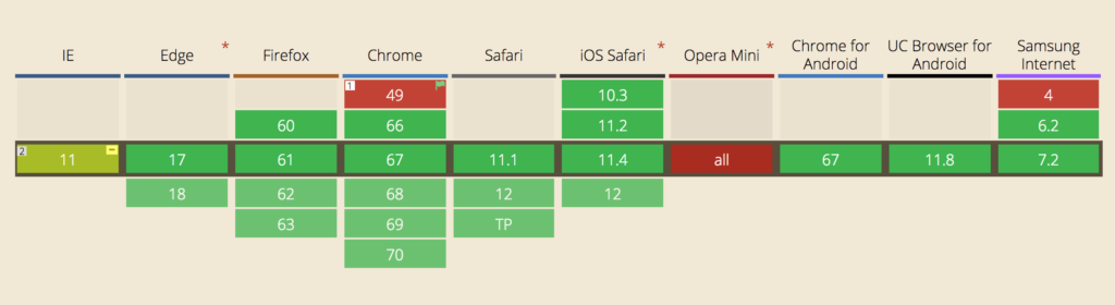
As you can see from the image above, the great news is that CSS Grid is supported by the latest version of most browsers.
从上图可以看到,好消息是大多数浏览器的最新版本都支持CSS Grid。
If you click the Show all option on Can I use, you’ll see how far back this support goes. Because Grid is such a new feature, backwards compatibility doesn’t extend far, so you need to bear this in mind if there’s a chance your audience is using an older version of a major browser.
如果单击“我可以使用”上的“ 显示全部”选项,您将看到此支持的有效时间。 由于Grid是一项新功能,向后兼容性不会扩展得很远,因此,如果您的受众有可能使用较旧版本的主流浏览器,则需要牢记这一点。
However, hovering over each version number on Can I use shows the rate of global usage for that version. At the time of writing, the latest version for each browser not to support Grid has a usage of far less than one percent.
但是,将鼠标悬停在“我可以使用”上的每个版本号上会显示该版本的全局使用率。 在撰写本文时,每个不支持Grid的浏览器的最新版本的使用率远远少于百分之一 。
Internet Explorer…和其他不支持的浏览器 (Internet Explorer … and other non-supporting browsers)
The first proposal of Grid Layout was developed by Microsoft, and IE10 shipped with an -ms prefixed implementation. If you take a look at support on Can I use, you’ll see that both IE10 and IE11 support CSS Grid … with the caveat that they only support the older version of the specification. Bummer. That’s not going to change. But what will change is the usage for those browsers. In July 2018, IE11 usage is down to around 2% globally, and IE10 usage is about a tenth of a percent.
网格布局的第一个建议是由Microsoft开发的,并且IE10附带了-ms前缀的实现。 如果您查看有关“我可以使用”的支持 ,您会看到IE10和IE11都支持CSS Grid…并发出警告,它们仅支持该规范的较旧版本。 笨蛋 那不会改变。 但是将会改变的是这些浏览器的用法。 在2018年7月,IE11的使用率在全球范围内已降至2%左右,而IE10的使用率约为百分之一。
Can I use also indicates that a few other browsers don’t support grid layout. These include Opera Mini and Blackberry Browser. Opera Mini is the only one with significant usage, but because it’s a mobile browser, you’ll most likely want to target it with a mobile-friendly, non-Grid layout anyway.
我是否可以使用还表示其他一些浏览器不支持网格布局。 其中包括Opera Mini和Blackberry Browser。 Opera Mini是唯一一个使用率很高的应用程序,但是由于它是一种移动浏览器,因此您很可能还是希望使用适合移动设备的非网格布局来定位它。
不支持浏览器的后备 (Fallbacks for non-supporting browsers)
Given that the vast majority of browsers in use today support CSS Grid, it’s a shame not to use it on the basis that some browsers may not support it. There are various options for using Grid and providing perfectly adequate fallbacks for non-supporting browsers.
鉴于当今使用的绝大多数浏览器都支持CSS Grid,因此以某些浏览器可能不支持CSS网格为理由不使用它是可耻的。 有多种使用Grid的选项,并为不支持的浏览器提供完美的备用。
Perhaps the simplest option is to provide a simple “mobile first” layout. This will be perfectly adequate for mobile devices that don’t support Grid and also desktop browsers like IE.
也许最简单的选择是提供简单的“移动优先”布局。 对于不支持Grid的移动设备以及IE之类的桌面浏览器,这将是完全合适的。
Another option is to use more sophisticated fallbacks and overrides to produce similar results to Grid, as outlined by Rachel Andrew.
另一个选择是使用更复杂的后备和替代来产生与Grid类似的结果,如Rachel Andrew概述的那样 。
And a polyfill is also available to provide a working implementation of the Grid Module for browsers that don’t support it natively. Note that this might be a bit out of date now.
此外,还可以使用polyfill为本地不支持它的浏览器提供Grid Module的有效实现。 请注意,现在可能有点过时了。
网格布局示例 (A Grid Layout Example)
Let’s start with an example to see the power of Grid Layout, and then I’ll explain some new concepts in more detail.
让我们从一个示例开始,看看Grid Layout的功能,然后我将更详细地解释一些新概念。
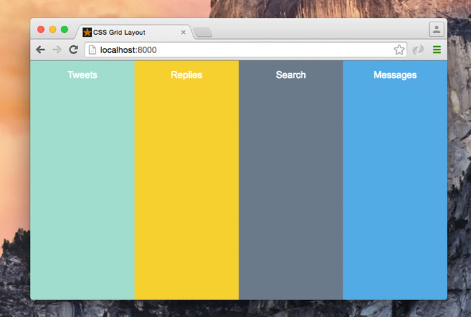
Imagine you want to create a Twitter app with a four, full-height column layout (Tweets, Replies, Search, and Messages), something abstracted and similar to the screenshot below.
想象一下,您想创建一个具有全高四列布局(推文,回复,搜索和消息)的Twitter应用程序,该应用程序是抽象的,类似于下面的屏幕快照。
Here is our HTML:
这是我们HTML:
<div class="app-layout">
  <div class="tweets">Tweets</div>
  <div class="replies">Replies</div>
  <div class="search">Search</div>
  <div class="messages">Messages</div>
</div>
Then we will apply some CSS to the .app-layout container element:
然后,我们将一些CSS应用于.app-layout容器元素:
.app-layout {
  display: grid; /* 1 */
  grid-template-columns: 1fr 1fr 1fr 1fr; /* 2 */
  grid-template-rows: 100vh; /* 3 */
}Here is the explanation of what we’ve done in the previous CSS:
这是我们在以前CSS中所做的解释:
Set the display property to
grid.将显示属性设置为
grid。Divide the container element into four columns, each column is
1fr(one fraction) of the free space within the grid container.将容器元素分为四列,每一列是网格容器内自由空间的
1fr(一小部分) 。Create one row and set the height to be
100vh(full viewport height).创建一行并将高度设置为
100vh(全视口高度)。
As you can see, the Grid Layout Module adds a new value to the display property which is grid. The grid value is responsible for setting the .app-layout element to be a grid container, which also establishes a new grid formatting context for its contents. This property is required to start using Grid Layout.
如您所见,“网格布局模块”将新值添加到display属性grid 。 grid值负责将.app-layout元素设置为网格容器,该容器还为其内容建立新的网格格式上下文 。 开始使用“网格布局”时需要此属性。
The grid-template-columns property specifies the width of each grid column within the Grid, and in our case it divides the .app-layout container to four columns; each one is 1fr (25%) of the available space.
grid-template-columns属性指定Grid中每个网格列的宽度,在我们的示例中,它将.app-layout容器分为四列; 每个空间为可用空间的1fr (25%)。
The grid-template-rows specifies the height of each grid row, and in our example we only created one row at 100vh.
grid-template-rows指定每个网格行的高度,在我们的示例中,我们仅以100vh创建了一行。
A layout with two columns and two rows would look like this:
具有两列两行的布局如下所示:
And we would use the following CSS:
我们将使用以下CSS:
.app-layout {
  display: grid;
  grid-template-columns: 1fr 1fr;
  grid-template-rows: 50vh 50vh;
}We can also achieve the above example only on small screens by wrapping the code inside a media query. This opens up a great opportunity for us to customize the layout differently in different viewports. For example, we can create the previous layout only on viewports under 1024px as follows:
通过将代码包装在媒体查询中,我们也只能在小屏幕上实现上述示例。 这为我们提供了一个绝佳的机会,可以让我们在不同视口中以不同的方式自定义布局。 例如,我们只能在1024px以下的视口上创建以前的布局,如下所示:
@media screen and (max-width: 1024px) {
  .app-layout {
    display: grid;
    grid-template-columns: 1fr 1fr;
    grid-template-rows: 50vh 50vh;
  }
}网格布局模块概念 (Grid Layout Module Concepts)
Now that you’ve seen a simple example, there are some new concepts that I’d like to cover to give you a better understanding of Grid Layout. Although there are a lot of new concepts, I will only take a look at a few of them.
既然您已经看到了一个简单的示例,那么我想介绍一些新概念,以使您更好地理解“网格布局”。 尽管有很多新概念,但我只会介绍其中一些。
Grid Item Grid items are the child elements of the grid container. In the above example, the .tweets, and .replies elements would qualify as grid items.
网格项网格项是网格容器的子元素。 在上面的示例中, .tweets和.replies元素将被视为网格项。
A Grid Line is a line that exists on either side of a column or a row. There are two sets of grid lines: One set defining columns (the vertical axis), and another set defining rows (the horizontal axis).
网格线是存在于列或行两侧的线。 网格线有两组:一组定义列(垂直轴),另一组定义行(水平轴)。
From the above screenshot, which represents the first example, I’ve created four columns at 1fr each, which will give us five vertical lines. I also created one row, which gives us two horizontal lines.
在上面的截图(代表第一个示例)中,我以1fr创建了四列,这将为我们提供5条垂直线。 我还创建了一行,这给了我们两条水平线。
Let’s see how we can position a grid item inside the grid container.
让我们看看如何在网格容器内放置网格项目。
使用行号定位项目 (Position Items by Using a Line Number)
You can refer to an exact line number in a grid by using the properties grid-column-start and grid-column-end. We then give these properties the start and end line numbers.
您可以使用属性grid-column-start和grid-column-end来引用网格中的确切行号。 然后,我们为这些属性指定开始和结束行号。
Looking at the previous example, this is how the browser positions the elements by default for us:
查看前面的示例,这是浏览器默认为我们定位元素的方式:
.tweets   {
  grid-column-start: 1;
  grid-column-end: 2;
  grid-row: 1;
}

.replies  {
  grid-column-start: 2;
  grid-column-end: 3;
  grid-row: 1;
}

.search   {
  grid-column-start: 3;
  grid-column-end: 4;
  grid-row: 1;
}

.messages {
  grid-column-start: 4;
  grid-column-end: 5;
  grid-row: 1;
}
Looking at the code for the .tweet column, this is what each of the three lines in the CSS does:
查看.tweet列的代码,这是CSS中三行代码的每一行:
- Position the child element starting from the first vertical line on the left. 从左侧的第一条垂直线开始定位子元素。
- End the element’s position at the second vertical line. 在第二条垂直线处结束元素的位置。
- Position the element inside the whole row. 将元素放置在整行中。
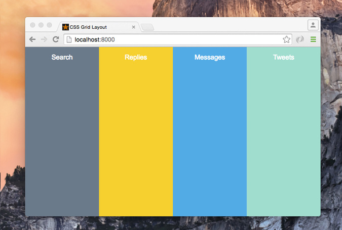
You can change this by changing the order of elements with different positions, so the order of the elements will be: .search, .replies, .messages, and .tweets.
您可以通过改变不同位置元素的顺序改变这一点,所以元素的顺序将是: .search , .replies , .messages和.tweets 。
And we can do it as follows:
我们可以做到如下:
.tweets {
  grid-column-start: 4;
  grid-column-end: 5;
  grid-row: 1;
}

.replies {
  grid-column-start: 2;
  grid-column-end: 3;
  grid-row: 1;
}

.search {
  grid-column-start: 1;
  grid-column-end: 2;
  grid-row: 1;
}

.messages {
  grid-column-start: 3;
  grid-column-end: 4;
  grid-row: 1;
}
We can also use the grid-column shorthand property to set the start and end lines in one line:
我们还可以使用grid-column速记属性在一行中设置开始和结束行:
.tweets {
  grid-column: 4 / 5;
  grid-row: 1;
}

.replies {
  grid-column: 2 / 3;
  grid-row: 1;
}

.search {
  grid-column: 1 / 2;
  grid-row: 1;
}

.messages {
  grid-column: 3 / 4;
  grid-row: 1;
}This has changed the layout structure with only CSS while the markup is still as it was without any changes. This is a huge advantage of using the Grid Layout Module. We can rearrange the layout of elements independent of their source order, so we can achieve any desired layout for different screen sizes and orientations.
这仅用CSS更改了布局结构,而标记仍保持不变,没有任何更改。 这是使用网格布局模块的巨大优势。 我们可以独立于源顺序重新排列元素的布局,因此我们可以针对不同的屏幕尺寸和方向实现任何所需的布局。
使用命名区域定位项目 (Position Items by Using Named Areas)
A grid area is the logical space used to lay out one or more grid items. We can name a grid area explicitly using the grid-template-areas property, then we can place a grid item into a specific area using the grid-area property.
网格区域是用于布置一个或多个网格项目的逻辑空间。 我们可以使用grid-template-areas属性显式命名网格区域,然后可以使用grid-area属性将网格项放置到特定区域中。
To make this concept more clear, let’s redo the four-column example with the search column placed first:
为了使这个概念更清楚,让我们重做四列示例,将search列放在第一位:
.app-layout {
  display: grid;
  grid-template-columns: 1fr 1fr 1fr 1fr;
  grid-template-rows: 100vh;
  grid-template-areas: "search replies messages tweets";
}
In the last line, we divide the grid container into four named grid areas, each name for a column. The next step is to position each grid item into a named area:
在最后一行中,我们将网格容器分为四个命名的网格区域,每个区域都有一列。 下一步是将每个网格项放置到一个命名区域中:
.search {
  grid-area: search;
}

.replies {
  grid-area: replies;
}

.messages {
  grid-area: messages;
}

.tweets {
  grid-area: tweets;
}松弛示例 (Slack Example)
What about using the Grid Layout Module to implement a more complex example, for example, creating the building blocks of the Slack layout. Since we are talking about layouts, we will abstract and simplify the Slack design to the building blocks represented in the grid. Something like this:
如何使用网格布局模块实现一个更复杂的示例,例如,创建Slack布局的构建块。 由于我们在谈论布局,因此我们将Slack设计抽象化并简化为网格中表示的构建块。 像这样:
From this layout we will create three vertical columns, and three horizontal rows, and we can visualize it using the grid lines as follows:
从这个布局中,我们将创建三个垂直列和三个水平行,并且可以使用网格线将其可视化,如下所示:
Here is the HTML:
这是HTML:
<div class="app-layout">
  <div class="teams">Teams</div>
  <div class="channels">Channels</div>
  <div class="header">Header</div>
  <div class="messages">
    <ul class="message-list">
      <li></li>
      <li></li>
    </ul>
  </div>
  <div class="input">
    <input type="text" placeholder="CSS Grid Layout Module">
  </div>
</div>
And the CSS:
和CSS:
.app-layout {
  display: grid;
  height: 100vh;
  grid-template-columns: 100px 250px 1fr;
  grid-template-rows: auto 1fr auto;
}
Here I’m using the grid-template-columns property to create three columns at 100px, 250px, and the third column takes up the remaining available space. The last line creates three rows: The first and third rows with auto height while the middle row takes up the remaining available space.
在这里,我使用grid-template-columns属性在100px,250px处创建三列,第三列占用剩余的可用空间。 最后一行创建三行:第一行和第三行具有自动高度,而中间行占据剩余的可用空间。
The remainder of the CSS looks like this:
CSS的其余部分如下所示:
.teams {
  grid-column: 1;
  grid-row: 1 / 4;
}

.channels {
  grid-column: 2;
  grid-row: 1 / 4;
}

.header {
  grid-column: 3;
  grid-row: 1;
}

.messages {
  grid-column: 3;
  grid-row: 2;
}

.input {
  grid-column: 3;
  grid-row: 3;
}We can also create the Slack layout using named areas, which you can see in this demo.
我们还可以使用命名区域创建Slack布局,您可以在此演示中看到。
网格布局模块与Flexbox (Grid Layout Module vs Flexbox)
Since many of you have started using Flexbox, you might wonder: When would it be appropriate to use Flexbox and when would it be more appropriate to use Grid Layout?
由于你们中的许多人已经开始使用Flexbox,您可能想知道:什么时候应该使用Flexbox,什么时候应该使用Grid Layout?
I found a good explanation from Tab Atkins:
我从Tab Atkins找到了一个很好的解释 :
Flexbox is appropriate for many layouts, and a lot of “page component” elements, as most of them are fundamentally linear. Grid is appropriate for overall page layout, and for complicated page components which aren’t linear in their design.
Flexbox适用于许多布局和许多“页面组件”元素,因为它们中的大多数基本上都是线性的。 网格适用于整体页面布局以及设计中不是线性的复杂页面组件。
The two can be composed arbitrarily, so once they’re both widely supported, I believe most pages will be composed of an outer grid for the overall layout, a mix of nested flexboxes and grid for the components of the page, and finally block/inline/table layout at the “leaves” of the page, where the text and content live
两者可以任意组合,因此,一旦它们都得到广泛支持,我相信大多数页面将由用于整体布局的外部网格,嵌套的弹性框和用于页面组件的网格组成,最后阻止/页面“叶子”中的内联/表格布局,其中包含文本和内容
Also, Rachel Andrew says:
另外, 雷切尔·安德鲁(Rachel Andrew)说 :
Grid Layout for the main page structure of rows and columns.
行和列的主页结构的网格布局。
Flexbox for navigation, UI elements, anything you could linearize.
Flexbox用于导航,UI元素以及任何您可以线性化的东西。
CSS网格布局模块资源 (CSS Grid Layout Module Resources)
I have not covered all the Grid Layout concepts and syntax, so I recommend you check out the following resources to go deeper:
我没有介绍所有的“网格布局”概念和语法,因此建议您查看以下资源以进一步了解:
Follow Rachel Andrew for updates and resources. She is doing a lot of great work in relation to Grid Layout.
关注Rachel Andrew以获取更新和资源。 她在“网格布局”方面做了很多出色的工作。
结论 (Conclusion)
As you’ve seen, the CSS Grid Layout Module is powerful because of its code brevity and the fact that you have the power to change the layout order without touching the markup. These features have helped us to permanently change the way we create layouts for the web.
如您所见,CSS Grid Layout Module功能强大,因为它的代码简洁,而且您可以更改布局顺序而无需触摸标记。 这些功能帮助我们永久性地更改了为网络创建布局的方式。
翻译自: https://www.sitepoint.com/introduction-css-grid-layout-module/
css 网格布局


 扫一扫
扫一扫
 143
143

 被折叠的 条评论
为什么被折叠?
被折叠的 条评论
为什么被折叠?
 到【灌水乐园】发言


